Crossfilter.js, dc.js and D3.js for data visualization
Greetings to connoisseurs of beautiful and functional data visualization! I bring to your attention a small overview of several JavaScript libraries, which, together with D3.js, will allow you to create interactive visualization of multidimensional data with the possibility of applying filtering on the fly.
Interested, then welcome under cat.
Note: This article is to some extent a compilation of several articles from the wonderful blog www.d3noob.org , revised and supplemented in accordance with my vision for the task of data visualization.
In our country, infographics are mainly associated with pictures created by designers (sometimes quite badly), although lately the video has also been developing more actively. This is only the tip of the iceberg, which was occupied by marketers, but the true power is available only todivers to analyst programmers. But about the current situation some other time, and now let's go back to interactive infographics. Usually, the word “interactive” means the ability to display tooltips, change the scale, sometimes apply filters and change the data structure, but all this, as a rule, is subject to pre-designed logic (scenario). Now imagine that you can manage the data flow yourself, with minimal restrictions, imagine that you can define arbitrary simple (without formulas) filters without being limited to choosing from the list. And now imagine even more, namely: all changes are almost instantly displayed on all graphs representing a multidimensional data array. Sounds good, doesn't it?
Crossfilter is a JavaScript library for working with multidimensional data in the browser. Crossfilter provides extremely fast interchangeability (less than 30 ms) of interconnected data views (multidimensional data slices) even if the input data contains more than a million rows. The library was created by people who are directly related to d3.js , this is Mike Bostock and Jason Davies .
')
The basis of working with data is based on the principles of Map-Reduce nowadays. For a person who has not come across this before, it all sounds rather complicated and confusing, so let's take a look. So, what do people usually do with multidimensional data (recall Excel pivot tables)? They are usually grouped in various ways, summarize, sort, calculate the frequency of occurrence of values, etc. Reduce is responsible for this, and Map provides a parallel calculation of all these manipulations. Of course, in reality, everything is abit more complicated, but I think it will do for the first approximation.
As they say, it's better to see it once, but you can do it on the Github library page .

Before us is information about
In the center of the
And most importantly, all this magnificence "Released under the Apache License 2.0" .
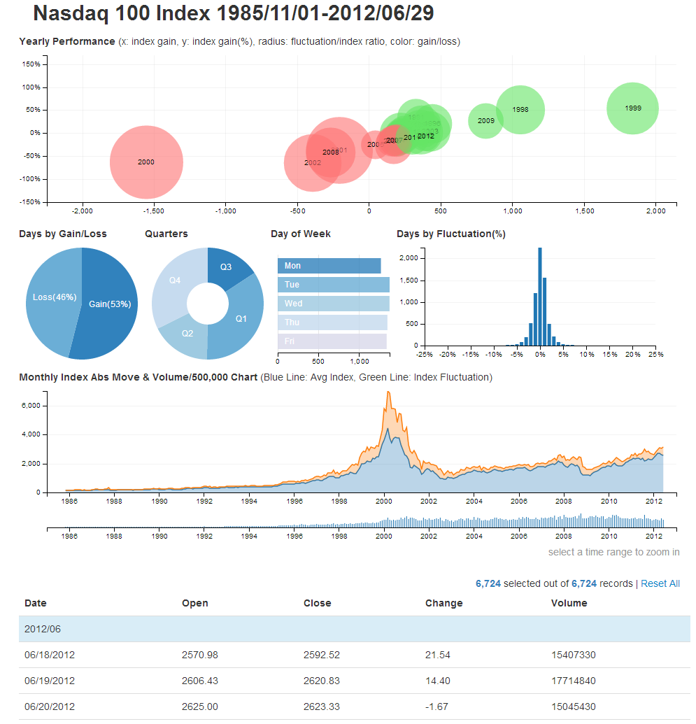
If you look at the demo code for the crossfilter , you will see that it takes more than 500 lines. This is because the crossfilter was created not for data visualization, but for manipulating it. D3.js , in turn, was created just for data visualization. This is where the dc.js library comes to the rescue for authorship Nick Qi Zhu , which binds the two technologies of interest to us into one powerful tool. Unfortunately, all the variety of D3.js graphs will not be available to us, but those that are implemented in dc.js are sufficient for most cases. DC.js supports the following types of graphs:
Examples of implemented graphs can be viewed on the Github project page . The library is also published under the license "Apache License 2.0" .
Well, now you know a few more data visualization tools and can create multi-component graphics with on-the-fly filtering. Successes to you in realization of your plans.
Dear habrovchane, how do you look at the creation of the hub Data Visualization or Data Visualization ? Because now only the Infographics hub exists from close thematic hubs, but it is dedicated to the actual infographics (results), and not to the process of its creation. Definitions of these two terms can be found on Wikipedia: Infographic , Data visualization .
So all interested please express your opinion on this issue.
Interested, then welcome under cat.
Note: This article is to some extent a compilation of several articles from the wonderful blog www.d3noob.org , revised and supplemented in accordance with my vision for the task of data visualization.
Source of inspiration:
Data Visualization and Analytics
In our country, infographics are mainly associated with pictures created by designers (sometimes quite badly), although lately the video has also been developing more actively. This is only the tip of the iceberg, which was occupied by marketers, but the true power is available only to
Crossfilter.js
Crossfilter is a JavaScript library for working with multidimensional data in the browser. Crossfilter provides extremely fast interchangeability (less than 30 ms) of interconnected data views (multidimensional data slices) even if the input data contains more than a million rows. The library was created by people who are directly related to d3.js , this is Mike Bostock and Jason Davies .
')
The basis of working with data is based on the principles of Map-Reduce nowadays. For a person who has not come across this before, it all sounds rather complicated and confusing, so let's take a look. So, what do people usually do with multidimensional data (recall Excel pivot tables)? They are usually grouped in various ways, summarize, sort, calculate the frequency of occurrence of values, etc. Reduce is responsible for this, and Map provides a parallel calculation of all these manipulations. Of course, in reality, everything is a
So what can crossfilter
As they say, it's better to see it once, but you can do it on the Github library page .
Before us is information about
231,083 flights in various sections. Here we see five data views: four bar charts and one table. The graph of Time of Day shows the distribution of flights depending on the hour. Arrival delay shows the distribution of the number of flight delays, grouped in 10-minute intervals. Distance shows the distribution of flights by flight range (interval 50 miles). Date - the number of flights per day. And all this was rendered on the client side, that is, in our browser, you see, not bad for so much data.In the center of the
Date graph, you can see a window that limits the working range, similar windows can be set with the mouse on the other graphs, and all the graphs will be coordinated to change in accordance with the superimposed filters. Thus, we have ample opportunities for data analysis on the fly.And most importantly, all this magnificence "Released under the Apache License 2.0" .
DC.js to the rescue
If you look at the demo code for the crossfilter , you will see that it takes more than 500 lines. This is because the crossfilter was created not for data visualization, but for manipulating it. D3.js , in turn, was created just for data visualization. This is where the dc.js library comes to the rescue for authorship Nick Qi Zhu , which binds the two technologies of interest to us into one powerful tool. Unfortunately, all the variety of D3.js graphs will not be available to us, but those that are implemented in dc.js are sufficient for most cases. DC.js supports the following types of graphs:
- Bar chart
- Pie chart
- Row chart
- Line chart
- Bubble chart
- Geo choropleth chart
- Data table
Examples of implemented graphs can be viewed on the Github project page . The library is also published under the license "Apache License 2.0" .
More infographics beautiful and functional
Well, now you know a few more data visualization tools and can create multi-component graphics with on-the-fly filtering. Successes to you in realization of your plans.
Hub dedicated to data visualization
Dear habrovchane, how do you look at the creation of the hub Data Visualization or Data Visualization ? Because now only the Infographics hub exists from close thematic hubs, but it is dedicated to the actual infographics (results), and not to the process of its creation. Definitions of these two terms can be found on Wikipedia: Infographic , Data visualization .
So all interested please express your opinion on this issue.
Source: https://habr.com/ru/post/189838/
All Articles