How to test responsive design?
Stop resizing your browser window, stop raping it! I bet you heard it more than once. Well, maybe not heard. But if you are professionally engaged in developing responsive websites, you understand what I mean: any DOM change or CSS editing, and you again begin to drag the edge of the browser back and forth, testing the changes and looking through nothing broken.
The purpose of your movements is to imitate the screens of various devices.
')
In a corporate environment, often you have a lot of gadgets provided by the company for the test. I have an iPad, iPod, other tablets, laptops, and desktop monitors at my disposal. If you do not have this luxury, you have to use what is at hand.
Fortunately, there is an inspiring set of online tools that simulate various diagonal devices. Of course, each of them has its advantages and disadvantages; we consider several such tools.
For testing, I chose a truly adaptive site PajamasOnYourFeet.com, a site built on the basis of an HTML5 template, provided free of charge by EGrappler.
Am I Responsive?
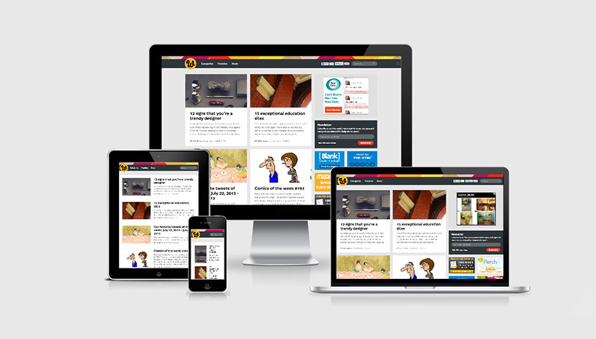
Am I Responsive , a very simple tool that allows you to quickly view your site on 4 devices. All of them are iOS and the developer explains this with a site chip. In general, no settings, no choice, but very simple and clear.
Available sizes:
- desktop monitor - 1600 x 992px;
- laptop - 1280 x 802px;
- tablet - 768 x 1024px;
- mobile phone - 320 x 480px.
I quote the developer: “this is not a tool for testing, it is extremely important to conduct testing on real devices. And this tool will help to quickly make a screenshot and show the client what you mean. "
There are two nice features: the ability to drag devices along your screen, and also the opportunity to share a link to the test site.
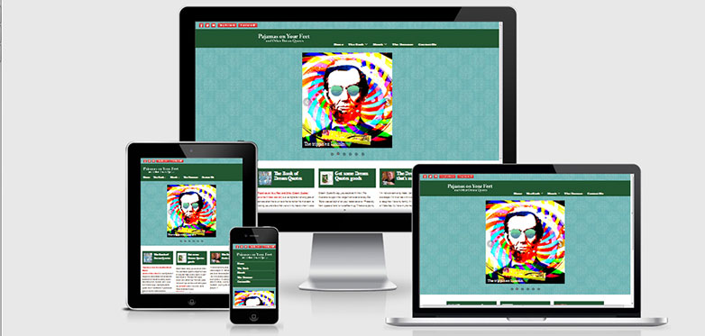
deviceponsive
The deviceponsive is very similar to Am I Responsive, in that it is just as simple with a minimum of settings and options. All available devices are displayed immediately on one long page. Of all the available options, it is possible to edit the background of the header and add your logo there, which will be useful when you decide to share a screenshot.
Devices and available screen resolutions.
- Macbook - 1280 x 800
- iPad portrait - 768 x 1024
- iPad portrait - 1024 x 768
- Kindle portrait - 600 x 1024
- Kindle landscape orientation - 1024 x 600
- iPhone portrait - 320 x 480
- iPhone landscape orientation - 480 x 320
- Galaxy portrait - 240 x 320
- Galaxy landscape orientation - 320 x 240
As with most similar tools, scrollbars are displayed that would not exist on real devices. This is a forced step to enable scrolling on non-touch devices.

responsive test
Like deviceponsive, the responsive test displays your site in various devices. But instead of showing all at once, you choose the device you need in the top menu of the page. By the way, scaling works here correctly, which allows testing of a higher resolution at a lower resolution.
30 different resolutions are available on the site, ranging from a huge desktop monitor, to what they call a “trashy android” (justice is worth noting that there is a normal android).
As for the Firefox browser, it does not work correctly with this site. Please note that the screenshot does not display a slider between the green title and the white area of the background content.

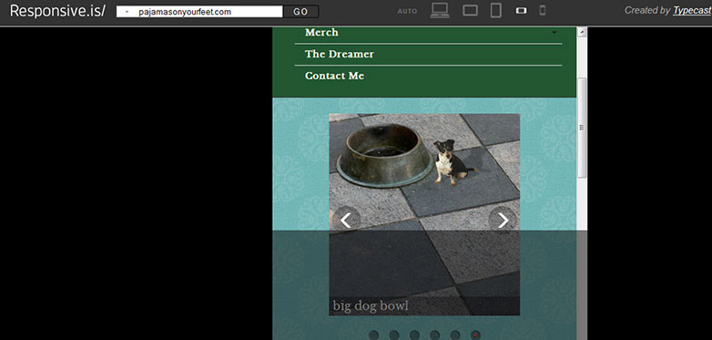
responsive.is
Very similar to the previous two tools, but there is one thing that distinguishes responsive.is from others. This is a smooth animation when moving from one device to another, as well as a semi-transparent area that shows the real area of the site that does not fall within the viewing area.
The available device options are auto (how you see the site), desktop computer, tablet in landscape and portrait orientations, smartphone in portrait and landscape position. Set arbitrary sizes in px, unfortunately it is impossible.
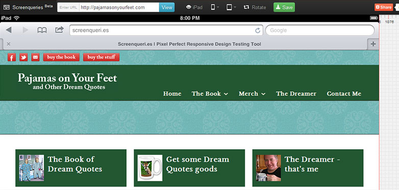
Screenqueries
But the features and options available distinguish the Screenqueries from previous services. 14 phones and 12 tablets are presented here, with a separate ability to switch to portrait and landscape mode. Results are displayed on a grid with rulers. It is also possible to set arbitrary resolution by pulling the right or bottom edge.
An interesting feature of this site for some devices is the “Trueview” option, which shows your site in the device’s native browser.
Unfortunately, Firefox could not display the slider here either. No need to blame me, Firefox is my favorite browser, but such are the cases.
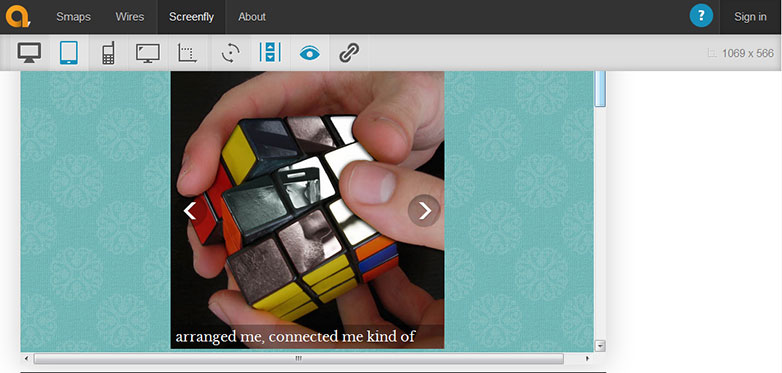
Screenfly
Screenfly perhaps the most functional of all. There are 9 more devices available than tablet - from 10 "laptops, up to 24" monitors, 5 tablets, 9 phones, 3 television resolutions, as well as arbitrary resolution. Add here a separate switch to portrait and landscape mode, as well as the scroll view option. You can also share a link to the test with a single button.
Each device in the menu shows the screen size in px., And the actual size of your browser window is displayed in the upper right corner.
All these advantages allow you to claim leadership if not for one thing (developer quote): “Screenfly can use a proxy server to imitate devices while browsing your site. The proxy server simulates the user agent string, but not the behavior of these devices. ”Screenfly is the only service from the list that allows you to test based on the user agent string.
Do you use the tools presented in your practice? Share your secrets of developing responsive websites in the comments.
PS Mistakes regarding the translation, please report to the PM.
Source: https://habr.com/ru/post/189726/
All Articles