Absolute horizontal and vertical centering
How many copies have already been broken about the task of aligning elements on the page. I bring to your attention the translation of an excellent article with a solution to this problem from Stephen Shaw for Smashing Magazine - Absolute Horizontal And Vertical Centering In CSS .
We all knew about the margin: 0 auto; for horizontal centering, but margin: auto; did not work for vertical. This can be easily fixed by simply setting the height and applying the following styles:
I am not the first to propose this solution, but this approach is rarely used for vertical alignment. In the comments on the article How to Center Anything With CSS Simon refers to the jsFiddle example, which provides an excellent solution for vertical centering. Here are some more sources on this topic.
')
Consider a closer look.
The method has been tested and works great in Chrome, Firefox, Safari, Mobile Safari and even IE 8-10. One user mentioned that content is not vertically aligned on Windows Phone.
Content placed in a container with position: relative will be perfectly aligned:
Set the content position: fixed and set the z-index:
Watch the demo
The main advantage of the described method is an excellent job, when the height or width is set as a percentage, and also the understanding of min-width / max-width and min-height / max-height .
If there is a fixed header on the site or some other indent is required, you just need to add code to the styles like top: 70px; While the margin is set : auto; the block with content will be correctly centered in height.
You can also align content on the right side, leaving centering height. To do this, use right: 0; left: auto; for right justification or left: 0; right: auto; to align left.

In order for a large amount of content not to allow layout to disperse, use overflow: auto . A vertical scroll appears. You can also add max-height: 100%; if the content has no extra padding.
The method also works great for images! Add a height style : auto; then the picture will be scaled along with the container.

The described method requires a given block height, which can be specified as a percentage and controlled using max-height , which makes the method ideal for responsive sites. One way to not set the height is to use display: table . In this case, the content block is centered regardless of size.
There may be problems with cross-browser compatibility, perhaps you should use the method with a table-cell (described below).
The described method works fine in most cases, but there are other methods that can be applied to solve specific problems.
Probably the most popular way. Suitable if block sizes are known.
Benefits:
Disadvantages:
One of the easiest ways to support height changes. There is a detailed article on this topic - " Centering Percentage Width / Height Elements " from CSS-Tricks.
Benefits:
Disadvantages:
Perhaps one of the best and easiest ways. Detailed description in the article " Flexible height vertical centering with CSS, beyond IE7 " from 456bereastreet. The main drawback is additional markup: three elements are required already:
CSS:
Benefits:
Disadvantages:
The future of CSS, flexbox will solve many of today's layout problems. Details about this are written in the article Smashing Magazine, called Centering Elements with Flexbox .
Benefits:
Disadvantages:
Each method has advantages and disadvantages. Essentially, the choice comes down to choosing which browsers to support.

We all knew about the margin: 0 auto; for horizontal centering, but margin: auto; did not work for vertical. This can be easily fixed by simply setting the height and applying the following styles:
.Absolute-Center { margin: auto; position: absolute; top: 0; left: 0; bottom: 0; right: 0; } I am not the first to propose this solution, but this approach is rarely used for vertical alignment. In the comments on the article How to Center Anything With CSS Simon refers to the jsFiddle example, which provides an excellent solution for vertical centering. Here are some more sources on this topic.
')
Consider a closer look.
Virtues
- Cross-browser compatibility (including IE 8-10)
- No additional markup, minimal styles.
- Adaptability
- Padding independence (without box-sizing !)
- Works for images
disadvantages
- Height must be specified (see Variable Height )
- It is recommended to set overflow: auto so that the content does not spread.
- Does not work on Windows Phone
Browser Compatibility
The method has been tested and works great in Chrome, Firefox, Safari, Mobile Safari and even IE 8-10. One user mentioned that content is not vertically aligned on Windows Phone.
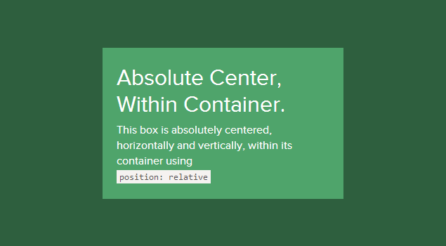
Inside the container
Content placed in a container with position: relative will be perfectly aligned:
.Absolute-Center { width: 50%; height: 50%; overflow: auto; margin: auto; position: absolute; top: 0; left: 0; bottom: 0; right: 0; } Using viewport
Set the content position: fixed and set the z-index:
.Absolute-Center.is-Fixed { width: 50%; height: 50%; overflow: auto; margin: auto; position: fixed; top: 0; left: 0; bottom: 0; right: 0; z-index: 999; } Watch the demo
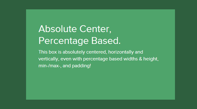
Adaptability
The main advantage of the described method is an excellent job, when the height or width is set as a percentage, and also the understanding of min-width / max-width and min-height / max-height .
.Absolute-Center.is-Responsive { width: 60%; height: 60%; min-width: 400px; max-width: 500px; padding: 40px; overflow: auto; margin: auto; position: absolute; top: 0; left: 0; bottom: 0; right: 0; } Offsets
If there is a fixed header on the site or some other indent is required, you just need to add code to the styles like top: 70px; While the margin is set : auto; the block with content will be correctly centered in height.
You can also align content on the right side, leaving centering height. To do this, use right: 0; left: auto; for right justification or left: 0; right: auto; to align left.
.Absolute-Center.is-Right { width: 50%; height: 50%; margin: auto; overflow: auto; position: absolute; top: 0; left: auto; bottom: 0; right: 20px; text-align: right; } Lots of content
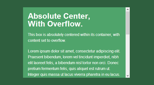
In order for a large amount of content not to allow layout to disperse, use overflow: auto . A vertical scroll appears. You can also add max-height: 100%; if the content has no extra padding.
.Absolute-Center.is-Overflow { width: 50%; height: 300px; max-height: 100%; margin: auto; overflow: auto; position: absolute; top: 0; left: 0; bottom: 0; right: 0; } Images
The method also works great for images! Add a height style : auto; then the picture will be scaled along with the container.
.Absolute-Center.is-Image { width: 50%; height: auto; margin: auto; position: absolute; top: 0; left: 0; bottom: 0; right: 0; } Adjustable height
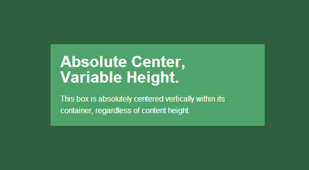
The described method requires a given block height, which can be specified as a percentage and controlled using max-height , which makes the method ideal for responsive sites. One way to not set the height is to use display: table . In this case, the content block is centered regardless of size.
There may be problems with cross-browser compatibility, perhaps you should use the method with a table-cell (described below).
- Firefox / IE8: using display: table aligns the block vertically at the top of the document.
- IE9 / 10: using display: table aligns the block to the upper left corner of the page.
- Mobile Safari: if the width is set as a percentage, horizontal centering suffers
.Absolute-Center.is-Variable { display: table; width: 50%; overflow: auto; margin: auto; position: absolute; top: 0; left: 0; bottom: 0; right: 0; } other methods
The described method works fine in most cases, but there are other methods that can be applied to solve specific problems.
Negative margin
Probably the most popular way. Suitable if block sizes are known.
.is-Negative { width: 300px; height: 200px; padding: 20px; position: absolute; top: 50%; left: 50%; margin-left: -170px; /* (width + padding)/2 */ margin-top: -120px; /* (height + padding)/2 */ } Benefits:
- Cross-browser compatibility
- Minimum code
Disadvantages:
- Not adaptive
- Crawl layout, if the container is too much content
- You have to compensate for indents or use box-sizing: border-box
Using transform
One of the easiest ways to support height changes. There is a detailed article on this topic - " Centering Percentage Width / Height Elements " from CSS-Tricks.
.is-Transformed { width: 50%; margin: auto; position: absolute; top: 50%; left: 50%; -webkit-transform: translate(-50%,-50%); -ms-transform: translate(-50%,-50%); transform: translate(-50%,-50%); } Benefits:
- Adjustable height
- Minimum code
Disadvantages:
- Does not work in IE 8
- Using prefixes
- May interfere with other transform effects
- In some cases, the rendering blurred the edges of the block and the text
Table-cell
Perhaps one of the best and easiest ways. Detailed description in the article " Flexible height vertical centering with CSS, beyond IE7 " from 456bereastreet. The main drawback is additional markup: three elements are required already:
<div class="Pos-Container is-Table"> <div class="Table-Cell"> <div class="Center-Block"> <!-- CONTENT --> </div> </div> </div> CSS:
.Pos-Container.is-Table { display: table; } .is-Table .Table-Cell { display: table-cell; vertical-align: middle; } .is-Table .Center-Block { width: 50%; margin: 0 auto; } Benefits:
- Adjustable height
- Layout does not travel with a large amount of text in the block.
- Cross-browser compatibility
Disadvantages:
- Complex structure
Flexbox
The future of CSS, flexbox will solve many of today's layout problems. Details about this are written in the article Smashing Magazine, called Centering Elements with Flexbox .
.Pos-Container.is-Flexbox { display: -webkit-box; display: -moz-box; display: -ms-flexbox; display: -webkit-flex; display: flex; -webkit-box-align: center; -moz-box-align: center; -ms-flex-align: center; -webkit-align-items: center; align-items: center; -webkit-box-pack: center; -moz-box-pack: center; -ms-flex-pack: center; -webkit-justify-content: center; justify-content: center; } Benefits:
- The contact can be any height or width.
- Can be used in more difficult cases.
Disadvantages:
- No support for IE 8-9
- Body or container required
- Requires a wide variety of prefixes to work correctly in modern browsers.
- Possible performance issues
Total
Each method has advantages and disadvantages. Essentially, the choice comes down to choosing which browsers to support.
Source: https://habr.com/ru/post/189696/
All Articles