Moscow bike
Our colleague, Evgeny Malikov ( all43 ), suggested that we explore the interface problems of the Moscow bike rental and find possible solutions. For the sake of sports interest, we decided to limit all work on this project to one day.
Anton Utkin ( aienn ) and Dmitry Kirillov ( dmitrek ) are colleagues at the Thalient interface company. Together they make interfaces, help startups, give lectures and do other interesting things.
Evgeny Malikov ( all43 ) - helps us here, worked as a project manager at MobiDengi and understands payment systems. By the way, he is now looking for work.
')
For the convenience of the story, we decided to split the project into several sections in order. In order to use the bike rental, you need to register on the site velobike.msk.ru. The same site is responsible for explaining how the whole system works.
Also on this site there is an interior with billing details, account replenishment and other functions available to the registered user, we will move on to it in the next story.
Next, we look at the interfaces of the storage and distribution system of bicycles, and then the general bottlenecks of the entire system.
So, the public part of the site. Here you can see its screenshot , and for our experiments we will immediately use the drawing of the site, so as not to be distracted by the design.
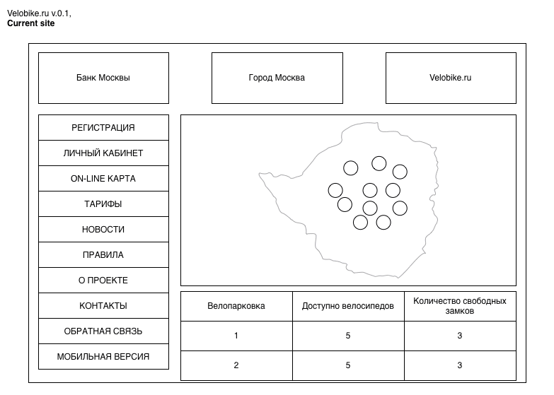
As we can see, the site consists of 10+ pages. The main page shows a map of bicycle parking with indication of employment, as well as a table duplicating information from the map.
To show the size of the parking (8 or 16 places) on the map, circles are used in two sizes, inside which the red-filled part indicates the available bicycles, and the white - free parking spaces.
In some places of the site are the system rates and the lease agreement. It should also be noted that the set of logos in the upper part of the site are links to relevant organizations, that is, the Bank of Moscow logo above the main menu leads, as you already understood, to the Bank of Moscow site, and not to the main page of the project.
In order to simplify the site, we decided to put all the important elements together, preventing users from being distracted by unnecessary parts. In addition, we immediately decided that the site should work on mobile devices without a separate mobile version. For a start, we reworked the main menu.
Obviously, the number of items in the menu is too large, so we studied the importance of each of them for users and slightly regrouped them. As a result, we still have: Registration and entrance (Registration and Personal Account got here), Parking scheme (On-line card), Tariffs and rules . News went to social networks, we removed information about the project altogether (this is bike rental, not nuclear physics), we sent the contacts and feedback to the basement of the site, and got rid of the mobile version already at the stage of deciding that the site would have one version.
At this point, we have already formed a picture of a one-page promotional site, which allows us to make all the important actions within one page.
Here is a modified drawing of the main page:
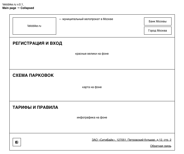
As you can see, the site has some focus:
Now we need to imagine what each of the main sections will consist of.
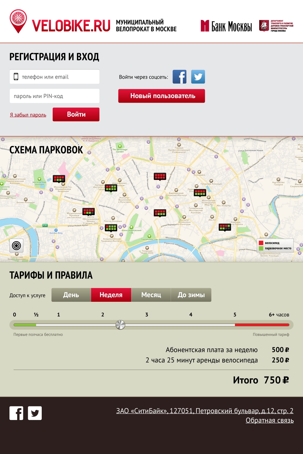
It seemed obvious to us that these two actions should be glued together so as not to confuse old and new users. When opening a tab, we will need to show login options (login / password, social networks for those who don’t like to remember logins and passwords, register new users)

The scheme of parking and their condition - this is the most necessary information for users. One needs to understand where there are free bikes nearby (and they will not run out in the next few minutes), while others need to find a place to park an already rented bike. If there is no free section, you will have to go to another parking lot and spend more time and money.
In the original scheme, the authors used a pie chart to indicate the size of the parking lot, the number of empty seats and the number of bicycles available. We decided to dwell on a design familiar to all of the strategic games: 8 small squares arranged in two rows with color coding of occupied / empty seats. This type takes up much less space and is better readable on the map.

The explanation of exactly how the rental system works and how much the fare costs, we decided to do in the form of an interactive unit. This unit should show the cost of the permanent and time-based parts of the lease. To do this, we made a choice of possible tariffs of the fixed part (for 1 day, for one week, for one month, until October 31), and the calculation of the value of the variable part was shown by a slider with accompanying explanations. Explanations are important to show that the first 30 minutes are provided free of charge, as well as to demonstrate an invisible threat after 6 hours of rent, when the cost of the time-based part of the lease is 1,500 rubles.
We decided to remove all the rules and legal explanations behind the link “a full description of the tariff and conditions for the use of bicycles,” especially since these rules still need to be adopted at the time of registration.

Having collected all the important parts, we made a rough draft of the design for our project - then you can give it to designers for finishing off or use it "as is", making improvements already later.
What is bike rental in Moscow?
In 2013, Moscow created the first public bicycle rental network. It consists of parking systems that store and issue bicycles, a website where you can register, find a free bike or parking place, a billing system, and, actually, bicycles.
Members
Anton Utkin ( aienn ) and Dmitry Kirillov ( dmitrek ) are colleagues at the Thalient interface company. Together they make interfaces, help startups, give lectures and do other interesting things.
Evgeny Malikov ( all43 ) - helps us here, worked as a project manager at MobiDengi and understands payment systems. By the way, he is now looking for work.
')
Project
For the convenience of the story, we decided to split the project into several sections in order. In order to use the bike rental, you need to register on the site velobike.msk.ru. The same site is responsible for explaining how the whole system works.
Also on this site there is an interior with billing details, account replenishment and other functions available to the registered user, we will move on to it in the next story.
Next, we look at the interfaces of the storage and distribution system of bicycles, and then the general bottlenecks of the entire system.
Site
So, the public part of the site. Here you can see its screenshot , and for our experiments we will immediately use the drawing of the site, so as not to be distracted by the design.
As we can see, the site consists of 10+ pages. The main page shows a map of bicycle parking with indication of employment, as well as a table duplicating information from the map.
To show the size of the parking (8 or 16 places) on the map, circles are used in two sizes, inside which the red-filled part indicates the available bicycles, and the white - free parking spaces.
In some places of the site are the system rates and the lease agreement. It should also be noted that the set of logos in the upper part of the site are links to relevant organizations, that is, the Bank of Moscow logo above the main menu leads, as you already understood, to the Bank of Moscow site, and not to the main page of the project.
Process
In order to simplify the site, we decided to put all the important elements together, preventing users from being distracted by unnecessary parts. In addition, we immediately decided that the site should work on mobile devices without a separate mobile version. For a start, we reworked the main menu.
The menu on the current site
Obviously, the number of items in the menu is too large, so we studied the importance of each of them for users and slightly regrouped them. As a result, we still have: Registration and entrance (Registration and Personal Account got here), Parking scheme (On-line card), Tariffs and rules . News went to social networks, we removed information about the project altogether (this is bike rental, not nuclear physics), we sent the contacts and feedback to the basement of the site, and got rid of the mobile version already at the stage of deciding that the site would have one version.
At this point, we have already formed a picture of a one-page promotional site, which allows us to make all the important actions within one page.
Here is a modified drawing of the main page:
As you can see, the site has some focus:
- now it is clear that this is the site of the Velobike, not the Bank of Moscow. For clarification, we decided to put a small signature "municipal bike rental in Moscow." If once we need the section “about the project” again, then it is this signature that we will make a reference.
- logos of participants, organizers and sponsors went to the right side
- the main sections of the menu are located on one page
- in the basement there are links to social networks, contact information and feedback
Now we need to imagine what each of the main sections will consist of.
Registration and Login
It seemed obvious to us that these two actions should be glued together so as not to confuse old and new users. When opening a tab, we will need to show login options (login / password, social networks for those who don’t like to remember logins and passwords, register new users)
Parking plan
The scheme of parking and their condition - this is the most necessary information for users. One needs to understand where there are free bikes nearby (and they will not run out in the next few minutes), while others need to find a place to park an already rented bike. If there is no free section, you will have to go to another parking lot and spend more time and money.
In the original scheme, the authors used a pie chart to indicate the size of the parking lot, the number of empty seats and the number of bicycles available. We decided to dwell on a design familiar to all of the strategic games: 8 small squares arranged in two rows with color coding of occupied / empty seats. This type takes up much less space and is better readable on the map.
Tariffs and rules
The explanation of exactly how the rental system works and how much the fare costs, we decided to do in the form of an interactive unit. This unit should show the cost of the permanent and time-based parts of the lease. To do this, we made a choice of possible tariffs of the fixed part (for 1 day, for one week, for one month, until October 31), and the calculation of the value of the variable part was shown by a slider with accompanying explanations. Explanations are important to show that the first 30 minutes are provided free of charge, as well as to demonstrate an invisible threat after 6 hours of rent, when the cost of the time-based part of the lease is 1,500 rubles.
We decided to remove all the rules and legal explanations behind the link “a full description of the tariff and conditions for the use of bicycles,” especially since these rules still need to be adopted at the time of registration.
Result
Having collected all the important parts, we made a rough draft of the design for our project - then you can give it to designers for finishing off or use it "as is", making improvements already later.
Source: https://habr.com/ru/post/189662/
All Articles