How I studied on my own wishes
Most probably started their way by reading books and performing test tasks, sometimes looking for solutions / improvements on specialized forums. The same demos repeated in different variations, which was reduced to lazy googling and the fastest passing of all tests for the sake of a transition to studying the next chapter, article, etc. I decided to act like a real samurai - to complicate my task by inventing some Wishlist and along the way study the materiel required to learn.
Initially, I looked for inspiration in the test tasks of the course under study on the basics of javascript, but soon decided to look for it in the vastly visited resources. So Habr was chosen.
The first to visit was the idea of hiding all the pictures in posts and comments, as they often only interfered. But the button to display them still would not hurt.
I'll look a little forward and say that almost immediately I came to the necessity of breaking the code into logical blocks, of which I singled out three — preparation for work, work with images, work with answers to comments. Each block was assigned a level of complexity and I decided to start with the fact that it was easier to consolidate previously studied material and gradually increase the complexity of the tasks.
How to hide images did not take long to think about - use the “display: none” property when loading the page and clicking on the button to return the “display: block” property for the selected items. I’ve traversed the DOM in search of elements that were previously checked in the debugger, taking into account the different options for the img tag nesting. The first block, which hid all the required elements, looked like this:
Now it was necessary to create a button and apply styles to it, because I wanted a native look like a habr.
Then I read about the different options and came across an ambiguous article . Here's what happened:
')
Remark about the method for working with styles - IE was in the plans right away, there was just no space left for the virtual machine for tests on a small ssd.
The next block was the most difficult and, at the same time, interesting. It was necessary not only to hide the answers for each comment, but also to take into account the lack of answers so as not to introduce the user into the stupor. When creating the button, the number of responses was taken into account and if it was zero, then a button for the side with such a comment was not created. Also, the number of responses was used to display in the body of the button. But you cannot just show the number, you need to add the noun “answer” and it is desirable to incline it depending on the numerals. Then I started writing a bicycle, but I remembered myself in time and thought that most likely it had long been decided without me. That's right, the solution was quickly found:
Well, the result was the third block, which was responsible for hiding / displaying the tree of responses to the comment using a button that displayed the current number of responses for each comment:
And I wrapped all the blocks into an anonymous self-invoking function.
The result posted on githab .
With the creation of browser extensions in the details did not penetrate and made them after reading the official developer documentation for Chrome and Safari . To install it in Chrome, you’ll have to download the extension and then drag it into the open option in the Extension.
Everyone gathered with the last forces and read to the end - thanks. I apologize for the bloopers, footwear code and some confusion. I hope it turned out to share experience, the main lesson of which is to study more productively and more fun with interesting tasks. I am just starting and I will be very happy for constructive criticism. I’m also happy to cooperate with someone to continue working on this script and a couple of others in the near future - I will be glad both to an experienced mentor and to a beginner like me :)
Initially, I looked for inspiration in the test tasks of the course under study on the basics of javascript, but soon decided to look for it in the vastly visited resources. So Habr was chosen.
The first to visit was the idea of hiding all the pictures in posts and comments, as they often only interfered. But the button to display them still would not hurt.
I'll look a little forward and say that almost immediately I came to the necessity of breaking the code into logical blocks, of which I singled out three — preparation for work, work with images, work with answers to comments. Each block was assigned a level of complexity and I decided to start with the fact that it was easier to consolidate previously studied material and gradually increase the complexity of the tasks.
How to hide images did not take long to think about - use the “display: none” property when loading the page and clicking on the button to return the “display: block” property for the selected items. I’ve traversed the DOM in search of elements that were previously checked in the debugger, taking into account the different options for the img tag nesting. The first block, which hid all the required elements, looked like this:
function initialHide() { function hideReply() { var replies = document.querySelectorAll('.reply_comments'); for (var r = 0; r < replies.length; r++) { var reply = replies[r]; reply.style.display = 'none'; } } hideReply(); function hideImages() { var images = document.querySelectorAll(".content > img, .content > div > img, .content > div > div > img, .content > a > img, .content > a > div > img, .content > table > tbody > tr> td> a > img, .content > table > tbody > tr> td> img, .content > ul > li > img, .content > ul > li > table > tbody > tr> td> img, .message > a > img, .message > img, .sidebar_right > .banner_300x500, .sidebar_right > #htmlblock_placeholder"); for (var m = 0; m < images.length; m++) { var image = images[m]; image.style.display = "none"; } } hideImages(); } Now it was necessary to create a button and apply styles to it, because I wanted a native look like a habr.
Then I read about the different options and came across an ambiguous article . Here's what happened:
')
function imgPosts() { var imgs = document.querySelectorAll(".content > img, .content > div > img, .content > div > div > img, .content > a > img, .content > a > div > img, .content > table > tbody > tr> td> a > img, .content > table > tbody > tr> td> img, .content > ul > li > img, .content > ul > li > table > tbody > tr> td> img, .message > a > img, .message > img"); var button = document.createElement("input"); button.type = "button"; button.className = "habraimage"; button.value = "◄ "; document.querySelectorAll(".main_menu")[0].appendChild(button); button.onclick = function () { for (var x = 0; x < imgs.length; x++) { var img = imgs[x]; img.style.display = (img.style.display != 'none' ? 'none' : 'block'); } }; function addCSSRule(sheet, selector, rules) { if (sheet.insertRule) { sheet.insertRule(selector + "{" + rules + "}"); } else { sheet.addRule(selector, rules); } } addCSSRule(document.styleSheets[0], ".habraimage", "position:fixed; right: 6%; z-index: 1; height: 2.45em; -webkit-border-radius: 6px; -moz-border-radius: 6px; border-radius: 6px; background-image: -webkit-linear-gradient(top, #eeeeee, #e1e1e1); background-image: linear-gradient(top, #eeeeee, #e1e1e1); background-image: -moz-linear-gradient(top, #eeeeee, #e1e1e1); background-repeat: repeat-x; border: 1px solid #d9d8d8; border-color: #d9d8d8 #cccbcb #aeaeae; text-shadow: 0 1px 0px rgba(255, 255, 255, 0.8); -webkit-box-shadow: inset 0 1px 0 rgba(255, 255, 255, 1), 0px 1px 7px rgba(177, 180, 199, 1); -moz-box-shadow: inset 0 1px 0 rgba(255, 255, 255, 1), 0px 1px 7px rgba(177, 180, 199, 1); box-shadow: inset 0 1px 0 rgba(255, 255, 255, 1), 0px 1px 7px rgba(177, 180, 199, 1);"); addCSSRule(document.styleSheets[0], ".habraimage:hover", "background-color: #fcfcfc !important; background-image: -webkit-gradient(linear, 0 0, 0 100%, from(#fcfcfc), to(#e8e8e8));background-image: -webkit-linear-gradient(top, #fcfcfc, #e8e8e8); background-image: linear-gradient(top, #fcfcfc, #e8e8e8); background-image: -moz-linear-gradient(top, #fcfcfc, #e8e8e8);background-repeat: repeat-x; text-decoration: none;"); } Remark about the method for working with styles - IE was in the plans right away, there was just no space left for the virtual machine for tests on a small ssd.
The next block was the most difficult and, at the same time, interesting. It was necessary not only to hide the answers for each comment, but also to take into account the lack of answers so as not to introduce the user into the stupor. When creating the button, the number of responses was taken into account and if it was zero, then a button for the side with such a comment was not created. Also, the number of responses was used to display in the body of the button. But you cannot just show the number, you need to add the noun “answer” and it is desirable to incline it depending on the numerals. Then I started writing a bicycle, but I remembered myself in time and thought that most likely it had long been decided without me. That's right, the solution was quickly found:
function declOfNum(number, titles) { cases = [2, 0, 1, 1, 1, 2]; return titles[(number % 100 > 4 && number % 100 < 20) ? 2 : cases[(number % 10 < 5) ? number % 10 : 5]]; } Well, the result was the third block, which was responsible for hiding / displaying the tree of responses to the comment using a button that displayed the current number of responses for each comment:
hideReplies(); function hideReplies() { function getChildrenByClassName(el, className) { var children = []; for (var i = 0; i < el.childNodes.length; i++) { if (el.childNodes[i].className == className) { children.push(el.childNodes[i]); } } return children; } function addBtn() { var comments = document.querySelectorAll(".comments_list > .comment_item"), comment, combody; function declOfNum(number, titles) { cases = [2, 0, 1, 1, 1, 2]; return titles[(number % 100 > 4 && number % 100 < 20) ? 2 : cases[(number % 10 < 5) ? number % 10 : 5]]; } for (var i = 0; i < comments.length; i++) { comment = comments[i]; var replies = comment.querySelectorAll('.reply_comments .comment_body'); if (replies.length > 0) { combody = getChildrenByClassName(comment, 'comment_body')[0]; if (combody) { var btn = document.createElement("input"); btn.type = "button"; btn.className = "hidereplies"; btn.value = replies.length + declOfNum(replies.length, [' ', ' ', ' ']); combody.appendChild(btn); } } } function addCSSRule(sheet, selector, rules) { if (sheet.insertRule) { sheet.insertRule(selector + "{" + rules + "}"); } else { sheet.addRule(selector, rules); } } addCSSRule(document.styleSheets[0], ".hidereplies", "height: 2em; margin-bottom: 2em; border-radius: 6px; background-image: -webkit-linear-gradient(top, #eeeeee, #e1e1e1); background-image: -o-linear-gradient(top, #eeeeee, #e1e1e1); background-image: linear-gradient(top, #eeeeee, #e1e1e1); background-image: -moz-linear-gradient(top, #eeeeee, #e1e1e1); background-repeat: repeat-x; border: 1px solid #d9d8d8; border-color: #d9d8d8 #cccbcb #aeaeae; text-shadow: 0 1px 0px rgba(255, 255, 255, 0.8); -webkit-box-shadow: inset 0 1px 0 rgba(255, 255, 255, 1); -moz-box-shadow: inset 0 1px 0 rgba(255, 255, 255, 1); box-shadow: inset 0 1px 0 rgba(255, 255, 255, 1);"); addCSSRule(document.styleSheets[0], ".hidereplies:hover", "background-color: #fcfcfc; background-image: -webkit-gradient(linear, 0 0, 0 100%, from(#fcfcfc), to(#e8e8e8));background-image: -webkit-linear-gradient(top, #fcfcfc, #e8e8e8); background-image: linear-gradient(top, #fcfcfc, #e8e8e8); background-image: -moz-linear-gradient(top, #fcfcfc, #e8e8e8);background-repeat: repeat-x; text-decoration: none;"); addCSSRule(document.styleSheets[0], ".hidereplies:active", "-webkit-box-shadow: inset 0 1px 1px rgba(0, 0, 0, 0.2); -moz-box-shadow: inset 0 1px 1px rgba(0, 0, 0, 0.2); box-shadow: inset 0 1px 1px rgba(0, 0, 0, 0.2); background: #e1e1e1 !important; border: 1px solid #a4a7ac; border-color: rgba(0, 0, 0, 0.1) rgba(0, 0, 0, 0.1) rgba(0, 0, 0, 0.25); border-color: #a4a7ac #d2d3d4 #e1e1e1; text-shadow: 0 1px 1px rgba(255, 255, 255, 0.5);"); } addBtn(); function hideR() { var buttons = document.querySelectorAll(".hidereplies"); for (a = 0; a < buttons.length; a++) { var btn = buttons[a]; btn.onclick = function (event) { var btn = event.currentTarget; var comments = btn.parentNode.parentNode.querySelectorAll(".reply_comments"); for (var y = 0; y < comments.length; y++) { var reply = comments[y]; reply.style.display = (reply.style.display != 'none' ? 'none' : 'block'); } }; } } hideR(); } And I wrapped all the blocks into an anonymous self-invoking function.
The result posted on githab .
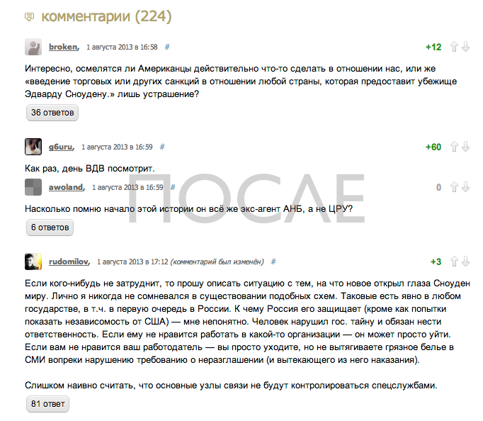
Under the cut you can see how Habr looks after installing the plugin


With the creation of browser extensions in the details did not penetrate and made them after reading the official developer documentation for Chrome and Safari . To install it in Chrome, you’ll have to download the extension and then drag it into the open option in the Extension.
Everyone gathered with the last forces and read to the end - thanks. I apologize for the bloopers, footwear code and some confusion. I hope it turned out to share experience, the main lesson of which is to study more productively and more fun with interesting tasks. I am just starting and I will be very happy for constructive criticism. I’m also happy to cooperate with someone to continue working on this script and a couple of others in the near future - I will be glad both to an experienced mentor and to a beginner like me :)
Source: https://habr.com/ru/post/189258/
All Articles