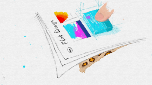
And one more post about Flat Design, or why everyone “rushed” to make flat interfaces
“Everything is simple”, or a brief retelling of a long history with omissions of some important facts and circumstances.
At some point it seemed to me that the day had not passed so that among those people to whom I subscribed, or among the sources that I read, there was at least something that would concern a “flat” design. Beat the words “flat design” or “flat design” in Bing, Google, Yandex - and you can easily find a huge amount of materials: from reviews and examples, to analytical and historical fabrications or just thoughts aloud ( 1 , 2 , 3 , 4 , 5 , 6 , 7 , 8 , 9 , 10 , ...).
')
I think that's great. It is wonderful that as a community we think about what we are doing or what we see around us, and we are trying to somehow realize this, verbalize. We need discussions and discussions, we need many, many articles and individual statements to get a feel for the moment in which we are.
Someone says that the flat design of the interfaces has come or, more precisely, announced itself in all its glory thanks to the Windows Phone (and Windows 8) platform with its revolutionary stylistically simple and even intentionally simplified interfaces. It was new and fresh against the backdrop of the cramped, skeptic, naturalistic icons in the Apple world. It was interesting and unusual, in some sense, symbolic, because at least sharply and irreversibly decided to change and renew such a big and seemingly clumsy monster like Microsoft.
Certainly, there were many people, designers, first of all, whom these moves inspired new achievements. And under the slogans about the wonderfulness of “metro” interfaces, they were sent to new creative exploits.
Someone (not necessarily, however, in response) says that flat designs were always, they were not just on the surface (for interfaces), however, even within iOS there were many external applications that experimented with the form and interfaces and in fact they were “flat”, in contrast to the “guideline” skaromorphic, although not at all the same as we saw in Windows Phone. In the end, some of the designers and designers have always been prone to simplicity and minimalism, someone was interested in infographics and was not averse to experimenting, therefore, the “flat” interfaces were (before) and without “metro”.
Whatever it was, it is impossible not to note the fact that it was against the background of the emergence of Windows Phone and subsequently Windows 8 that the large industrial flow began to gain momentum. At some point, Google still made intelligible guides for Android, then led to the uniformity of a bunch of its services, having invested in them a new design language - and someone did not fail to call it a “almost flat” design. Of course, there were also those who waved the checkboxes and said that “it reminds me of something”, winking towards Microsoft.
Microsoft also did not stand still and, under the fanfare of transformations, began to reduce all their products, including websites, portals and services to a single visual scheme, more precisely, to the same design principles, and even began to change product logos and themselves, following a common trend.
Then, with the release of Windows 8, in the MS camp, the codename “metro” was abandoned in favor of a simple (new) Windows interface, also known as the Modern UI. Just against the background of the discussion of these events, the naming of a “flat” design appealing to the plane of visual solution is less well established. In the crowd, unfortunately, many sensible cries that it wasn’t the plane or “metrosciousness” remained unheard.
Rumors about the new iOS7, which “according to the rumor version” should be revolutionary flat, added fuel to the fire. Evil tongues, of course, were prepared to count and retell how much and what Apple stole from its competitors. iOS7 has indeed become flatter, more ambiguous, and the rewriting of new steps by the apple company cannot be considered.
Ultimately, it seems that “everyone” has moved in the direction of “flat” design. On each design site, interests, dribbblah, etc. There are a large number of examples or collections of examples; many, many new ones appear every day. So the revolution took place. Throw out your leather textures, turn on your head.
What did I forget?
Oh yeah, there are still opinions that the plane of interfaces is a fad, a sort of pendulum movement between simplicity and realism. Yesterday I’m skumarfnenko, today is simpler, tomorrow again we are putting on leopard skins, well, etc. There would be a photoshop.
- Wait, sir! Did they just take and copied?
One funny effect of having any community (the community, if we think it is) is the willingness of some of its members to defend the core of their community, that is, what it is formed around. It is right and normal, sometimes it is pleasant.
For example, I, as a person who loves many Microsoft products and, in particular, a design direction chosen by the company (however, I cannot help noting that the whole article is of an exclusively private nature), is damn nice when the same company fans say how competitors copy some ideas and implement them in their products.
I admit, sometimes I even allow myself to retweet such tweets.
However, if they (competitors) just took and copied, or, say, took, copied and slightly changed, repainted there and there, etc. - that would be half the trouble. The problem with the “flat” design is that it ... ummm ... is inevitable. That is, if you were at least a thousand times a fruit design company with a thousand minds and photoshop aces and top-class engineers, you would sooner or later come to one or another variation of the “flat” design.
Microsoft's great merit is that the company, first, decided on this step before the others (and this step, oddly enough, was also inevitable), and secondly, on the marketing wave of product promotion, she was able to convey some key ideas to the professional community. And it’s magical, as magical, and the fact that those who started investing in “flat interfaces” before now have more elevators than those who haven’t even begun to scratch in this direction. Good to be on the right course!
For those who had a small anti-marketing bathert in their head in the last paragraph, I inform you: there could have been another large company in the place of Microsoft, if it turned out to be in similar conditions. And although the devil is certainly in the details and not everyone could succeed, and the design team of Windows Phone is definitely one of the best in the world, I will say it again: this or that variation of the “flat” design was inevitable. It would happen in a year or two, maybe in five years, but it would definitely happen.
Towards a flat world
First and foremost, I terribly dislike the definition of what happened and what we see as a “flat” design. Of course, it is in many ways really flat, but this is only one of the many facets of what is happening today with the design of interfaces. One of many, although it is the one that lies on the surface, its strong visual component.
In general, if someone asked me, I would definitely be against calling this magnificent phenomenon "flat", because it would detract from all other aspects. In a certain sense, this could be called simply modern (modern) design, although if you take all the components together and accept the inevitability, you will have nothing left but to call it simply a good (relevant) design ( www.toledo2.com/ 2013/05/02 / dont-call-it-metro-call-it-good-design ).
Good design that meets modern trends of the time. A plane or not a plane, or almost a plane - these are details.
I will allow myself a digression to try to better illustrate what I’m going to talk about next. Imagine some big palace with its spacious halls, say, the Grand Palace of Peterhof or the Winter Palace of Peter I, or Versailles, the Louvre, depending on what is closer and more familiar to you. If not, look for pictures on the Internet. And now try to fit into these interiors of a modern person in sneakers, jeans and T-shirts, nokia lumiya (product placement) in your pocket, strolling through the halls. If you think about the naturalness, or rather the consistency, of this picture, then you can easily catch in your head a clear sense of the inconsistency of eras.
What we would call good design today is unlikely to easily fit into a good design three or four centuries ago. What we are doing today will also be of little relevance in the sense of the modern interface in 50 years, if not much earlier. Each task and time has its own interfaces and solutions.
Why today I am talking about the inevitability of "flat" design? Why is a good design suddenly flat today?
If you look a little bit into the past (or, excuse me, could not resist, look at your iPhones) and think about the socio-historical conditions in which many existing software interfaces were created (applications and operating systems in the first place), you will certainly be able to follow the naturalness of their appearance, or rather the reasons why they look that way. That is, just like the first cars are necessarily carts or carriages, so everything “pressed” like buttons should look like push buttons (do you know why radio buttons are called that way?).
As long as we communicate in a narrow circle of developers-engineers, we can have any kind of interface arrangements, but as soon as we reach a wide audience not familiar with the digital world, the most natural impulse will be to make the interfaces look like what people already know and are using. Therefore, all digital calculators in a computer are similar to real “physical” calculators, so the digital keyboard repeats the usual “physical”, which in turn copies a typewriter. Therefore, collections of files are combined into folders similar to paper document folders. Therefore, the application for the wallet should be leather, like a leather wallet, worn in the back pocket of someone's jeans. Therefore, digital books should lie on wooden shelves and cast shadows. Therefore, interfaces to a certain extent in a certain period inevitably had to be close to reality, and skeomorphism was only one of the manifestations of this inevitability. No one could make a mass product that would not be understood by a mass audience. It is important.
And now, many now smartphone users have become accustomed to digital interfaces, have learned to work with their fingers ... Everything is generally good. And the only design problem, in my opinion, is that many (not all) designers, yielding to the fashion for apple products, rushed to do skeumorphic interfaces instead of just making good interfaces. (I would call it professional ... ummm ... degradation, but having some good guides saves you in part.)
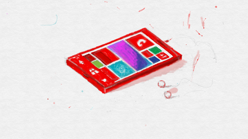
At some point in the timeline (autumn 2010), Microsoft gets out with its new telephones with metro interfaces. Frankly, I didn’t sit with a candle, and the fortune teller was useless from me to reproduce reliably all the details of this transformation, however, I’ll try to outline some important points that have been said and retold many times in different situations.
In the short version, the design history of the new Windows Phone sounds something like this. At some point inside Microsoft (this, obviously, was a few years before the public release) realized that with the mobile direction you need to do something new. I think it was both a question of the overall situation in the market and growing competition, and the prediction of some emerging transformations of the industry that it would be wrong to ignore. We will talk about some of these transformations later, but some elements will be critical for understanding changes in design.
Pretty much a new one, the team starts working practically in the mode of an internal startup over what will be called Windows Phone. In fact, having carte blanche on any reasonable creativity, girls and boys experiment, look at interesting products inside Microsoft (like Zune), look at the “right” sources that could form the basis of the design of the new platform as sources of inspiration, philosophy and visual expression . I think there was a lot of interesting things that were left behind the frame, but Bauhaus, Swiss typography (and generally great attention to working with font and form), motion design, sinematography, in particular, come to us explicitly. and infographics.
These references today sound outside as the main sources of inspiration. And I, echoing the authors, say to everyone: if you have few guides on Windows Phone or Windows, then here are directions for you - read, study, be inspired and create. Each of them has its own logic, its own naturalness and, in a certain sense, its own inevitability, which follows from the awareness of where we want to go, or, rather, what goals we set for ourselves.
Girls and boys experiment, draw mockups, build grids, formulate rules and principles, learn on the go, come up with a visual language, interface elements, operating system behavior, basic applications and concepts for external ones, make guidelines and guides. Ultimately, we get a Windows Phone ... and a big, big bell. And the interface turned out to be "flat"! Of course, it does not occur to anyone to call it "flat." It is minimalistic in the sense of design elements, the decorative component is minimized to the implementation of functionality. The main priority is given to his majesty content!
And this is one of these inevitable elements. As soon as you explicitly put content on the head of the screen, you have no choice but to clean up and hide everything else. You may have excellent visual solutions in details, but you will be forced to “flatten”, removing the volume and leaving the schematics at the buttons. The main attention should be given to the content and it is the content that should “hang” above the buttons, and not vice versa. The idea of direct interaction and finger input pours onto the same wheel. Some of the new gestures are worth, including gestures from the edges of the screen!
Removing unnecessary frames and contours, you will inevitably rely on typography and a grid, managing free space and font. For text content, the font becomes a natural hierarchy message tool. And, of course, this is not something fundamentally new in the design world, since it has long been passed and studied in the printing industry.
Finally, you will have to plug in an animation and think through the language of movement as soon as you come to “simplified” interfaces, in which content is central. How can it be otherwise, if you make “live” and mobile interfaces, with which you assume direct interaction, and at the same time you remove the navigation elements, integrating the activation of transitions into the content itself? (By the way, if you are looking at iOS7 guides, pay attention to the use of animation.)
Content on the front of the transformation wave!
Therefore, I would love to call this transformation a transition to content design , gmmmm ... from interface design. We set number one priority to the content itself, not the layer interface to interact with it - and we certainly get the need to minimize the layer, integrate the interaction into the content itself, where it is possible and appropriate, de-emphasize controls - and transfer it to the most valuable. This is where the revolution of “flat” design takes place ... But it has never once been about how to flatten, but about how to make the main content. Roughly speaking, if a volume talks about what can be interacted with, then content, not buttons, should become “voluminous”.
The key question, however, is not how to name it, but why this is happening now. Why haven't they done it before? It seems to me personally that although there may be many important components, the key ones are still three. First, it is a critical mass of users potentially ready to work with digital interfaces . They are no longer confused by touch interfaces, cloud storage, social services and many other aspects that were simply not widely available five or ten years ago. It took time and people who could understand, accept and tell others.
Secondly, it is a question of inertia. No one will deliberately kill a cow that gives milk if it can still be milked and milked. If there are interfaces that work and work well, there is little point in changing them dramatically. The evolutionary path is more appropriate here, so with each new version of iOS or Android or earlier Windows Mobile, we saw a gradual development rather than a sharp change in direction. At some point, Microsoft found itself in a situation in which not only could she afford it, but in general had no other choice but to start from scratch (in the sense of interface design).
Thirdly, it is a question of the projection of the future or an attempt to form it . At Microsoft, Microsoft Research teams and product teams are involved in this, at the time of the creation of Windows Phone, at least there was also a team in an office group that worked on “productivity future” projects, trying to imagine not only what future interfaces might look like, but also in general would look like a digital world and the interaction of people and digital objects. And in these projections the priority of content, direct interaction, the digital world and the destruction of analog atavisms are inevitable.
On this subject I will give a simple example: a well-known save button. I think it’s not necessary to explain where it came from and why it looks like a floppy disk, despite the fact that there is no drive for a 3.5 "disk in any new computer (including your iPad and surprise). There is no floppy disk, but there is an icon. Somewhere, the icon is discarded in favor of simply “save”, somewhere is saved to the cloud, but the point is that the preservation function as such is not needed today and is allowed in the direction of two interrelated operations that should be done automatically: autosave and versioning In the future, there is no button "save "You'll just want to be sure that you have the current version of the document on your current device, without getting into any other details.
An important aspect of the projection of the future is the understanding of the versatility of content and digital objects. The world in which the user can freely move from one device to another, most likely, in different formats, preaches the versatility of the content as opposed to the binding interface. All additional interface should be as simple as possible, symbolic, transparent and portable - so that nothing confuses and does not distract from the content.
In this situation, you will be obliged to think about designing the content and direct ways of interacting with it, allowing any side elements to be minimized. Any additional elements will be symbolic, simple and minimalist, portable from one device to another. At this point, you simply should not be concerned about how voluminous your buttons are, in which direction the shadows under them are tilted or how shiny the fur is on your interface skin. The glitter of the skin should excite you only if it is content, an element of interaction.
Therefore, the design inevitably becomes “flat”, more precisely, content and functional. A plane is just a manifestation of reductionism, the removal of secondary details, the integration of functionality directly into essential objects, the intended focus on important things and the concealment of all secondary. But the “plane” is not necessarily the same and unambiguous, the “plane” is multidimensional in the sense of implementation possibilities, therefore, despite the similar design principles, different platforms will have different visual language and different implementation details.
However, the main thing is for designers to start making just “good” content design.
And another thing: it is believed that “flat” design is easier to do, but the truth is that it is also difficult to make a good “flat” design, because you need to pay a lot of attention to details and such things as movement, which you may not have enough paid attention. Guides and ready-made elements also help here.
And one more thing: no one has proven that the future will be just that, that is, “flat”, and not, say, some other. That is, if, for example, they suddenly invent direct interfaces to the brain with the transmission of images, then all this will go to the garbage. Or, if we are captured by aliens who, due to an unknown misunderstanding, have all the interfaces rounded and with hallucinogenic colors ...
Source: https://habr.com/ru/post/188568/
All Articles