Mobile typography
When developing a design, it is necessary to take into account the correctness of its display not only on large screens, but also on mobile devices. And first of all it concerns the readability of the content. Therefore, it is necessary to pay special attention to typography, which is the basis of web design. On this subject there is a useful article six years ago - Web Design is 95% Typography (by Oliver Reichenstein).
First, let's take a look at the highlights of web typography with examples on mobile devices.
')
The size
One of the most common problems of reading sites on mobile devices is that the font size is too small. We have to constantly scale the site to read the small text, and this is very annoying to the user. Even if the site has a mobile version or responsive design, the problem of poor readability due to the small font is often encountered.
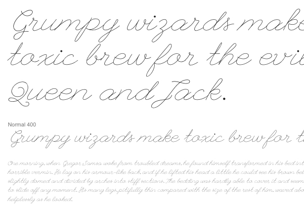
In general, the font size on the pages can completely change the appearance and attractiveness of the site. Modular Scale Calculator - Tim Brown's calculator (Tim Brown), which will help you choose the font sizes for the site, including in the "golden ratio" (1: 1.618).
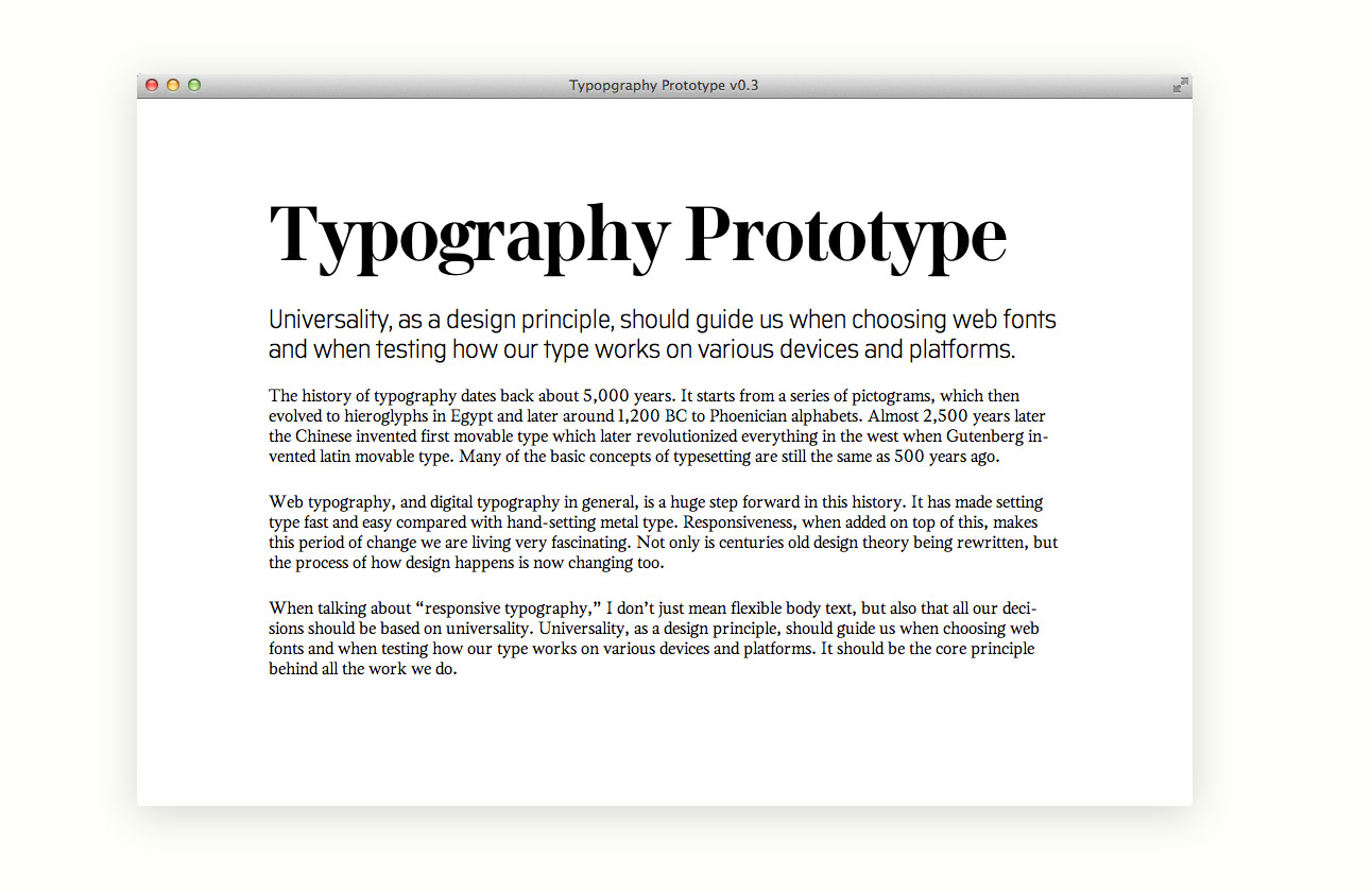
An example of a website with a font size ratio of 16/24/72:
Contrast
Any text on the site should contrast with the background, as when viewed on the desktop, and on a mobile device. This seemingly simple and obvious rule is often neglected, so it happens to see red text on a purple background or yellow on a blue one.
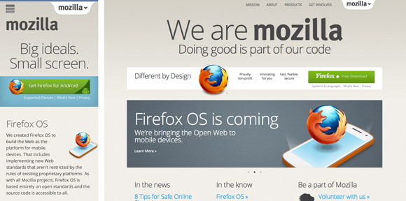
By the way, there is even a service that checks the contrast of colors on the site - checkmycolours.com . Below are a few sites with good content contrast.


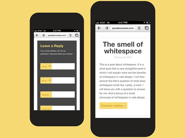
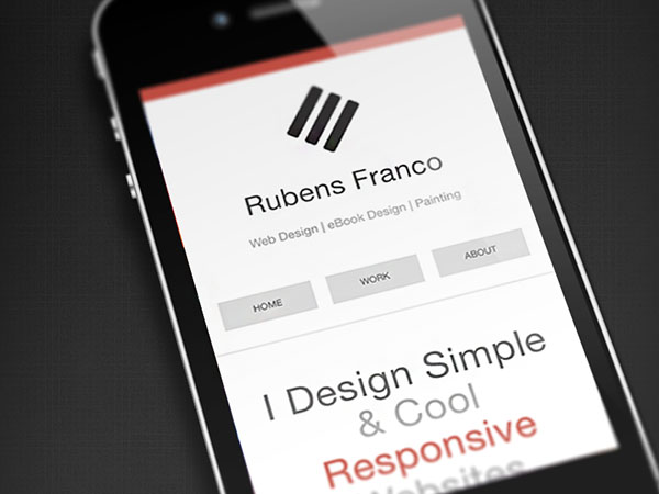
Indentation
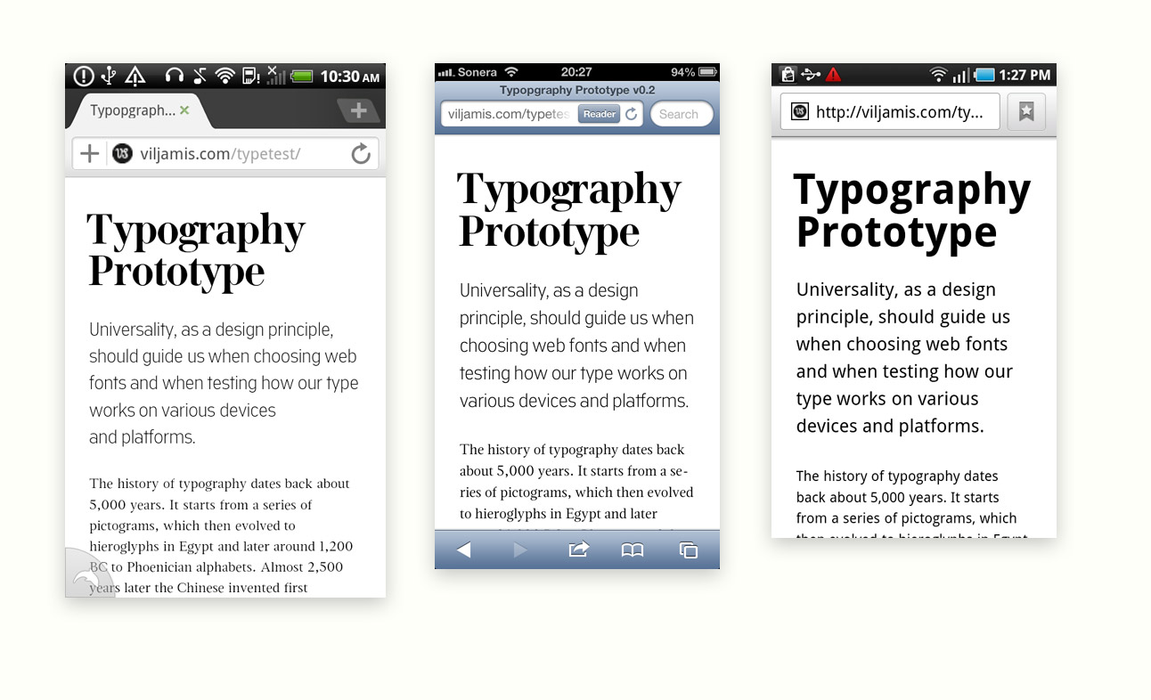
Different devices have different screen sizes, as well as different aspect ratios of the display. It must be remembered when the layout of the site, the text is convenient to read with sufficient indentation from the edges and the correct line spacing. This is especially true of reading text on a mobile device. Examples:

Font selection
Selecting fonts that will correctly display on any device and any OS is not an easy task. It is very important to consider how the font will be rendered on various devices, for example:
Special web services can help solve this problem: Web Font Specimen , Typecast app and Typekit's font browser . Sometimes it is advisable to use different fonts for different screen sizes. This practice, for example, the site A List Apart .
In addition, do not use non-standard fonts in inappropriate places. So, for example, League Script looks like, it is impossible to read:
Adaptive design
All of the above should be taken into account when developing an adaptive design, with special attention should be paid to changing the font size, indents and line lengths. And of course, testing the resulting layout.
Change font size
Most sites use px or em to set the font size. Em is preferable because it allows the user to change the font size in the browser. But there is a drawback - the size in em depends on the font-size of the parent element. Therefore, it is better to use rem: the font size will depend on the root element - html:
html { font-size: 62.5%; } body { font-size: 1.4rem; } /* =14px */ h1 { font-size: 2.4rem; } /* =24px */ Example with media queries:
@media (max-width: 640px) { body {font-size:1.2rem;} } @media (min-width: 640px) { body {font-size:1rem;} } @media (min-width:960px) { body {font-size:1.2rem;} } @media (min-width:1100px) { body {font-size:1.5rem;} } Indentation and line length
According to a study by the Baymard Institute , the optimal string length for easy reading is from 50 to 75 characters. It is not easy to achieve automatic compliance with this rule on any device. For example, the default font size of a device is 16 px, and we want to use 20 px. It turns out that our font should be 1.25 rem. We make the block of text 675 px wide, then 60 characters will fit in the line:
@media (min-width: 950px) { .container {width:675px;} } Thus it is possible to register containers for screens with any sizes. For better readability on large screens, you can also place content in two columns:
@media (min-width:1140px) { .content { -webkit-column-count: 2; -webkit-column-gap: 1em; -moz-column-count: 2; -moz-column-gap: 1em; column-count: 2; column-gap: 1em; } } With a width of more than 1140 pixels, the text will be divided into two columns.
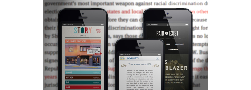
Good examples of mobile typography


It is useful to read
- Mobile Design Typography is Vitally Important and Challenging
- Typography in Mobile Design: Aspects and Examples
- A simple guide to responsive typography
- Optimizing Typography in Responsive Web Design
- The responsive web will be 99.9% typography
- 7 Articles That Responsive Typography
- Prototyping Responsive Typography
Source: https://habr.com/ru/post/188484/
All Articles