Unsuccessful interface examples
I will say right away that I do not consider myself an expert in usability issues, and I wouldn’t like to advise the developers of the interface how and what to do, but on this blog I would just like to show something that I don’t need to do.
As a bad example, an automated system was chosen that actually operates on one of the enterprises.
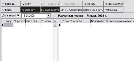
1. You are presented with the window of the program for recording payments. To account for payments, a special register is opened every day, in which every payment made on that day is displayed. Operators are also known to people, and during the day may be wrong.
To cancel the entered entry, use the “Return” button, and pay attention right next to this button is another “Close Registry”, which closes the registry accordingly, and for good so that no changes can be made with it in the future.
')
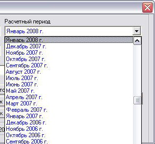
2. In my opinion, one of the examples of the disgusting implementation of the interface - a drop-down list that serves to select the billing period, contains records of the form: January 2007, February 2007, March 2007 ..., and this list has been maintained since 2003, up to today.
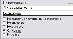
3. Well, and the third example, just funny, turned out apparently as a result of inattention of developers, but nevertheless continues to work to this day. Everything is very simple, the checkbox property is set (disable, do not disable), and its value is duplicated in the text string.
And what do we see in the text line?
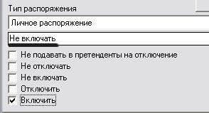
Well, for greater certainty, the opposite is true:
And such masterpieces created by Russian developers are becoming more and more every day, and without any further product support.
As a bad example, an automated system was chosen that actually operates on one of the enterprises.
1. You are presented with the window of the program for recording payments. To account for payments, a special register is opened every day, in which every payment made on that day is displayed. Operators are also known to people, and during the day may be wrong.
To cancel the entered entry, use the “Return” button, and pay attention right next to this button is another “Close Registry”, which closes the registry accordingly, and for good so that no changes can be made with it in the future.
')
2. In my opinion, one of the examples of the disgusting implementation of the interface - a drop-down list that serves to select the billing period, contains records of the form: January 2007, February 2007, March 2007 ..., and this list has been maintained since 2003, up to today.
3. Well, and the third example, just funny, turned out apparently as a result of inattention of developers, but nevertheless continues to work to this day. Everything is very simple, the checkbox property is set (disable, do not disable), and its value is duplicated in the text string.
And what do we see in the text line?
Well, for greater certainty, the opposite is true:
And such masterpieces created by Russian developers are becoming more and more every day, and without any further product support.
Source: https://habr.com/ru/post/18811/
All Articles