PhoneGap: how to make the application responsive
To date, there are a considerable number of review articles on PhoneGap, but unfortunately, they were written either by front-end developers who decided to work on mobile platforms, or by native programmers who decided to try themselves in cross-platform development. And from this point of view, the advantages and disadvantages of PhoneGap are considered, articles arise about how “how cool is the cross platform”, or about “the disadvantage of cross platform solutions”.
As a seed - a video demo application written in 6 hours; the ready was taken UI-bootstrap, catching up in 3.5 hours; iScroll, backbone, underscore, jQuery, and a small wrapper on the backbone were used (RAD.js - rapid application development, an architectural framework that takes on some of the optimization related to the mobile runtime).
Another 2 hours was spent on the fixed engine. But today it is not about the fact that something slows down, twitches, or the samopisny svayp does not always work out in time on 14,000 data objects; Speech that on PhoneGap can and should be written.
')
We bring to your consideration the opinions of people who are engaged in cross-platform development on PhoneGap, in order to tell about what subtleties we find necessary and important when developing on PhoneGap, and why they are so important.
PhoneGap is positioned as a platform for cross-platform development in HTML / JavaScript for seven mobile operating platforms .
Cross-platform in PhoneGap is achieved by the fact that the code of your HTML / JavaScript application is executed in the webView component (which is the browser built into the application).
In fact, the development of the PhoneGap application is the development of an HTML5 application, taking into account the characteristics of the runtime environment (mobile device, limited processor power, memory, touchscreen, etc.) and ... browser zoo.
Just as when developing for desktop browsers, when developing mobile sites or PhoneGap applications, you need to know and take into account the specifics of each operating system and its default browser, on the basis of which the webView component is built.
And the main thing that affects the limitations of the mobile runtime environment of the PhoneGap application and resources is the responsiveness of the user interface.
For an ordinary user, it is not terrible if, during the execution of any lengthy operations, the program blocks the interface, showing, for example, a dialogue with the progress of the task. It is much worse if the user subconsciously experiences discomfort when, when pressed, the button does not immediately respond. Speech in this case is not even about seconds; For a person to experience subconscious discomfort, a delay of more than 150 milliseconds between pressing and program reaction is sufficient. In this case, our subconscious will signal that the program interface is not responding as we expect.
Therefore, in our programs we are trying to focus on the responsiveness of the user interface. And in this article we will not talk about optimizing JavaScript code or CSS, since this is not specific to PhoneGap and mobile applications, and besides this, a lot has been written about it ( here , here , here or here ).
We would like, on the contrary, to focus on the specifics and subtleties that are often ignored, but in the end it begins to play a crucial role for the user.
It is not easy to find articles that comprehensively consider the relationship of the interface and responsiveness of a mobile web application. For example, this article , or this . The second article is quite fresh, and indicates the direction of the “movement” to create a good application on PhoneGap, but the author in some cases uses “canvas based UI”, which is not always possible).
But in these articles, unfortunately, not all problems are considered.
Let us highlight the problems that we consider to be characteristic and which we would like to consider today:
Perhaps in some ways we will repeat, but even so we will begin.
300 ms delay problem:
Most of the mobile operating systems in their browser (and as a result, in the webView) to solve the problem of false touches introduce a special delay of about 300 milliseconds between directly pressing and launching the "click" event in DOM.
The approach to solving this problem is not difficult to find on the Internet. There are at least several dozen JavaScript libraries that solve this problem. The principle of operation of all of them is the same - to track the events “touchstart” and “touchend” - and at the moment of the end of the last to trigger the event “click” or a similar custom event (for example, “tap”). Examples can be found both as a solution on stackoverflow , as a plugin for jQuery , and as a separate library , even in the Mozilla implementation, or simply as tips .
Unfortunately, there is always a small “but” - if you generate a “click” event (for example, as google advises in its decision ), then after some delay you will have to catch and stop distributing the standard “click” generated by the browser itself. What in older versions of android can lead to incompatibility with third-party libraries. In this case, if you generate a custom event, then the focus will be transmitted with a delay, and this delay will be visible when selecting input fields.
But it is quite difficult to find a library that correctly transmits and establishes tricks when clicking on elements, and at the same time works correctly with various types of input fields, and in addition it will be quite voluminous. It is much easier and painless to use the generally accepted approach - to generate not a “click” event, but any other custom event - and tie the listener directly to it.
And although, in this case, your application becomes dependent on this library, this disadvantage is more than covered by the simplicity of the solution and the smallest number of bugs.
It should also warn you against linking separate “fastclick” instances to each UI element, as some libraries do. This solution, though workable, but extremely costly in terms of the consumption of mobile device resources. It is necessary to use delegation and binding, for example, on the listener's “body” and generation of a pop-up custom event using the coordinates of the native one.
The second problem is the touch point:
Another frequently encountered problem in improperly designed interfaces of mobile devices (including on PhoneGap) sounds from the lips of users like this: “I click, but it does not always work” or “I click, but it does not work”.
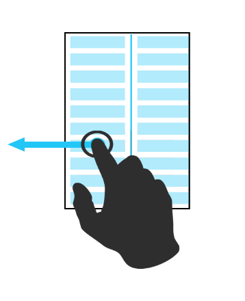
Let's take a closer look at the following figure, which shows exactly how the user's finger interacts with the device screen.
It is easy to see that the point of real contact of the fingertip (green) and the point of eye contact (red) are different. First, we tend to look at the mobile device at an angle. Secondly, the screen itself generates the coordinates of the touch as the weight-average coordinates for the area of the touch of the finger pad. No matter how hard we try, we will not succeed in a perfect circle from the pad of our fingers.
It is for these reasons that the real touch point never coincides with the visual one.
Most of the solution to these problems takes the operating system, namely, the touchscreen driver itself.
But if you do not know these subtleties, and do not take them into account when developing the program interface, then with fairly small details of the interface this becomes a tangible problem for the user of the application - pressing does not always happen. And although the user is absolutely sure that he pressed the button exactly, in reality he simply clicked past.
This moment is corrected simply enough - competent layout of application controls; for example, when a button has an invisible 4-6 pixel padding if it is not large enough in design: that is, its background has invisible external borders that increase its physical size to what is necessary and convenient for the user (pink field in the figure).

This problem is discussed in great detail in here , and in the recommendations of Microsoft you can see the recommended sizes of interface elements, depending on the screen size.
And now about the most non-trivial - about optimizing the DOM structure
If you look at the more or less “standard” screen of the “average” application, you can count from 200-300 html tags (DOM nodes), with which the application screen can be found. In this particular example, the page is captured using 225 HTML elements. Far, not the most optimal layout, but, no matter how hard we try, in any case, on the average screen of the PhoneGap application you can count from 100 to 250 HTML elements. And we ask to take into account that we are not yet considering screens with lists (let's talk about this a little bit later).
The average application, similar to the native, contains from five to a half dozen screens. In the case of PhoneGap, all these pages are part of a single-page application.
There is a generally accepted approach to the architecture of such an application: all pages are made up in one html file as blocks, and then, during the execution of the program, depending on which page is needed, by styles
the necessary page is displayed (for example, it is done in JqueryMobile).
But this approach, unfortunately, leads to delays in the application when switching pages (and not only). And the more complex the application, the longer these delays.
This is due to the fact that even for the most common JavaScript function of querying the DOM, for example, document.querySelector ('selector'), the execution time depends on the number of nodes in the document object model. For example, the specified operation with a three-level selector is performed in 0.003 ms with 100 elements and 0.36 ms with 10,000 elements (approximately 40 pages of the application). It can be argued that these are trifles: 40 pages are not often found in real life, and 0.36 ms is a penny.
But almost no one ever uses pure JavaScript, and when using jQuery (up to version 2), the specified time grows to 2.46 ms. And if we take into account that, in addition to a simple query, it is also necessary to carry out any manipulations with the DOM, then this can already lead to noticeable delays even in the eyes of a fairly complex application.
Here is a small SYNTHETIC test that generates a document with a different number of elements, and displays the result of sampling two-level CSS in the console.
The result of its execution on Chrome 28.0.1500.63
As can be seen from the test, the solution with “display: none” does not help, since it removes the work only on drawing the document, but does not change the time when querying for the “redundant” DOM.
This solution helps us to get rid of only reflow and repaint, the behavior of the browser during these events is perfectly discussed in the article .
Once again, we remind you that the test is synthetic , does not correspond to real conditions, and some positions have been specially “overwhelmed”. But it gives a great idea of what can happen in a real project with a single-page application with a large number of pages and complex layout.
And although the time will differ on different platforms (in different browsers), it is easy to see that the situation in mobile browsers will be even worse - in complex single-page applications with a standard approach, you are unlikely to get smooth animation on a mobile device.
In this case, there are two possible solutions:
Maximum optimization can be achieved by combining these two options. Then you only have to load the page or template for the first time, later simply attaching or detaching the DOM branches to the main document tree.
Nor should we forget about well-known optimization sites .
And again about the DOM - the problem of large lists
The problem of large lists is part of the problem described in the previous section.
The more list items you have, the more HTML elements will be in the page, and the slower the list will be updated and rendered.
In native components this is implemented through the cache ( an example of the implementation of the native component on Android ).
The problem can be solved either by replacing the data in an already hidden item and also by rearranging its position or removing the hidden list item and generating a new one. That is, in fact, there is not a list of 1000 elements on the screen, but a list of 10 elements visible on the screen, and perhaps several hidden elements that are currently being worked on.
In web applications, such an implementation of lists is almost impossible to see; as a rule, everything is done as simple as possible: a list of 1000 items. And if on the desktop it is not so critical, then on mobile platforms, large lists can play a crucial role in rejecting PhoneGap as a development platform.
As a solution to this problem, it is possible to recommend “paging”, that is, displaying the list in parts. This architectural solution is implemented by many js libraries; you can beat it very nicely - for example, with a swipe.
Or you can write or find a JavaScript library that implements the functionality similar to the native components; for example, as done in InfiniteWall or here .
Finally, I would like to give some useful tips that we hope will help you save time and nerves:
And a few more links to articles with tips: here , here or here .
But most importantly, what we want to say: You can write on PhoneGap.
Although it is not a panacea for development. Each tool is designed for its tasks . With PhoneGap, you can write a responsive application and / or an application with a non-standard design (and this is even easier to do than when implemented with native code). But if you need processing large amounts of data, then most likely PhoneGap will not work for you, although sometimes this can be fought.
We hope our advice will be useful.
PS After 11 hours of optimizing UI, the bugs remained, with the same button sizes, but the application really got better.
As a seed - a video demo application written in 6 hours; the ready was taken UI-bootstrap, catching up in 3.5 hours; iScroll, backbone, underscore, jQuery, and a small wrapper on the backbone were used (RAD.js - rapid application development, an architectural framework that takes on some of the optimization related to the mobile runtime).
Another 2 hours was spent on the fixed engine. But today it is not about the fact that something slows down, twitches, or the samopisny svayp does not always work out in time on 14,000 data objects; Speech that on PhoneGap can and should be written.
')
We bring to your consideration the opinions of people who are engaged in cross-platform development on PhoneGap, in order to tell about what subtleties we find necessary and important when developing on PhoneGap, and why they are so important.
PhoneGap is positioned as a platform for cross-platform development in HTML / JavaScript for seven mobile operating platforms .
Cross-platform in PhoneGap is achieved by the fact that the code of your HTML / JavaScript application is executed in the webView component (which is the browser built into the application).
In fact, the development of the PhoneGap application is the development of an HTML5 application, taking into account the characteristics of the runtime environment (mobile device, limited processor power, memory, touchscreen, etc.) and ... browser zoo.
Just as when developing for desktop browsers, when developing mobile sites or PhoneGap applications, you need to know and take into account the specifics of each operating system and its default browser, on the basis of which the webView component is built.
And the main thing that affects the limitations of the mobile runtime environment of the PhoneGap application and resources is the responsiveness of the user interface.
For an ordinary user, it is not terrible if, during the execution of any lengthy operations, the program blocks the interface, showing, for example, a dialogue with the progress of the task. It is much worse if the user subconsciously experiences discomfort when, when pressed, the button does not immediately respond. Speech in this case is not even about seconds; For a person to experience subconscious discomfort, a delay of more than 150 milliseconds between pressing and program reaction is sufficient. In this case, our subconscious will signal that the program interface is not responding as we expect.
Therefore, in our programs we are trying to focus on the responsiveness of the user interface. And in this article we will not talk about optimizing JavaScript code or CSS, since this is not specific to PhoneGap and mobile applications, and besides this, a lot has been written about it ( here , here , here or here ).
We would like, on the contrary, to focus on the specifics and subtleties that are often ignored, but in the end it begins to play a crucial role for the user.
It is not easy to find articles that comprehensively consider the relationship of the interface and responsiveness of a mobile web application. For example, this article , or this . The second article is quite fresh, and indicates the direction of the “movement” to create a good application on PhoneGap, but the author in some cases uses “canvas based UI”, which is not always possible).
But in these articles, unfortunately, not all problems are considered.
Let us highlight the problems that we consider to be characteristic and which we would like to consider today:
- The delay in 300 milliseconds of the event "click" on the "touch" devices;
- Touch problem
- Optimization of the DOM structure;
- The problem of large lists.
Perhaps in some ways we will repeat, but even so we will begin.
300 ms delay problem:
Most of the mobile operating systems in their browser (and as a result, in the webView) to solve the problem of false touches introduce a special delay of about 300 milliseconds between directly pressing and launching the "click" event in DOM.
The approach to solving this problem is not difficult to find on the Internet. There are at least several dozen JavaScript libraries that solve this problem. The principle of operation of all of them is the same - to track the events “touchstart” and “touchend” - and at the moment of the end of the last to trigger the event “click” or a similar custom event (for example, “tap”). Examples can be found both as a solution on stackoverflow , as a plugin for jQuery , and as a separate library , even in the Mozilla implementation, or simply as tips .
Unfortunately, there is always a small “but” - if you generate a “click” event (for example, as google advises in its decision ), then after some delay you will have to catch and stop distributing the standard “click” generated by the browser itself. What in older versions of android can lead to incompatibility with third-party libraries. In this case, if you generate a custom event, then the focus will be transmitted with a delay, and this delay will be visible when selecting input fields.
But it is quite difficult to find a library that correctly transmits and establishes tricks when clicking on elements, and at the same time works correctly with various types of input fields, and in addition it will be quite voluminous. It is much easier and painless to use the generally accepted approach - to generate not a “click” event, but any other custom event - and tie the listener directly to it.
And although, in this case, your application becomes dependent on this library, this disadvantage is more than covered by the simplicity of the solution and the smallest number of bugs.
It should also warn you against linking separate “fastclick” instances to each UI element, as some libraries do. This solution, though workable, but extremely costly in terms of the consumption of mobile device resources. It is necessary to use delegation and binding, for example, on the listener's “body” and generation of a pop-up custom event using the coordinates of the native one.
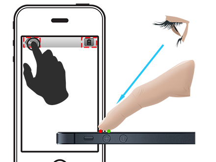
The second problem is the touch point:
Another frequently encountered problem in improperly designed interfaces of mobile devices (including on PhoneGap) sounds from the lips of users like this: “I click, but it does not always work” or “I click, but it does not work”.
Let's take a closer look at the following figure, which shows exactly how the user's finger interacts with the device screen.
It is easy to see that the point of real contact of the fingertip (green) and the point of eye contact (red) are different. First, we tend to look at the mobile device at an angle. Secondly, the screen itself generates the coordinates of the touch as the weight-average coordinates for the area of the touch of the finger pad. No matter how hard we try, we will not succeed in a perfect circle from the pad of our fingers.
It is for these reasons that the real touch point never coincides with the visual one.
Most of the solution to these problems takes the operating system, namely, the touchscreen driver itself.
But if you do not know these subtleties, and do not take them into account when developing the program interface, then with fairly small details of the interface this becomes a tangible problem for the user of the application - pressing does not always happen. And although the user is absolutely sure that he pressed the button exactly, in reality he simply clicked past.
This moment is corrected simply enough - competent layout of application controls; for example, when a button has an invisible 4-6 pixel padding if it is not large enough in design: that is, its background has invisible external borders that increase its physical size to what is necessary and convenient for the user (pink field in the figure).
This problem is discussed in great detail in here , and in the recommendations of Microsoft you can see the recommended sizes of interface elements, depending on the screen size.
And now about the most non-trivial - about optimizing the DOM structure
If you look at the more or less “standard” screen of the “average” application, you can count from 200-300 html tags (DOM nodes), with which the application screen can be found. In this particular example, the page is captured using 225 HTML elements. Far, not the most optimal layout, but, no matter how hard we try, in any case, on the average screen of the PhoneGap application you can count from 100 to 250 HTML elements. And we ask to take into account that we are not yet considering screens with lists (let's talk about this a little bit later).
The average application, similar to the native, contains from five to a half dozen screens. In the case of PhoneGap, all these pages are part of a single-page application.
There is a generally accepted approach to the architecture of such an application: all pages are made up in one html file as blocks, and then, during the execution of the program, depending on which page is needed, by styles
display: none;
display: block;
the necessary page is displayed (for example, it is done in JqueryMobile).
But this approach, unfortunately, leads to delays in the application when switching pages (and not only). And the more complex the application, the longer these delays.
This is due to the fact that even for the most common JavaScript function of querying the DOM, for example, document.querySelector ('selector'), the execution time depends on the number of nodes in the document object model. For example, the specified operation with a three-level selector is performed in 0.003 ms with 100 elements and 0.36 ms with 10,000 elements (approximately 40 pages of the application). It can be argued that these are trifles: 40 pages are not often found in real life, and 0.36 ms is a penny.
But almost no one ever uses pure JavaScript, and when using jQuery (up to version 2), the specified time grows to 2.46 ms. And if we take into account that, in addition to a simple query, it is also necessary to carry out any manipulations with the DOM, then this can already lead to noticeable delays even in the eyes of a fairly complex application.
Here is a small SYNTHETIC test that generates a document with a different number of elements, and displays the result of sampling two-level CSS in the console.
The result of its execution on Chrome 28.0.1500.63
start create 1 items index.js: 12
none 1 items: 0.078ms index.js: 38
none jquery 1 items: 0.774ms index.js: 43
block 1 items: 0.131ms index.js: 38
block jquery 1 items: 0.234ms index.js: 43
jquery show1 items: 1.768ms index.js: 52
start create 10 items index.js: 12
none 10 items: 0.071ms index.js: 38
none jquery 10 items: 0.138ms index.js: 43
block 10 items: 0.139ms index.js: 38
block jquery 10 items: 0.090ms index.js: 43
jquery show10 items: 0.865ms index.js: 52
start create 100 items index.js: 12
none 100 items: 0.071ms index.js: 38
none jquery 100 items: 0.099ms index.js: 43
block 100 items: 0.103ms index.js: 38
block jquery 100 items: 0.105ms index.js: 43
jquery show100 items: 1.418ms index.js: 52
start create 1000 items index.js: 12
none 1000 items: 0.178ms index.js: 38
none jquery 1000 items: 0.163ms index.js: 43
block 1000 items: 0.156ms index.js: 38
jquery block 1000 items: 0.176ms index.js: 43
jquery show1000 items: 9.709ms index.js: 52
start create 10000 items index.js: 12
none 10000 items: 2.333ms index.js: 38
none jquery 10,000 items: 2.434ms index.js: 43
block 10000 items: 1.810ms index.js: 38
block jquery 10,000 items: 1.810ms index.js: 43
jquery show10000 items: 106.425ms
As can be seen from the test, the solution with “display: none” does not help, since it removes the work only on drawing the document, but does not change the time when querying for the “redundant” DOM.
This solution helps us to get rid of only reflow and repaint, the behavior of the browser during these events is perfectly discussed in the article .
Once again, we remind you that the test is synthetic , does not correspond to real conditions, and some positions have been specially “overwhelmed”. But it gives a great idea of what can happen in a real project with a single-page application with a large number of pages and complex layout.
And although the time will differ on different platforms (in different browsers), it is easy to see that the situation in mobile browsers will be even worse - in complex single-page applications with a standard approach, you are unlikely to get smooth animation on a mobile device.
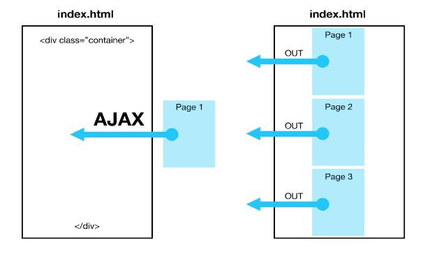
In this case, there are two possible solutions:
- Load the contents of pages with ajax requests;
- If the page is already installed by the standard approach, after it is loaded into the DOM, you need to detach the DOM branches responsible for invisible pages from the main DOM tree, keeping references to these branches in JavaScript (for example, using api.jquery.com/detach ), in this case GC will not clear detached branches.
Maximum optimization can be achieved by combining these two options. Then you only have to load the page or template for the first time, later simply attaching or detaching the DOM branches to the main document tree.
Nor should we forget about well-known optimization sites .
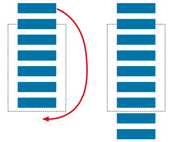
And again about the DOM - the problem of large lists
The problem of large lists is part of the problem described in the previous section.
The more list items you have, the more HTML elements will be in the page, and the slower the list will be updated and rendered.
In native components this is implemented through the cache ( an example of the implementation of the native component on Android ).
The problem can be solved either by replacing the data in an already hidden item and also by rearranging its position or removing the hidden list item and generating a new one. That is, in fact, there is not a list of 1000 elements on the screen, but a list of 10 elements visible on the screen, and perhaps several hidden elements that are currently being worked on.
In web applications, such an implementation of lists is almost impossible to see; as a rule, everything is done as simple as possible: a list of 1000 items. And if on the desktop it is not so critical, then on mobile platforms, large lists can play a crucial role in rejecting PhoneGap as a development platform.
As a solution to this problem, it is possible to recommend “paging”, that is, displaying the list in parts. This architectural solution is implemented by many js libraries; you can beat it very nicely - for example, with a swipe.
Or you can write or find a JavaScript library that implements the functionality similar to the native components; for example, as done in InfiniteWall or here .
Finally, I would like to give some useful tips that we hope will help you save time and nerves:
- The fewer third-party libraries you use, the better, this is due to the limited resources of the mobile device. For comparison, I can give a squadron of "starships" - third-party libraries. You want this squadron to transport a single “cargo” - complete the business case of your application. But the fuel will consume the entire squadron. Therefore, save resources (your "fuel"), choose the most optimal libraries and try to make the most of their capabilities. For example, jQuery, starting from version 2, is not much inferior in zepto performance, and the functionality is much more.
- Your application does not have to look the same on all platforms and versions of the OS. It may be worth making some concessions in styles and design in order to preserve the speed and functionality of the program. Remember the situation with IE;
- In the lists, do not use the "src" attribute for img tags, use the CSS background to display the image; in this case, the image will be loaded only if the list item is visible on the screen;
- Not always optimization methods that work in the case of web pages with a client-server architecture are important and optimal for the application on PhoneGap. For example, it makes no sense to pay attention to the size of the loaded JavaScript file or to minimize invisible pixels in the image, as in our case there are no long network requests to download these files. Unfortunately, the delay of 250 milliseconds before downloading each file has not been canceled, and it is up to you to decide how to deal with it. We chose a lazy preload and tiles for ourselves;
- Place the input fields at the top of the screen - this will avoid different behavior of page layout when displaying the keyboard on mobile devices;
- Avoid large lists - this is a difficult task; grasp it when you already have at least a blueprint for its solution;
- Get rid of shadows, gradients and translucences to the maximum. All this beauty requires additional power from a mobile device, so use it only where you really need it;
- Use the power of the GPU through CSS, like this:
transform: translate3d(0,0,0);
-webkit-transform: translate3d(0,0,0);
In particular, you can read about the specific implementation .
Or in more detail with tests .
And a few more links to articles with tips: here , here or here .
But most importantly, what we want to say: You can write on PhoneGap.
Although it is not a panacea for development. Each tool is designed for its tasks . With PhoneGap, you can write a responsive application and / or an application with a non-standard design (and this is even easier to do than when implemented with native code). But if you need processing large amounts of data, then most likely PhoneGap will not work for you, although sometimes this can be fought.
We hope our advice will be useful.
PS After 11 hours of optimizing UI, the bugs remained, with the same button sizes, but the application really got better.
Source: https://habr.com/ru/post/187960/
All Articles