Single window mode, or the main error "Microsoft"
The guys from Redmond are used to surprising the world with unexpected ideas. Often they get into a puddle and fail with innovative products (Vista, Windows Phone), often overlook the main trends and cannot preempt fashion, unlike the guys from Cupertino (iPod, iPhone, iPad).
This continues from year to year. For quite a long time in “Windows” there was an ascetic interface, devoid of excesses (sorry for tautology) - without designer lotions. What can I say, the classic theme of Windows is still relevant today. We, the users, somehow came to terms with this, got used to it, especially as there were no alternatives. In the province of something. Win98, 2000, XP. "Linux" then still bite, due to the fact that they were a lot of enthusiasts. Like the Macintosh. Over time, broadband Internet broke into our world, and the operating systems took a step forward. Understanding the moral obsolescence of XP, primarily in terms of appearance, Redmond prepared a radically new OS - Vista. Which, however, came out in the best traditions of AvtoVAZ, that is, crude, unfinished. Although the Aero interface was striking, and many, incl. I, put on the XP Inspiration Pack or XP Life, to touch the fresh shell. Then the light saw "Seven", the creation of which took into account errors with "Vista".
I like Windows 7. After three years of active use, I am sure that this is the best Microsoft OS at the moment. Best in terms of convenience and in terms of design. But I have to admit that even the current Linux can outperform Windows in these aspects. For many years, perhaps the first thing that I install on a new computer is RocketDock, which by creating stacks allows you to get instant access to the most frequently used programs without cluttering up the desktop. On the laptop, I moved the taskbar to the left, and now it’s hard to imagine how I lived before without it. Since the screen is widescreen, then attaching the taskbar to the side edge allowed freeing up space and using all the vertical pixels for the program windows. RocketDock for the same reason attached to the right side. But Win7 still lacks something.
')
When Redmond conceived to remove the “Start” button, in my opinion, they made a strategic blunder here. Instead of the "Start" button, you had to make the "Menu" button, simultaneously moving the taskbar to the side. In Opera, Firefox and a number of other programs, the main menu is put into a separate button on the window frame. In Win7 Explorer, the menu is disabled. Consequently, from the fact that the menu would be caused by pressing the Win button or the icon in the left corner, nothing catastrophic would have happened. Yes, I would have to adapt. However, how convenient it is embodied on Apple's PC! As far as it is moderately minimalist, with a functional architecture. Dock + taskbar, combined with the menu bar (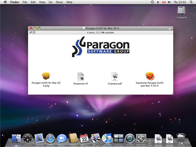 ). And in general, it would have turned out a stylistic unity and there was no usual riot of panels in the windows of programs. Special chic - the general menu bar, which in the case of non-use becomes translucent or disappears altogether. Either another option: imagine, press the familiar Win button or click on the icon, and here you have a colorful animation, with the File, Edit, View, Service submenus. In the style of Aero. Compact and concise. At the same time free up space on the display. And the “Start” call can be hung up on Ctrl + Win, for example. A bit rude, but tried to illustrate his idea :
As you know, the opponent is better to beat his own trump card. And copying is a form of the highest adulation. Since importing Docs is not worth it (since the standard taskbar does its job well, in addition there are many third-party successful crutches) and because creating an ecosystem is an even more difficult and thorny path, then with the menu can go to redmond for good. Having tried to get involved in a battle with “Macs”, “window workers” have significant chances not only to win it, but also to gain an advantage. How many accusations about usability Windows heard from the "makovodov." And Microsoft is among those who want to be a leader and not retreat. Yes, I can't keep up with Android, but why not press down on a competitor in such a simple way and not strengthen its niche status? Say, well, creative people are sitting on you, but behind us are billions of people around the world. Who are no less your addicted to music, design, architecture, and just love beautiful things. What are your arguments? Ryushechki, speak? We are now all the same, no worse, and in some ways even more glorious. Agree, what is not a logical move, in terms of marketing? You can compare this case with the fact that Mac OS looks less vulnerable. So after all, Windows has long ceased to be sieve. Hands from the right place and gray matter in the head - this is the recipe to provide reasonable protection for the system. He was revealed to the world 200 years ago. Will we wait for the debunking of the myth that the Mac OS is supposedly "a more perfect, pretty and easy-to-learn system"?
But all the attention paid to the developers of the tiles Metro. Which, in my humble taste, not very much increase the usability of the product, or usability, in a word. And this is when Cupertino seems to have fallen into a light stupor, but there is still no new guru there.
PS I understand the reasons why Microsoft is not going to borrow anything from the Mac OS interface. It is clear that each of the system adjusts for themselves. It is clear that there is nothing perfect. I just expressed my observation, and kindling meaningless holivar is not part of my plans. Peace for everyone!
What would you add to the Windows interface first?
This continues from year to year. For quite a long time in “Windows” there was an ascetic interface, devoid of excesses (sorry for tautology) - without designer lotions. What can I say, the classic theme of Windows is still relevant today. We, the users, somehow came to terms with this, got used to it, especially as there were no alternatives. In the province of something. Win98, 2000, XP. "Linux" then still bite, due to the fact that they were a lot of enthusiasts. Like the Macintosh. Over time, broadband Internet broke into our world, and the operating systems took a step forward. Understanding the moral obsolescence of XP, primarily in terms of appearance, Redmond prepared a radically new OS - Vista. Which, however, came out in the best traditions of AvtoVAZ, that is, crude, unfinished. Although the Aero interface was striking, and many, incl. I, put on the XP Inspiration Pack or XP Life, to touch the fresh shell. Then the light saw "Seven", the creation of which took into account errors with "Vista".
I like Windows 7. After three years of active use, I am sure that this is the best Microsoft OS at the moment. Best in terms of convenience and in terms of design. But I have to admit that even the current Linux can outperform Windows in these aspects. For many years, perhaps the first thing that I install on a new computer is RocketDock, which by creating stacks allows you to get instant access to the most frequently used programs without cluttering up the desktop. On the laptop, I moved the taskbar to the left, and now it’s hard to imagine how I lived before without it. Since the screen is widescreen, then attaching the taskbar to the side edge allowed freeing up space and using all the vertical pixels for the program windows. RocketDock for the same reason attached to the right side. But Win7 still lacks something.
')
When Redmond conceived to remove the “Start” button, in my opinion, they made a strategic blunder here. Instead of the "Start" button, you had to make the "Menu" button, simultaneously moving the taskbar to the side. In Opera, Firefox and a number of other programs, the main menu is put into a separate button on the window frame. In Win7 Explorer, the menu is disabled. Consequently, from the fact that the menu would be caused by pressing the Win button or the icon in the left corner, nothing catastrophic would have happened. Yes, I would have to adapt. However, how convenient it is embodied on Apple's PC! As far as it is moderately minimalist, with a functional architecture. Dock + taskbar, combined with the menu bar (
). And in general, it would have turned out a stylistic unity and there was no usual riot of panels in the windows of programs. Special chic - the general menu bar, which in the case of non-use becomes translucent or disappears altogether. Either another option: imagine, press the familiar Win button or click on the icon, and here you have a colorful animation, with the File, Edit, View, Service submenus. In the style of Aero. Compact and concise. At the same time free up space on the display. And the “Start” call can be hung up on Ctrl + Win, for example. A bit rude, but tried to illustrate his idea : As you know, the opponent is better to beat his own trump card. And copying is a form of the highest adulation. Since importing Docs is not worth it (since the standard taskbar does its job well, in addition there are many third-party successful crutches) and because creating an ecosystem is an even more difficult and thorny path, then with the menu can go to redmond for good. Having tried to get involved in a battle with “Macs”, “window workers” have significant chances not only to win it, but also to gain an advantage. How many accusations about usability Windows heard from the "makovodov." And Microsoft is among those who want to be a leader and not retreat. Yes, I can't keep up with Android, but why not press down on a competitor in such a simple way and not strengthen its niche status? Say, well, creative people are sitting on you, but behind us are billions of people around the world. Who are no less your addicted to music, design, architecture, and just love beautiful things. What are your arguments? Ryushechki, speak? We are now all the same, no worse, and in some ways even more glorious. Agree, what is not a logical move, in terms of marketing? You can compare this case with the fact that Mac OS looks less vulnerable. So after all, Windows has long ceased to be sieve. Hands from the right place and gray matter in the head - this is the recipe to provide reasonable protection for the system. He was revealed to the world 200 years ago. Will we wait for the debunking of the myth that the Mac OS is supposedly "a more perfect, pretty and easy-to-learn system"?
But all the attention paid to the developers of the tiles Metro. Which, in my humble taste, not very much increase the usability of the product, or usability, in a word. And this is when Cupertino seems to have fallen into a light stupor, but there is still no new guru there.
PS I understand the reasons why Microsoft is not going to borrow anything from the Mac OS interface. It is clear that each of the system adjusts for themselves. It is clear that there is nothing perfect. I just expressed my observation, and kindling meaningless holivar is not part of my plans. Peace for everyone!
What would you add to the Windows interface first?
Source: https://habr.com/ru/post/187858/
All Articles