Unusual site navigation
Translation of the article Smashing Magazine Creative And Innovative Navigation Designs .
Any site owner wants his project to stand out among a huge number of others, so that users want to return. In addition to useful content, visitors can be attracted by memorable design and unusual solutions. Below are examples of creative approaches to navigation, not at the expense of ease of use.
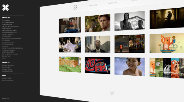
Navigation on the site should always be at hand, but at the same time not interfere with the user. On the Toybox website, this is exactly the solution: navigation is simple, but at the same time it is clearly visible. When the menu bar is hidden, the page focuses the visitor’s attention on the content, since there are no distracting blocks. Horizontal navigation is also simple and convenient.
')
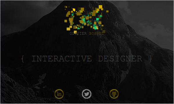
The site portfolio designer Oliver Bossel interactive navigation elements with an unusual effect of "exploding" pixels when you hover over them. This is a good visual contrast solution that motivates the user to use buttons.
Tsto is a design agency with an unusual approach to design. Navigation is just as unconventional: when viewing a site, menu items are fixed in the four corners of the screen. Very unusual. It is convenient to view the work of the agency with the buttons leading to the previous and next work.
The site portfolio of the designer Derek Boateng is interesting by the effect of scrolling the page: In the process, the big cap disappears and the header of the site decreases, providing more useful space for the content.

Good old horizontal scrolling! The site is more like a mobile application on the tablet. Content is divided into blocks that can be scrolled vertically. When viewing a portfolio, the main menu is hidden behind the left edge.
Navigation is made in the form of colored balloons, the friendly animation attracts the attention of visitors. Internal pages are more practical, the content is easy to read.
Browsing pages on this site resembles a bookshelf, selects an article, and it opens to full screen. The solution for the “About” and “Contact” pages is also convenient: when you click on the corresponding menu item, all useful information is displayed in the header of the site. The disadvantage of this interface is the lack of search - it is not easy to find old articles.

Clean design, good color scheme, unobtrusive content animation and simple, but interesting navigation attract visitors to the LayerVault website.
Navigation on the site is fixed at the top of the screen, simulating a board of departures at the airport. If you click on any direction and scroll down the page, an additional horizontal navigation block will appear with useful information, which is very convenient. Plus, there are a lot of amazing photos on the site that motivate you to travel.
For ASCII fans! In the design of the spirit of the 90s.

Photos are the basis of this site, and the design helps to focus on this. Interface feature is an unusual image hover effect.
On the site there is an unusual and attractive hover-effect in the form of moving images of articles. In addition, the site is one-page.
A clean design, without distracting garbage, when you hover over information blocks additional text appears. When clicked - opens a block with detailed information without reloading the page.

This example is slightly different from others, there is no complicated animation, the site is attractive primarily because of its simplicity and thoughtfulness. A good example is when there is nothing superfluous on the pages, only useful information.

This adaptive one-page site differs primarily in the unusual form of information blocks, instead of conventional rectangular blocks, blocks with large roundings are used.
One-page website about events, all the necessary information: what, when and where it will take place, is collected in one place. A beautiful introduction to the design of Twitter and Facebook icons.

An interesting solution for tabs, in general, the design reflects well the site content, information about unusual travel ideas.
The hover animation must be not only beautiful, but also informative. An example of such a hover image effect can be seen on this site.
The site presents an unusual 3D animation of product images: when you hover, the picture becomes similar to a book. An example of such an effect is on Codrops .

A very interesting and informative effect when you hover the cursor on the "Full Report" button: additional data appears. In addition, you can see the hover-effect, reflecting the project logo.

On this responsive website, navigation does not take up much space and can be turned off by clicking a button in the upper left corner.
In addition, several TemplateMonster templates with interesting navigation:
38211 : Template with navigation image carousel on the main page.

38198 : template with circular navigation of the main page.
38228 : template for a site portfolio.

44467 : Template for a portfolio site with a built-in Moto CMS admin panel, and you can not buy it right away but test your personal version for free for 30 days: make any changes and save them.

Any site owner wants his project to stand out among a huge number of others, so that users want to return. In addition to useful content, visitors can be attracted by memorable design and unusual solutions. Below are examples of creative approaches to navigation, not at the expense of ease of use.
Toybox
Navigation on the site should always be at hand, but at the same time not interfere with the user. On the Toybox website, this is exactly the solution: navigation is simple, but at the same time it is clearly visible. When the menu bar is hidden, the page focuses the visitor’s attention on the content, since there are no distracting blocks. Horizontal navigation is also simple and convenient.
')
Oliver bossel
The site portfolio designer Oliver Bossel interactive navigation elements with an unusual effect of "exploding" pixels when you hover over them. This is a good visual contrast solution that motivates the user to use buttons.
Tsto
Tsto is a design agency with an unusual approach to design. Navigation is just as unconventional: when viewing a site, menu items are fixed in the four corners of the screen. Very unusual. It is convenient to view the work of the agency with the buttons leading to the previous and next work.
Derek boateng
The site portfolio of the designer Derek Boateng is interesting by the effect of scrolling the page: In the process, the big cap disappears and the header of the site decreases, providing more useful space for the content.
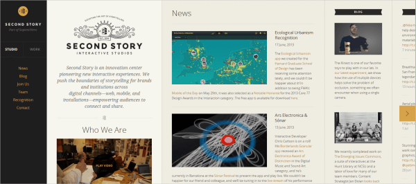
Second story
Good old horizontal scrolling! The site is more like a mobile application on the tablet. Content is divided into blocks that can be scrolled vertically. When viewing a portfolio, the main menu is hidden behind the left edge.
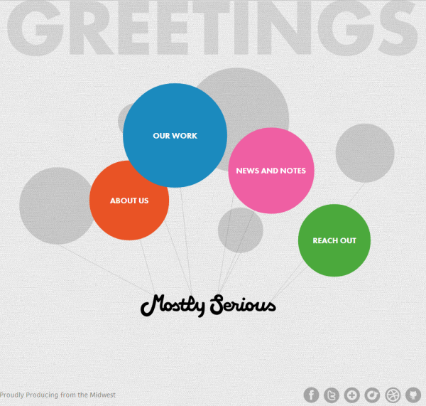
Mostly serious
Navigation is made in the form of colored balloons, the friendly animation attracts the attention of visitors. Internal pages are more practical, the content is easy to read.
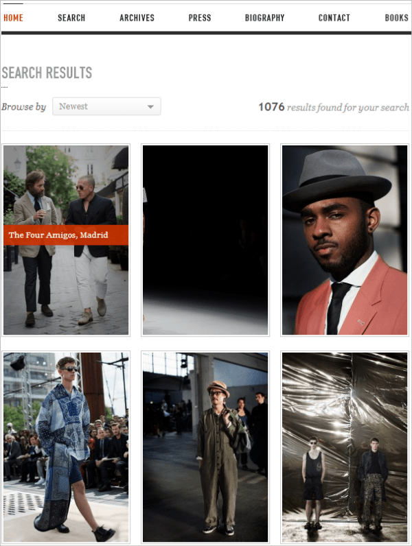
Minimal monkey
Browsing pages on this site resembles a bookshelf, selects an article, and it opens to full screen. The solution for the “About” and “Contact” pages is also convenient: when you click on the corresponding menu item, all useful information is displayed in the header of the site. The disadvantage of this interface is the lack of search - it is not easy to find old articles.
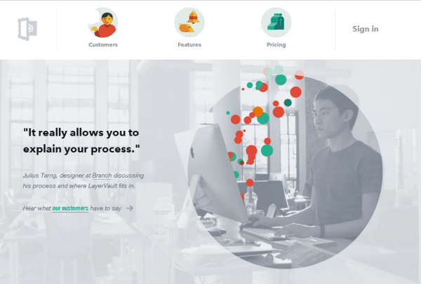
LayerVault
Clean design, good color scheme, unobtrusive content animation and simple, but interesting navigation attract visitors to the LayerVault website.
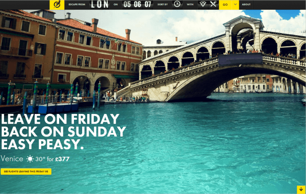
Escape flight
Navigation on the site is fixed at the top of the screen, simulating a board of departures at the airport. If you click on any direction and scroll down the page, an additional horizontal navigation block will appear with useful information, which is very convenient. Plus, there are a lot of amazing photos on the site that motivate you to travel.
aSCIIaRENa
For ASCII fans! In the design of the spirit of the 90s.
The sartorialst
Photos are the basis of this site, and the design helps to focus on this. Interface feature is an unusual image hover effect.
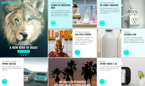
SilkTricky
On the site there is an unusual and attractive hover-effect in the form of moving images of articles. In addition, the site is one-page.
SumAll
A clean design, without distracting garbage, when you hover over information blocks additional text appears. When clicked - opens a block with detailed information without reloading the page.
Potluck
This example is slightly different from others, there is no complicated animation, the site is attractive primarily because of its simplicity and thoughtfulness. A good example is when there is nothing superfluous on the pages, only useful information.
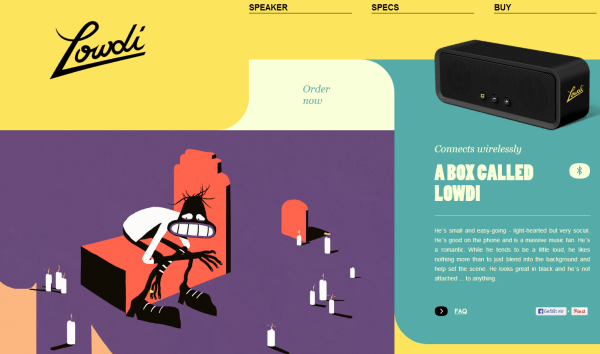
Lowdi
This adaptive one-page site differs primarily in the unusual form of information blocks, instead of conventional rectangular blocks, blocks with large roundings are used.
Barcamp omaha
One-page website about events, all the necessary information: what, when and where it will take place, is collected in one place. A beautiful introduction to the design of Twitter and Facebook icons.
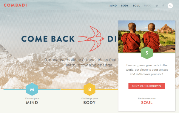
Combadi
An interesting solution for tabs, in general, the design reflects well the site content, information about unusual travel ideas.
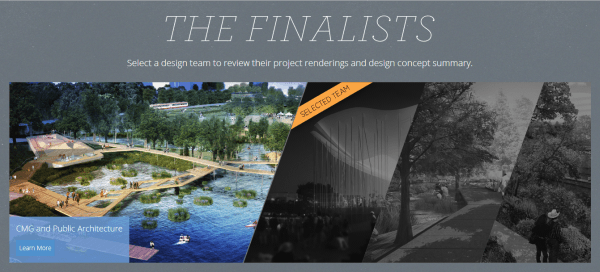
Waller Creek Conservancy: The Final Four
The hover animation must be not only beautiful, but also informative. An example of such a hover image effect can be seen on this site.
Lift
The site presents an unusual 3D animation of product images: when you hover, the picture becomes similar to a book. An example of such an effect is on Codrops .
Snowbird
A very interesting and informative effect when you hover the cursor on the "Full Report" button: additional data appears. In addition, you can see the hover-effect, reflecting the project logo.
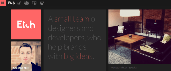
Etch
On this responsive website, navigation does not take up much space and can be turned off by clicking a button in the upper left corner.
In addition, several TemplateMonster templates with interesting navigation:
38211 : Template with navigation image carousel on the main page.
38198 : template with circular navigation of the main page.
38228 : template for a site portfolio.
44467 : Template for a portfolio site with a built-in Moto CMS admin panel, and you can not buy it right away but test your personal version for free for 30 days: make any changes and save them.
Source: https://habr.com/ru/post/187708/
All Articles