Site Optimization for tablets
The Internet is changing, there are more and more devices with screen sizes that are different from the desktop. Tablet sales are constantly growing , and this means that today we can not ignore users using these devices, it is necessary to optimize sites for easy viewing on tablets.
You can change the additional characters of the virtual keyboard to the necessary in each case. For example, when typing plain text, we see punctuation marks:
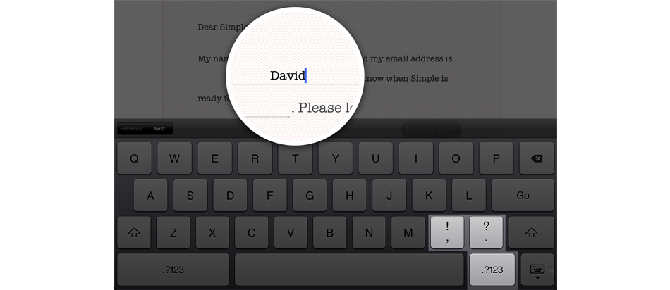
')
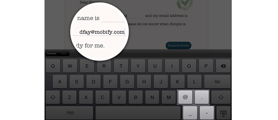
And when entering an email address, we change the characters to the necessary ones:
Standard keyboard:
URL parameters:
Email characters:
Numeric Keypad:

Filling out forms on the virtual keyboard of the tablet has its own characteristics. In particular, when logging in to many sites, you must enter your email address, and the system tries to correct it in accordance with its knowledge of the dictionary, as well as start the line with a capital letter. To prevent this from happening, we use simple HTML code in the form:
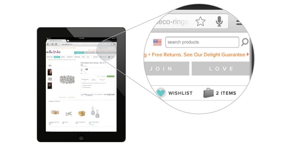
The logic of user interaction with the site on the tablet is different from the desktop. When designing the interface, this should be taken into account, with an emphasis on the most important elements. Here is one example where the search form on the website of the online store was changed.
Too small:
Good:

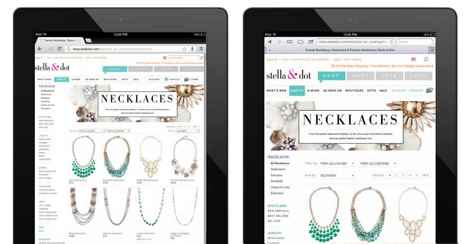
It is an obvious thing: the site must be made well readable on a specific device. For the tablet version, you need to increase the text. You can also invite the user to change the size of the text. Below is an example, on the left - before optimization, on the right - after:
On tablets and smartphones we use touch controls, so you need to optimize the navigation elements. Usually it comes down to increasing the size of the buttons and the active area of the click.
Typing text on a virtual keyboard is not very convenient, so you need to minimize the need for such work for the user. In forms, for example, you can use autocomplete (by the first letters of the name or using geolocation):
If the site uses an image carousel, it should be controlled by the following:
In touch devices, there is no possibility of conveniently pointing the cursor at an object, so you should not use this way of user interaction (On Habré, by the way, this is still the case - tooltips when you hover over the evaluation of a topic or comment to view the balance of votes)
Users can use the tablet both in landscape and portrait orientation when interacting with the site. Therefore, it is necessary to take this into account when designing the interface.
Tablets open up new possibilities for us: for example, when filling out a profile, you can offer the user to make a photo for an avatar with a tablet camera:
When using a tablet on the account every pixel, you can therefore hide the address bar (in Safari) to increase the usable screen area:
Speeding up typing with special characters
You can change the additional characters of the virtual keyboard to the necessary in each case. For example, when typing plain text, we see punctuation marks:
')
And when entering an email address, we change the characters to the necessary ones:
Standard keyboard:
<input type="text"> URL parameters:
<input type="url"> Email characters:
<input type="email"> Numeric Keypad:
<input type="text" pattern="[09]*"> Disable autocorrection and initial capital letters
Filling out forms on the virtual keyboard of the tablet has its own characteristics. In particular, when logging in to many sites, you must enter your email address, and the system tries to correct it in accordance with its knowledge of the dictionary, as well as start the line with a capital letter. To prevent this from happening, we use simple HTML code in the form:
<input type="text" autocapitalize="off" autocorrect="off"> Correct block layout
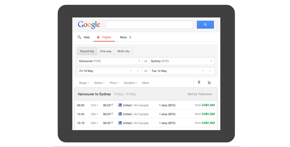
The logic of user interaction with the site on the tablet is different from the desktop. When designing the interface, this should be taken into account, with an emphasis on the most important elements. Here is one example where the search form on the website of the online store was changed.
Too small:
Good:
Change typography
It is an obvious thing: the site must be made well readable on a specific device. For the tablet version, you need to increase the text. You can also invite the user to change the size of the text. Below is an example, on the left - before optimization, on the right - after:
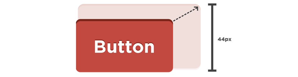
Resizing buttons
On tablets and smartphones we use touch controls, so you need to optimize the navigation elements. Usually it comes down to increasing the size of the buttons and the active area of the click.
Minimize typing
Typing text on a virtual keyboard is not very convenient, so you need to minimize the need for such work for the user. In forms, for example, you can use autocomplete (by the first letters of the name or using geolocation):
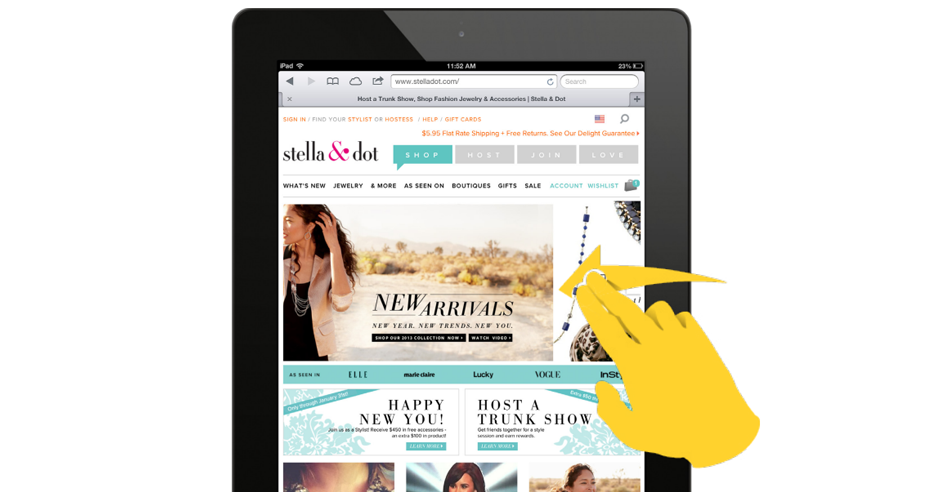
Touch carousel
If the site uses an image carousel, it should be controlled by the following:
Disable a: hover
In touch devices, there is no possibility of conveniently pointing the cursor at an object, so you should not use this way of user interaction (On Habré, by the way, this is still the case - tooltips when you hover over the evaluation of a topic or comment to view the balance of votes)
Design for landscape and portrait screen orientation
Users can use the tablet both in landscape and portrait orientation when interacting with the site. Therefore, it is necessary to take this into account when designing the interface.
Camera use
Tablets open up new possibilities for us: for example, when filling out a profile, you can offer the user to make a photo for an avatar with a tablet camera:
<input type="file" accept="image/*" capture="camera"> Hide address bar
When using a tablet on the account every pixel, you can therefore hide the address bar (in Safari) to increase the usable screen area:
<meta name="apple-mobile-web-app-capable" content="yes" /> Useful Fiction and Used Material
- 5 Easy Tablet Optimizations You Can Make On Your Website Right Now
- 5 Easy Ways To Optimize Your Website For Mobile
- Tablet Web Design: Best Practices
- Responsive Navigation: Optimizing for Touch Across Devices
- Webinar Tablet Growth and Evolution in 2013
- White Paper: Optimize Your Website for iPads and Other Tablets
- User Experience Coding How-To's for Safari on iPhone , Juggler added
Source: https://habr.com/ru/post/187536/
All Articles