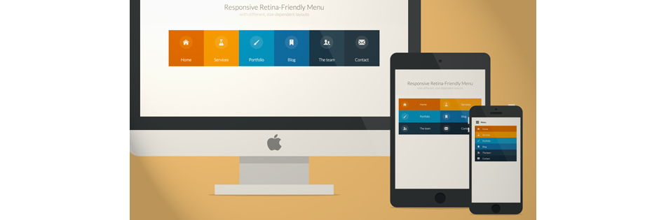
Retina responsive menu
This article describes in great detail the step-by-step creation of an adaptive menu for a site with several options for the layout of elements (depending on the screen size of the device). To support retina-screens, an icon font is used.
Demo / Download source
')
Creating an iconic font manually can cause problems, but fortunately, there are web services that facilitate such tasks for the developer. IcoMoon is one such tool.
First of all, prepare SVG-files of icons and import them into IcoMoon:
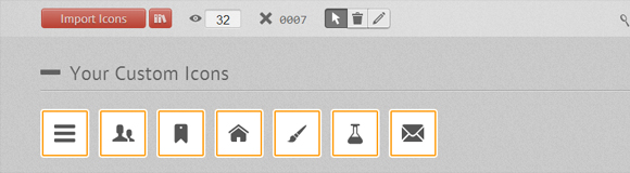
The site already has a lot of ready-made files to create a font, you can partially use them. Each icon can be assigned a key:
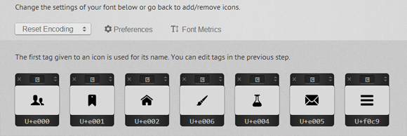
The output is a ZIP file with fonts in four formats: SVG, EOT, TTF and WOFF, as well as a CSS file and a demo page. By the way, to make the font look better in Chrome, you can use a special hack .
Layout of our menu:
To add an icon font, use the CSS class "icon-iconname" inside the i tag. We also add the “no-js” class to the body , which will be changed to the “js” class using Modernizr . This is necessary to ensure that the menu works correctly for users with disabled JavaScript.
Basic CSS for all types of screens:
Main hover effect:
Add a background color for menu items. Thanks to the use of nth-child, you can add as many list items as you want, color will be inherited:
Use the media query to change the menu form on a smaller screen:
Add a border of different colors for menu items:
Styles of icons and text in our menu:
Small animation menu:
CSS transition for icons:
For the desired visual effect, change the shadow of the element:
Another media query, for screens from 800 to 980 pixels:
Finished with CSS for the "desktop" version of the menu, go to "tablet" and "mobile":
For screens ranging in size from 520px (32.5em) to 799px (49.938em), the menu should be displayed in two columns. Add a few indents for a convenient tap on the touchscreens:
Big screen navigation is too complicated for mobile devices, so we simplify it:
Adapt the font size and width:
For the smallest screens, it is necessary to hide all navigation, leaving only the “Menu” button, on click on which all items open. Use javascript:
For cleaner HTML code, the Menu button is created directly in JavaScript. CSS for button:
By default, the button is hidden, appears when the screen size is less than 519px (32.438em):
We use the “no-js” class to display a menu for non-javascript users:
When javascript is supported, we hide the menu:
Adapt the menu for the smallest screens:
Add a border to the left:
The resulting navigation looks good in the desktop browser when the window is resized, but on mobile devices there may be problems with the menu items. To determine the touch device, use Modernizr . If the touch is supported, the “touch” tag is added:
That's all, it turned out a beautiful retina-ready navigation, well displayed on any device!
Demo / Download source
')
Preparation of the icon font
Creating an iconic font manually can cause problems, but fortunately, there are web services that facilitate such tasks for the developer. IcoMoon is one such tool.
First of all, prepare SVG-files of icons and import them into IcoMoon:
The site already has a lot of ready-made files to create a font, you can partially use them. Each icon can be assigned a key:
The output is a ZIP file with fonts in four formats: SVG, EOT, TTF and WOFF, as well as a CSS file and a demo page. By the way, to make the font look better in Chrome, you can use a special hack .
HTML
Layout of our menu:
<nav id="menu" class="nav"> <ul> <li> <a href="#" title=""> <span class="icon"> <i aria-hidden="true" class="icon-home"></i></span><span>Home</span> </a> </li> <li> <a href="#" title=""><span class="icon"> <i aria-hidden="true" class="icon-services"></i></span><span>Services</span></a> </li> <li> <a href="#" title=""><span class="icon"><i aria-hidden="true" class="icon-portfolio"></i></span><span>Portfolio</span></a> </li> <li> <a href="#" title=""><span class="icon"><i aria-hidden="true" class="icon-blog"></i></span><span>Blog</span></a> </li> <li> <a href="#" title=""><span class="icon"><i aria-hidden="true" class="icon-team"></i></span><span>The team</span></a> </li> <li> <a href="#" title=""><span class="icon"><i aria-hidden="true" class="icon-contact"></i></span><span>Contact</span></a> </li> </ul> </nav> To add an icon font, use the CSS class "icon-iconname" inside the i tag. We also add the “no-js” class to the body , which will be changed to the “js” class using Modernizr . This is necessary to ensure that the menu works correctly for users with disabled JavaScript.
CSS and JavaScript
Basic CSS for all types of screens:
.nav ul { max-width: 1240px; margin: 0; padding: 0; list-style: none; font-size: 1.5em; font-weight: 300; } .nav li span { display: block; } .nav a { display: block; color: rgba(249, 249, 249, .9); text-decoration: none; transition: color .5s, background .5s, height .5s; } .nav i{ /* Chrome */ transform: translate3d(0, 0, 0); } /* Webkit- - */ a, button { -webkit-tap-highlight-color: rgba(0,0,0,0); } Main hover effect:
.no-touch .nav ul:hover a { color: rgba(249, 249, 249, .5); } .no-touch .nav ul:hover a:hover { color: rgba(249, 249, 249, 0.99); } Add a background color for menu items. Thanks to the use of nth-child, you can add as many list items as you want, color will be inherited:
.nav li:nth-child(6n+1) { background: rgb(208, 101, 3); } .nav li:nth-child(6n+2) { background: rgb(233, 147, 26); } .nav li:nth-child(6n+3) { background: rgb(22, 145, 190); } .nav li:nth-child(6n+4) { background: rgb(22, 107, 162); } .nav li:nth-child(6n+5) { background: rgb(27, 54, 71); } .nav li:nth-child(6n+6) { background: rgb(21, 40, 54); } Use the media query to change the menu form on a smaller screen:
@media (min-width: 50em) { /* Transforms the list into a horizontal navigation */ .nav li { float: left; width: 16.66666666666667%; text-align: center; transition: border .5s; } .nav a { display: block; width: auto; } Add a border of different colors for menu items:
.no-touch .nav li:nth-child(6n+1) a:hover, .no-touch .nav li:nth-child(6n+1) a:active, .no-touch .nav li:nth-child(6n+1) a:focus { border-bottom: 4px solid rgb(174, 78, 1); } .no-touch .nav li:nth-child(6n+2) a:hover, .no-touch .nav li:nth-child(6n+2) a:active, .no-touch .nav li:nth-child(6n+2) a:focus { border-bottom: 4px solid rgb(191, 117, 20); } .no-touch .nav li:nth-child(6n+3) a:hover, .no-touch .nav li:nth-child(6n+3) a:active, .no-touch .nav li:nth-child(6n+3) a:focus { border-bottom: 4px solid rgb(12, 110, 149); } .no-touch .nav li:nth-child(6n+4) a:hover, .no-touch .nav li:nth-child(6n+4) a:active, .no-touch .nav li:nth-child(6n+4) a:focus { border-bottom: 4px solid rgb(10, 75, 117); } .no-touch .nav li:nth-child(6n+5) a:hover, .no-touch .nav li:nth-child(6n+5) a:active, .no-touch .nav li:nth-child(6n+5) a:focus { border-bottom: 4px solid rgb(16, 34, 44); } .no-touch .nav li:nth-child(6n+6) a:hover, .no-touch .nav li:nth-child(6n+6) a:active, .no-touch .nav li:nth-child(6n+6) a:focus { border-bottom: 4px solid rgb(9, 18, 25); } Styles of icons and text in our menu:
.icon { padding-top: 1.4em; } .icon + span { margin-top: 2.1em; transition: margin .5s; } Small animation menu:
/* */ .nav a { height: 9em; } .no-touch .nav a:hover , .no-touch .nav a:active , .no-touch .nav a:focus { height: 10em; } /* */ .no-touch .nav a:hover .icon + span { margin-top: 3.2em; transition: margin .5s; } CSS transition for icons:
.nav i { position: relative; display: inline-block; margin: 0 auto; padding: 0.4em; border-radius: 50%; font-size: 1.8em; box-shadow: 0 0 0 0.8em transparent; background: rgba(255,255,255,0.1); transform: translate3d(0, 0, 0); transition: box-shadow .6s ease-in-out; } For the desired visual effect, change the shadow of the element:
.no-touch .nav a:hover i, .no-touch .nav a:active i, .no-touch .nav a:focus i { box-shadow: 0 0 0px 0px rgba(255,255,255,0.2); transition: box-shadow .4s ease-in-out; } } Another media query, for screens from 800 to 980 pixels:
@media (min-width: 50em) and (max-width: 61.250em) { /* Size and font adjustments to make it fit better */ .nav ul { font-size: 1.2em; } } Finished with CSS for the "desktop" version of the menu, go to "tablet" and "mobile":
/* "tablet" "mobile" */ @media (max-width: 49.938em) { /* border */ .no-touch .nav ul li:nth-child(6n+1) a:hover, .no-touch .nav ul li:nth-child(6n+1) a:active, .no-touch .nav ul li:nth-child(6n+1) a:focus { background: rgb(227, 119, 20); } .no-touch .nav li:nth-child(6n+2) a:hover, .no-touch .nav li:nth-child(6n+2) a:active, .no-touch .nav li:nth-child(6n+2) a:focus { background: rgb(245, 160, 41); } .no-touch .nav li:nth-child(6n+3) a:hover, .no-touch .nav li:nth-child(6n+3) a:active, .no-touch .nav li:nth-child(6n+3) a:focus { background: rgb(44, 168, 219); } .no-touch .nav li:nth-child(6n+4) a:hover, .no-touch .nav li:nth-child(6n+4) a:active, .no-touch .nav li:nth-child(6n+4) a:focus { background: rgb(31, 120, 176); } .no-touch .nav li:nth-child(6n+5) a:hover, .no-touch .nav li:nth-child(6n+5) a:active, .no-touch .nav li:nth-child(6n+5) a:focus { background: rgb(39, 70, 90); } .no-touch .nav li:nth-child(6n+6) a:hover, .no-touch .nav li:nth-child(6n+6) a:active, .no-touch .nav li:nth-child(6n+6) a:focus { background: rgb(32, 54, 68); } .nav ul li { transition: background 0.5s; } } For screens ranging in size from 520px (32.5em) to 799px (49.938em), the menu should be displayed in two columns. Add a few indents for a convenient tap on the touchscreens:
@media (min-width: 32.5em) and (max-width: 49.938em) { /* */ .nav li { display: block; float: left; width: 50%; } /* */ .nav a { padding: 0.8em; } /* */ .nav li span, .nav li span.icon { display: inline-block; } .nav li span.icon { width: 50%; } .nav li .icon + span { font-size: 1em; } .icon + span { position: relative; top: -0.2em; } Big screen navigation is too complicated for mobile devices, so we simplify it:
.nav li i { display: inline-block; padding: 8% 9%; border: 4px solid transparent; border-radius: 50%; font-size: 1.5em; background: rgba(255,255,255,0.1); transition: border .5s; } .no-touch .nav li:hover i, .no-touch .nav li:active i, .no-touch .nav li:focus i { border: 4px solid rgba(255,255,255,0.1); } } Adapt the font size and width:
@media (min-width: 32.5em) and (max-width: 38.688em) { .nav li span.icon { width: 50%; } .nav li .icon + span { font-size: 0.9em; } } For the smallest screens, it is necessary to hide all navigation, leaving only the “Menu” button, on click on which all items open. Use javascript:
// var changeClass = function (r,className1,className2) { var regex = new RegExp("(?:^|\\s+)" + className1 + "(?:\\s+|$)"); if( regex.test(r.className) ) { r.className = r.className.replace(regex,' '+className2+' '); } else{ r.className = r.className.replace(new RegExp("(?:^|\\s+)" + className2 + "(?:\\s+|$)"),' '+className1+' '); } return r.className; }; // var menuElements = document.getElementById('menu'); menuElements.insertAdjacentHTML('afterBegin','<button type="button" id="menutoggle" class="navtoogle" aria-hidden="true"><i aria-hidden="true" class="icon-menu"> </i> Menu</button>'); // / document.getElementById('menutoggle').onclick = function() { changeClass(this, 'navtoogle active', 'navtoogle'); } // document click // http://tympanus.net/codrops/2013/05/08/responsive-retina-ready-menu/comment-page-2/#comment-438918 document.onclick = function(e) { var mobileButton = document.getElementById('menutoggle'), buttonStyle = mobileButton.currentStyle ? mobileButton.currentStyle.display : getComputedStyle(mobileButton, null).display; if(buttonStyle === 'block' && e.target !== mobileButton && new RegExp(' ' + 'active' + ' ').test(' ' + mobileButton.className + ' ')) { changeClass(mobileButton, 'navtoogle active', 'navtoogle'); } } For cleaner HTML code, the Menu button is created directly in JavaScript. CSS for button:
.nav .navtoogle{ display: none; width: 100%; padding: 0.5em 0.5em 0.8em; font-family: 'Lato',Calibri,Arial,sans-serif; font-weight: normal; text-align: left; color: rgb(7, 16, 15); font-size: 1.2em; background: none; border: none; border-bottom: 4px solid rgb(221, 221, 221); cursor: pointer; } .navtoogle i{ z-index:-1; } .icon-menu { position: relative; top: 3px; line-height: 0; font-size: 1.6em; } By default, the button is hidden, appears when the screen size is less than 519px (32.438em):
@media (max-width: 32.438em) { .nav .navtoogle{ margin: 0; display: block; } We use the “no-js” class to display a menu for non-javascript users:
.no-js .nav ul { max-height: 30em; overflow: hidden; } When javascript is supported, we hide the menu:
.js .nav ul { max-height: 0em; overflow: hidden; } /* */ .js .nav .active + ul { max-height: 30em; overflow: hidden; transition: max-height .4s; } Adapt the menu for the smallest screens:
.nav li span { display: inline-block; height: 100%; } .nav a { padding: 0.5em; } .icon + span { margin-left: 1em; font-size: 0.8em; } Add a border to the left:
.nav li:nth-child(6n+1) { border-left: 8px solid rgb(174, 78, 1); } .nav li:nth-child(6n+2) { border-left: 8px solid rgb(191, 117, 20); } .nav li:nth-child(6n+3) { border-left: 8px solid rgb(13, 111, 150); } .nav li:nth-child(6n+4) { border-left: 8px solid rgb(10, 75, 117); } .nav li:nth-child(6n+5) { border-left: 8px solid rgb(16, 34, 44); } .nav li:nth-child(6n+6) { border-left: 8px solid rgb(9, 18, 25); } The resulting navigation looks good in the desktop browser when the window is resized, but on mobile devices there may be problems with the menu items. To determine the touch device, use Modernizr . If the touch is supported, the “touch” tag is added:
.touch .nav a { padding: 0.8em; } } That's all, it turned out a beautiful retina-ready navigation, well displayed on any device!
Source: https://habr.com/ru/post/187460/
All Articles