Full-screen, scalable div, respecting the proportions of width, height and text
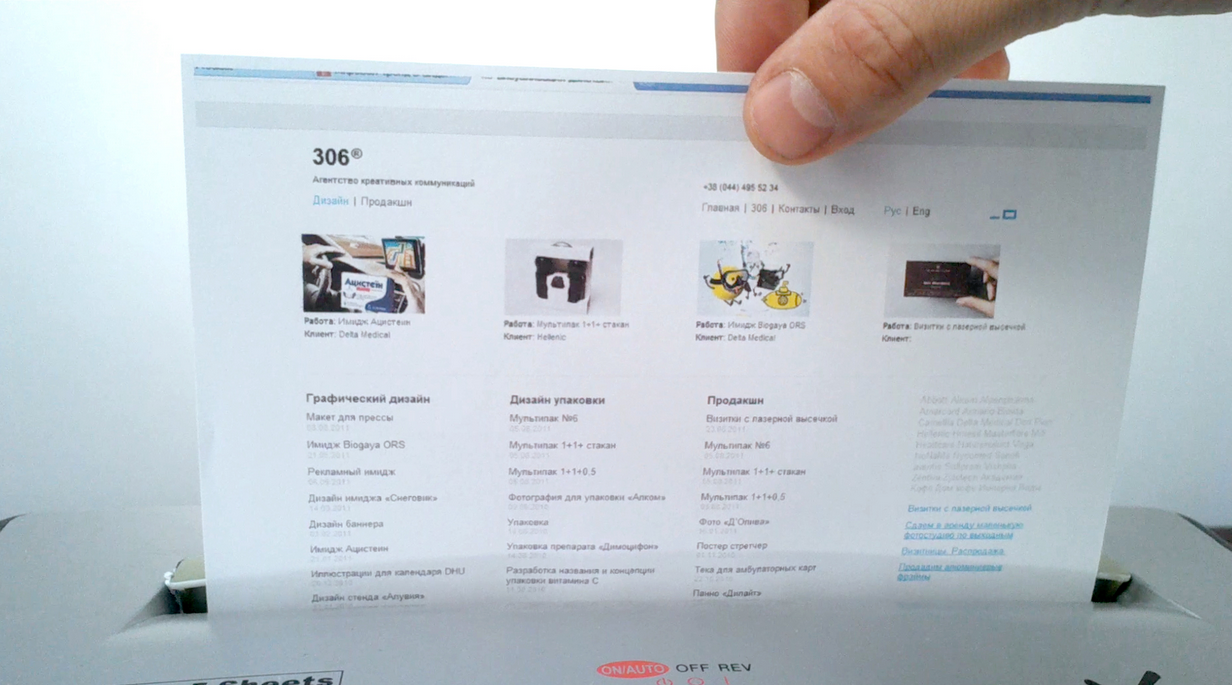
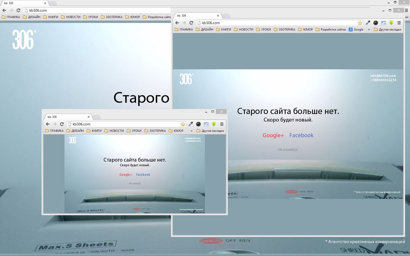
Hello! The other day I had the task to write a "stub" on the site, which ceased to exist. Design solution is to create a video which depicts an old site, printed on a piece of paper, smoothly absorbed by the office paper recycler. After the end of the video should appear the inscription “The old site is no more. Soon there will be a new one. ”, Company logo, links to Facebook and Google+, as well as contact information.
Video by Css is placed on the entire width or height of the viewport, depending on the user's screen, while maintaining its proportions. That is, if we have video with a resolution of 1280 x 1024, then when resizing the browser window, its resolution will vary proportionally: 1000 x 800, 600 x 480.
')
So, the main snag is that over the video we need to create a block with the same properties and dimensions, and all the content in the block should scale just as if we were not resizing or filling the block itself, but a picture or its screenshot.
After sitting a little and thinking, I realized that with the help of one Css we could not do this, so I sketched a small script that implements this task.
An example can be found here . Works in all the latest browsers.
The values of 'vw' and 'vh' allow us to be attached to the width and height of the viewport.
Using the above functions and conditional values in Css, you can create a site for any monitor.
Video by Css is placed on the entire width or height of the viewport, depending on the user's screen, while maintaining its proportions. That is, if we have video with a resolution of 1280 x 1024, then when resizing the browser window, its resolution will vary proportionally: 1000 x 800, 600 x 480.
')
So, the main snag is that over the video we need to create a block with the same properties and dimensions, and all the content in the block should scale just as if we were not resizing or filling the block itself, but a picture or its screenshot.
After sitting a little and thinking, I realized that with the help of one Css we could not do this, so I sketched a small script that implements this task.
An example can be found here . Works in all the latest browsers.
HTML code
<div></div> CSS styles
body { overflow: hidden; } div { position: absolute; font-family: Arial; color: #fff; background: #5aa348; } Javascript
var docWidth, docHeight, docRatio, div = document.getElementsByTagName('div')[0]; onresize = function() { docWidth = document.body.clientWidth; docHeight = document.body.clientHeight; // docRatio = docWidth / docHeight; // fullScreenProportionalElem(div, 1920, 1080); // , , resizeFont(div, 1920, 1080, 200); // , , , // } function fullScreenProportionalElem(elem, width, height) { var ratio = width / height; // if (docRatio < ratio) { elem.style.width = docWidth + 'px'; elem.style.height = Math.round(docWidth / ratio) + 'px'; elem.style.top = Math.round(docHeight / 2 - elem.offsetHeight / 2) + 'px'; elem.style.left = '0px'; // // , , } else if (docRatio > ratio) { elem.style.width = Math.round(docHeight * ratio) + 'px'; elem.style.height = docHeight + 'px'; elem.style.top = '0px'; elem.style.left = Math.round(docWidth / 2 - elem.offsetWidth / 2) + 'px'; // // , , } else { elem.style.width = docWidth + 'px'; elem.style.height = docHeight + 'px'; elem.style.top = '0px'; elem.style.left = '0px'; // // , top left } } function resizeFont(elem, width, height, size) { var ratio = width / height; // if (docRatio < ratio) elem.style.fontSize = height * size / 14062 + 'vw'; else if (docRatio > ratio) elem.style.fontSize = width * size / 14062 + 'vh'; // 14062 , } onresize(); // The values of 'vw' and 'vh' allow us to be attached to the width and height of the viewport.
Using the above functions and conditional values in Css, you can create a site for any monitor.
Source: https://habr.com/ru/post/187406/
All Articles