Good user interface
Free translation of the article by Yakub Linovski - “A Good User Interface” .
A good user interface has a high conversion rate and is easy to use. In other words, it is good both for business and for people who use it. Below are a number of practical ideas that you can try to apply.
')
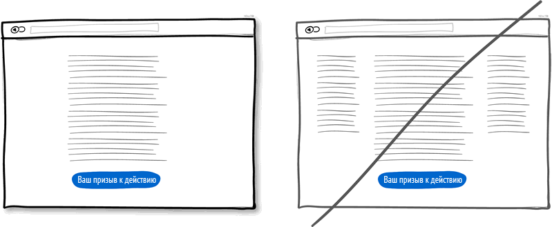
Idea 1: Try to use the layout with one column instead of multicolumn
Single column layout allows better control of the story. He will be able to direct your users in the most predictable way - from top to bottom. The multi-column approach assumes the risk that the user may be distracted from the main goal of the page. Guide people through the story with a mandatory call to action at the end.
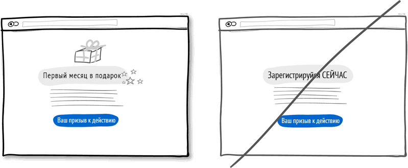
Idea 2: Try to make a gift, do not complete the sale immediately
A friendly gesture, such as making a gift to a customer, is exactly what you need. Looking deeper, gifts are also an effective persuasion tactic based on the principle of reciprocity. No matter how obvious it may sound, but small marks of appreciation will pay off handsomely.
Idea 3: Try to combine similar functions and not split up the interface
In the course of work, you can inadvertently create several sections and elements that perform the same function. This is common entropy when the system becomes erratic over time. Do not use different names for the same functions in order not to increase the information load on your customers. The more fragmented the user interface, the steeper the learning curve becomes and the more difficult it is for the client to grasp the essence of what is required of him. Refactorize the user interface and combine similar functions together.
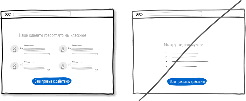
Idea 4: Try to use social proof instead of telling about yourself
Social proof is another persuasion tactic that allows for increased conversion.
Recommendations about you and your proposal may prompt the user to take action. Make sure that these recommendations or opinions are present.
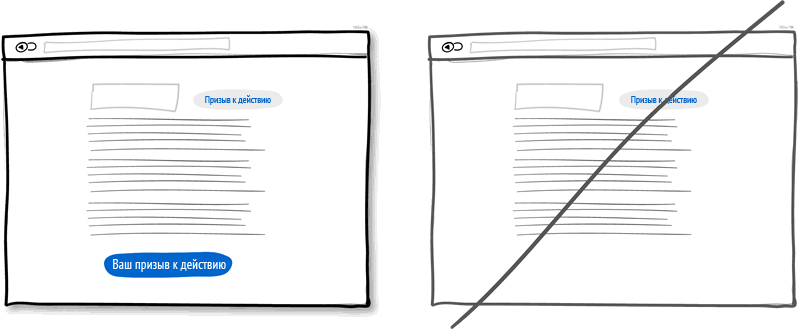
Idea 5: Try to repeat the main call to action, instead of showing it once
Call-to-action repetition is more applicable to longer pages, or repetition across multiple pages is used. Of course, you do not want the offer to be displayed 10 times on one page and annoyed people. Long pages have become the norm, and trying to fit everything into the first screen is no longer a good idea. There is nothing wrong with making one call at the top of the page, gently reminding in the middle and fixing it at the end. When people reach the bottom of the page, they stop to think about what to do next, and now is the time to make an offer or complete a deal.
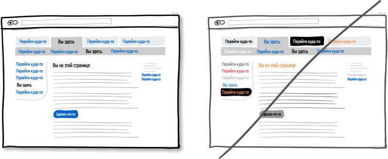
Idea 6: Try to reinforce the differences in style between clickable and selected elements, rather than blur them.
Expressive tools, such as color, depth and contrast, can be used as reliable markers that reflect the fundamental interface navigation language: where I am, and where I can go. To clearly convey this idea to users, you need to use a different visual design for elements for different purposes (links, buttons, selected elements and content), these differences must be clearly expressed, and you should use them in the same way throughout the interface.
The picture shows an example where blue is selected to mark everything that can be pressed, and black for everything that has been selected or indicates where we are. When properly applied, people will be much easier to navigate among such clues. Do not complicate the lives of users - do not violate the sense coding.
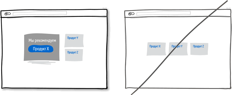
Idea 7: Try recommendations instead of showing equivalent options.
In cases where multiple offers are displayed, a highlighted recommendation of a product may be a good idea, because some people need a little push. There are some psychological studies that suggest that the wider the choice, the less likely it is that the decision will be made and implemented at all. To prevent such analytical paralysis, try to emphasize and highlight some options against others.
Idea 8: Try canceling an action instead of confirmation requests
Imagine that you have just clicked on a valid button or link. Canceling an action respects the original user intent, allowing the action to occur immediately, with the option of canceling. Requests for permission to act, on the contrary, inspire the user that he or she does not know what they are doing, questioning their intentions. Man’s actions most often reflect his real intentions, and only in rare situations are they accidental. The inefficiencies and misery of hints are especially obvious when users must perform actions repeatedly, and hints will appear many times, again and again: this is a bad experience. Try to give your users more control: cancel the action and do not ask for confirmation where it is possible.

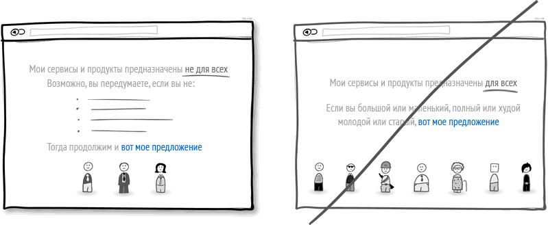
Idea 9: Explain who the product is for. Do not try to address the message to everyone
Do you clearly distinguish your audience, or do you appeal to everyone at once? This idea of increasing conversion is to clearly explain who your product or service is for. When you reach out to your audience, highlight certain attributes of your customers. This will bring communication with them to a new level and will give a certain shade of exclusive and elitism. The possible risk of such a strategy is that if you declare any restrictions, you can cut off part of the potential audience. In this case, the transparency of the proposal will help: honesty inspires confidence.
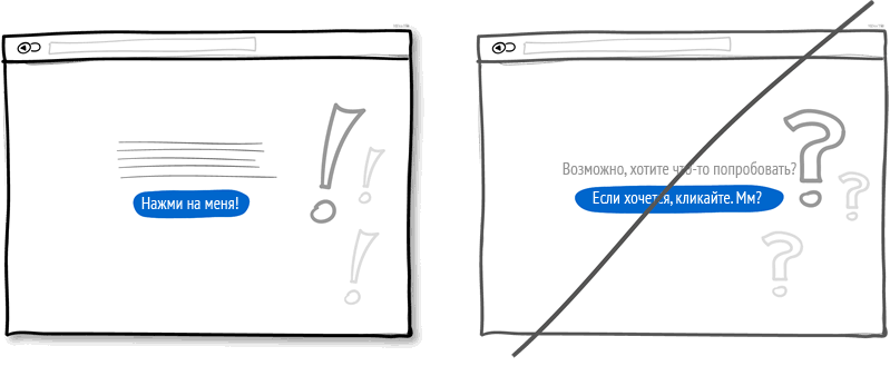
Idea 10: Speak directly instead of assumptions
You can speak to people with an uncertain tremor in your voice or you can say the same with confidence. If you end each sentence with question marks, use words like “maybe,” “would be great,” “are you interested?” Or “do not want to try?”, Then you have every opportunity to add conviction to your message. Who knows, maybe it is sometimes worth telling people the next step in optimizing conversion?
Idea 11: More Contrast Instead of Homogeneity
The more clearly and dramatically stand out calls to action among the other elements of the page, the better your interface will work, the stronger it will be. The contrast of the main target actions can be enhanced using a variety of methods. Using saturation, you can make some elements darker against a light background, with the help of depth you make objects appear closer against other content that looks more distant (use shadows and gradients). Finally, you can choose complementary colors from the color wheel (for example, yellow and purple) for even greater enhancement. However, do not get too carried away: the contrast between the content and the main action should be balanced.

Idea 12: Show the place of origin of the product instead of generalizations
Information about you, your product or service allows you to reach a more personal level in communication with the client. A good way to tell about yourself is to mention the country, state or city of origin. If you can practically apply this advice, then the attitude towards you will become more benevolent. Often, mentioning where the product was made is a good way to create a sense of a higher quality product.

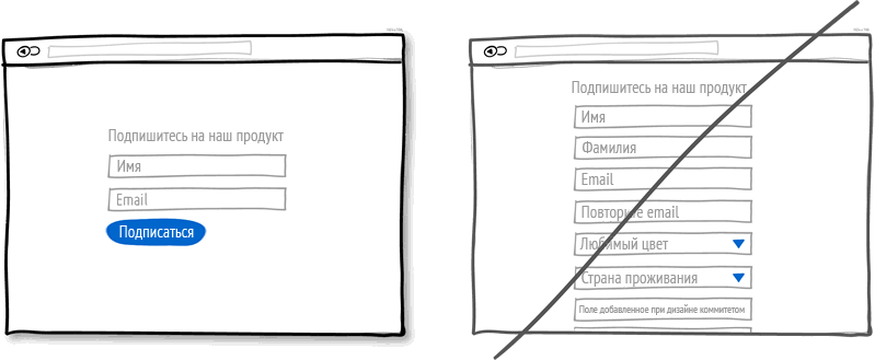
Idea 13: Reduce the number of fields, do not ask too much
People by nature do not like time-consuming tasks, and this fully applies to filling out the form fields. Each field that requires a response from the user can provoke him from leaving the page. In addition, not all devices allow you to quickly type text, it is especially difficult to do this on mobile devices. Try to leave only the required fields, and remove as many fields as possible. If there are really a lot of required fields, then it will be better to fill them after sending the main form on a separate page or with the help of an additional form. Expanding the form is easy, but fewer fields allow you to increase conversion.
Idea 14: Expand all options at once.
Each drop-down menu used by you hides a set of actions that require additional effort to find. If these hidden options are central in order for the user to perform the necessary action, then it may be worthwhile to increase their priority on the page. Try to make a drop-down menu for those options that are obvious and do not require new knowledge from the user: in the choice of date and time (for example, calendars) or geographical location. Sometimes the drop-down menu items can work in those interfaces that the user must perform from time to time. Be careful using drop-down lists for items in the main story path.

Idea 15: Offer a sequence instead of double bottom pages
Double bottom pages are conversion killers. Yes, everyone is already accustomed to scrolling long pages, but it is important not to create a false impression among the visitors that the page has ended before this actually happens. If the page assumes scrolling, set a visual or semantic rhythm that will clearly indicate to the user that there is a sequel next. Be careful with large gaps in the “fold” places where the screen border may appear (of course, I mean conditional zones, since it is difficult to foresee all the options for various devices).

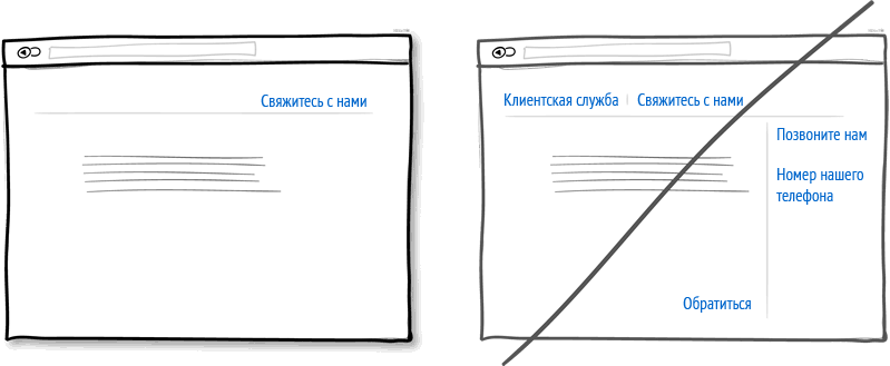
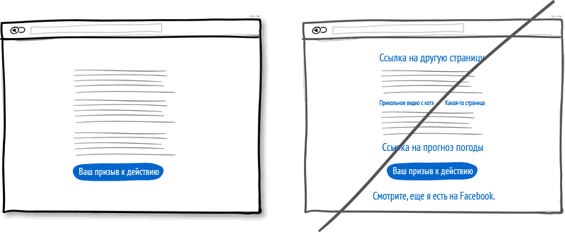
Idea 16: Keep your focus, do not abuse links
There is nothing difficult to arrange more links in different places of the page in the hope of satisfying as many potential customers as possible. However, when you create a narrative page, the purpose of which is to lead the user to a specific target action, think twice. Do not forget that any link before the main target action increases the risk of the user leaving the page and distracts from what you expect from him. Keep track of the number of links and, if possible, keep a balance between distributing pages (with a slightly larger number of links) with “tunnel” pages with a smaller number of links and a higher conversion. Cleaning up unnecessary links will certainly increase the chances of getting to the important button.
Dmitry Kalinnikov, Director of Design and Design Department, ADV / web-engineering
Ildar Kinyabulatov, web designer, ADV / web-engineering
Source: https://habr.com/ru/post/186846/
All Articles