Mojo Ribbon - the perfect tape or trigonometry in LESS
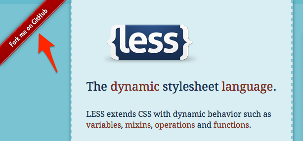
Good day, dear habrazhiteli. Recently in one project I needed to make a ribbon for blocks. For example: very often they make a tape with the inscription “Fork me on GitHub” on top of it, or there is a tape with the date of publication of the work above each element in the portfolio. I'd better show an example from the official LESS site, since this is about such a small detail that some might not have paid attention to at all.
This Ribbon is an image inside a link with absolute positioning. What does not suit me this option? First of all: I really like modern CSS standards, with which you can create a nice design using a minimum of images, and in this case, a tape can be a regular
')
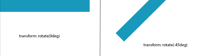
Create a block 500px long, 50px high, with absolute positioning, top, left. Get what we see in the image below on the left side. Next, we rotate the block by -45 degrees so that we have something similar to the Ribbon with LESS. The result is shown on the right side of the image. Our element rotates from its center, as a result of which an indent appears to the left, and a part of the future ribbon leaves the work area.
With the help of the inspector, we can find the values we need for
As I said, the rotation of the element is from the center. Consequently, the values of the indents are measured from the edge of the workspace to the center. Let us mentally represent the formed figures - triangles, the sides of which we need to calculate:

It turned out two triangles ABC and A2B2C2 , the sides of which we need to calculate. We know that C = 500px (width), C2 = 50px (height), the slope angle is -65 (deg), therefore, the angle a in the triangle ABC is 65 degrees and the angle b is 25 degrees (180 - 90 - 65) . In the A2B2C2 triangle , the angles a2 and b2 are 65 and 25 degrees, respectively.
It's simple. The sine of the angle is equal to the ratio of the opposite leg to the hypothinosis. Consequently:
A = sin (a) * C or A = sin (65) * 500;
B = sin (b) * C or B = sin (25) * 500;
A2 = sin (a2) * C2 or A2 = sin (65) * 50;
B2 = sin (b2) * C2 or B2 = sing (25) * 50;
Demo result
Github
Many thanks to allthe same as I CSS bore for your attention.
This Ribbon is an image inside a link with absolute positioning. What does not suit me this option? First of all: I really like modern CSS standards, with which you can create a nice design using a minimum of images, and in this case, a tape can be a regular
transform rotate block. Secondly: recently I look at the web through the Retina display and the non-optimized img immediately catch the eye, but developers also pay attention to some kind of ribbon, optimize its display with media queries, it seems to me even a little ridiculous.')
Create a block 500px long, 50px high, with absolute positioning, top, left. Get what we see in the image below on the left side. Next, we rotate the block by -45 degrees so that we have something similar to the Ribbon with LESS. The result is shown on the right side of the image. Our element rotates from its center, as a result of which an indent appears to the left, and a part of the future ribbon leaves the work area.
With the help of the inspector, we can find the values we need for
top and -left . What does not suit me this option? Firstly, perfectionism: I want the maximum number of specified pixels (in this case, 500) to be displayed in the workspace and not to go for it. Secondly - laziness: I don’t want to manually select values in order to hide all angles when changing positions (top, right, bottom, left) and degrees of inclination.Geometry
As I said, the rotation of the element is from the center. Consequently, the values of the indents are measured from the edge of the workspace to the center. Let us mentally represent the formed figures - triangles, the sides of which we need to calculate:
It turned out two triangles ABC and A2B2C2 , the sides of which we need to calculate. We know that C = 500px (width), C2 = 50px (height), the slope angle is -65 (deg), therefore, the angle a in the triangle ABC is 65 degrees and the angle b is 25 degrees (180 - 90 - 65) . In the A2B2C2 triangle , the angles a2 and b2 are 65 and 25 degrees, respectively.
Trigonometry
It's simple. The sine of the angle is equal to the ratio of the opposite leg to the hypothinosis. Consequently:
A = sin (a) * C or A = sin (65) * 500;
B = sin (b) * C or B = sin (25) * 500;
A2 = sin (a2) * C2 or A2 = sin (65) * 50;
B2 = sin (b2) * C2 or B2 = sing (25) * 50;
LESS
.MojoRibbon(@width, @height, @deg, @valign) { width: @width; height: @height; -webkit-box-sizing: border-box; /* padding */ -moz-box-sizing: border-box; -ms-box-sizing: border-box; box-sizing: border-box; .defineDegree(@deg, @valign) when (@deg < 0) and (@valign = top) { @degree: -@deg; /* , sin */ top: @countHeight; left: @countWidth; -webkit-transform: rotate(@deg); -moz-transform: rotate(@deg); -o-transform: rotate(@deg); -ms-transform: rotate(@deg); transform: rotate(@deg); }; .defineDegree(@deg, @valign) when (@deg < 0) and (@valign = bottom) { @degree: -@deg; /* , sin */ bottom: @countHeight; right: @countWidth; /* , */ -webkit-transform: rotate(@deg); -moz-transform: rotate(@deg); -o-transform: rotate(@deg); -ms-transform: rotate(@deg); transform: rotate(@deg); }; .defineDegree(@deg, @valign) when (@deg > 0) and (@valign = top) { @degree: @deg; top: @countHeight; right: @countWidth; -webkit-transform: rotate(@degree); -moz-transform: rotate(@degree); -o-transform: rotate(@degree); -ms-transform: rotate(@degree); transform: rotate(@degree); }; .defineDegree(@deg, @valign) when (@deg > 0) and (@valign = bottom) { @degree: @deg; bottom: @countHeight; left: @countWidth; /* , */ -webkit-transform: rotate(@degree); -moz-transform: rotate(@degree); -o-transform: rotate(@degree); -ms-transform: rotate(@degree); transform: rotate(@degree); }; .defineDegree(@deg, @valign) when (@deg = 0) { @degree: @deg; top: 0; left: 0; }; .defineDegree(@deg, @valign); @angleB: 90-@degree; @angleB2: @angleB; @sideA: round(sin(@degree), 3)*@width; /* */ @sideB: round(sin(@angleB), 3)*@width; /* B */ @sideB2: round(sin(@angleB2), 3)*@height; /* 2 */ @sideA2: round(sin(@degree), 3)*@height; /* B2 */ @countHeight: @sideA/2 - @height/2 - @sideB2/2; @countWidth: -((@width)-(@sideB))/2 - @sideA2/2; } Demo result
Github
Many thanks to all
Source: https://habr.com/ru/post/186386/
All Articles