Fakebook. Concept of sanity
For quite a long time I read Habr and I constantly see articles about Facebook usability, written in a negative way, both from the standpoint of its users, and from the point of view of people who are directly related to the IT community.
A huge and very rich company, which gathered under its wing a lot of professionals, the best specialists in usability. A company collecting statistics, collecting focus groups, conducting marketing research. Every time the same sore question arises: where is the result that suits the user? Facebook is now a mess.
The first time I tried to become his user of the year was like this in 2009, when he suddenly became “fashionable” and many of my friends moved there from VK. But many did not survive there. For example, I was scared of absolutely everything: from the blue-lilac color of the caps to the misunderstanding of what would happen when I clicked on the button. Over the next few years, we silently watched the complexity of the interface , when the whole world was striving for simplicity.
')
But my article is not about that. I want to bring to your attention my work, which was originally prompted to me by a user Klimentij , who wrote the article “Usability Facebook”. For a long time I wanted to do it, and now, finally, free time appeared.
I chose to create a concept app for the iPad, as the modern world is becoming more and more mobile, people are increasingly accessing social networks from smartphones and tablets. In addition, the mobile Facebook has been deprived of advertising so far and has collected only the basic and most necessary functions of its older brother.
Why is this necessary? I want to show my Facebook with a simple and clear interface that will be friendly to the user, increase usability and make it more trendy. I want to note that this is only my vision of the problem, many elements may need to be rethought, so do not judge strictly.
All UI is in English. First, closer to the original; secondly, in the current version its Russification is incorrect.

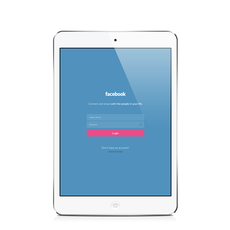
The current mobile solution greets us with a very good login screen. There is nothing superfluous. In my opinion, the correct policy is to put the emphasis on what the user interacts with more often, that is, in this case, this is the entrance to the application, and not the registration, as in the browser version.
Why? First, the new user, seeing an unfamiliar screen in front of him, in any case will try to study it and find the registration button. Secondly, it needs registration only once, and there is no sense in constantly showing it. Therefore, we change only the design.
The picture is larger (1200x1500 px., 132 Kb.)
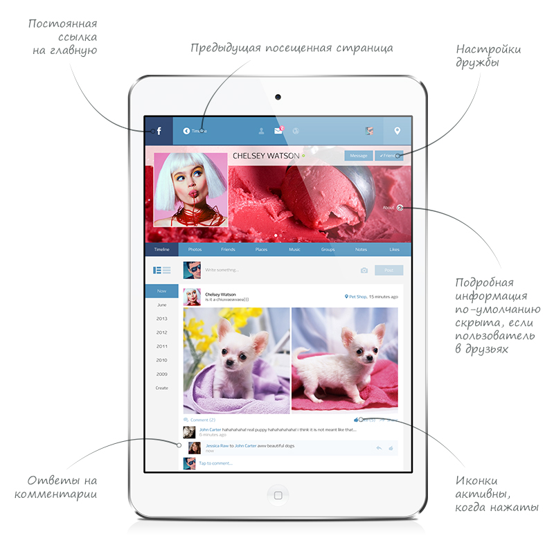
After entering the application, we get exactly here. First of all, I fixed the Facebook approximate “about an hour ago” for the exact time. I don’t know about you, but it’s so much more convenient for me to navigate the stream of news. From above, we see a hybrid header that adapts to a specific page (examples below). Now there is a search on it, a block of notifications, a link to your profile and a check-in button. Under the header is a calendar that allows you to specify a specific date of the chronicle. There was a lack of this functionality, as there were often cases when it was necessary to find some news two days ago. On the right are the filters for chronicles and user groups. The latter allows you to show the chronicle of only those friends who are listed in a specific group.
Also filter are event icons. When you click, for example, on a photo - only tapes with photos attached will remain in the tape.
Further, everything is standard - comments unfold when you click on them. If we comment on the post, the icon will become active, as well as likes.

The picture is larger (1200x1500 px., 336 Kb.)
Perhaps we will go to the profile to the blonde Chelsea. We immediately see how the cap has changed. Now on the left is the logo of the FB, which is also a link to the Chronicle. Next to it appeared a link back to the previous visited page.
Since Chelsea is in our friends, we don’t see detailed information about the user, it is accessible by swipe to the left. For non-friend users, the default information is located on the main screen.
The section menu will now go up to the header, in the case of Timeline and other sections scrolling. But more on that later.
The picture is larger (1200x1500 px., 519 Kb.)
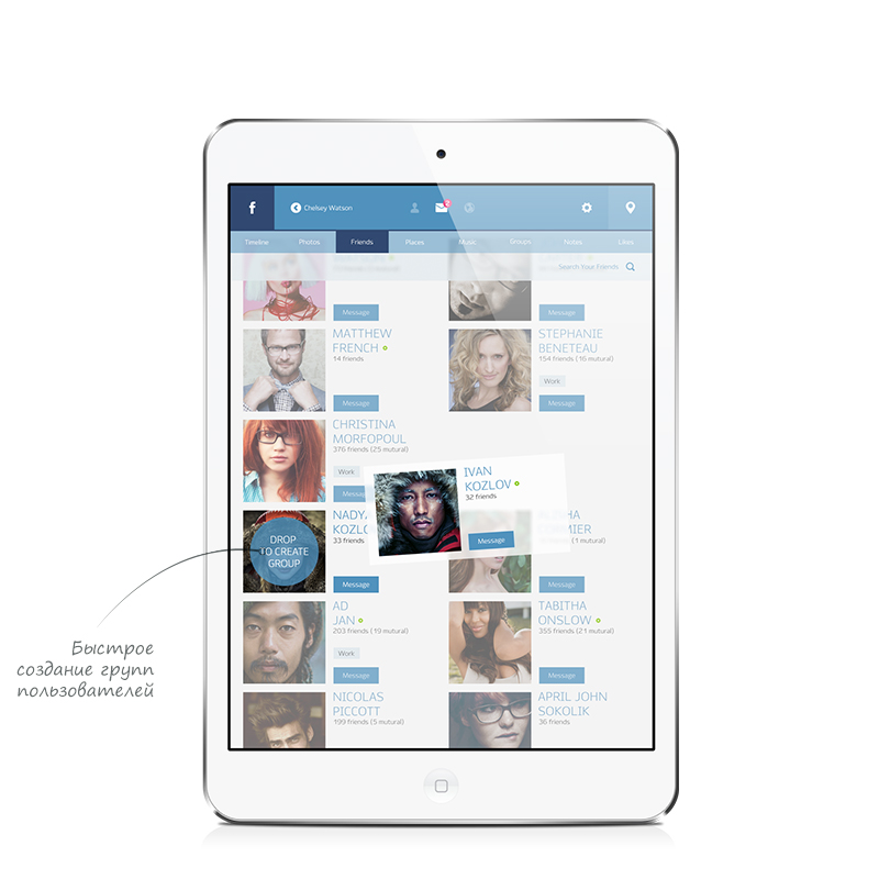
On the right, in the header, instead of a link to your profile, there appeared a setting of it, this very profile. Also this icon is responsible for the general settings of the application. The basic information about yourself is hidden, as is the case with Chelsea, in order not to litter the cover. Under the section menu, we see a selection of the information view, search by friends, the button “Find new friends” and filters. On the left, user groups are filtered. On the right are the last visited friends, a list view in alphabetical order and those who are nearby (yes, yes, after all, there are chekins!). Under the names of friends, we see a button to quickly send a message. Green rings - online indicator. Nothing extra.

The picture is larger (1200x1500 px., 554 Kb.)
In this picture we see what happens if you scroll through the list of friends. The menu has risen, freeing us more space. I also want to show the ability to quickly create a group of users. It's simple: captured and dragging on to any other friend.
The picture is larger (1200x1500 px., 427 Kb.)

The picture is larger (1200x1500 px., 344 Kb.)
Somehow this spring, Badoo, too, I must say, a rather large company that has very serious problems with the usability of its service, decided to substantially change the policy and stop torturing its users. Londoners organized a competition among designers in Russia and Ukraine to develop a new interface concept for the iPad. At first they had all the same standard, a la FB and VC, application. Bad did not begin to go the trodden path and decided to make a bet on the mobile version and, as far as I know, they are doing well now. I was one of the participants and, later, one of the finalists of this competition. The work that they have chosen directly reflects the new strategy of a bright and dynamically developing company. But FB, a clumsy monster, everything continues to compromise itself and force us with you with its logic-free interface, which, as we know last year, Zuckerberg's sister could not figure out .
Thank you for reading this place. I would be glad to objective and reasonable criticism in the comments.
A huge and very rich company, which gathered under its wing a lot of professionals, the best specialists in usability. A company collecting statistics, collecting focus groups, conducting marketing research. Every time the same sore question arises: where is the result that suits the user? Facebook is now a mess.
The first time I tried to become his user of the year was like this in 2009, when he suddenly became “fashionable” and many of my friends moved there from VK. But many did not survive there. For example, I was scared of absolutely everything: from the blue-lilac color of the caps to the misunderstanding of what would happen when I clicked on the button. Over the next few years, we silently watched the complexity of the interface , when the whole world was striving for simplicity.
')
But my article is not about that. I want to bring to your attention my work, which was originally prompted to me by a user Klimentij , who wrote the article “Usability Facebook”. For a long time I wanted to do it, and now, finally, free time appeared.
I chose to create a concept app for the iPad, as the modern world is becoming more and more mobile, people are increasingly accessing social networks from smartphones and tablets. In addition, the mobile Facebook has been deprived of advertising so far and has collected only the basic and most necessary functions of its older brother.
Why is this necessary? I want to show my Facebook with a simple and clear interface that will be friendly to the user, increase usability and make it more trendy. I want to note that this is only my vision of the problem, many elements may need to be rethought, so do not judge strictly.
All UI is in English. First, closer to the original; secondly, in the current version its Russification is incorrect.
Login screen
The current mobile solution greets us with a very good login screen. There is nothing superfluous. In my opinion, the correct policy is to put the emphasis on what the user interacts with more often, that is, in this case, this is the entrance to the application, and not the registration, as in the browser version.
Why? First, the new user, seeing an unfamiliar screen in front of him, in any case will try to study it and find the registration button. Secondly, it needs registration only once, and there is no sense in constantly showing it. Therefore, we change only the design.
The picture is larger (1200x1500 px., 132 Kb.)
Timeline, she's Home
After entering the application, we get exactly here. First of all, I fixed the Facebook approximate “about an hour ago” for the exact time. I don’t know about you, but it’s so much more convenient for me to navigate the stream of news. From above, we see a hybrid header that adapts to a specific page (examples below). Now there is a search on it, a block of notifications, a link to your profile and a check-in button. Under the header is a calendar that allows you to specify a specific date of the chronicle. There was a lack of this functionality, as there were often cases when it was necessary to find some news two days ago. On the right are the filters for chronicles and user groups. The latter allows you to show the chronicle of only those friends who are listed in a specific group.
Also filter are event icons. When you click, for example, on a photo - only tapes with photos attached will remain in the tape.
Further, everything is standard - comments unfold when you click on them. If we comment on the post, the icon will become active, as well as likes.
The picture is larger (1200x1500 px., 336 Kb.)
Someone else's profile
Perhaps we will go to the profile to the blonde Chelsea. We immediately see how the cap has changed. Now on the left is the logo of the FB, which is also a link to the Chronicle. Next to it appeared a link back to the previous visited page.
Since Chelsea is in our friends, we don’t see detailed information about the user, it is accessible by swipe to the left. For non-friend users, the default information is located on the main screen.
The section menu will now go up to the header, in the case of Timeline and other sections scrolling. But more on that later.
The picture is larger (1200x1500 px., 519 Kb.)
Your profile. Friends tab
On the right, in the header, instead of a link to your profile, there appeared a setting of it, this very profile. Also this icon is responsible for the general settings of the application. The basic information about yourself is hidden, as is the case with Chelsea, in order not to litter the cover. Under the section menu, we see a selection of the information view, search by friends, the button “Find new friends” and filters. On the left, user groups are filtered. On the right are the last visited friends, a list view in alphabetical order and those who are nearby (yes, yes, after all, there are chekins!). Under the names of friends, we see a button to quickly send a message. Green rings - online indicator. Nothing extra.
The picture is larger (1200x1500 px., 554 Kb.)
In this picture we see what happens if you scroll through the list of friends. The menu has risen, freeing us more space. I also want to show the ability to quickly create a group of users. It's simple: captured and dragging on to any other friend.
The picture is larger (1200x1500 px., 427 Kb.)
The picture is larger (1200x1500 px., 344 Kb.)
Conclusion
Somehow this spring, Badoo, too, I must say, a rather large company that has very serious problems with the usability of its service, decided to substantially change the policy and stop torturing its users. Londoners organized a competition among designers in Russia and Ukraine to develop a new interface concept for the iPad. At first they had all the same standard, a la FB and VC, application. Bad did not begin to go the trodden path and decided to make a bet on the mobile version and, as far as I know, they are doing well now. I was one of the participants and, later, one of the finalists of this competition. The work that they have chosen directly reflects the new strategy of a bright and dynamically developing company. But FB, a clumsy monster, everything continues to compromise itself and force us with you with its logic-free interface, which, as we know last year, Zuckerberg's sister could not figure out .
Thank you for reading this place. I would be glad to objective and reasonable criticism in the comments.
Source: https://habr.com/ru/post/185410/
All Articles