ChartJS - JavaScript data visualization library
Every year the world of computing technology is increasingly creeping into the global web. HTML5 is sweeping across the planet, and so far there are no signs of slowing down its development and distribution. It seems even the fridges will soon begin to understand HTML5!
We in DevExpress like no one feel this trend. And did a good job this year!
')
Habrasoobschestvuyu already knows about our new framework PhoneJS , which allows experienced web developers to feel confident and in development for mobile devices.
However, the classic side of web development, we have not forgotten.
People still get information from the Internet.
Unfortunately, these same people still do not like to read long and tedious reports.
A picture is worth a thousand words.
A live picture that interacts with the person watching it is priceless.
In order for web developers to show their customers live charts, we created the ChartJS data visualization library .
Schedules? It is already there!
Of course there is.But there is always something to strive for and what to improve.
What we wanted to improve:
- graphics should be rendered on the client. Why - in order for the client to change;
- Creating a schedule should be simple. If you need 100 lines of code to create a graphic, then this is already a bit of a search;
- However, if a task arises to supplement the schedule to the ideal, then it should be solved. Only it should be solved separately from the first, and as the evolution of the code, and not a revolution;
- elegance. When we draw a graph based on the data - we want to see the data, but not the thingies;
- graphics should work in all browsers. And last but not least, considering where the world is heading - on mobile devices;
- Well, actually, data visualization is not only graphics. Our library also includes a set of Gauges - “indicators” - visual elements that allow you to visually assess the value, and a RangeSelector widget that simplifies such manipulations of data as filtering and scaling.
Examples
Unfortunately, I try not to mix work and politics, so I will not have cool schedules from “public initiatives”.In order to preserve the interest of the Internet audience, I actually have one way out - to draw a chart with kittens!

Cats surround us. Many kitchen conversations sooner or later come down to furry pets.
I wondered - what percentage of DevExpress'ovs hold a pet? What is their favorite, how similar to the ideal kitten from a photo, or more like a Simon's cat from well-known cartoons?
Thought begets action. A small survey was organized among our colleagues. Comic, of course - because we are still talking about kittens! - but with a claim to some representativeness.
The results of this survey are a plate with numbers.
But only a certain percentage of people really enjoy looking at the plates with dry numbers (well, if we are not talking about tables showing salary growth!)
Let's look at this data in pictures.
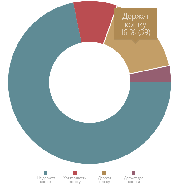
What is the proportion of people - cat lovers - in the company, mainly engaged in the development?
(yes, all the pictures are clickable , the code is here , and next you can find the code of all the following examples)
Not so much, but, on the other hand, not so little - almost every fourth person either already shares his dwelling with a four-legged friend, or is going to. And some - and not with one!
And who are these cats and cats?
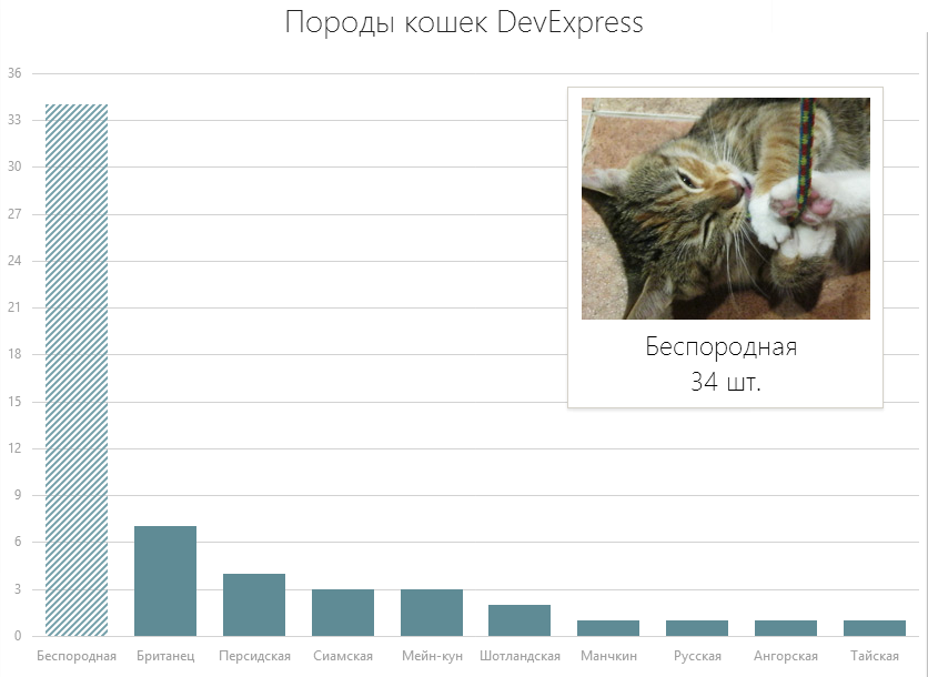
In the world now there are about seven dozen cat breeds . About 40 breeds can be found in Russia, and even less common. What cats live with our programmers? How much more than others?
For the presentation of such information, you can take the simplest type of series - bars, or Bar chart. Such a schedule on paper does not give one important point - it is impossible, having defined the most common breed at a glance, to imagine it alive. Fortunately, the modern web is completely built on interactivity and user interaction. And using ChartJS is not at all difficult to add the ability to show a photo of a cat when a user interacts with a diagram:
You can play here .
And then, looking at the picture, no doubts and hesitation are needed - the facts are striking: although some species of purebred cats are of a certain popularity (there are even rather exotic species) - yet the usual gray-white-red wins a steady victory over aristocratic cats cats and cats.
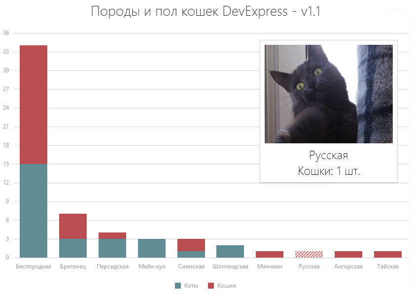
By the way, and cats or cats?
This is also easy to show - let's consider the data on cats and cats as two separate values that can be represented using two data series:

It is already clearly seen how many cats or cats, and who more. You can compare the number of British cats with the number of Siamese cats.
But on the other hand, it became slightly worse to see which rocks are more in total.
Let's continue to improve the chart - instead of the adjacent bars, we’ll show the same data in the form of composite bars (stacked bar):
By the way, if the exact number of animals is not at all interesting for us, and only the ratios inside each breed are important, we can generally get rid of the visual component of the quantity using the Full Stacked Bar series:
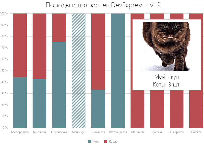
The last three graphs are an excellent example of the effect that only one line of code can have on human perception. Using the minimum code, you can persuade our users to certain thoughts and conclusions, make you see that the ratio of cats and cats among the most popular outbred and the following British breeds is almost the same - it was not visible on the first graphs. But on the latter the amount was completely lost ...
The only good solution is to let users choose what and how they want to see:

It was to dynamically change the type of graphs, which can be achieved with the help of three lines of code - counting the Egyptian brackets - we created ChartJS .
Quantity is not the only indicator dedicated to our cats.
For example: very few people, with the same success as a typical representative of the cat family, are able to convince people that he has been starving for the last 24 hours. Often, the result is cats, gradually catching up with their weight owners.
What is the weight of DX cats? Which cat is the easiest and which cat is the heaviest? And does it depend on the breed?
Let's look at the average weight for each of the breeds, as well as the extent to which their representatives reach. RangeBar and RangeArea series types are great for displaying ranges:
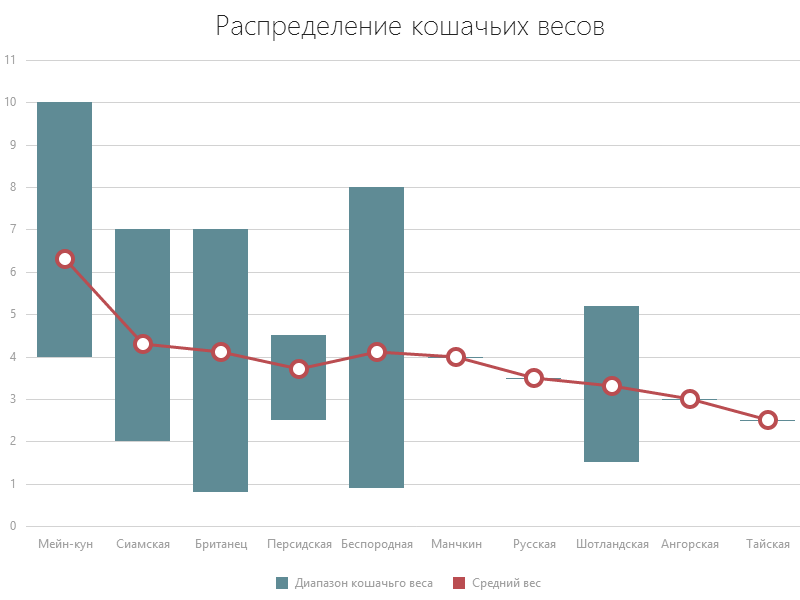
(Yes, unfortunately, some cats are present in a single copy; for them, the average weight naturally coincides with itself. The example code is here )
It is already slowly becoming clear which breed can have the most pitiful eyes! ..
Well, or who should be afraid in a dark alley ...
The main thing, of course, is to remember that in feeding a cat you cannot go to extremes; on the contrary, you need to stick to the golden mean!

After all, overfeeding can also spoil the character ... It is better to estimate in advance at least approximately how certain volumes of feeding will affect the mood of the cat.

(The example code is here . When creating the sample, the data was selected according to the author's feelings and no animals were injured!)
Interesting is the age distribution of cats among our employees. There is a clear jump in the graphics in the direction of young cats. This peak does not allow to consider in detail the schedule of animals that are slightly older. Here the ability to scale the graphics comes in handy:

Example code for scaling the graph .
Let me lower the seriousness a little more!
Appearing in the house, the cat occupies the whole house. Traces of her stay can be found everywhere.
How much wool does an average cat leave on its owner's clothes? Unless, of course, it leaves in principle ... Because sometimes we need to show the viewer not just a value equal to zero, but the absence of a value as such:

Example code Null Values .
Well, the last point - a separate question specifically devoted to our profession.
How does the host's favorite programming language affect the overall cattle of an animal?
Well, here, of course, we have to somehow quantify the concept of "cat" ... After some debate, two criteria were chosen:
- tail length;
- the amount of scratches received by the owner during the game.
It should be understood that these two indicators are measured in different units - the first in centimeters, the second - in pieces (well, or in dozens of pieces ...); showing them on the same axis is academically wrong.
What we are doing is adding a second axis to the chart, associating the first chart with the main axis, the second with the newly added one.
To read the graph was a little easier, you can optionally draw them with the same color that we draw the data, and move one of the axes to the right edge of the canvas.
It turns out this picture:
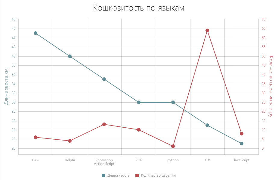
The conclusions from the picture are very interesting. The length of the tail is the undisputed leader of C ++ - and it is not surprising! Delphi, quite unexpectedly, follows him, and rather unexpected Photoshop Action Script closes the top three - there is a strong suspicion that the Design Team cats tried it ... By the way, they showed quite confidently on the claw field ... But not half as much cats C #! These are obviously the real beasts!
Here, however, lies the catch. The graph shows the average values; we would probably analyze them if we had only numbers on our hands.
If, on the graph, we add a corridor of distribution of values in the survey, the picture changes:
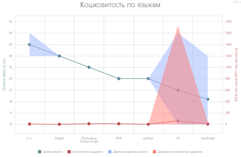
It can be seen that the mean value in C #, although large, is almost at the very bottom of the distribution of quantities. That is, most of the C # -cats are normal cute human friends. One or several feline terminators are probably responsible for the high mean value.
At this point, let us complete our brief visual analysis of DX cats.
About data to analyze
Yes, anticipating the inevitable questions - we really did an online survey among employees. When calculating the number of people, we accepted that 90% of our main office employees noticed this survey and participated in it, and the graph of the number of people was based on this assumption.
The question of the breed was given open, with free filling; in the end, I had to process the results. Representative of the breed "polusiamskaya" recorded in the Siamese; the proud representatives of the “mongrel”, “common”, “red” and “Tula mashzavodskaya” breeds were placed in the “purebred” category. In general, everything is like in real statistics!
The exceptions are the graph devoted to the amount of wool left by the cats, and a chart with a cat mood indicator depending on feeding. These two visualizations are entirely the product of the author’s fantasy.
And in any case, it is worth remembering the specifics of statistics as a science. Do not forget - 100% of the people who ate cucumbers in 1884 are already dead. Beware of cucumbers!
And besides the kittens, these graphics are suitable for something?
We believe that yes.
Of course, my analyst above was often clearly comic.
However, using the example of our cats, I tried to show some quite serious approaches to data visualization. To show how the data expressed in graphical form changes the perception of certain figures, and how changing the type of graph changes the point of view from which we consider these figures.
All graphs are fully alive and allow you to actively interact with the user in various forms.
A transparent change in the type of graphs allows the user to look at the same data from different angles, draw new patterns, come to fresh conclusions.
The use of indicators to assess the user's choice attracts his attention and allows for a better understanding of the consequences of a decision.
Graph scaling is often necessary for the ability to both evaluate a wide range of data and analyze local variations within a small range.
Well, of course, our library is used in real projects.
As the Steel Was Tempered
In full accordance with the principles of agile development, we gave our library to the mercy of neighboring departments after the first iterations. There is nothing more useful for product development than using it in real projects and getting feedback from people.
The technical support department has integrated them into its website dedicated to their eternal struggle for quality and speed - the analysis of incoming requests; internal department used to integrate with bugtracker. And in the kitchen of each floor on the TV a mini-website is spinning with a schedule of the number of bugs by department and the dynamics of the change in the number of bugs (I have long been visited by the desire to compare these schedules and diagrams of consumption of cookies in the kitchen - to determine the correlation, but my hands never reach ...) .
Thus, we could receive feedback as early as possible.
Based on the feedback received, the library has expanded and expanded.
Our team also uses our graphs in the performance statistics tool. Of course, we are far from C ++ compilers written in C ++, but still nice!
Closer to the release of the library began to use and for more serious things. Library elements are used in the new product DevExpress - Dashboards, dedicated to analyzing large amounts of data, including financial ones. Sample Dashboards on the DevExpress site .
ChartJS widgets are not only suitable for enterprise solutions. The library works quite successfully with glands and microcontrollers - which was successfully demonstrated using the example of virt2real solution integration and a set of weather sensors - the results with real-time graphs are available in the author's blog .
Under the hood
The reaction of quite a large number of people (visiting Habr) who saw something interesting on the Internet is to click on an interesting right-click and select “Inspect element”.
Let me have some spoilers.
For graphics rendering, we use SVG. This technology works great in most modern browsers, in some places even uses hardware acceleration and, with some desire, styled using CSS style sheets. Rendering can occur in several stages, asynchronously, so as not to occupy the JavaScript engine for a long time and not to provoke a decrease in the responsiveness of the user interface.
Due to the specifics and the “charts” -> “data analysis” -> “corporate sector” -> “windows xp” -> IE 8 chain, we simply had no choice but to hold this browser using VML technology. The transition occurs inside and invisibly to the user.
This leads us to the fact that the charts themselves are architecturally arranged largely according to the principle of Dependency Injection (DRY and SOLID are not empty abbreviations for us either). I am a big fan of this approach and strongly promote it. In the JavaScript world, this approach has acquired some interesting features, which I plan to separately discuss in the future.
Each visual element is implemented as a separate object, which accepts some dependent objects (visual and non-visual) as input.
Almost all elements for calculating screen coordinates rely on the “translator” object, the task of which is to convert the units of the domain (“business values”) to screen pixels. Thus, this translation is well isolated, not duplicated, and is easily amenable to centralized modification (for example, when we perform a zoom in the chart).
If we depict the dependencies between the components as a graph, we will see a fairly pure hierarchical pyramid - and we put quite a lot of effort not to slip into the “web”, which inevitably ends with difficult to modify code for us and long waiting for the simplest features - for our users. Already, we provide a large number of interesting things out of the box, but we still have a lot of plans!
In addition to the classic approach to creating widgets from pure JS, we fully support the rapidly gaining popularity of the Knockout framework, which allows the use of MVVM approach to create HTML + JavaScript applications. The closest use case is the DXWorkout application written in PhoneJS.
How much is opium for the people?
If you are an enthusiast, if you work for the good of society, if you run an open-source project, then it will be completely free for you.
If you have a commercial project, and thanks to our library, golden rivers will flow to you - we ask for some price for commercial use. What do you get for this? The right to use the library on any number of sites and projects. Unlimited number of questions to our support service during the one-year subscription period. The opportunity to distribute our library with our products - and if necessary, even the corrected and supplemented by you - source code is open.
Where can I see and try?
The library is available for download on the ChartJS website.
A large number of examples have been published in our ChartJS demo gallery , allowing you to familiarize yourself with various configuration options of our widgets, familiarize yourself with the features and play online with the code.
The site will regularly publish blogs telling about the features, methods, approaches to data visualization, methods for choosing the correct data display and related things.
I can not guarantee the presence of kittens there, but it is very likely.
Thank you for your attention and good mood for you all!
Good mood always helps to do serious things.
PS The article and examples used a wonderful site placekitten.com , a few photos from the Russian section of Wikipedia (which has an inspiring section about cats ) and a few photos, the authors of which I could not find, but it is extremely grateful to them. And even more - to my colleagues, who did not spare the time and told me about their cats.
Examples are hosted on JSFiddle and are available in the GitHub repository .
Source: https://habr.com/ru/post/185210/
All Articles