20 questions about web fonts
Hi, Habr!
Already written mountains of articles describing the different aspects of working with web fonts, collected a lot of working examples, but every day we continue to be confronted with an elementary misunderstanding of what web fonts are. Not everyone has time to google materials on this topic, so I tried to give answers to frequently asked questions. This material will be of interest primarily to those who have not yet delved into the subtleties of font technology.
01. Why do we need web fonts at all, why not do standard ones?
The first thing that comes to mind is that the standard fonts are terribly boring, and with their help it is difficult to do something original. As a rule, most of them cast longing and despondency not only on users, but also on web designers. In this case, non-standard fonts are more expressive and, besides, they are an order of magnitude larger, so there is plenty to choose from. And yet, the font is an integral part of the brand, so each company seeks to use it more actively, once this technical opportunity has appeared.
')
And it would be possible to completely abandon the standard fonts, especially since many mobile OSs do not support them (for example, Arial, Taһoma, Verdana and Georgia). But, unfortunately, the industry, for many years driven by 96 DPI screens and George Verdan, was not quite ready for rapid changes, and on old Windows OS there are still problems with displaying non-standard fonts due to the features of the rasterization mechanism.
02. How to choose a good web font?
A font is not just a digitized set of letters, created with a brush on paper or in an illustrator, it is also 98% of polishing, hinting and testing on various media and in different sizes. Such a font looks good, his style is polished, with him there will be no problems either on the printer or on the screen, the quality factor blows from him.
However, when choosing a font, it is not even this that has much more importance, but the expediency and relevance of the font to the method of use and the tasks assigned to it. If you work with fonts, you need to understand how it all works , what technologies are used. This will help not to keep in mind a bunch of incomprehensible memorized rules, seized snatches. For example, every self-respecting printer knows why it is undesirable to use TrueType fonts in offset printing, which fonts can be used as text and which ones can be used only for headings or pointers. If he does not know this, then he will have to reprint a huge circulation, and at work he will have to wait for constant surprises and problems. It's amazing why no one makes any demands on web designers.
03. How do browsers draw fonts?
Quite often, you had to hear that the browsers themselves draw fonts, so they look different in every place. But in reality, a special graphics subsystem of the OS deals with font rendering: on Windows it is GDI or DirectWrite , and on OS X and iOS it is CoreText (and earlier QuickDraw). In total there are 3 common mechanisms for rasterization (rendering) of fonts: two-color (black and white) pixel, monochrome pixel (it is often called antialiasing or ordinary anti-aliasing) and subpixel. Subpixel uses a feature of LCD and plasma displays, where each pixel is divided into 3 parts (red, green and blue) in order to increase the horizontal resolution of the drawn picture and increase clarity.

However, browsers do choose the rendering method themselves, from those provided by the OS. For example, GDI has 3 rendering options: B / W, plain anti-aliasing and subpixel ClearType . The peculiarity of the latter is that smoothing occurs only horizontally, in accordance with the location of subpixels. That is why when using it we often observe horrible teeth on the horizontal and diagonal strokes of the font. Fortunately, Microsoft began to slowly improve the mechanism, and GDI was replaced by DirectWrite technology, where vertical smoothing appeared. Compare:

04. TTF or OTF?

TrueType and PostScript - initially these were different font formats. TrueType uses quadratic Bezier curves, and PostScript has cubic curves that are familiar to designers working in Illustrator and Photoshop. Today, both ways of describing curves are used as part of the same OpenType format, with the only difference that files with TrueType have the extension TTF, and with PostScript - OTF. Each of the technologies has its own particular hinting and application specifics.
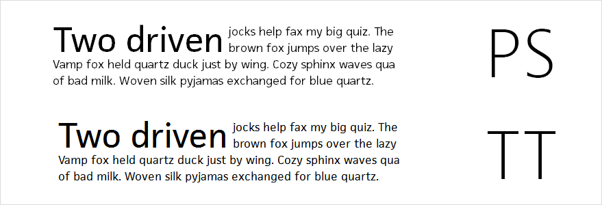
Look at the picture. If TrueType font is much more readable in small size, but on a large scale we see characteristic teeth, then for PostScript font it is exactly the opposite. This happens because for PS and TT browsers choose different screening methods. For PS, the browser applied the usual monochrome anti-aliasing, and the TT was processed by ClearType. So it turns out that TrueType would be preferable for text fonts, and PostScript is better suited for headings and large text.

We also see that not all browsers use DirectWrite yet. So, it is still not in Google Chrome.
05. What else affects the display?
Sometimes it is better to set the rasterization method manually. For example, in browsers with the Webkit engine, you can use the CSS property - webkit-font-smoothing and manually enable regular anti-aliasing instead of sub-pixel, and vice versa. There are also non-trivial ways to make the browser change the method of rasterization, on the habre once offered to use a hack with text-shadow .
We can not forget about the font size (font-size). The shape of the contours, the contrast of strokes and readability can vary greatly for different pins. Set aside the graphic editor and see how the web font looks in the browser, in combat conditions.

Another way to smooth out the imperfections of smoothing is to control color and contrast. In order to weaken the effect of the chromatic contour (when using ClearType, yellow and purple outlines appear at the edges), you can try to weaken the tonal contrast, bringing the background color closer to the text color. Do not get carried away, remember the visually impaired users.

06. Do web fonts need hinting?
Hinting is special instructions that tightly tie abstract font curves to pixels on a monitor. The absolute majority of fonts (including commercial ones) are not hintered, because this is a rather laborious and complicated procedure. For TrueType and PostScript hinting is done differently. If you take a cheap font, the OTF format is safer, because in TT the procedure has remained unchanged since black-and-white screening and is not quite adequate, and for PS the procedure is simpler, and the author has the opportunity to do automatic hinting.

A font without hinting during rasterization becomes zamylenny, and the height of the letters can jump.

On the one hand, the hinting font is quite clear, sharp and uniform, and on the other hand, the shape of the letters is distorted depending on the size, and the intervals can differ from the real ones. Letters strictly obey the pixels.
In Windows, we see, perhaps, the most radical approach: such popular fonts as Tahoma, Verdana, Arial and Georgia were otkhintovany specially for GDI ClearType, and when DirectWrite appeared, it was necessary to perehintovyvat and update the main fonts in the OS set.
Unlike Microsoft, Apple takes the opposite approach, so its operating systems use algorithms that allow it to display any font more or less qualitatively, and hinting is not taken into account at all.
Answering the question: the era of 300 DPI monitors is rapidly approaching, and a huge number of mobile devices already have this resolution, and soon hinting will not be needed at all. But since Windows is still hinting-dependent and oriented to low-resolution monitors, try selecting quality or standard text fonts as text fonts, otherwise the text will be unreadable and difficult to read.
07. @ font-face or cufon?
Strange as it may sound, there are still people who ask themselves this question. It would seem that after browsers began to support the @ font-face attribute, all other font embedding technologies (Cufon, sIFR, Flash) seemed to have become irrelevant. But some sense still remains, such as a way to replace a font with an image, when not vector curves are displayed on the site, but only a print, as the printer prints it on a sheet, or Photoshop displays an unedited JPG. This is permitted by many licenses for regular (desktop) fonts. Some font manufacturers (for example, Adobe) allow embedding (in programs and on the server) desktop font, if it remains protected and cannot be downloaded. If you are not able to buy a separate web license, then you can apply the appropriate sIFR for this, when the font is embedded using flash objects. The disadvantage is that Flash is used, which is not supported by all devices. You can also use Cufon technology (Canvas is used), if the license allows. Of course, in this case the script will be cumbersome, and the selection of the text does not work, but it will work in a hopeless situation.
But the best way is to use @ font-face, it is both more technological and more convenient, moreover, enough experience has been gained to work with it. He has only one drawback: not all manufacturers allow using their fonts on the web.
08. In what formats should the font files be?
Fonts prepared for the introduction (@ font-face) on the site today should be in several formats at once:
TTF or OTF - familiar to us font file, but loaded from the server while viewing the site;
WOFF is an unprotected archive of OTF or TTF source code, perhaps the most important format supported by most popular browsers, and files in WOFF are usually 2–2.5 times lighter than the original ones;
EOT - the TTT OpenType-implemented archive with protection mechanisms is needed to support older Internet Explorer browsers (since IE8, in addition to TrueType curves, PostScript is also supported);
SVG - to support the Safari browser.
09. Can I convert web fonts?

No matter what you say, you can’t just convert the file and keep the original font quality, especially if it was originally in the OpenType format. In the process there is a chance to lose some data embedded in the font file (compiled instructions, additional signs, metrics). You will notice this, when converting a file, it suddenly “grows thin”, especially non-curly, to convert TrueType to PostScript and back.
In addition, the conversion process is almost always contrary to the terms of the license, prohibiting modification. Simply put - this is the same theft. When you drop the files into the converter, be sure that it will not miss them and will give a warning, because the file contains the digital signatures of the manufacturer and the corresponding restrictions on modification.
10. How much should web fonts weigh?
Before displaying the page, the browser must fully download the font files. Maybe you had to see the effect of “font flash” (or FOUT), when for a short moment the standard fonts of the system instead of the exotic fonts have time to flash. Normally, if the TTF (OTF) fits into 100 kb, and WOFF (EOT) at 50 kb. Always think about whether you need to use non-standard fonts at all, even if you use it in one short title, you still have to download the entire font file.
The more perfectionism in design, the smaller the font files can weigh, and try to choose simple shapes. In this sense, the ideal form is an open geometric grotesque with little contrast. To speed up the loading of a font, it can also be useful to include it in a style file using data: uri.
11. How many font styles can I use on the web?
From the point of view of the designer, a lot of styles - that's cool. And indeed, for the headline - Bold, and over there, for the inset - ExtraLight, unnecessary textiles will generally be stuffed and pressed into the Condensed Bold. Here it is - the real wealth and stylistic diversity. But when all this "wealth" begins to transfer to the site, it turns out that everything is terribly slow. And it is better not to even try to open such a site from a mobile device. And also, do not forget that each style is worth some money, and it is likely that the customer will either ask you to find a font synonym, or reduce the number of styles, just not to buy the whole expensive headset. It is normal to use a maximum of 2-3 styles of the same or different typefaces.
12. Do I need to restrict the character set?
The answer to this question depends on what the site is and how it will be used. Restrictions can be useful, because it is possible to significantly reduce the size of files. Sometimes, because of ignorance, developers load heavy font files with its full character set onto the site, and it’s good if there are no hieroglyphs (note that the Arial Unicode font contains most of the characters from the Unicode table weighs 22 mb).
The easiest way for those who make English-language websites is that they don’t need to load additional characters at all, it’s enough for Basic Latin (or ASCII). If you use the font only for headings in Russian + blotches of English, then ASCII (Basic Latin) and 64 characters of the Russian alphabet will be enough for you, it is not necessary to load the Cyrillic Extended set of 420 characters. It is a completely different story, if your site is multilingual, in this case, in order to avoid incorrect display of characters, you should try to cover all the languages used.

13. Can I use font clones?

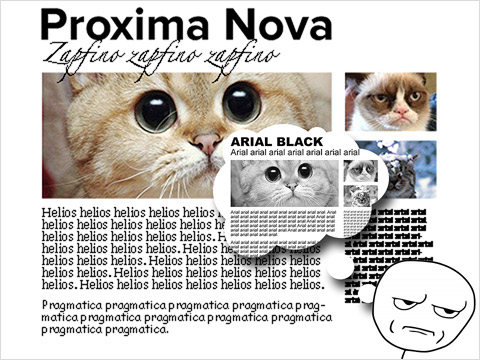
It happens that it is either too expensive or even impossible to buy the original font, then it will be appropriate to choose a font synonym (clone). Of course, one should not expect tremendous quality from them, even if they are made by, say, a well-known Russian firm. It’s all very bad when you hit upon the opus of an anonymous author who decided to try himself on a new field, beware of such fonts. Here are examples of clones (the original is indicated in parentheses): FreeSet (Frutiger), Pragmatica and Helios (Helvetica). Please note that letter shapes may vary. A large number of clones are in the directory of font synonyms Paratype .
14. How to test a font?
Designers, do not get used to seeing fonts only through Photoshop windows, graphic editors use their text smoothing techniques, and you can be deceived by a beautiful picture. It is much more useful to learn how to test and watch them in browsers. If there is a demo page, be sure to ensure that all sorts of artifacts and spikes do not come out when rendering. There is also a tool like Typecast , where you can check many fonts, and then show the page to the client. For those who choose a new font for a ready-made site - an indispensable service for you Web Fonts Previewer , you can test any font on a lively working site, as if you had already implemented it.
15. I have a font on my computer, can I use it on the site?

First, a little about stealing. I know a lot of designers who have thousands of fonts on their computers, whose origin is unknown to anyone. As a rule, just downloaded from the Internet. But for some reason no one thinks that the creation of good fonts is months, and sometimes years of serious work! But not only therefore it is impossible to use fake, it is not clear where the fonts are taken from, but because you can face serious difficulties at the development stage.
If you want to embed in the site the font that comes with the operating system, you can do this only by rasterizing or using it in images. If you really need to embed, then you will need to buy a separate license, just like regular fonts (both Georgia and Tahoma are commercially available ).
16. How to buy a web font?
When you “buy a font” is the closest thing to buying software, when you get a license to use it, and not the rights to the program file itself. It turns out that a legally compiled font file is a program. Modification and modification, if the license does not permit it, is considered a violation of copyright.
A convenient way to buy fonts is through font catalogs (Fonts.com, MyFonts, Ascender, Typekit). You can view, compare and select one of the available use cases, pay by card. For companies, the easiest way is to directly contact the studio or to provide a purchase of fonts to the customer.
And maybe it is generally better not to spend money on the font? There are many great free fonts that are not inferior to paid ones!
17. What are the licenses?
There are different types of font licenses, and with the advent of web fonts, their diversity has only increased. In real life, each company sets the rules for the game itself, and a font license may contain signs of various others. We will be interested in typical.
A typical commercial license restricts use on a certain number of devices and allows the distribution of works created using a font. It can be magazines, newspapers, leaflets, business cards, screened images of the font - all together you can call them prints. This license is not suitable for film, television, web and embedding in applications and programs, such rights need to be redeemed separately.
There are also specific licenses, for example: a license with exclusive rights. In this case, the company redeems all rights from type designers, and even the author of the font has no right to use it anywhere. It is especially surprising when such fonts are on torrents, or when they are used by some third-party designers.
Free licenses (public domain) - the author of the font allows free distribution, with the condition of specifying his own name (Creative Commons) or without it (for example, OFL, GPL, Apache 2.0). This type of license even allows commercial use, except for sales and paid distribution. Examples: PT Sans, Opensans, Droid. Sometimes a font modification (GPL) is allowed, but the modification you create automatically inherits the same license (that is, you can also be forked). Freedom implies that it can be used on any media, incl. and web.
Free for non-commercial use - that is, you can use it in all cases when you do not earn on it. Let's say for learning, hobbies and community projects. Sometimes, manufacturers allow use for designers, in the hope that a happy client designer will then buy a commercial version of the font.
You can read more about licenses in the article by Emil Yakupov. Practical and legal aspects of font business .
18. What is the difference of licenses for web fonts?
Web licenses are our favorite, they are either a supplement to the main license, or are given separately. Regulates a special case - the use of fonts on sites. As a rule, the most important restriction is on the number of page views. For example, 10 thousand per month, 100 thousand or 1 million. That is, the more people visit your site, the more you pay for the license. There are unlimited options when you pay for the font 1 time, but they are many times more expensive. Probably, they wondered if someone was watching the number of views? Most often not. But do not forget that a huge number of counters track the traffic of your site and, having caused the suspicion of the seller, you can lose the license.
And yet, a separate web license does not allow use on ordinary computers. Sometimes a web license is issued free of charge, that is, at the same time you buy a desktop font, you get the right to use its web version. But this is still rare, the vast majority of manufacturers require an additional fee.
After the purchase, you get special files that are embedded in the site (TTF, OTF, WOFF, EOT), and some fonts do not allow to place these files on the site in an unprotected form, since theoretically third parties can get the font files themselves. The third option is that you use a special web service of the font manufacturer, such as Adobe’s Typekit, and pay a subscription fee.
19. Where to get good web fonts?
Catalog of free fonts from the Google
Fontsquirrel - known converter and web font directory
MyFonts - huge fonts store with convenient payment system
Fonts.com - the main competitor MyFonts
Typekit - service for the rental of fonts as Adobe
Typecast - above the store with the testing service
PS is another useful resource who advised ilyaerin , WebFont.ru
20. What else can you read about web fonts?
:
. Licensing.
Tim Brown. Type rendering on the web
Tim Brown. CSS properties that affect type rendering
Tim Brown. Type rendering: operating systems
Tim Ahrens. A Closer Look At Font Rendering
Tim Ahrens (Typekit). A closer look at TrueType hinting
The Benefits Of OpenType/CFF Over TrueType
, - ADV/web-engineering
Source: https://habr.com/ru/post/184864/
All Articles