Integration of mobile application design. Part 2: iOS, Windows Phone

This is the second part of the report, which I read at Dribbble Meetup 2013 in Moscow. In the first part, I described in detail my design integration process for the Android platform. This part is about the integration of design for iOS and Windows Phone, and I also briefly mention Samsung Bada 2.0. Next - a lot of pictures.
')
iOS
Go to iOS. It's all much easier than in Android. The integration process will be dealt with by the example of the iPhone, but everything described below is successfully used on the iPad.

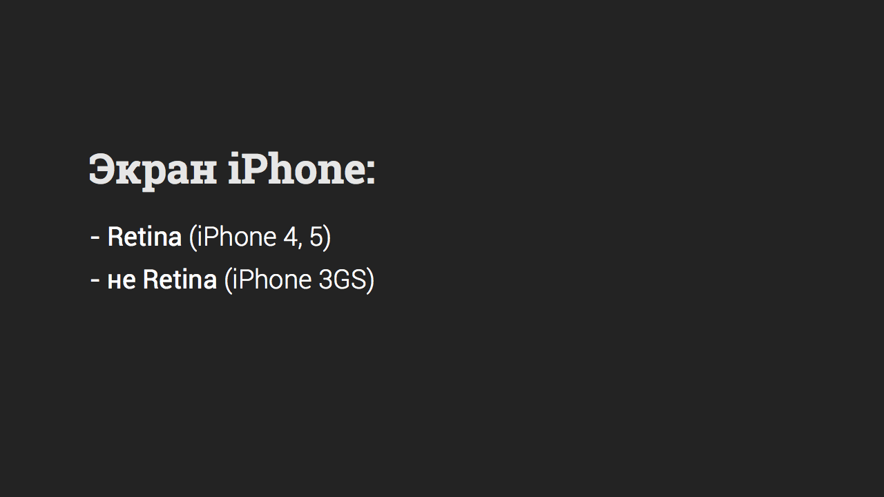
As we all know, the iPhone has only two types of screen: “Retina”, “not Retina”.
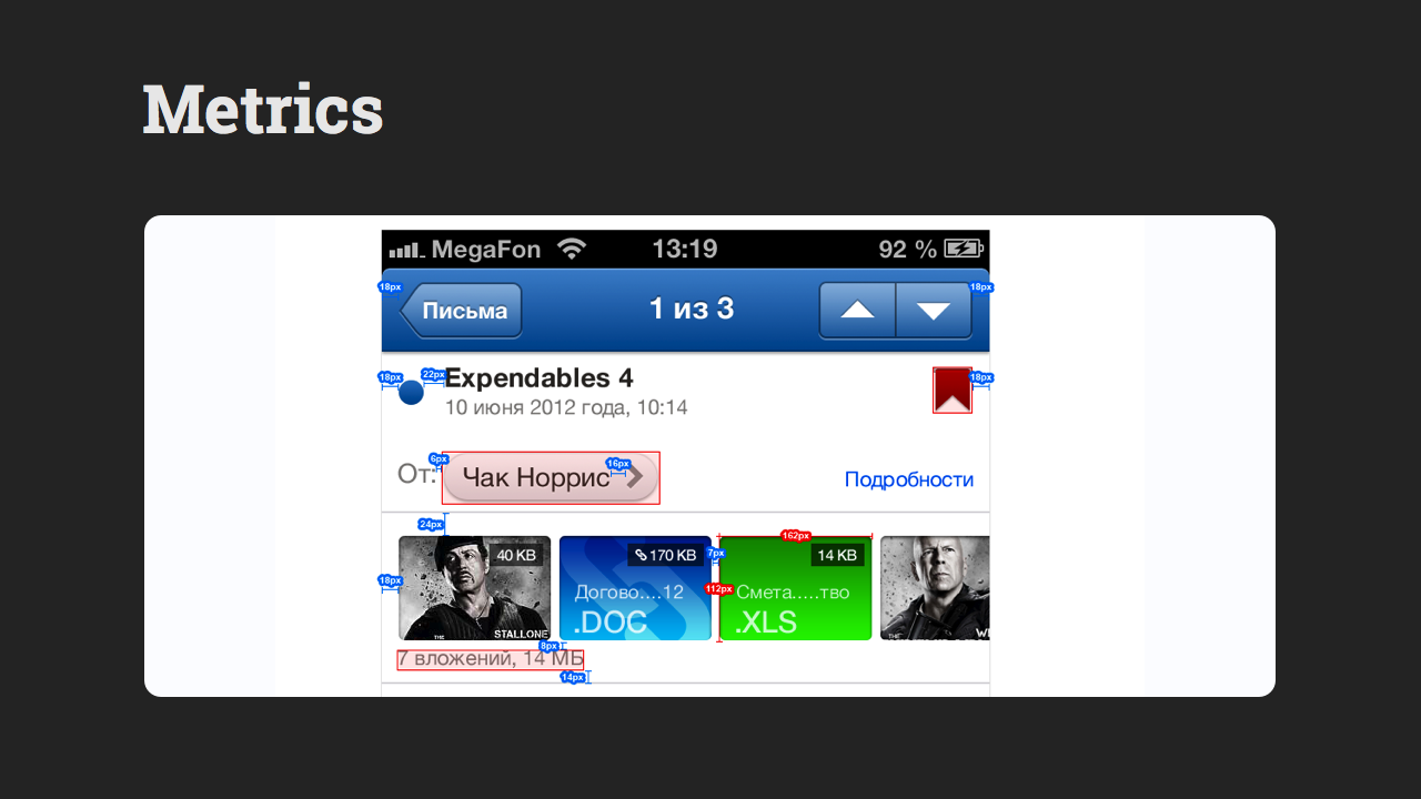
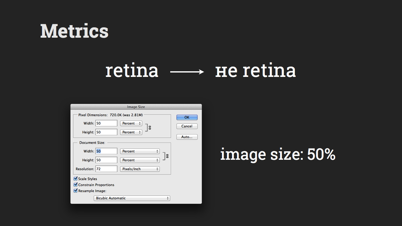
Metrics
So, the Metrics folder should contain everything the same as for Android: the size of the elements, the indents between them and from the edge of the screen, the colors of the plain elements (for example, separators), etc. It is important to note (and remember!) That colors for programmers should be specified in decimal format . That is, for example, RGB (255, 255, 255), and not in hexadecimal - #FFFFFF.
Dimensions for programmers should be specified for non-Retina screens.
And since psd layouts are made for Retina here, then we go to Image for correct work, click Image Size, and set the value to 50%.
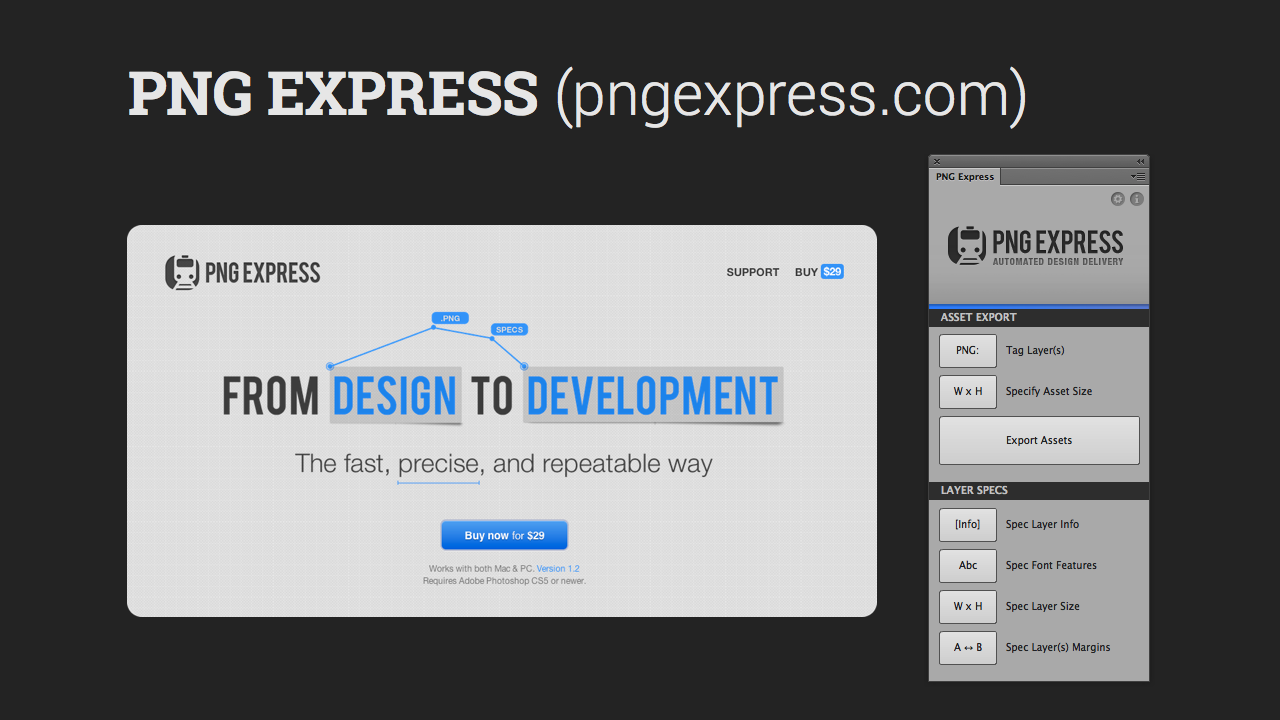
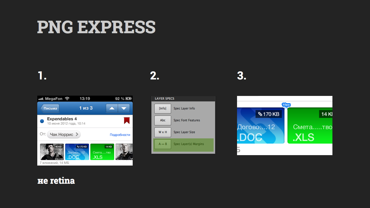
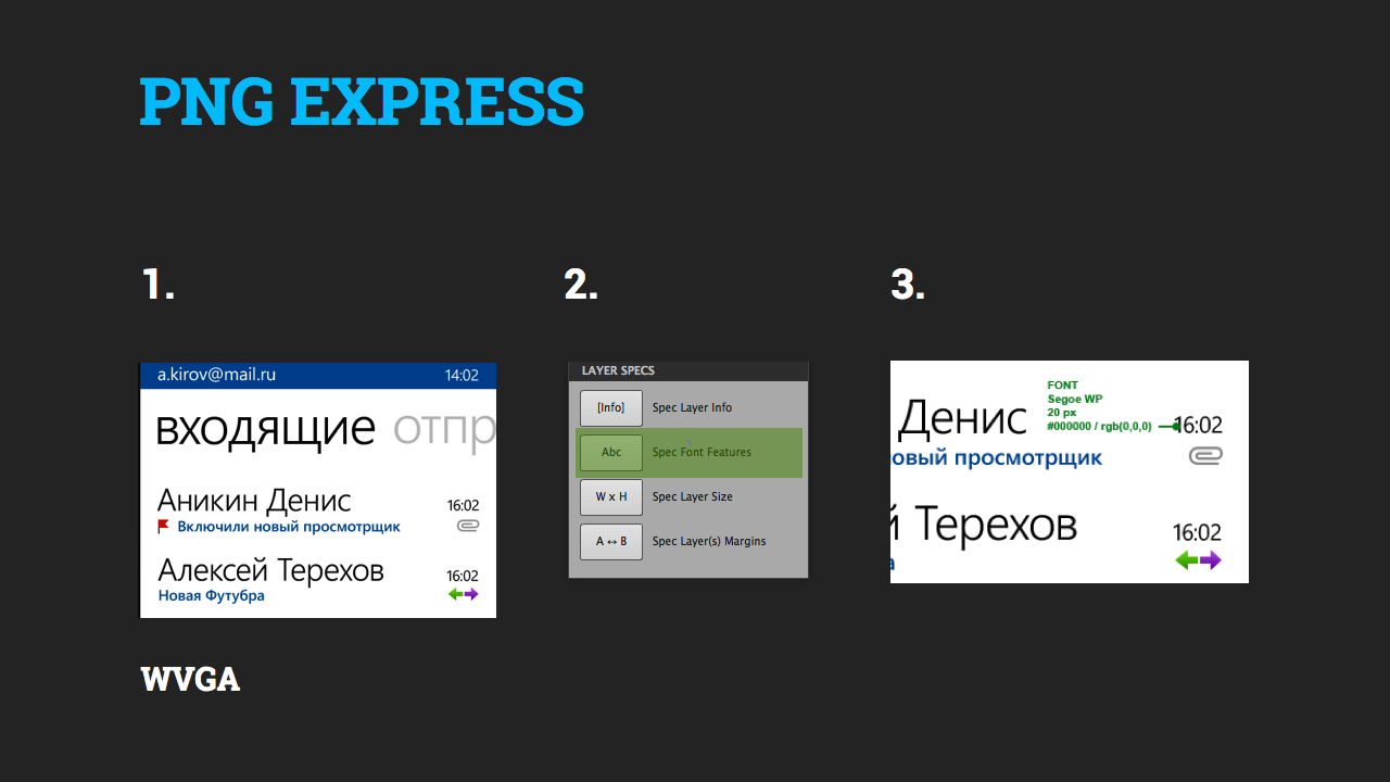
You can proceed, so to speak, to the “dimensioning” of the layout. We will do this with the help of PNG EXPRESS already familiar to us ($ 29, for PS CS5 / 6). Everything is similar to Android.
Example
Step 1. Suppose we need to specify the size between the attachment pictures.
Step 2. Simply select these two layers in Photoshop and in PNG EXPRESS click Margins.
Step 3. The extension itself will draw the dimensions. If the size is wrong, our designer cant, edit it as a regular Photoshop text layer.
Fonts
The Fonts folder should contain files with everything related to fonts: size, color, style, Photoshop styles, etc.
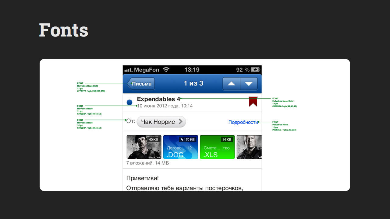
Example
Step 1. If we need to specify the font for the link “Details”, then
Step 2. Select this layer in Photoshop and in PNG EXPRESS click Spec Font Features.
Step 3. Got a full description of the font.
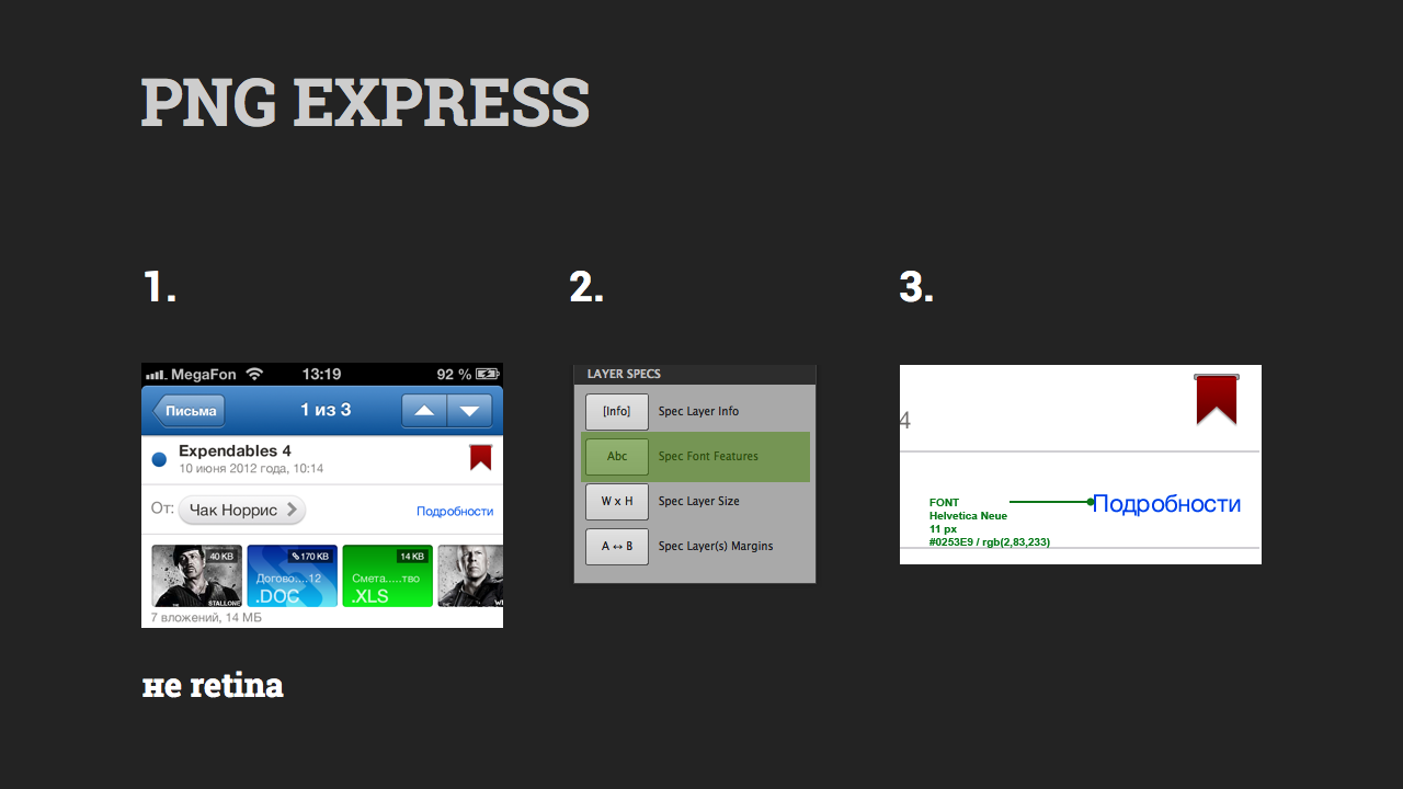
Again saved a lot of time.
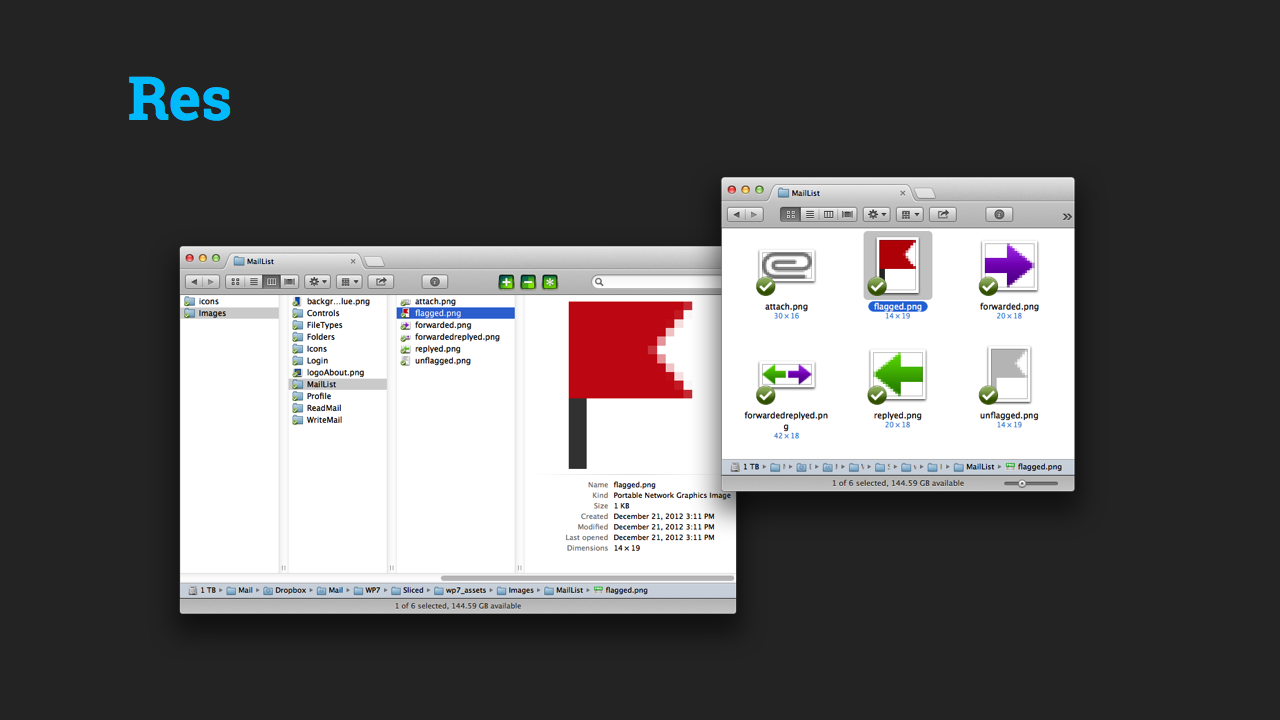
Resources
The Res folder should contain graphics resources for your application. For iPhone, everything goes in one folder:
Retina files are marked with @ 2x, i.e. excel @ 2x.png , not Retina - just excel.png
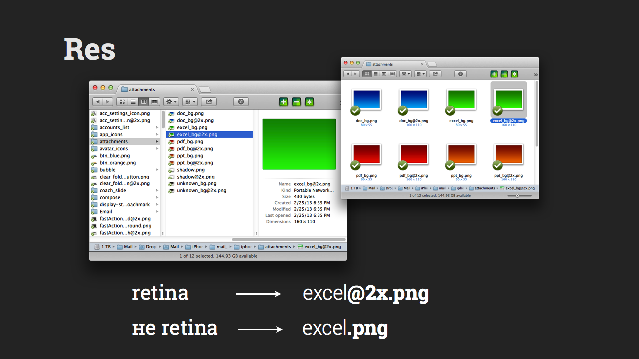
Again we use the Cut & Slice me extension (free, for PS CS6).
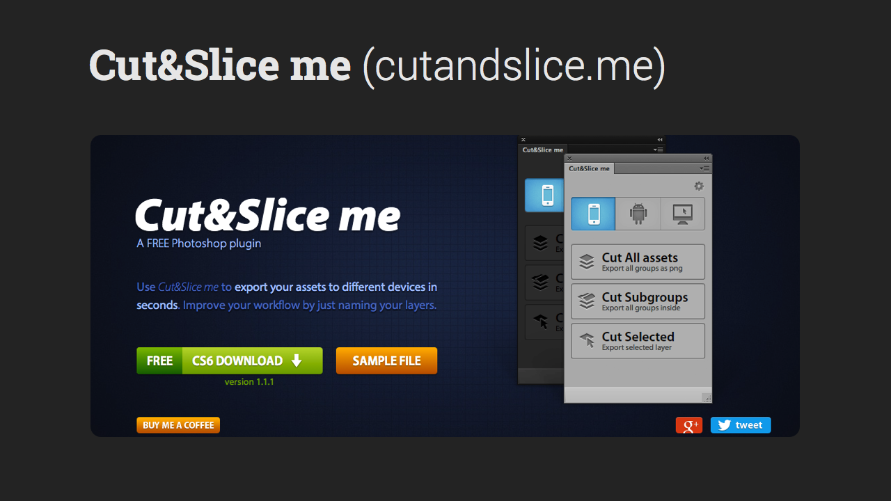
The original psd layout should be for Retina screens.
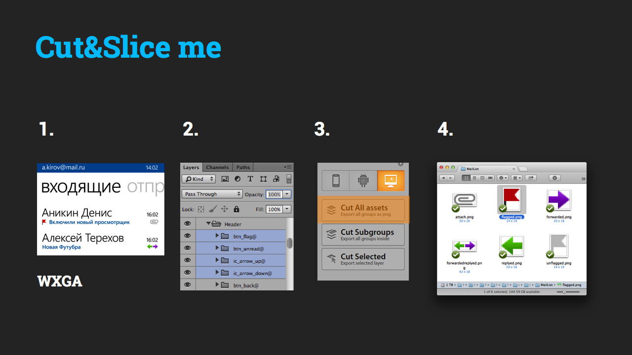
Example
Step 1. We need to cut icons for our application.
Step 2. Reorganize the layers: we place each icon in the folder with @ at the end of its name. Thus, the script determines that this folder should be cut.
Step 3. Go to the iPhone tab, click Cut all assets.
Step 4. Expansion automatically cuts our icons with the necessary names for Retina and not Retina.
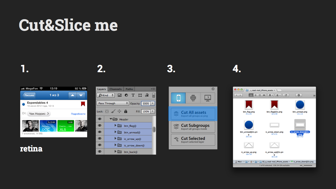
In order to avoid the problem of “soap” pixels, all elements must have an even size.
Samsung bada
The third in the list of platforms - Samsung Bada. Quite popular platform in Russia. But recently, Samsung has killed this mobile operating system, officially announcing its closure. Therefore, the Bada can either be good or not ...
So, Windows Phone.
Windows phone
Here, the situation repeats iOS, so just run through the process again.
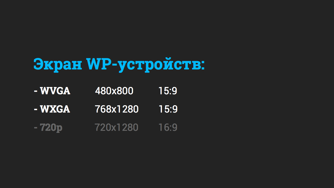
On WP, we have two main types of screen: W V GA, W X GA.
Metrics
Dimensions for programmers must be specified for W V GA-screens.
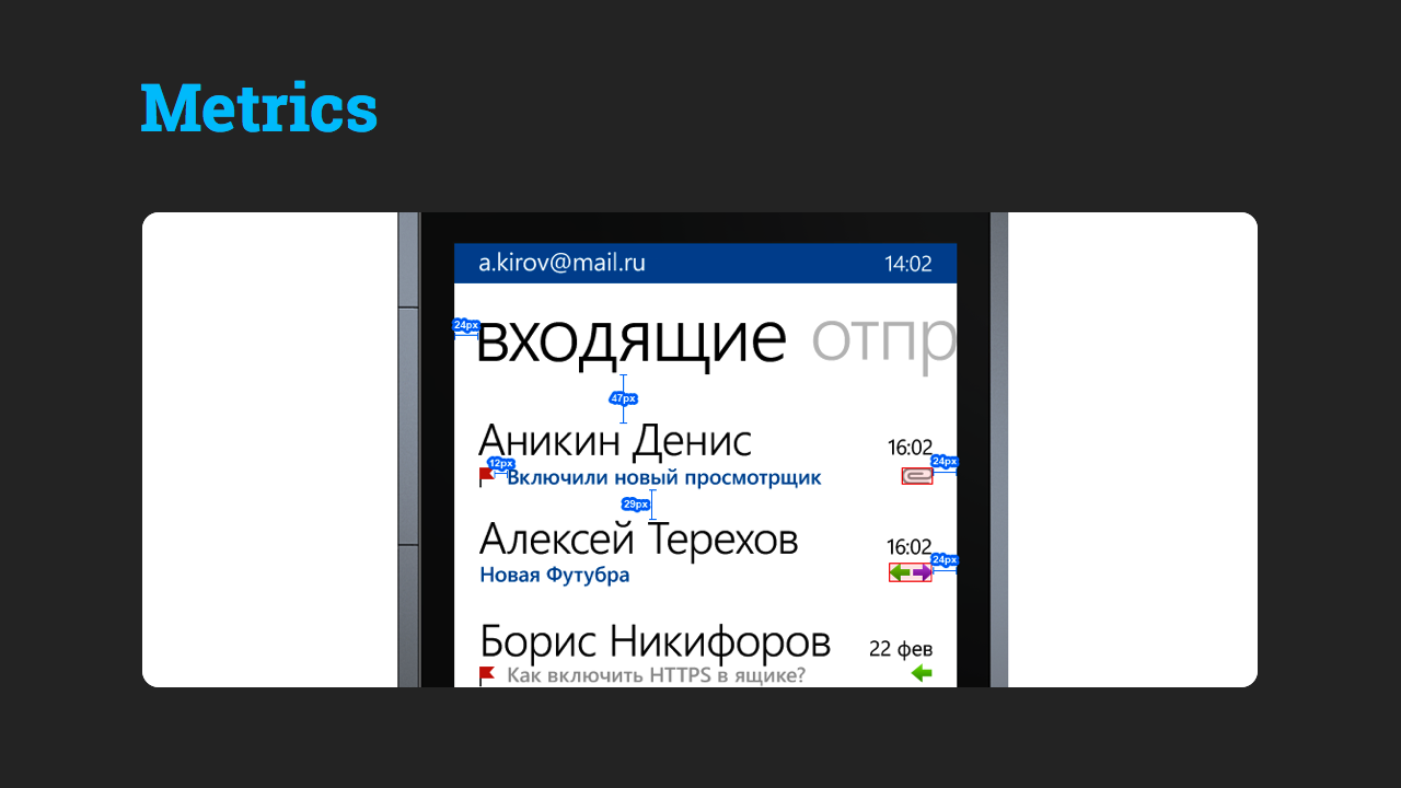
With the help of PNG EXPRESS, we “dimension” the layout.
Example

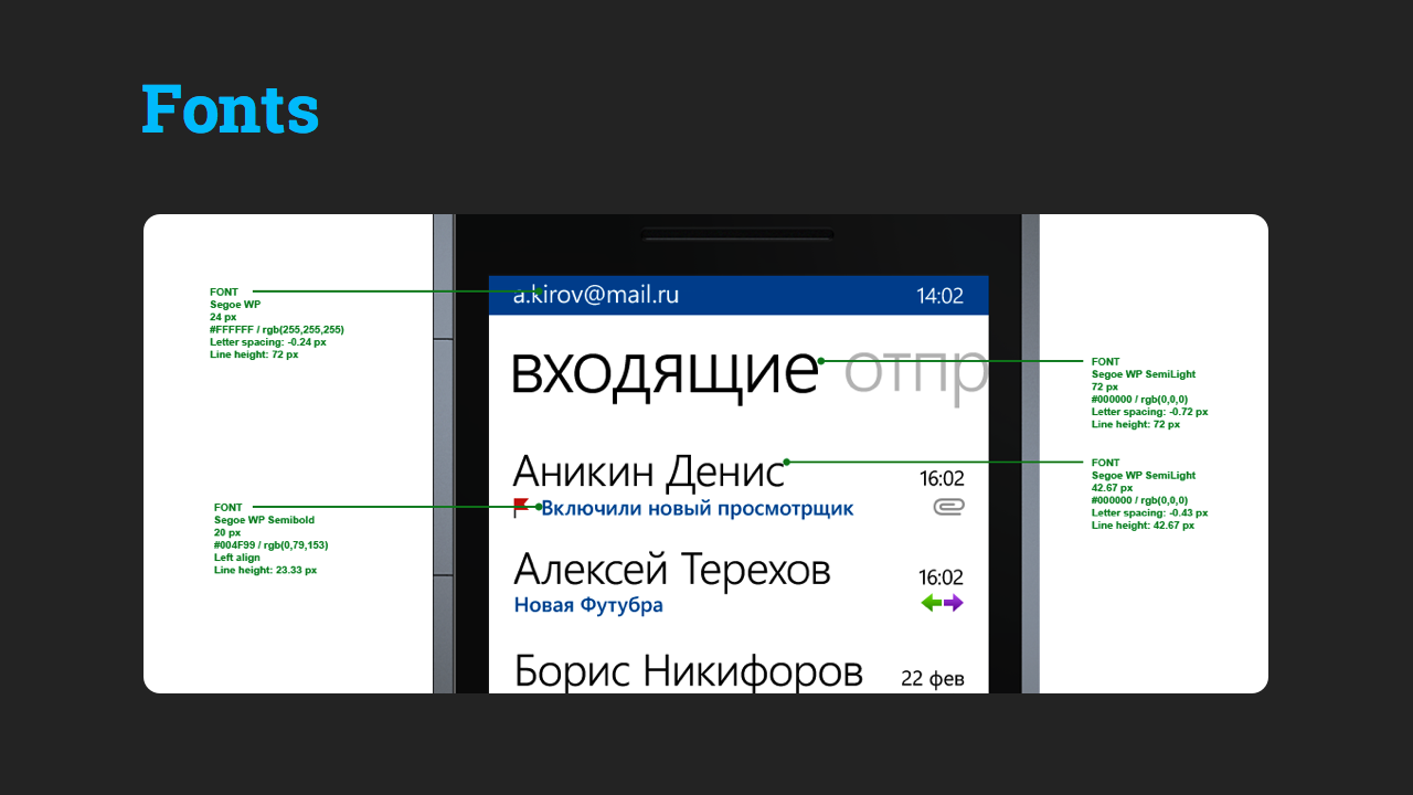
Fonts
Example
Resources
Unfortunately, Cut & Slice me does not support Windows Phone. Therefore, you have to manually resize for two resolutions.
First we make graphics for W V GA. To do this in Cut & Slice, go to the third tab, which cuts the layers of 1 to 1. In essence, replaces the mass command Save for Web.
Then we translate W V GA to W X GA, set the Image Size to 160%.
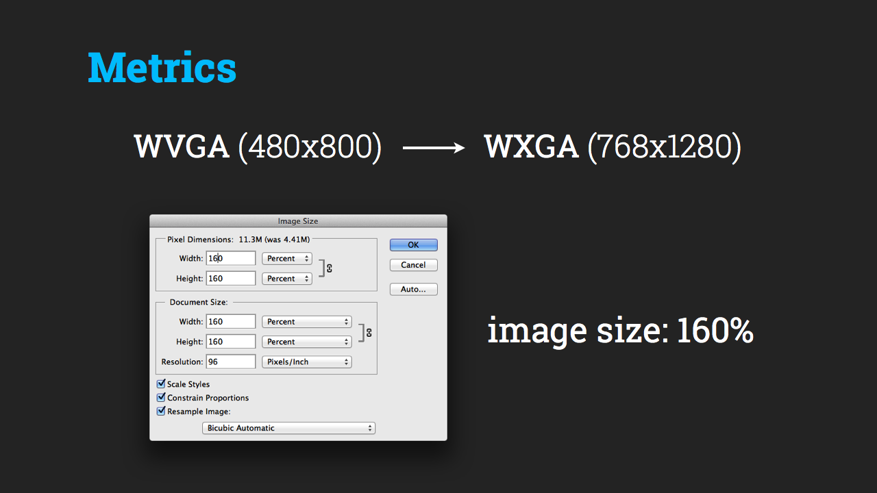
Repeat the process.
All, now we have mastered the integration of design for all major mobile platforms.
Source: https://habr.com/ru/post/184654/
All Articles