About the features of the location of controls in mobile applications
I greet the audience Habr. Reading articles about the development of application design, including non-mobile, this work was not so much for the programmer, but for “people specially trained”, decided to touch on the topic of building the interface of mobile applications. Consider several ToDo applications designed to make it easier for the user to own a smartphone.
Looking at these photos, I have a question: “Do you really hold the phone when you use it with one hand?”
I myself have a 4.5-inch screen phone and it is frankly inconvenient for me to reach the top of the screen. If the top-down gesture is still more or less dexterous, then you have to shift the button at the top of the screen. phone in hand. So they also put up-and-down buttons next to each other! After all, ToDo applications mean not only adding tasks for a day / week / month / year in a relaxed atmosphere. They also have a task quickly, perhaps with one hand ( if the other is busy with luggage), enter the task and, p about the possibility, set up a reminder.
In this photo, the phone, which, thanks to the new trends of manufacturers, has a 4.7 "screen. A man holds it as I hold it, and I hope most people. I tried to highlight convenient working areas for the right and left hands. Now look up at the photo Above. I personally do not observe any useful function in these zones. It seems to me that the fashion to locate the controls at the top of the screen came from IOS. BUT, then the screen of the Iphone was 3.5 "! Yes, it is possible that the application in the picture looks beautiful, but it is inconvenient to use it.
Of course, not all applications are. The same Catch developers have found a fairly simple and at the same time effective solution for adding tasks. But most seem to be living in 2011, when the screen with a diagonal of 4.3 "was at the flagships.
It would seem to use Catch! Honestly, I tried, but the process of using some kind of ... not smooth or something, some clues and complaints about the “usability” of the product as a whole constantly emerge. It turns out the relationship with the product has not developed for other reasons.
With such uncomplicated methods, without thinking through the interface, many developers sift out a substantial percentage of people whose mobility and finger length are not like those of a musician.
Of course, the successful arrangement of controls on the screen, in itself, does not guarantee the developer that the whole mass of people will immediately leave the competitor and go to him, but this is a huge step forward. After all, the interface is the beginning, this is the one that is “greeted by clothes”, from which the familiarity and lapping of the user to the product begins. And maybe your application will be filtered by the user for some other reasons, but the convenience of the program will always be in one of the first places.
Of course, you can just buy a phone with a smaller screen "under your fingers", but the producers somehow only support the flagships, and thus force buyers to take them. The screens of the flagships are growing by leaps and bounds, losing thickness. And fingers do not grow!
Any do
Todoist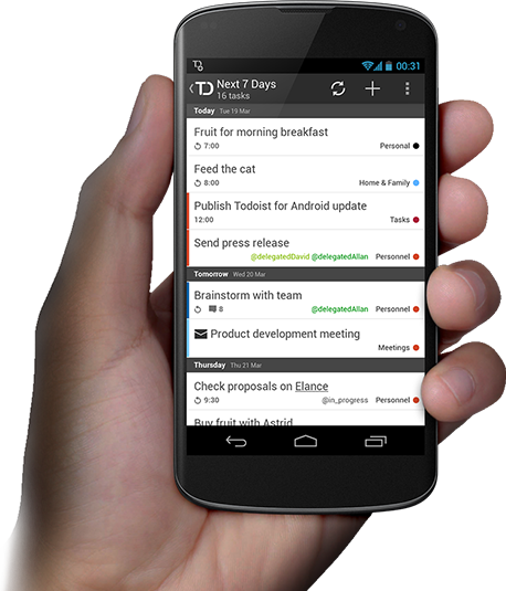
Tasklist
Wunderlist
Looking at these photos, I have a question: “Do you really hold the phone when you use it with one hand?”
I myself have a 4.5-inch screen phone and it is frankly inconvenient for me to reach the top of the screen. If the top-down gesture is still more or less dexterous, then you have to shift the button at the top of the screen. phone in hand. So they also put up-and-down buttons next to each other! After all, ToDo applications mean not only adding tasks for a day / week / month / year in a relaxed atmosphere. They also have a task quickly, perhaps with one hand ( if the other is busy with luggage), enter the task and, p about the possibility, set up a reminder.
Modern smartphone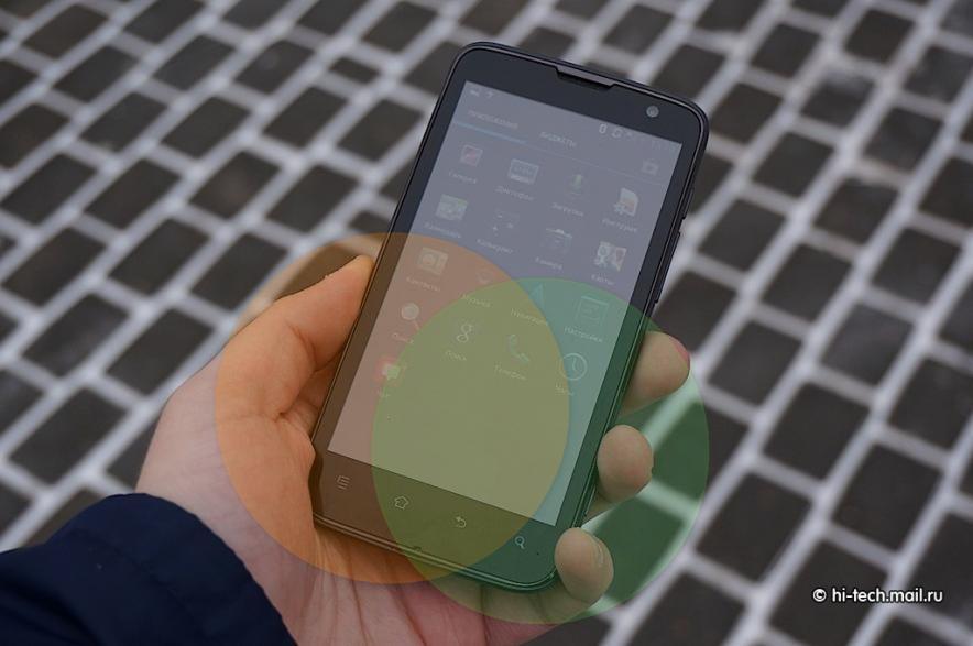
In this photo, the phone, which, thanks to the new trends of manufacturers, has a 4.7 "screen. A man holds it as I hold it, and I hope most people. I tried to highlight convenient working areas for the right and left hands. Now look up at the photo Above. I personally do not observe any useful function in these zones. It seems to me that the fashion to locate the controls at the top of the screen came from IOS. BUT, then the screen of the Iphone was 3.5 "! Yes, it is possible that the application in the picture looks beautiful, but it is inconvenient to use it.
Catch: IOS and Android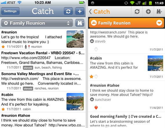
The early version of the Catch interface for Android is not much different from the version for IOS.
The early version of the Catch interface for Android is not much different from the version for IOS.
Of course, not all applications are. The same Catch developers have found a fairly simple and at the same time effective solution for adding tasks. But most seem to be living in 2011, when the screen with a diagonal of 4.3 "was at the flagships.
Catch
It would seem to use Catch! Honestly, I tried, but the process of using some kind of ... not smooth or something, some clues and complaints about the “usability” of the product as a whole constantly emerge. It turns out the relationship with the product has not developed for other reasons.
With such uncomplicated methods, without thinking through the interface, many developers sift out a substantial percentage of people whose mobility and finger length are not like those of a musician.
Of course, the successful arrangement of controls on the screen, in itself, does not guarantee the developer that the whole mass of people will immediately leave the competitor and go to him, but this is a huge step forward. After all, the interface is the beginning, this is the one that is “greeted by clothes”, from which the familiarity and lapping of the user to the product begins. And maybe your application will be filtered by the user for some other reasons, but the convenience of the program will always be in one of the first places.
Of course, you can just buy a phone with a smaller screen "under your fingers", but the producers somehow only support the flagships, and thus force buyers to take them. The screens of the flagships are growing by leaps and bounds, losing thickness. And fingers do not grow!
')
Source: https://habr.com/ru/post/184596/
All Articles