Model-View in QML. Part One: Predefined Component Views
In this part of my series of articles about Model-View in QML, we will begin to look at views and begin with those that are made on the basis of ready-made components.
Model-View in QML:
Representation in MVC provides data mapping. This is the part of the program that determines how the data will look and, ultimately, what the user will see.
I have already said that the implementation of a view in Qt has one significant feature: the view here is combined with control. Why is this done? In the graphical interface, often the same elements are responsible for displaying data and changing it. As an example, we can recall the tabular processor. Each cell not only displays the data but is also responsible for changing them, and therefore performs the functions not only of presentation, but also of control. So the decision to combine them in one element is quite logical.
')
This suggests the idea that when combining two functions in one element, we lose flexibility and the presentation itself becomes more complicated. Not really. In order to provide the possibility of customizing the presentation of data and processing user input, the concept of a delegate is introduced.
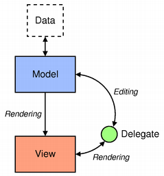
A delegate is a component that displays data from a single model element and provides for its editing. Instances of the delegate are created for each element of the model and are located in the view, which is essentially a container. It is the delegate who decides how the data of a particular element should be displayed and edited, and this gives us great opportunities for customization. In the above example with a tabular processor, we can simply make it so that the data in each cell is edited using a spinbox or a drop-down list.
In QML, everything is exactly the same except that the delegate may not edit data for all models (and the ability to edit model data is not specified in the documentation).
To summarize, a view in QML has three tasks:
We will begin acquaintance with ideas from, in my opinion, the necessary and sought-after presentation itself, and we will consider in detail some of the things typical of most of these components.
This component allows us to display objects in a list. Navigation issues are also resolved - the component handles mouse and keyboard events, allowing you to scroll through elements with gestures using a mouse or touch screen, using a mouse scroll, as well as from the keyboard.
ListView (and most other views as well) have a notion of a current item. Which current item is determined by the currentIndex property and the current item itself is accessible through the currentItem property. Also, each delegate has an associated ListView.isCurrentItem property that will be true if this item is current. This gives us the opportunity to highlight the current element so that it appears somehow differently.
In addition, the ListView itself can highlight the current item. To do this, you need a component that will perform the backlight. In the simplest case, it will be a colored rectangle. When you change the current item, the ListView will move the highlight (this behavior can be customized).
Consider all this with a simple example.
We use the ListView.isCurrentItem attached property in the delegate to determine if this item is current and in the current item we display an asterisk (*) besides the text. To click on an element to set itself current we need access to the ListView object and we get it using the ListView.view property. Here this property is used for demonstration, it is not necessary to use it, and you can directly access this object, since this object is already in the scope of the delegate. But if the delegate is defined in another qml-file, then in the scope of the delegate there will no longer be a ListView object and this property will allow access to it.
A simple colored rectangle is used as the backlight. Its size is set by ListView and it moves it itself behind the current element.
By running the program, we can change the current item by clicking the mouse and see how the backlight moves behind it:
Another important point regarding the visibility of attached properties in the delegate. In contrast to model data, attached properties are valid only in the delegate itself, but not in its child objects. Those. we cannot use ListView.isCurrentItem in the Text element. This feature may not be obvious, given that the attached properties themselves are visible in the object and there will be no errors when referring to them. For example, you can replace the handler with a click in MouseArea with the following:
And on all elements it will return false, even on the current one.
To access from the child elements of the delegate, you must either explicitly specify the scope of the delegate through its id, i.e. listDelegate.ListView.isCurrentItem or use an intermediate property for this, as was done in the example using the isCurrent property.
The first method is good because it does not create an additional property. The second method is worth using if the delegate implementation is placed in a separate QML file. For example, if you put it into the ListDelegate.qml file, you can write this code:
This allows you to not bind the delegate implementation to the ListView and change the display (for example, on Repeater + Column) without changes in the delegate code.
In ListView, you can specify additional items that will be displayed at the beginning and at the end of all items. To do this, use the properties header and footer. Let's add the previous example with these elements:
As a result, we get something like this:
In ListView, elements can be divided into groups and each group can have its own title. To do this, choose which role from the model will be used for splitting into groups and define a delegate for the titles of these groups.
Consider this in the following example.
We specify the type field for splitting into groups. Accordingly, all elements with the same value of this field are combined into one group. You can make it so that the group combines elements whose first letter matches (for example, for the address book). To do this, the section.criteria property needs to be set to the value of the ViewSection.FirstCharacter.
Running the program, we get the following result:
It is worth noting that the ListView does not create instances of the delegate for all elements of the model, but only for those that are visible. When moving the visible part (i.e., when paging), the ListView creates them on the fly, when they have to get into the visible area and deletes, when they have to disappear from this area. It follows that delegates should be as light as possible, otherwise the scrolling of the elements will slow down.
ListView can create items not only for the area that is visible now, but with some margin. Objects in this area are created asynchronously, so as not to interfere with the operation of the interface. Accordingly, the greater the number of such elements, the smaller the probability of scrolling lags, but memory consumption is also increasing. The number of such elements is controlled by a special parameter - cacheBuffer. It determines the size of the area in pixels beyond the border of the visible part for which objects will be created. To understand how many additional objects will be created, you need to divide this value by the height (or width, if the ListView is horizontal), and multiply this value by two, since there are two such areas.
I, having worked for some time on the fifth version of Qt, somehow gathered and launched my project on the fourth version. And he noticed that scrolling elements noticeably lags. Having dug a little deeper, I noticed that in Qt 5.0, the default cacheBuffer is 320, and in Qt 4.8 - 0. Increasing the cache size, scrolling became noticeably smoother. But even so noticeably, that in the fifth version we did a good job of acceleration - as compared with the fourth version, the difference is visible with the naked eye.
The default buffer size can be different on different platforms, so you should not rely on the numbers I indicated here, I just cited them for example.
Based on the foregoing, we can draw two conclusions regarding performance:
This component is similar to ListView, but allows you to arrange the elements of the grid. The grid is filled line by line from left to right (by default). Accordingly, if there are fewer elements, there will be empty spaces at the end.
The first example slightly adapted for use by the GridView:
Unlike ListView, there is no spacing property here. Instead, the cell size is set using cellHeight and cellWidth. If the element is smaller than the cell, there will be indents. If more - will fit on each other :)
The result of the program:
In addition to the possibility of the location of the elements of the grid and the lack of spacing, this component has another difference from the ListView - there are no sections. Otherwise, everything said about ListView is also true for the GridView.
Some data is most conveniently displayed as a table. Qt uses the QTableView class for this. In QML, with the advent of the QtQuick Controls module, a ready-made component for creating a tabular representation of data has appeared.
I must say that the model should still be in the form of a list. One model element corresponds to a row in a table, and data for columns is taken from element roles. Pass the real C ++ table model there, i.e. the derived class from QAbstractTableModel does not work - only the first column will be visible.
In the definition of the TableView object, we specify which columns should be and which role from the model data should be used for each column.
Consider an example.
One important feature regarding the model data in the delegate. The appearance of components from QtQuick Controls is configured using styles from QtQuick Controls Styles and, by default, the style is used so that the components look native for the current platform. In essence, these components combine the model and the presentation, and the style is the delegate. Data from the model in style is available using the styleData property. In the TableView, a delegate is used in a similar way with styles and data in it is accessible through the styleData object.
As a result, we get the following table:
In this example, the itemDelegate property is used, which sets the delegate for all cells in the table. What to do if for some column you need to display data a little differently? You can set a delegate for this particular column when it is defined in a TableViewColumn. For example, in the first column, our color is displayed with text. Let's make it so that instead the cell is painted over with this color.
As a result, we get colored cells:
There is also a delegate for the entire row (the rowDelegate property). With it, you can customize things like column height, background color, etc.
TableView allows you to make tables in pure QML and display them so that they look like native, but at the same time allowing you to flexibly customize their appearance. Such a component can be very useful for creating desktop programs with QML interface. But despite the ability to look like a desktop component, the TableView does not work with pure tabular models and can only process data presented in the form of a list.
QML, focused primarily on the implementation of the presentation, has for this powerful, and at the same time quite simple tools. Among the standard components there are ready-made views that take up a significant part of the work, and the user only needs to provide the model and the delegate.
In many representations, delegates are created and deleted on the fly, so for good performance and, therefore, smooth animation, you should try to make them as light as possible.
Model-View in QML:
- Model-View in QML. Part zero, introductory
- Model-View in QML. Part One: Predefined Component Views
- Model-View in QML. Part Two: Custom Submissions
- Model-View in QML. Part Three: Models in QML and JavaScript
- Model-View in QML. Part Four: C ++ Models
Representation in MVC provides data mapping. This is the part of the program that determines how the data will look and, ultimately, what the user will see.
I have already said that the implementation of a view in Qt has one significant feature: the view here is combined with control. Why is this done? In the graphical interface, often the same elements are responsible for displaying data and changing it. As an example, we can recall the tabular processor. Each cell not only displays the data but is also responsible for changing them, and therefore performs the functions not only of presentation, but also of control. So the decision to combine them in one element is quite logical.
')
This suggests the idea that when combining two functions in one element, we lose flexibility and the presentation itself becomes more complicated. Not really. In order to provide the possibility of customizing the presentation of data and processing user input, the concept of a delegate is introduced.
A delegate is a component that displays data from a single model element and provides for its editing. Instances of the delegate are created for each element of the model and are located in the view, which is essentially a container. It is the delegate who decides how the data of a particular element should be displayed and edited, and this gives us great opportunities for customization. In the above example with a tabular processor, we can simply make it so that the data in each cell is edited using a spinbox or a drop-down list.
In QML, everything is exactly the same except that the delegate may not edit data for all models (and the ability to edit model data is not specified in the documentation).
To summarize, a view in QML has three tasks:
- create delegate instances for each item in the model;
- arrange these elements as required;
- provide navigation through the elements.
1. ListView
We will begin acquaintance with ideas from, in my opinion, the necessary and sought-after presentation itself, and we will consider in detail some of the things typical of most of these components.
This component allows us to display objects in a list. Navigation issues are also resolved - the component handles mouse and keyboard events, allowing you to scroll through elements with gestures using a mouse or touch screen, using a mouse scroll, as well as from the keyboard.
1) simple examples of use
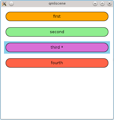
ListView (and most other views as well) have a notion of a current item. Which current item is determined by the currentIndex property and the current item itself is accessible through the currentItem property. Also, each delegate has an associated ListView.isCurrentItem property that will be true if this item is current. This gives us the opportunity to highlight the current element so that it appears somehow differently.
In addition, the ListView itself can highlight the current item. To do this, you need a component that will perform the backlight. In the simplest case, it will be a colored rectangle. When you change the current item, the ListView will move the highlight (this behavior can be customized).
Consider all this with a simple example.
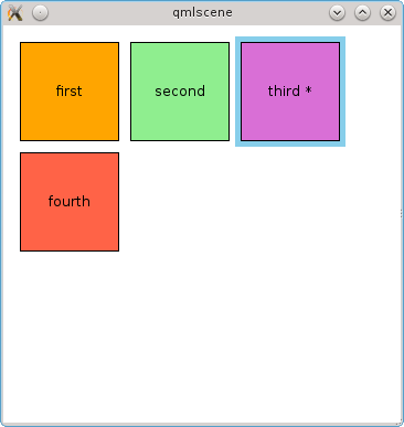
import QtQuick 2.0 Rectangle { width: 360 height: 360 ListModel { id: dataModel ListElement { color: "orange" text: "first" } ListElement { color: "lightgreen" text: "second" } ListElement { color: "orchid" text: "third" } ListElement { color: "tomato" text: "fourth" } } ListView { id: view anchors.margins: 10 anchors.fill: parent spacing: 10 model: dataModel clip: true highlight: Rectangle { color: "skyblue" } highlightFollowsCurrentItem: true delegate: Item { id: listDelegate property var view: ListView.view property var isCurrent: ListView.isCurrentItem width: view.width height: 40 Rectangle { anchors.margins: 5 anchors.fill: parent radius: height / 2 color: model.color border { color: "black" width: 1 } Text { anchors.centerIn: parent renderType: Text.NativeRendering text: "%1%2".arg(model.text).arg(isCurrent ? " *" : "") } MouseArea { anchors.fill: parent onClicked: view.currentIndex = model.index } } } } } We use the ListView.isCurrentItem attached property in the delegate to determine if this item is current and in the current item we display an asterisk (*) besides the text. To click on an element to set itself current we need access to the ListView object and we get it using the ListView.view property. Here this property is used for demonstration, it is not necessary to use it, and you can directly access this object, since this object is already in the scope of the delegate. But if the delegate is defined in another qml-file, then in the scope of the delegate there will no longer be a ListView object and this property will allow access to it.
A simple colored rectangle is used as the backlight. Its size is set by ListView and it moves it itself behind the current element.
By running the program, we can change the current item by clicking the mouse and see how the backlight moves behind it:
Another important point regarding the visibility of attached properties in the delegate. In contrast to model data, attached properties are valid only in the delegate itself, but not in its child objects. Those. we cannot use ListView.isCurrentItem in the Text element. This feature may not be obvious, given that the attached properties themselves are visible in the object and there will be no errors when referring to them. For example, you can replace the handler with a click in MouseArea with the following:
onClicked: console.log(ListView.isCurrentItem) And on all elements it will return false, even on the current one.
To access from the child elements of the delegate, you must either explicitly specify the scope of the delegate through its id, i.e. listDelegate.ListView.isCurrentItem or use an intermediate property for this, as was done in the example using the isCurrent property.
The first method is good because it does not create an additional property. The second method is worth using if the delegate implementation is placed in a separate QML file. For example, if you put it into the ListDelegate.qml file, you can write this code:
ListView { delegate: ListDelegate { isCurrent: ListView.isCurrentItem } } This allows you to not bind the delegate implementation to the ListView and change the display (for example, on Repeater + Column) without changes in the delegate code.
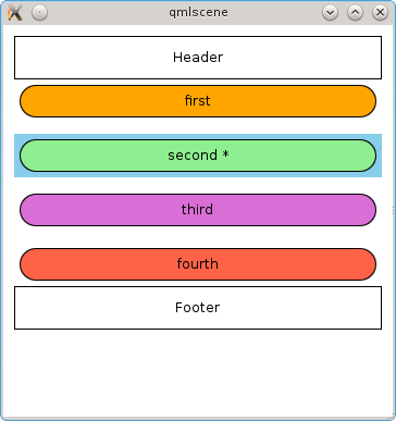
In ListView, you can specify additional items that will be displayed at the beginning and at the end of all items. To do this, use the properties header and footer. Let's add the previous example with these elements:
header: Rectangle { width: view.width height: 40 border { color: "black" width: 1 } Text { anchors.centerIn: parent renderType: Text.NativeRendering text: "Header" } } footer: Rectangle { width: view.width height: 40 border { color: "black" width: 1 } Text { anchors.centerIn: parent renderType: Text.NativeRendering text: "Footer" } } As a result, we get something like this:
2) sections
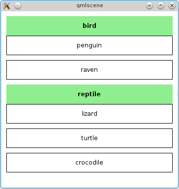
In ListView, elements can be divided into groups and each group can have its own title. To do this, choose which role from the model will be used for splitting into groups and define a delegate for the titles of these groups.
Consider this in the following example.
import QtQuick 2.0 Rectangle { width: 360 height: 360 ListModel { id: dataModel ListElement { type: "bird" text: "penguin" } ListElement { type: "bird" text: "raven" } ListElement { type: "reptile" text: "lizard" } ListElement { type: "reptile" text: "turtle" } ListElement { type: "reptile" text: "crocodile" } } ListView { id: view anchors.margins: 10 anchors.fill: parent spacing: 10 model: dataModel clip: true section.property: "type" section.delegate: Rectangle { width: view.width height: 40 color: "lightgreen" Text { anchors.centerIn: parent renderType: Text.NativeRendering font.bold: true text: section } } delegate: Rectangle { width: view.width height: 40 border { color: "black" width: 1 } Text { anchors.centerIn: parent renderType: Text.NativeRendering text: model.text } } } } We specify the type field for splitting into groups. Accordingly, all elements with the same value of this field are combined into one group. You can make it so that the group combines elements whose first letter matches (for example, for the address book). To do this, the section.criteria property needs to be set to the value of the ViewSection.FirstCharacter.
Running the program, we get the following result:
3) About performance
It is worth noting that the ListView does not create instances of the delegate for all elements of the model, but only for those that are visible. When moving the visible part (i.e., when paging), the ListView creates them on the fly, when they have to get into the visible area and deletes, when they have to disappear from this area. It follows that delegates should be as light as possible, otherwise the scrolling of the elements will slow down.
ListView can create items not only for the area that is visible now, but with some margin. Objects in this area are created asynchronously, so as not to interfere with the operation of the interface. Accordingly, the greater the number of such elements, the smaller the probability of scrolling lags, but memory consumption is also increasing. The number of such elements is controlled by a special parameter - cacheBuffer. It determines the size of the area in pixels beyond the border of the visible part for which objects will be created. To understand how many additional objects will be created, you need to divide this value by the height (or width, if the ListView is horizontal), and multiply this value by two, since there are two such areas.
I, having worked for some time on the fifth version of Qt, somehow gathered and launched my project on the fourth version. And he noticed that scrolling elements noticeably lags. Having dug a little deeper, I noticed that in Qt 5.0, the default cacheBuffer is 320, and in Qt 4.8 - 0. Increasing the cache size, scrolling became noticeably smoother. But even so noticeably, that in the fifth version we did a good job of acceleration - as compared with the fourth version, the difference is visible with the naked eye.
The default buffer size can be different on different platforms, so you should not rely on the numbers I indicated here, I just cited them for example.
Based on the foregoing, we can draw two conclusions regarding performance:
- you need to create as easy delegates as possible with the minimum number of bindings (especially for complex JavaScript expressions in bindings);
- If there are problems with scrolling, you should experiment with the size of the buffer.
2. GridView
This component is similar to ListView, but allows you to arrange the elements of the grid. The grid is filled line by line from left to right (by default). Accordingly, if there are fewer elements, there will be empty spaces at the end.
The first example slightly adapted for use by the GridView:
import QtQuick 2.0 Rectangle { width: 360 height: 360 ListModel { id: dataModel ListElement { color: "orange" text: "first" } ListElement { color: "lightgreen" text: "second" } ListElement { color: "orchid" text: "third" } ListElement { color: "tomato" text: "fourth" } } GridView { id: view anchors.margins: 10 anchors.fill: parent cellHeight: 100 cellWidth: cellHeight model: dataModel clip: true highlight: Rectangle { color: "skyblue" } delegate: Item { property var view: GridView.view property var isCurrent: GridView.isCurrentItem height: view.cellHeight width: view.cellWidth Rectangle { anchors.margins: 5 anchors.fill: parent color: model.color border { color: "black" width: 1 } Text { anchors.centerIn: parent renderType: Text.NativeRendering text: "%1%2".arg(model.text).arg(isCurrent ? " *" : "") } MouseArea { anchors.fill: parent onClicked: view.currentIndex = model.index } } } } } Unlike ListView, there is no spacing property here. Instead, the cell size is set using cellHeight and cellWidth. If the element is smaller than the cell, there will be indents. If more - will fit on each other :)
The result of the program:
In addition to the possibility of the location of the elements of the grid and the lack of spacing, this component has another difference from the ListView - there are no sections. Otherwise, everything said about ListView is also true for the GridView.
3. TableView
Some data is most conveniently displayed as a table. Qt uses the QTableView class for this. In QML, with the advent of the QtQuick Controls module, a ready-made component for creating a tabular representation of data has appeared.
I must say that the model should still be in the form of a list. One model element corresponds to a row in a table, and data for columns is taken from element roles. Pass the real C ++ table model there, i.e. the derived class from QAbstractTableModel does not work - only the first column will be visible.
In the definition of the TableView object, we specify which columns should be and which role from the model data should be used for each column.
Consider an example.
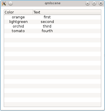
import QtQuick 2.0 import QtQuick.Controls 1.0 Rectangle { width: 360 height: 360 ListModel { id: dataModel ListElement { color: "orange" text: "first" } ListElement { color: "lightgreen" text: "second" } ListElement { color: "orchid" text: "third" } ListElement { color: "tomato" text: "fourth" } } TableView { id: view anchors.margins: 10 anchors.fill: parent model: dataModel clip: true TableViewColumn { width: 100 title: "Color" role: "color" } TableViewColumn { width: 100 title: "Text" role: "text" } itemDelegate: Item { Text { anchors.centerIn: parent renderType: Text.NativeRendering text: styleData.value } } } } One important feature regarding the model data in the delegate. The appearance of components from QtQuick Controls is configured using styles from QtQuick Controls Styles and, by default, the style is used so that the components look native for the current platform. In essence, these components combine the model and the presentation, and the style is the delegate. Data from the model in style is available using the styleData property. In the TableView, a delegate is used in a similar way with styles and data in it is accessible through the styleData object.
As a result, we get the following table:
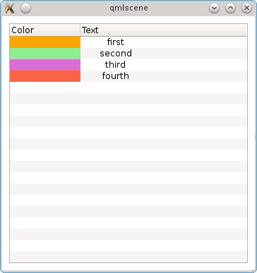
In this example, the itemDelegate property is used, which sets the delegate for all cells in the table. What to do if for some column you need to display data a little differently? You can set a delegate for this particular column when it is defined in a TableViewColumn. For example, in the first column, our color is displayed with text. Let's make it so that instead the cell is painted over with this color.
TableViewColumn { width: 100 title: "Color" role: "color" delegate: Rectangle { color: styleData.value } } As a result, we get colored cells:
There is also a delegate for the entire row (the rowDelegate property). With it, you can customize things like column height, background color, etc.
TableView allows you to make tables in pure QML and display them so that they look like native, but at the same time allowing you to flexibly customize their appearance. Such a component can be very useful for creating desktop programs with QML interface. But despite the ability to look like a desktop component, the TableView does not work with pure tabular models and can only process data presented in the form of a list.
findings
QML, focused primarily on the implementation of the presentation, has for this powerful, and at the same time quite simple tools. Among the standard components there are ready-made views that take up a significant part of the work, and the user only needs to provide the model and the delegate.
In many representations, delegates are created and deleted on the fly, so for good performance and, therefore, smooth animation, you should try to make them as light as possible.
Source: https://habr.com/ru/post/184416/
All Articles