Beautiful CSS3 menu
A little less than a year ago, Snickersmix published an article " Menu with a smooth color inversion. " This article describes a menu made in javascript. A day earlier, he showed me the site on which he made this menu, and I, as a fan of NoScript , was indignant: “This menu can be made in CSS!”
Of course, I lost my temper, because you can make a similar menu, and not just that. However, an ordinary user, especially one who is not in the know, will not notice the difference. Including I did not immediately understand the chips of this menu. Although I am a fan of all sorts of small details and nuances when creating something, because of these small details and nuances a general impression about the project is built.
')
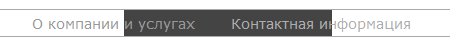
So, I suggest the implementation of a similar menu on CSS3.
So that at once you, dear reader, see the differences, I will bring the final demo of the menu on CSS3 and the demo of the menu from Snickersmix on JS
Now I will try to briefly describe the process of creating
HTML
1) The display inline-block menu, so there should be no spaces and line breaks between tags
2) The last menu item with the class slide will be a moving plate. I was looking for a way to do before / after pseudo-element, but I did not find it.
Option 1
I wrote this option fairly quickly - here the fixed width of the elements.
This and other menus use CSS3 transition animation.
I assigned this animation to any (all) actions / changes over the list items (li, a).
Now it was necessary to make the element move with the class slide . For this, I set this element position: absolute , not forgetting its parent (ul) to set position: relative , so that the slide is positioned relative to the menu, not the page. Thus, we can move it through the menu using left or right .
But how to make move? In the first version, I made an absolute miscalculation of each element in pixels, i.e. Received dimensions and coordinates. And with the help of the selector of generalized related elements, I made the slide move on hover.
It seems to work, but terribly uncomfortable:
- It is necessary to constantly calculate the elements if they change
- There is a bug - if the fonts do not pass, then the whole menu collapses
Option 2
Variant with background animation
The menu was made and shown by Snickersmix . And after I had my eyes open. It turns out that he has a trick in "smooth color inversion". Then I began to look for solutions, but at the moment I did not find it, but the menu itself was made.
Option 1a
The search began, and the version “one and a half” was born. It turned out a little embellishment
I was hoping that I could try to implement it somehow through svg matrix filters, but unfortunately nothing happened ( Option 3 )
And an attempt to make before / after pseudo-elements, instead of the additional element slide , but also not successfully. We are waiting for CSS4 and the ability to contact the parent. ( Option 4 )
All these events took place a little less than a year ago. Then the above voiced options were created. But in these implementations there is a small joint: on Linux systems that do not have Windows fonts, the menu breaks down. But at that time it was too lazy to edit, because it was still not planned to be used anywhere, and for the implementation of the working version there were a little bit of edits, so all this work was carefully put on the mezzanine to collect dust.
Almost a year has passed since then, and I decided to fix the menu, and at the same time write an article.
And so, meet, the final fifth version of this menu.
In general, nothing fundamentally new has appeared. The only difference is that the sizes are indicated in percents, which saves us from the problem with fonts, and at the same time makes it possible to insert the menu into a rubber or adaptive layout.
Also in the fifth version were added fixes for IE6-9. Of course, they will not be animation, but the menu is quite edible.
So that's it. Everything is pretty easy and simple.
If anyone comes up with another implementation option, I will be glad to see and, I think, not only me.
Thank you for reading to the end!
Of course, I lost my temper, because you can make a similar menu, and not just that. However, an ordinary user, especially one who is not in the know, will not notice the difference. Including I did not immediately understand the chips of this menu. Although I am a fan of all sorts of small details and nuances when creating something, because of these small details and nuances a general impression about the project is built.
')
So, I suggest the implementation of a similar menu on CSS3.
So that at once you, dear reader, see the differences, I will bring the final demo of the menu on CSS3 and the demo of the menu from Snickersmix on JS
Now I will try to briefly describe the process of creating
HTML
<nav id="a"> <ul><li><a href="#"></a></li><li><a href="#"> </a></li><li class="active"><a href="#"> </a></li><li><a href="#"></a></li><li class="slide"></li></ul> </nav> 1) The display inline-block menu, so there should be no spaces and line breaks between tags
2) The last menu item with the class slide will be a moving plate. I was looking for a way to do before / after pseudo-element, but I did not find it.
Option 1
I wrote this option fairly quickly - here the fixed width of the elements.
This and other menus use CSS3 transition animation.
transition: all 0.5s ease-in-out; I assigned this animation to any (all) actions / changes over the list items (li, a).
Now it was necessary to make the element move with the class slide . For this, I set this element position: absolute , not forgetting its parent (ul) to set position: relative , so that the slide is positioned relative to the menu, not the page. Thus, we can move it through the menu using left or right .
But how to make move? In the first version, I made an absolute miscalculation of each element in pixels, i.e. Received dimensions and coordinates. And with the help of the selector of generalized related elements, I made the slide move on hover.
.active:nth-child(1) ~ li.slide, /* */ li:hover:nth-child(1) ~ li.slide { /* */ left: 0; width: 147px; } .active:nth-child(2) ~ li.slide, li:hover:nth-child(2) ~ li.slide { left: 147px; width: 241px; } .active:nth-child(3) ~ li.slide, li:hover:nth-child(3) ~ li.slide { left: 388px; width: 257px; } .active:nth-child(4) ~ li.slide, li:hover:nth-child(4) ~ li.slide { left: 645px; width: 156px; } It seems to work, but terribly uncomfortable:
- It is necessary to constantly calculate the elements if they change
- There is a bug - if the fonts do not pass, then the whole menu collapses
Option 2
Variant with background animation
The menu was made and shown by Snickersmix . And after I had my eyes open. It turns out that he has a trick in "smooth color inversion". Then I began to look for solutions, but at the moment I did not find it, but the menu itself was made.
Option 1a
The search began, and the version “one and a half” was born. It turned out a little embellishment
I was hoping that I could try to implement it somehow through svg matrix filters, but unfortunately nothing happened ( Option 3 )
And an attempt to make before / after pseudo-elements, instead of the additional element slide , but also not successfully. We are waiting for CSS4 and the ability to contact the parent. ( Option 4 )
All these events took place a little less than a year ago. Then the above voiced options were created. But in these implementations there is a small joint: on Linux systems that do not have Windows fonts, the menu breaks down. But at that time it was too lazy to edit, because it was still not planned to be used anywhere, and for the implementation of the working version there were a little bit of edits, so all this work was carefully put on the mezzanine to collect dust.
Almost a year has passed since then, and I decided to fix the menu, and at the same time write an article.
And so, meet, the final fifth version of this menu.
In general, nothing fundamentally new has appeared. The only difference is that the sizes are indicated in percents, which saves us from the problem with fonts, and at the same time makes it possible to insert the menu into a rubber or adaptive layout.
Also in the fifth version were added fixes for IE6-9. Of course, they will not be animation, but the menu is quite edible.
So that's it. Everything is pretty easy and simple.
If anyone comes up with another implementation option, I will be glad to see and, I think, not only me.
Thank you for reading to the end!
Source: https://habr.com/ru/post/183848/
All Articles