What lives mobile islet
Hello. My name is Max Degterev (I don’t have an account here, so here’s my twitter: @suprMax and maxdegterev.name site). We recently launched a new cool version of a mobile site. I'll tell you about him now.
')
Working on a new mobile site, I already had the experience of developing the old. At the time of writing these letters, it should still be available at http://ostrovok.ru/m , but I don’t know how long it will work. The old site worked very simply. He lives in a common OTA project and, accordingly, uses the same Back-end (Django), standard media generator, simple HTML templates (server-side), some JavaScipt templates on underscore, SCSS, and regular JavaScipt. This is all we have already passed a hundred times, it's all very boring.
Before developing a new site, I had the following tasks:
So historically, the site is always designed with the design of a mobile application, this design is tested on it. Like this experiment. And here the design was completely new, flat (iOS 7 style, fashionable!). Therefore, do not be surprised that the colors, and indeed the appearance, are slightly different from the rest of the Islet.
I did not want to depend on OTA, like last time. Plus, I worked on the site alone, and learning Django is not at all interesting, but constantly distracting one of the OTA developers is not comme il faut. So I decided to think like a pirate. The island already has a mobile API that covers most of what is required from the mobile site. By combining this with parts of the API from the desktop site, you can get quite a good solution. This is the approach I have chosen.
I took NodeJS as a basis. Always wanted to try. The framework was ExpressJS, which is very similar to Sinatra (hello Ruby!). I needed to conduct user sessions, so I can't do without Redis. For less typing, instead of using regular JavaScript, I used CoffeeScript. For templates, I took Jade, and for CSS, Stylus. We need a trendy website, and on mobile phones you can get a big gain in speed, so everyone decided to do a singlepage. At first I thought to take SpineJS, but his community is not very big, so the classic bundle: Backbone, Lo-Dash, Zepto.

I had to tinker with the assembly of assets. I want everything to be cool, automatically, like the rails. The asset-rack turned out to be a quite good solution, which completely takes over the tasks of building JS, CSS and even Jade templates. Of course, he knows how to precompile the templates, puts them in the specified namespace (I chose app.templates). He also takes on the headache of precompiling CoffeeScript and the system requirements, providing 2 options: Snockets (Sprockets) and the classic NodeJS version with RequireJS (Browserify). Nevertheless, NodeJS is a new thing, so there were problems:
Subtotal:
The task in order to be fashionable, youth and fun, I, thus, decided.
A little bit about how the project is organized. A picture is worth a thousand words:
I will not go into the details of the development on Backbone and CoffeeScript. Thousands of articles have been written about this. I will speak very briefly about the structure of the modules, and in general, as I did, so as not to go crazy.
Obviously, Backbone has collections, models, and views. I put them in different folders. I also needed modules. These are things that are needed all the time, regardless of which page I'm on. They are loaded at the start of the application and are no longer unloaded when the view, for example, is destroyed immediately upon switching to another page. Like some models / collections (for example, a list of bookings when you click "Exit"). My modules are modal windows, sidebars, information about the physical location of the phone, etc.
As a result, this is how my main app.coffee file looks like:
Here is helpers.js, which is also used on the Back-end. Connecting folders through require_tree makes it possible not to think about connecting individual files, but this does not guarantee the boot order, so you will need to make additional require if you need to inherit from some other class (for example, view). I didn’t have such a task, but by the time Backbone.history.start is called, all the modules and components of the system are already in memory, so the router can do its job, call view, etc.
Now a little about Stylus. It is very similar to SASS, but has a number of additional features. Obviously, it is identation based. This makes it possible not to bother about the intersection of class names. But we all saw this a long time ago, it is boring. How about being able to use the value of any CSS rule as a variable?
Not bad. What about vendor prefixes support? We live in a terrible world of competition. Fortunately, it looks like this:
Stylus itself looks at what mixin it has, and if it finds properties with the same name, it performs a replacement. Accordingly, if you no longer need to fill in vendor prefixes, for example, for border-radius (which, by the way, is true), you can simply delete one mixin and not even open other files. I'm not sure, but it seems to me that this can save about a hundred times in the future. Well, a small example of how my app.styl looks like:
It turns out that mixed imports are not a problem either. The only flaw at the moment is that in order to call mixin, arguments are needed. Without this, the call did not work for me, although it could already be fixed. I have written this:
For styling, I always use only classes to defeat the evil specificity of the Sith. To give a 146% guarantee that the classes would never intersect, I used the SMACSS approach. Well, or not at all, but very similar. Everything that relates to the structure of the page, and does not change during transitions, I did with the prefix l (layout). I also have p (page), blocks inside b (block) pages, etc. If an element is nested in an element, its class will inherit in itself a part of the name of the parent. Or it may not inherit, but the root class is always inherited. Here is an example of styles:
For this markup:
If you combine this approach with the nesting of rules in Stylus (the main thing is not to re-invest, otherwise there will be a sausage at the exit), then there should be no intersections.
About Jade especially nothing to tell. Quite a template engine. Who used Slim - the same. Supports include and partial. Helpers I just threw a file through the common helpers.js. Although you can register your own. For example, there is already: markdown.
If about how to develop the development, everything is clear almost immediately, here's how to deploy deploys have to think a little. 9999999 solutions like capistrano were already invented by the railmen, but for the node so far I could not find anything workable.
I decided on a test VPS to lay out just cake with the instruction: `cake deploy`, which literally does the following:
To roll out to production, Denis Orlikhin set up a debian package collector. Works teampics, runs tests before building. Very cool. I will not tell the details, but maybe he will somehow tell.
Speaking of tests. I usually do not write tests, because haha-frontend and, in principle, very lazy. But here integration tests were really needed, since you have to depend on a third-party API. I wrote tests for mocha + chaiJS. Very simple and convenient, and most importantly a good reporter:
(I sit in the park, so the Internet is not super fast and tests have fallen down)
And indeed, it would be time to talk about the most important thing. What differences have I noticed when developing for mobile devices in comparison with full-featured browsers. Given that we have to work under several platforms at once, and each platform has its own problems, it turns out not so easy. I can say that the situation has not changed much since last year. The main problem is Android phones of the 2nd version, and early 4-ki. With iOS, everything is much simpler, although they have miracles.
First, more about the problems. Some quite obvious, but I repeat. Some were new to me, which means they could be useful to someone else.
In general, the approach to development is similar to working with large sites on very weak machines. We must not forget that the battery and processor / memory resources are very limited, and always check the performance on real devices. Of course, this is only my personal experience, based on the devices that were available for testing. I could be wrong on some points.
Development bonuses for mobile, as opposed to desktop browsers:
We live in a great time to be a developer. An idea has come to my mind, and you will easily implement it. The rest of the people live with ideas that for them are not to be realized. So write the code and use NodeJS - quickly, conveniently, asynchronously, youth. And more time will be left to come up with ideas, rather than typing letters.
I think I will post something from the site on GitHub, it will be possible to see and use it at my place. Good luck to everyone, potsy.
')
Main basis
Working on a new mobile site, I already had the experience of developing the old. At the time of writing these letters, it should still be available at http://ostrovok.ru/m , but I don’t know how long it will work. The old site worked very simply. He lives in a common OTA project and, accordingly, uses the same Back-end (Django), standard media generator, simple HTML templates (server-side), some JavaScipt templates on underscore, SCSS, and regular JavaScipt. This is all we have already passed a hundred times, it's all very boring.
Before developing a new site, I had the following tasks:
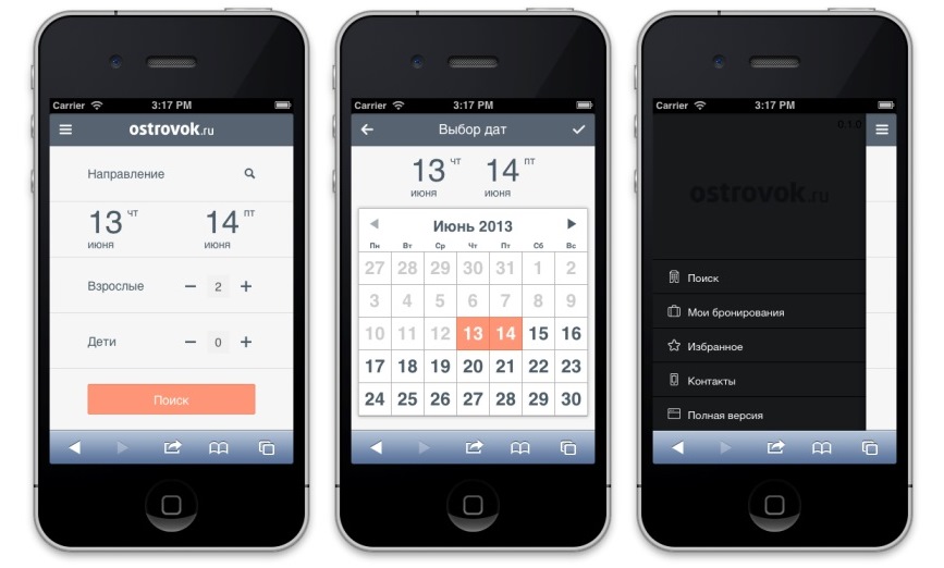
- Make a website in a new design, at the same time to see how this new design will work at all, and whether it is worth using it for a mobile application in the future.
- The site should work well on iPhone and Android 2.x, 4.x, default browsers.
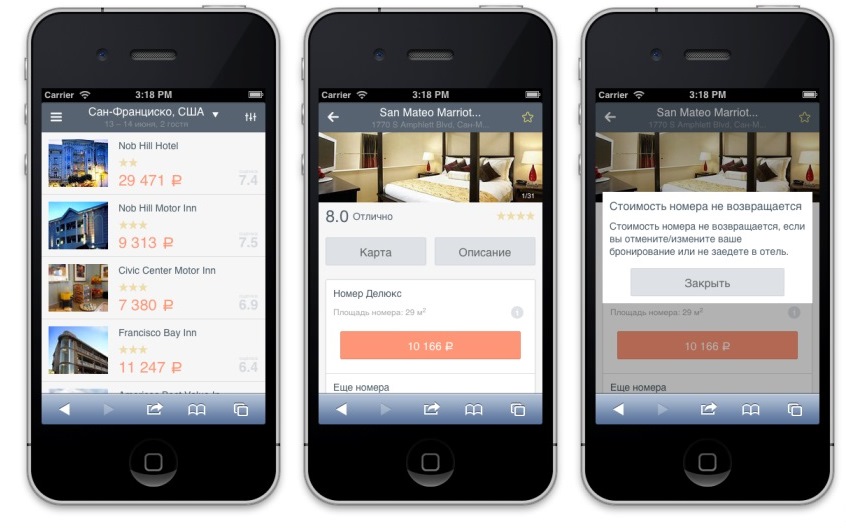
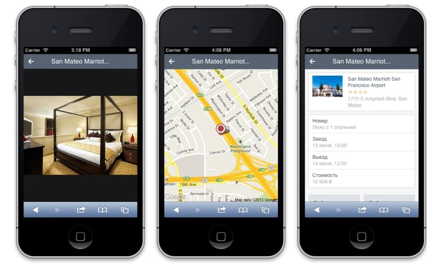
- Add some new features that are not on the old. For example, filter by hotel name and add hotels to favorites. Of course, a large site should not be completely copied.
- Make it fun and interesting.
So historically, the site is always designed with the design of a mobile application, this design is tested on it. Like this experiment. And here the design was completely new, flat (iOS 7 style, fashionable!). Therefore, do not be surprised that the colors, and indeed the appearance, are slightly different from the rest of the Islet.
I did not want to depend on OTA, like last time. Plus, I worked on the site alone, and learning Django is not at all interesting, but constantly distracting one of the OTA developers is not comme il faut. So I decided to think like a pirate. The island already has a mobile API that covers most of what is required from the mobile site. By combining this with parts of the API from the desktop site, you can get quite a good solution. This is the approach I have chosen.
I took NodeJS as a basis. Always wanted to try. The framework was ExpressJS, which is very similar to Sinatra (hello Ruby!). I needed to conduct user sessions, so I can't do without Redis. For less typing, instead of using regular JavaScript, I used CoffeeScript. For templates, I took Jade, and for CSS, Stylus. We need a trendy website, and on mobile phones you can get a big gain in speed, so everyone decided to do a singlepage. At first I thought to take SpineJS, but his community is not very big, so the classic bundle: Backbone, Lo-Dash, Zepto.
I had to tinker with the assembly of assets. I want everything to be cool, automatically, like the rails. The asset-rack turned out to be a quite good solution, which completely takes over the tasks of building JS, CSS and even Jade templates. Of course, he knows how to precompile the templates, puts them in the specified namespace (I chose app.templates). He also takes on the headache of precompiling CoffeeScript and the system requirements, providing 2 options: Snockets (Sprockets) and the classic NodeJS version with RequireJS (Browserify). Nevertheless, NodeJS is a new thing, so there were problems:
- Statics are compiled at the time of server startup. Something has changed in the file - please restart the server. There are no problems in production, but during development it is not particularly convenient. It is solved by installing nodemon. Next, just write a simple instruction in Cakefile and start the server, for example, like this: `cake dev`. And no problem.
- Static is compiled, but not put on the disk. Asset-rack can upload files to the hosting (Amazon S3 etc.), but if you want to give them yourself, for example, through nginx, you have to be creative:
compressAsset = (filename, contents)-> console.log("[#{(new Date()).toUTCString()}] #{logPrefix} Compressing asset #{filename}.gz") zlib.gzip(contents, (e, buffer) -> fs.writeFile(filename + '.gz', buffer)) generateAssets = -> for asset in assets.assets filename = __dirname + '/public' + asset.url.replace('.', "-#{asset.md5}.") if not fs.existsSync(filename) console.log("[#{(new Date()).toUTCString()}] #{logPrefix} Saving asset #{filename}") fs.writeFileSync(filename, asset.contents, encoding: 'utf-8') compressAsset(filename, asset.contents) assets.on('complete', -> generateAssets() unless config.is_dev
Subtotal:
- Back-end and Front-end are written in the same language. One codestyle, and you can also connect the same files. For example, data validation and helpers templates. Well, as an additional bonus, front-end vendors can read the backend code and understand what is happening.
- Speaking of patterns. Jade can be used both on the client and on the server. In my case, I connect one layout.jade to all pages. But if I want, I can give absolutely any page, generating it on the back-end. Skipping the correct data structure of course, but the convenience is obvious.
- Stylus is simply divine. You can completely copy the Jade template to the Stylus file, delete everything unnecessary from there and write styles. This is how the web should be designed.
- Simple clear JSON configs on the Back-end, Front-end, anywhere.
The task in order to be fashionable, youth and fun, I, thus, decided.
How it all worked
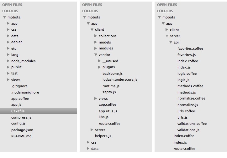
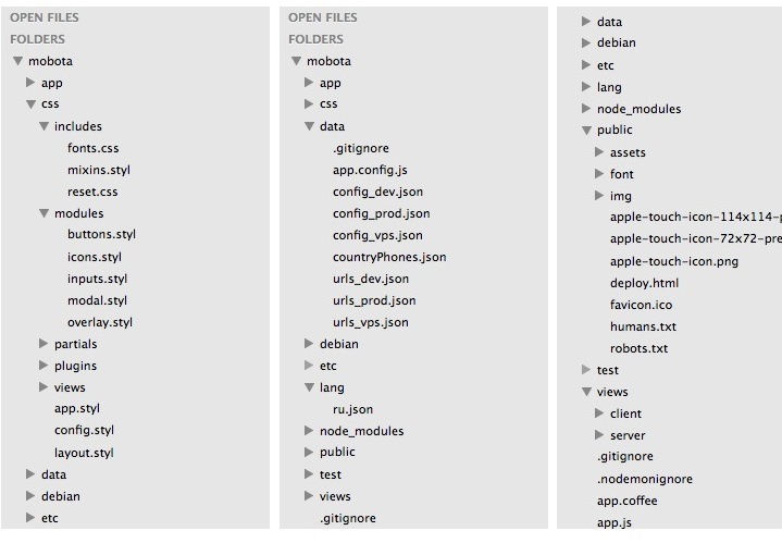
A little bit about how the project is organized. A picture is worth a thousand words:
I will not go into the details of the development on Backbone and CoffeeScript. Thousands of articles have been written about this. I will speak very briefly about the structure of the modules, and in general, as I did, so as not to go crazy.
Obviously, Backbone has collections, models, and views. I put them in different folders. I also needed modules. These are things that are needed all the time, regardless of which page I'm on. They are loaded at the start of the application and are no longer unloaded when the view, for example, is destroyed immediately upon switching to another page. Like some models / collections (for example, a list of bookings when you click "Exit"). My modules are modal windows, sidebars, information about the physical location of the phone, etc.
As a result, this is how my main app.coffee file looks like:
#= require ../../data/app.config.js #= require ../helpers.js #= require app.utils.js #= require_tree modules #= require router.coffee #= require_tree models #= require_tree collections #= require_tree views app = _.extend(@app, Backbone.Events) # ... # Layout modules app.size = new app.modules.Size() # Data modules app.geo = new app.modules.Geo() app.user = new app.modules.User() app.analytics = new app.modules.Analytics() # Modals and extra views app.overlay = new app.modules.Overlay() app.modal = new app.modules.Modal() # Router relies heavily on stuff above app.router = new app.Router() # ... Backbone.history.start(pushState: true, hashChange: false) Here is helpers.js, which is also used on the Back-end. Connecting folders through require_tree makes it possible not to think about connecting individual files, but this does not guarantee the boot order, so you will need to make additional require if you need to inherit from some other class (for example, view). I didn’t have such a task, but by the time Backbone.history.start is called, all the modules and components of the system are already in memory, so the router can do its job, call view, etc.
Now a little about Stylus. It is very similar to SASS, but has a number of additional features. Obviously, it is identation based. This makes it possible not to bother about the intersection of class names. But we all saw this a long time ago, it is boring. How about being able to use the value of any CSS rule as a variable?
.my-awesome-block width: 100px height: 100px margin: (@width / 2) auto line-height: @height Not bad. What about vendor prefixes support? We live in a terrible world of competition. Fortunately, it looks like this:
.my-awesome-block box-sizing: border-box transition: all .2s ease Stylus itself looks at what mixin it has, and if it finds properties with the same name, it performs a replacement. Accordingly, if you no longer need to fill in vendor prefixes, for example, for border-radius (which, by the way, is true), you can simply delete one mixin and not even open other files. I'm not sure, but it seems to me that this can save about a hundred times in the future. Well, a small example of how my app.styl looks like:
@import 'config' @import 'includes/reset.css' @import 'includes/fonts.css' @import 'includes/mixins' @import 'plugins/iswipe' @import 'plugins/zepto.sidebarify' @import 'plugins/zepto.calendar.css' @import 'plugins/zepto.input.numselect.css' @import 'plugins/zepto.listselect.css' @import 'plugins/zepto.textarea_autogrow' @import 'partials/partial_date' @import 'partials/partial_spinner' // ... It turns out that mixed imports are not a problem either. The only flaw at the moment is that in order to call mixin, arguments are needed. Without this, the call did not work for me, although it could already be fixed. I have written this:
html, body // lol! noselect plz body, select, input, button, textarea color: #4b5c66 font: normal 14px Helvetica, Arial, sans-serif line-height: 1.4em //... For styling, I always use only classes to defeat the evil specificity of the Sith. To give a 146% guarantee that the classes would never intersect, I used the SMACSS approach. Well, or not at all, but very similar. Everything that relates to the structure of the page, and does not change during transitions, I did with the prefix l (layout). I also have p (page), blocks inside b (block) pages, etc. If an element is nested in an element, its class will inherit in itself a part of the name of the parent. Or it may not inherit, but the root class is always inherited. Here is an example of styles:
.p-awesomepage .pa-header // styles .pah-soopermenulink color: hotpink .pa-content // styles .pa-loading // styles .pa-title // styles For this markup:
.p-awesomepage header.pa-header wow, header! .pa-content .pa-title my awesome title .pa-loading .pa-title loading is being loaded If you combine this approach with the nesting of rules in Stylus (the main thing is not to re-invest, otherwise there will be a sausage at the exit), then there should be no intersections.
About Jade especially nothing to tell. Quite a template engine. Who used Slim - the same. Supports include and partial. Helpers I just threw a file through the common helpers.js. Although you can register your own. For example, there is already: markdown.
A little about Deploy
If about how to develop the development, everything is clear almost immediately, here's how to deploy deploys have to think a little. 9999999 solutions like capistrano were already invented by the railmen, but for the node so far I could not find anything workable.
I decided on a test VPS to lay out just cake with the instruction: `cake deploy`, which literally does the following:
task 'update', '[VPS]: Update current state with new from repo', -> console.log('[Cake]: Pulling updates from repo') exec('git pull', (error, stdout, stderr) -> unless error console.log('[Cake]: Installing npm packages') exec('npm install', (error, stdout, stderr) -> unless error console.log('[Cake]: Restarting forever') # exec('forever restartall') exec('killall forever') exec('killall nodejs') console.log('[Cake]: Cleaning up old assets') exec('find ./public/assets -regextype posix-egrep -regex ".*\.(js|css|gz|gzip)$" -delete') exec('cake forever') sendMail() else console.warn("[Cake]: Installation failed with error: #{error}") ) else console.warn("[Cake]: Update failed with error: #{error}") ) task 'deploy', '[DEV]: Deploy current repo state to dev VPS', -> console.log('[Cake]: Connecting to VPS mobota@mobota-dev.ostrovok.ru && running update') exec('ssh mobota@mobota-dev.ostrovok.ru \'cd /var/www/mobota && cake update\'', (error, stdout, stderr) -> if error console.warn("[Cake]: Deploy failed with error: #{error}") else console.log('[Cake]: Deployed!') ) To roll out to production, Denis Orlikhin set up a debian package collector. Works teampics, runs tests before building. Very cool. I will not tell the details, but maybe he will somehow tell.
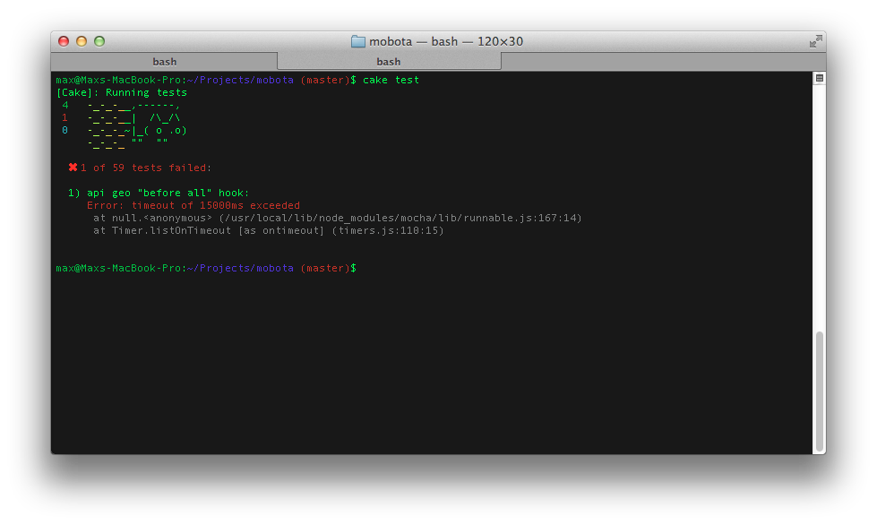
Speaking of tests. I usually do not write tests, because haha-frontend and, in principle, very lazy. But here integration tests were really needed, since you have to depend on a third-party API. I wrote tests for mocha + chaiJS. Very simple and convenient, and most importantly a good reporter:
(I sit in the park, so the Internet is not super fast and tests have fallen down)
This is all very interesting, but where is the mobile development?
And indeed, it would be time to talk about the most important thing. What differences have I noticed when developing for mobile devices in comparison with full-featured browsers. Given that we have to work under several platforms at once, and each platform has its own problems, it turns out not so easy. I can say that the situation has not changed much since last year. The main problem is Android phones of the 2nd version, and early 4-ki. With iOS, everything is much simpler, although they have miracles.
First, more about the problems. Some quite obvious, but I repeat. Some were new to me, which means they could be useful to someone else.
- Brakes with clicks. Everyone knows about the 300ms delay in clicks. Any clicks on regular links on the site will be processed approximately 300ms after clicking. This is to understand that this is really a click, and not some other gesture. As a bonus, if you try to add a touchstart event listener to the link, we will see a so-called ghost click in the same area after exactly 300ms, even if the content of the page has already changed. And on Android 2 it even happens on a completely different page. There are several solutions to the problem. You can invent ingenious schemes for catching these ghost-click, as they do in Google. And you can just refuse links and click event in principle. In my case, I chose the second option. In Zepto, there is a custom tap event just for this, only it is broken. I wrote my solution, and probably post it on GitHub.
- Blurry pictures on the Retina. Now more and more devices with pixel-ratio> 1.5, which means that there are several physical ones per virtual pixel. To prevent pictures from being smeared on such devices, it is enough to load images for them several times larger and scale. Approach for the lazy - always upload large images and scale (background-size FTW).
- Hardware-accelerated animations with transition / transform. It seems that everything is obvious here, use translate everywhere or even translate3d and you will be happy. In fact, it goes wrong. First, not all properties will be accelerated with the help of a GPU, there are only a few of them. Position, transparency, etc. Secondly, Android 2 has serious problems with translate3d in the form of periodic flickering of an animated block, the appearance of fir trees, and generally brakes. Well, iOS has a problem if you need to re-render the block that is on the GPU layer. For example, on my website there is a sidebar, and it can be dragged, as well as it animates / leaves on a click. A cool thing, there is little where there is, and with the animation I have never seen anywhere. But the problem is that if the content is transferred to the GPU, then when switching to some pages it starts to flicker, disappear from the screen for half a second, until the browser renders it and again throws it onto the GPU. I had to go back to using left / top. In addition, if you show native select elements on the block that was pulled out from somewhere using the translate, then they will not work fully on Android 2. Keep in mind (the drop-down list is shown where the unit was originally, and not where it is on the screen).
- Fixed positioning. I would not even try. With overflow: scroll, the situation seems to be better, so solving the problem of fixed elements requires tricky layout. When I watched the last time, redrawing with the open keyboard on iOS didn’t really work.
- Android 2 works just fine with JSON.parse (null). Try to validate the string before parsing. And he does not know how to fully draw text with text-shadow. Shifts may not work, some letters fly away and anything happens at all. I always do:
.android2 * text-shadow: none !important;
Saves a lot of time and nerves. - There are some differences in how the window behaves. Firstly, it is very easy to change the scale, which on large browsers almost never do. I advise to lock the scale, it will become easier to live. It works like this:
meta(name="viewport", content="width=device-width, initial-scale=1, maximum-scale=1, user-scalable=no")
You also need to look at the preventZoom () method at the mobile html5boilerplate . Helps a lot. Anyway, from there a lot of cool things can be taken.
There may be problems with determining the height / width of the screen. Android / iOS are inconsistent in their responses. Android, in particular, can generally say that it is 2 times wider and higher than it actually is. I prefer to use CSS whenever possible, and I advise you. But if I really want to, I did it like this:class Size _min_width: 320 _min_height: 416 _iOS_toolbar_height: 44 _android_delay: 300 constructor: -> @width = null @height = null if $.os.ios app.dom.win.on('orientationchange load', @orientationChange) else app.dom.win.on('orientationchange resize load', => window.setTimeout(@orientationChange, @_android_delay) ) @orientationChange() orientationChange: => prevWidth = @width prevHeight = @height if $.os.ios and not window.orientation @width = window.screen.availWidth @height = window.screen.availHeight - @_iOS_toolbar_height else @width = app.dom.win.width() @height = app.dom.win.height() @width = Math.max(@_min_width, @width) @height = Math.max(@_min_height, @height) if @width isnt prevWidth or @height isnt prevHeight app.trigger('size:resize', width: @width height: @height )
With the definition of the height of the content / window, expect a lot of adventures, mobile browsers in this plan are very cool and it is normal to do something full screen and overlay / modal will not be easy. - Network requests are very slow, especially if nothing has been requested for a long time. Parallel requests may also not be a very good idea, one of them can easily be spilled, and as it turned out, this is not at all faster. I try to make few requests with great answers. (large is 500kb-1mb maximum, still mobile communication). It seems to work better. DOM operations are the same story. Everything is very slow, because the device is very stupid. Especially Android, I do not understand what their problem is. Even the new 4-ki lose the same iPhone 4S. In general, the usual rules work here - fewer requests and grouping of read / write.
- Earlier versions of Android 4 do not support the History API. This means that Backbone will have to use hashes instead of the normal state update. The new versions should already support everything as it should, and Android 2 has always supported, so I just did not bother.
- If your page is scrolled down and you change the content - Android will not return the scroll position to its original position. Depending on the height of the new content there may be visible problems.
- If you have a block with position: absolute, which flew somewhere off the screen, make sure that it is not very large in height. Otherwise, “holes” will appear on the page as if it still occupies some height. Actual for iOS.
- If you want to do something on the full screen in iOS, then you need to set the height of one of the root elements, equal to the actual height of the screen. Otherwise, the status bar will not disappear anywhere no matter how hard you try. height: 100% doesn't work as well.
- If the parent block has overflow: scroll, and the children have position: absolute, there may be problems when drawing on Android. It is solved only by disabling overflow: scroll.
In general, the approach to development is similar to working with large sites on very weak machines. We must not forget that the battery and processor / memory resources are very limited, and always check the performance on real devices. Of course, this is only my personal experience, based on the devices that were available for testing. I could be wrong on some points.
Development bonuses for mobile, as opposed to desktop browsers:
- Although the device and brake, but still modern and a lot of that is supported. This means animations through keyframes / transition and modern JavaScript etc.
- Only 3 platforms. iOS works quite well by itself, and for debugging we have the Developer Tools in Safari, I advise you to use it. Android is worse, few give browser log to the adb console, but all the same there are only 2 platforms and a similar browser engine. You can forget about many vendor prefixes.
- It is always interesting to play with new toys. And mobile sites can be wrapped up as native apps, or at least added to homescreen. Cool.
Conclusion
We live in a great time to be a developer. An idea has come to my mind, and you will easily implement it. The rest of the people live with ideas that for them are not to be realized. So write the code and use NodeJS - quickly, conveniently, asynchronously, youth. And more time will be left to come up with ideas, rather than typing letters.
I think I will post something from the site on GitHub, it will be possible to see and use it at my place. Good luck to everyone, potsy.
Source: https://habr.com/ru/post/183746/
All Articles