Slides in iOS 7
On Habré, several posts have already been published with reviews of new iOS, mainly with criticism of the new design, but little information about the experience of interacting with the system. I think they are bad, but it doesn’t matter - they will still be redrawn . Bad localization and crash beta will correct for the autumn release.
I look at the system with the look of the interface designer and I would like to tell you about one of the most important things in the new iOS - the concept of slides.
System
First of all - the new design is not flat. In a sense, it is more voluminous and, forgive, it is more scorphic than it was before.
')
The iOS 6 interface, on the one hand, exploited metaphors from the real world, and on the other, completely digital folders, search and notification center. Have you seen in real life a folder that, when opened, would tear the table in half and reveal its contents in its depth? Or a notification center that has nothing to do with household items? Despite the volume of each individual icon, the whole system was flat. This is a natural course of things - because of the new features, the system interface becomes inconsistent and requires a global update.
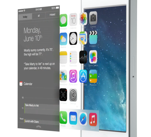
What do we have in the seven? This is how iOS 7 looks on top:

Now look at it in section:
Seven is similar to a set of translucent slides placed at each other at some distance. I identified three main levels:
Background
It is located in the depths, a few centimeters from the glass of the phone, judging by the change in perspective depending on the inclination. There can be nothing below the background.
Applications
A huge slide on which are all the applications. Opening an application or folder is an increase in a piece of the slide, clicking on the "home" button returns to the original scale. Putting an application in a folder means scaling it down. Opening the application looks like this:

The value of this effect is easy to underestimate, but the increase instead of changing the screen gives the user a clear understanding that he does not leave the slide with applications, but only changes the scale. This effect is slightly hampered by the disappearing and then reappearing status panel - it should change color, but in no case should it move. I am sure that this defect will be repaired with time.
I note that the dock is on the same level as the application, but on a separate slide.
Control
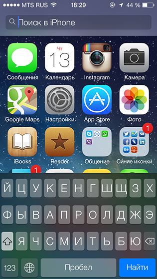
Service slides that can be called up from obscurity by a shift from outside the screen. Drawn on translucent plastic. These include not only the control point and the notification center, but also the search and keyboard.
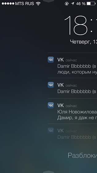
Loxcreen supports the concept - now the whole slide with the clock, notifications and other things is shifted. Icons fly in a strange way, though very beautiful. The only thing that is clearly from another opera is sound. The click of the camera has nothing to do with a smooth shift.
Applications
With applications, things are a little worse - they only partially support the concept and are rather inconsistent. Slides are not fixed in the Human Interface Guidelines, although they were presented as a feature of the system at the presentation:
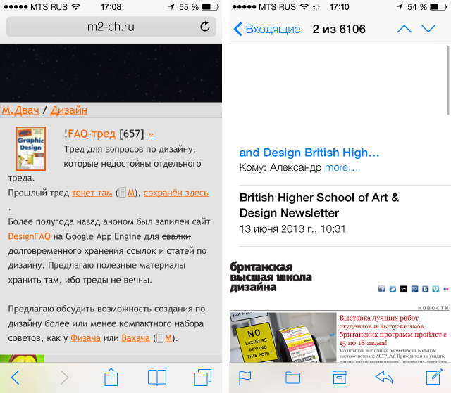
Safari shows a slide with a background if the page is over, and the mail shows only a white background. In general, Safari is the only application that behaves in this way:
Reminders are paper on a slide, albeit almost opaque, and notes are just paper:

The new weather and compass (in particular, the tab with the level) are very beautiful, but there are no slides in it:

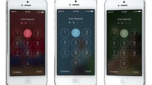
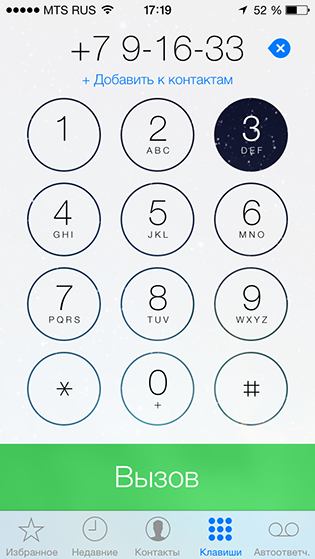
Sometimes slides pop up in unexpected places - for example, in telephone buttons:
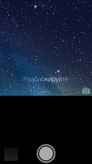
But they are not in the chamber. And because of this, we have to go on a crime on lockscreen - to block the background with a black opaque brick:
Why is it important?
I already wrote above why these translucencies and animations increase so important. But the help in orientation in the system is not all. Stretching all applications on one big slide and with the possibility of increasing, Apple slightly brings the design of the OS to the old designer utopia in the form of one huge canvas with this smooth movement and zooming, instead of abrupt transitions from one window to another. That is why iOS 7 is a huge step compared to the six. And the icons will be redrawn.
Source: https://habr.com/ru/post/183246/
All Articles