Flat design: why did the design go flat?
We don’t know if you noticed or not, but lately (especially in the last year) a clear tendency towards simplification, rigid minimalism and visual relief with what we as users interact with every day has begun to be traced around the world. Simply put, the design has become “flat”: in contrast to the convex icons of the times of rapid growth of social networks and web 2.0, now we are increasingly met with unpretentious icons of new services. All this got its name - flat design. Not flat, but flat.
')
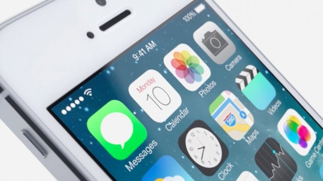
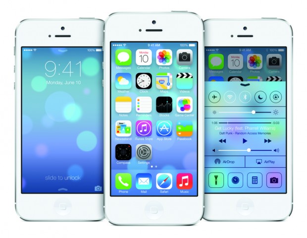
With yesterday’s presentation of the new mobile OS, iOS 7, Apple finally confirmed the rapid growth in popularity of this trend, traditionally making some fans happy, but also having met with considerable discontent among experienced users and designers. What's the matter? What is the use of this flat design and does the world really need it? We decided to turn to experts from Ukraine and abroad.
We asked them to answer three main questions:
- why the world began to move to a flat design in the web and mobile and what it is like;
- what Apple and iOS 7 will do;
- how it will affect designers - on the one hand, and users - on the other.

Denis Sudilkovsky, Kiev
Interaction Design Specialist, Producer Prodesign.in.ua
The “pendulum effect” in predicting the future is manifested in the fact that if there are two extremes in a matter, humanity will throw itself from one side to the other. Without a doubt, this is also true for the design of interactive systems. The flat and uninteresting-primitive web at one time changed to voluminous webdvanol buttons. The visualization of interfaces has reached its apogee of realism and the pendulum flies in the opposite direction - flat & simple.
What will Apple get from this? Retain its place in the trend and hundreds of thousands of comments that their iOS becomes very similar to Android.
Designers will have to evolve (and not joke about when flat-design will come to mechanical engineering and give us flat cars :). When there are no decorations, the whole job is to create a mood with content for a specific scenario with the user. This profession will have more in common with the Director than with the Artist. Users, on the contrary, get new experience and new impressions. Personally, I was an iPhone adept for 4 years, but this spring I changed the phone to Android for the only reason - I was fed up with the monotonous ideality of the apple interface.

Daniel Bruce, Stockholm
Senior Digital Creative, danielbruce.se
For a start, I would like to point out that I do not like the term "flat design". Most of the graphic design over the centuries has been "flat." I also believe that this limits your ability to make outstanding design when the choice is between flat and something else. Design can be something significantly larger than this. Fun, bright, dark, positive, minimalist - it can be called anything. But today, I rarely hear anyone considering a design not only flat or sclero-morphic. This is a little sad.
Why does the web and mobile go slowly to a flat design? I see it like this - it's just a trend. I have never seen articles about the advantages of flat design in user interfaces and have not yet been convinced of this. Simple and clear design - yes, but this is not the same as “flat”. Look, for example, on Google. They do not make completely flat designs, they - and I share this moment - still see the need for some depth and variations.
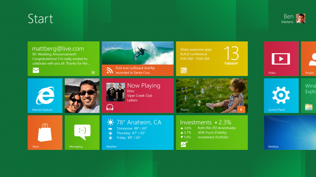
I was very surprised when Microsoft chose this trend for themselves several years ago, presenting the famous Metro style. In fact, they used graphic design for large signs that people look at from certain distances and never interact with small screens with a significant number of elements. It looks beautiful, but do they have good usability?
What I saw last night from Apple was just a bad replica of several interesting designs that have appeared on sites like Dribbble i Behance over the past year. I did not see anything new - except that this is not the same “old Apple” by Steve Jobs. The company has shown that it is not at the forefront of mobile interface design. Of course, we will see fans who will inherit all these snow-white designs and creative gradients over the next few months, but I do not think that this aspect will be as influential as the recent termination of Google. But on the other hand, no matter how it was there, Apple has always acted as a trendsetter and inspiration for many people, including me.
As for ordinary users, they like bright colors.

Ivan Klimenko, Kiev
mobile interface designer, 5tak.com
To a large extent, I take this situation with a passion for flat styles a little philosophically. Not for the first time designers are addicted to minimalism and artificial materials. Everything passes.
The Bauhaus Epoch of the 20-30s brought a huge contribution to the design, but still the tonal integrity and artificiality could not withstand the desire and the inner urge of people to exist surrounded by more natural things.
Then in the 60s everyone started to admire plastic.
Furniture, dishes and even clothes - all of plastic. It seemed that this is a new hope of humanity, but again not - people very quickly returned to natural forms or to copies of natural materials.
Hard contrast of forms and minimalistic graphics have always expressed the accumulation of internal conflicts within society. Design is just a mirror that shows our inner world. Too much around. Life is very accelerated, and we just have no time to think and consider something. We often have no time to just live.
Minimalist and all these electronic pieces of iron - just a step on the road to something more natural and human. More than just another computer. I even wish Apple, which could look deep, no longer exists.

Olesya Grichina, Kiev
UI designer at Componentix, twitter: elendiel
I think that designers were greatly influenced by a large number of gadgets with different screen sizes and resolution - for all this variety it is easier to create a design without textures, complex shadows that correctly take into account the lighting, etc. More began to think in the direction of "how would it be easier for the user to do", and not "as if beautifully drawn." Content is the main thing, and in our work it is important to submit it in the best possible way.
It seems to me that behind external changes (flat UI, icons) especially did not notice serious changes in the usability, and how they swear on this topic. When they check in the work, “ooo, how convenient, and why they haven’t done so before.” I hope the designers will be affected in such a way that they will pay more attention to the convenience of the interface, rather than textures and shadows. In the end, customers will be able to explain that this is in trend :)
I think that the flat design users will not be particularly affected - if it is convenient for them to create and consume content, there will be a lot of satisfied people. But the icons on the home screen are still acidic :)

Pavel Grozyan, Kiev
Product Designer at MacPaw, grozyan
“Apple! A-ha-ha, stop it! - Shout designers. - Hooray, it's easier. - users are chanting ". I understand both points of view. Today, after the presentation from WWDC2013, many of my colleagues got up and said," Oh, her, this profession! Anyone now can draw such stupidity. And these icons for $ 30 ?! " at first glance, they are right. But if you dig deeper, you realize that there are thousands of objects that for a long time differed from one another only by their use of scenario, then by form, then by color, and only then by artistic details. I remember the times when all these guys on LinkedIn whose profiles today are written UX , UI Designer, nervously copied the white shadow effect of the letters. Like Apple. Then light and light websites. Like Apple. Then rich interfaces with textures and realism. Like Apple, all their work was to copy, because there was no original, unified and a development concept that is convenient for all. This is exactly the task that flat design solves today, although it seems to me wrong to call it that way.

Flat - it is not for clicks, it is for clicks, tapes, taps. You can’t call it flat - the lack of “thick” textures and shadows on the buttons makes it rather simplistic and without visual aggression. And without gradients to the buttons can not do. I support this trend. If this does not interfere with the quality of the experience, but it will be easier for everyone to live with it. First of all to the user. Secondly - to the creator: it will be easier in technical implementation, more convenient for clicking (underlining the links - hello), and multiplatform - combining the web, mobile and dextup into one single experience. No doubt Apple is a bold move. And only they can decide on it. Their history has dozens of evidence, because they are more likely to succeed than the other way around.
Source: https://habr.com/ru/post/182978/
All Articles