The evolution of design with the advent of adaptive design
Habr, hello!
About two years have passed since the launch of the first adaptive site by our company, about the same to this issue in Russia in general. From this point on, I, as a designer, have already managed to go through many rakes, so in my first post I would like to share my thoughts on what has changed in our website design processes with the advent of adapt.
I will not describe the entire design process in detail; there will be enough articles on this topic on this issue, but I’ll dwell only on a few points.
So, the averaged design process in our general form looks like this:
Below, I have cited several major evolutionary additions to the process that adaptive design brings:
')
I must say that 2 years ago, as is usually the case with everything new, the client was very wary of implementing adaptability due to cost and lack of understanding of the advantages. Now, 80% of our new projects have adaptability - one of the mandatory incoming requirements. At the same time, the client is still not very concerned about the limits of adaptability, or there are cases when its boundaries are erroneously determined by the client.
Example 1: The client knows that his site has a mobile audience (based on statistics), but has no information about its behavior.
Example 2: It seems to the client that the mobile audience prefers articles to the news of its portal. The results of the study showed that it really seemed to the client, but in fact it was exactly the opposite.
What will affect the findings? On the choice of the limits of adaptability, namely:
Therefore, in order not to break the firewood from the very beginning, you need to listen to the client and test all his hypotheses on measurable parameters using well-known tools (Google Analytics, Yandex.Metrica).
What if the client had no website at all? It is necessary to carry out a full cycle of classical design with testing prototypes, analyze the environment, competitors and the target audience in accessible ways and be sure to make sure that everything is correct after the release of the project. A good interface is, as you know, a process. Make perfect immediately fail.
Working with analytics also gives us information about real user groups, key tasks and interaction scenarios without their synthetic inventing. But this applies to all sites in general.
One of the most difficult and holivarny stages of work. Actually, the stage for which all this adaptive and need. The subject of hot discussions - what to do with the content during the migration between versions of the site, designed for different devices.
Main features of working with content:
As the working area of the browser window decreases, we adjust the font, tables, change the number of images to publish into a line, etc. This is the basic rule of working with content.
Content, which is secondary, based on analytics and / or compiled user scenarios, is hidden behind any action (click, scroll), etc.
Sometimes for a mobile audience it is more important for us to say or show something first, then we can change the priority of the content. In online stores, for example, it is often quite clearly possible to identify groups of products that interest the mobile audience more than the rest of the range.
We are used to the fact that on regular mobile sites we present to users a trimmed version of the content, while still maintaining the opportunity to switch to the full version. Adaptive design deprives us of this opportunity, because the version of the site is one. Can I delete content now?
I'll start with the prerequisites for this - there is an opinion that the use cases of mobile devices differ from the use cases of desktop devices. Mobile audience has its own specific tasks, they are more focused on results. Users surf through mobile platforms intermittently and erratically. Is it so? And what are mobile devices today?
The answer to these two questions, given the modern level of portability and blurring of the boundaries of a mobile audience, is this: to form basic user tasks, we must take into account not only the platforms, but also the circumstances, conditions, current needs, i.e. context of use. Small screens of user devices do not mean their limited needs, they do not mean anything at all.
Therefore, it is often problematic to differentiate the audience, but there are also situations where the differences in tasks and behavior are obvious and significant.
Thus, to show the user all the content, or, as often can be found in discussions, only “a few chapters of the book” should be based on the actual user tasks. And to invent them, as well as trying to rethink the experience of other sites of similar subjects, is quite dangerous. Therefore, there is a simple rule: if not sure, do not delete. Delete content can only be provided that there is reliable data or the ability to check the absence of the need for it from the desired audience segment. As a verification tool, all the same web analytics services.
This is where the fun begins. Even if the tasks of the mobile audience coincide with the tasks of the "desktop", this does not mean at all that we should not prepare content, including semantic optimization. If you go to the site from your mobile, this will be a different site, and not all users will be happy to surf among the “pile” of marketing text pages in search of answers.
What are we doing? We do not give all the content of the desktop version in the same form to move to the mobile sector. The objective of this optimization is solely to reduce the published volume and increase the speed of content consumption.
This is not always necessary, and is definitely not suitable for:
For a visual representation, we design the transformation within the content tables:

Everything looked somewhat simpler and consisted of fixing high-level requirements: content structure and relationships, content types, content format, requirements for the composition of attributes, as well as more detailed content tables with key content characteristics.
When developing an adaptive site, we are faced with a lot of uncertainties associated with the variety of devices (different viewports, performance, interfaces). Naturally, without sufficient abstraction from devices to design a site, it becomes simply impossible.
And here, development methods that are widespread before adaptation come to our rescue:
All of them help our interface to remain device-independent and provide a given level of fault tolerance.
Since, basically, they are used directly in the development, I want to briefly discuss the question of how these methods affect the organization of design.
In Graceful Degradation, we start designing with the most functional versions of the site, and in Progressive Enhancement, on the contrary, with the most non-functional and simple ones. As a rule, this means that in Graceful Degradation we start with desktop versions, and in Progressive Enhancement - with mobile versions, but this is not necessarily the case. And Mobile First, just, recommends us to start only with mobile devices and in general goes well with Progressive Enhancement.
Which approach to choose?
For myself, I defined the following selection criteria:
Progressive Enhancement / Mobile First is good when all functional requirements are already formed at the time of the start of the design. We, as a rule, fall into this category: internal (everything has already been negotiated, outlined, recorded in advance 100500 times) and promotional projects (there is no serious and complex functionality). Therefore, nothing prevents to start with the prototyping of the mobile version (Mobile First) and, then, gradually increase functionality.
When prototypes are an element of extraction and approval of requirements, as is customary for most client projects, we need to start with Graceful Degradation.
In other words, if we work with the requirements when creating prototypes, we must work with them on the example of the most functional states of the interface. In the context of adaptive design, this may not be the version of the largest screen size, but it must be a version whose functionality should not be exceeded by any other state of this interface. This allows us not to lose functional requirements (as in the figure below, where it is shown that one of the requirements may not be obvious) and gives a clear understanding of the project as a whole - both for us and for the client.

After that, you can move down the adaptation ladder, and sometimes down and up.
Now on the market a large number of devices. Permissions are also not small (colleagues have put together a good list here ). The adaptive site should be continuously displayed over the entire target resolution range. For these purposes, there is the concept of breakpoints or border states of an interface. Their number, of course, is much less than all possible resolutions on the desired range.
There are three approaches to the selection of these points:
The third way is flexible, correct, because it is abstracted from devices in general and is pleasant to designers, but absolutely unpredictable in terms of effort. On projects with a fixed cost it is difficult to use.
The first two are convenient for designers and managers like because they are transparent and do not create additional uncertainties, and also can be taken into account in the initial assessment of labor costs for a project.
We also add design adaptation patterns to the prototyping process itself. Adaptation of the interface should occur logically, naturally and as uniformly as possible. Elements of the same type and blocks (tables, lists, etc.) of different sections should have the minimum sufficient variability, i.e. better seek to use the same patterns. This also applies to content and functional blocks. Their examples can be found here .
And a couple of words about what you should not forget when designing an adaptive interface:
Since adaptability is associated with a dynamic change in the structure of pages and content, the following problem arises: in what form to present the final result? We have two options:
Despite the tendency to use interactive prototypes, if they do not need to be actively tested, you can use static without consequences.
It is necessary to coordinate in stages, showing only one version (when using GD, the most functional one). As soon as it is approved, proceed to the next one. This insures us that in case of any changes in the prototypes on the part of the client, we will have to change instead of one layout - 4 or more.
In practice, the most clear and safe option is to coordinate static layouts. They are easy to understand, make corrections, while the adaptation mechanics itself and the interactivity associated with it are often uninteresting to the client. Providing layouts in portions is not so tiring for the client, although there is still a tendency that his attention is not enough for all approvals.
A more complex option - interactive prototypes. At the same time, there is a risk of not agreeing everything without knowing it. The reason is simple: with the advent of moving / interactive elements, the lack of clear fixed positions, the likelihood of losing sight of anything is much higher.
Adaptive threw enough extra work to the designers, having increased it by my calculations by about 2.5 times and requested additional resources, as well as made friends with the frontends and testers. By the way, they got the most, but this is the topic of another article.
If you are interested in learning more about some aspects or have your own experience in designing responsive websites - write, be sure to discuss in the comments.
About two years have passed since the launch of the first adaptive site by our company, about the same to this issue in Russia in general. From this point on, I, as a designer, have already managed to go through many rakes, so in my first post I would like to share my thoughts on what has changed in our website design processes with the advent of adapt.
I will not describe the entire design process in detail; there will be enough articles on this topic on this issue, but I’ll dwell only on a few points.
So, the averaged design process in our general form looks like this:
- We study brief and business problems
- We define, formulate hypotheses / set goals
- Determine KPI
- Determine the conditions of achievement / non-achievement indicators
- We define a segment for research
- We look, analyze the results and make up the design assignment
- According to the results of item 6, we determine the characters and interaction scenarios
- We create the structure of the site and define the relationship
- Designing content
- Create content (if necessary)
- Developing prototypes
- Testing (if necessary)
- We document the requirements
Below, I have cited several major evolutionary additions to the process that adaptive design brings:
')
Choice of limits of adaptability
I must say that 2 years ago, as is usually the case with everything new, the client was very wary of implementing adaptability due to cost and lack of understanding of the advantages. Now, 80% of our new projects have adaptability - one of the mandatory incoming requirements. At the same time, the client is still not very concerned about the limits of adaptability, or there are cases when its boundaries are erroneously determined by the client.
Example 1: The client knows that his site has a mobile audience (based on statistics), but has no information about its behavior.
Example 2: It seems to the client that the mobile audience prefers articles to the news of its portal. The results of the study showed that it really seemed to the client, but in fact it was exactly the opposite.
What will affect the findings? On the choice of the limits of adaptability, namely:
- what permissions the site adapts to;
- what exactly needs to be adapted on the site and what is not;
- which devices you should pay attention to: do you need to take into account low-budget devices, mobile phones without touch interfaces, devices with retina-screens.
Therefore, in order not to break the firewood from the very beginning, you need to listen to the client and test all his hypotheses on measurable parameters using well-known tools (Google Analytics, Yandex.Metrica).
What if the client had no website at all? It is necessary to carry out a full cycle of classical design with testing prototypes, analyze the environment, competitors and the target audience in accessible ways and be sure to make sure that everything is correct after the release of the project. A good interface is, as you know, a process. Make perfect immediately fail.
Working with analytics also gives us information about real user groups, key tasks and interaction scenarios without their synthetic inventing. But this applies to all sites in general.
Content transformation
One of the most difficult and holivarny stages of work. Actually, the stage for which all this adaptive and need. The subject of hot discussions - what to do with the content during the migration between versions of the site, designed for different devices.
Main features of working with content:
Transform structurally
As the working area of the browser window decreases, we adjust the font, tables, change the number of images to publish into a line, etc. This is the basic rule of working with content.
Hide / hide content
Content, which is secondary, based on analytics and / or compiled user scenarios, is hidden behind any action (click, scroll), etc.
Change priority
Sometimes for a mobile audience it is more important for us to say or show something first, then we can change the priority of the content. In online stores, for example, it is often quite clearly possible to identify groups of products that interest the mobile audience more than the rest of the range.
Delete
We are used to the fact that on regular mobile sites we present to users a trimmed version of the content, while still maintaining the opportunity to switch to the full version. Adaptive design deprives us of this opportunity, because the version of the site is one. Can I delete content now?
I'll start with the prerequisites for this - there is an opinion that the use cases of mobile devices differ from the use cases of desktop devices. Mobile audience has its own specific tasks, they are more focused on results. Users surf through mobile platforms intermittently and erratically. Is it so? And what are mobile devices today?
The answer to these two questions, given the modern level of portability and blurring of the boundaries of a mobile audience, is this: to form basic user tasks, we must take into account not only the platforms, but also the circumstances, conditions, current needs, i.e. context of use. Small screens of user devices do not mean their limited needs, they do not mean anything at all.
Therefore, it is often problematic to differentiate the audience, but there are also situations where the differences in tasks and behavior are obvious and significant.
Thus, to show the user all the content, or, as often can be found in discussions, only “a few chapters of the book” should be based on the actual user tasks. And to invent them, as well as trying to rethink the experience of other sites of similar subjects, is quite dangerous. Therefore, there is a simple rule: if not sure, do not delete. Delete content can only be provided that there is reliable data or the ability to check the absence of the need for it from the desired audience segment. As a verification tool, all the same web analytics services.
Transform by sense
This is where the fun begins. Even if the tasks of the mobile audience coincide with the tasks of the "desktop", this does not mean at all that we should not prepare content, including semantic optimization. If you go to the site from your mobile, this will be a different site, and not all users will be happy to surf among the “pile” of marketing text pages in search of answers.
What are we doing? We do not give all the content of the desktop version in the same form to move to the mobile sector. The objective of this optimization is solely to reduce the published volume and increase the speed of content consumption.
This is not always necessary, and is definitely not suitable for:
- dynamic content (news, periodic publications), where information is often added and updated, and we do not have the opportunity to work with ready-made texts. In this case, we transform according to its format;
- static, which should migrate to all versions without changes (for example, contacts).
For a visual representation, we design the transformation within the content tables:
And what happened before the arrival of adapta?
Everything looked somewhat simpler and consisted of fixing high-level requirements: content structure and relationships, content types, content format, requirements for the composition of attributes, as well as more detailed content tables with key content characteristics.
The choice of design method
When developing an adaptive site, we are faced with a lot of uncertainties associated with the variety of devices (different viewports, performance, interfaces). Naturally, without sufficient abstraction from devices to design a site, it becomes simply impossible.
And here, development methods that are widespread before adaptation come to our rescue:
- Graceful Degradation;
- purely web Progressive Enhancement;
- and, directly related to adaptive, the Mobile First philosophy.
All of them help our interface to remain device-independent and provide a given level of fault tolerance.
Since, basically, they are used directly in the development, I want to briefly discuss the question of how these methods affect the organization of design.
In Graceful Degradation, we start designing with the most functional versions of the site, and in Progressive Enhancement, on the contrary, with the most non-functional and simple ones. As a rule, this means that in Graceful Degradation we start with desktop versions, and in Progressive Enhancement - with mobile versions, but this is not necessarily the case. And Mobile First, just, recommends us to start only with mobile devices and in general goes well with Progressive Enhancement.
Which approach to choose?
For myself, I defined the following selection criteria:
Progressive Enhancement / Mobile First is good when all functional requirements are already formed at the time of the start of the design. We, as a rule, fall into this category: internal (everything has already been negotiated, outlined, recorded in advance 100500 times) and promotional projects (there is no serious and complex functionality). Therefore, nothing prevents to start with the prototyping of the mobile version (Mobile First) and, then, gradually increase functionality.
When prototypes are an element of extraction and approval of requirements, as is customary for most client projects, we need to start with Graceful Degradation.
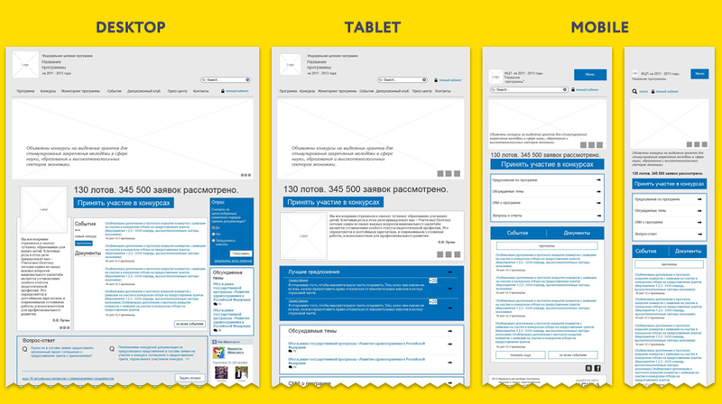
In other words, if we work with the requirements when creating prototypes, we must work with them on the example of the most functional states of the interface. In the context of adaptive design, this may not be the version of the largest screen size, but it must be a version whose functionality should not be exceeded by any other state of this interface. This allows us not to lose functional requirements (as in the figure below, where it is shown that one of the requirements may not be obvious) and gives a clear understanding of the project as a whole - both for us and for the client.
After that, you can move down the adaptation ladder, and sometimes down and up.
How to prototype
Now on the market a large number of devices. Permissions are also not small (colleagues have put together a good list here ). The adaptive site should be continuously displayed over the entire target resolution range. For these purposes, there is the concept of breakpoints or border states of an interface. Their number, of course, is much less than all possible resolutions on the desired range.
There are three approaches to the selection of these points:
- Selection based on resolution boundaries (as a rule, classical 320, 480, 768, 1024, 1280px ...). This may be adjusted based on the results of web analytics.
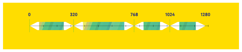
- The choice is based on the fact that the classical resolutions lie within the interval between adjacent breakpoints. Thus, the most stressful states of the interface do not fall on common device resolutions.
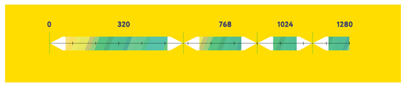
- The third way is to select arbitrary breakpoints in the place where the design starts to break or deteriorates the UX.

The third way is flexible, correct, because it is abstracted from devices in general and is pleasant to designers, but absolutely unpredictable in terms of effort. On projects with a fixed cost it is difficult to use.
The first two are convenient for designers and managers like because they are transparent and do not create additional uncertainties, and also can be taken into account in the initial assessment of labor costs for a project.
We also add design adaptation patterns to the prototyping process itself. Adaptation of the interface should occur logically, naturally and as uniformly as possible. Elements of the same type and blocks (tables, lists, etc.) of different sections should have the minimum sufficient variability, i.e. better seek to use the same patterns. This also applies to content and functional blocks. Their examples can be found here .
And a couple of words about what you should not forget when designing an adaptive interface:
- Do not be afraid to simplify and optimize the functionality as you move down.
- No need to change the site beyond recognition. This is the question of adaptation laws.
- If the site works with user data, they may be partially or completely unavailable in any state of the site, but depending on this state, it is impossible to change the presentation / input format (you can simplify the form, but you can’t ask for different versions to enter the date of birth in a different format).
- Do not use the fold line (the lower boundary of the site displayed in the browser) for the placement of functional elements. It is clear that the place of the fold is not regular for different devices, but, in general, we can determine the dangerous interval, where you should not place the sliders and other similar elements.
- Do not place Google Maps and other elements with internal navigation that coincide in direction with page scrolling on a large screen area - this may entail difficulties with page scrolling. Mobile users can be redirected to native map applications.
- The main page of mobile versions should often be made divorcing in order to redirect the user to landing pages as quickly as possible.
- Use native interface elements where it is possible and appropriate.
- It is necessary to track the moment of transition from a device that does not support the touch to a device with its support. This is necessary, for example, in order to propose in time an alternative to mouse on. At the same time, we must understand that the screen size should not be decisive, since there are enough touch-screen laptops on the market.
- Try to use scrolled only for periodic information (news, articles). At the same time to optimize the speed of work should be resorted to reloading such content. And below this block, no important elements should be placed, since the user, naturally, will not get to them.
Result of work
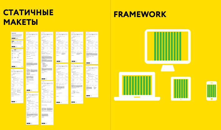
Since adaptability is associated with a dynamic change in the structure of pages and content, the following problem arises: in what form to present the final result? We have two options:
- Static layouts. Of the obvious disadvantages is the increase in 4 or more times the number of layouts (it was 30, it became 120 or more). Of the implicit ones, adaptation patterns are not always obvious, so that designers should not then ask where the news is, you should not be lazy to use metadata for explanations. Of the benefits - the speed of creation and ease of change. Although many may have a question about the ease of change, but, in general, thanks to the master panels, this can be done quickly.
- Interactive prototypes ( example ). Here, we either use the capabilities of the design software itself (I use Axure and this is not good there), or use the available frameworks. The obvious advantage is the ability to fully demonstrate the adaptation mechanisms and partial functionality. Of the minuses - the complexity and complexity of the changes. I will tell about one more disadvantage below.
Despite the tendency to use interactive prototypes, if they do not need to be actively tested, you can use static without consequences.
How to negotiate with the client
It is necessary to coordinate in stages, showing only one version (when using GD, the most functional one). As soon as it is approved, proceed to the next one. This insures us that in case of any changes in the prototypes on the part of the client, we will have to change instead of one layout - 4 or more.
In practice, the most clear and safe option is to coordinate static layouts. They are easy to understand, make corrections, while the adaptation mechanics itself and the interactivity associated with it are often uninteresting to the client. Providing layouts in portions is not so tiring for the client, although there is still a tendency that his attention is not enough for all approvals.
A more complex option - interactive prototypes. At the same time, there is a risk of not agreeing everything without knowing it. The reason is simple: with the advent of moving / interactive elements, the lack of clear fixed positions, the likelihood of losing sight of anything is much higher.
In custody
Adaptive threw enough extra work to the designers, having increased it by my calculations by about 2.5 times and requested additional resources, as well as made friends with the frontends and testers. By the way, they got the most, but this is the topic of another article.
If you are interested in learning more about some aspects or have your own experience in designing responsive websites - write, be sure to discuss in the comments.
Source: https://habr.com/ru/post/182974/
All Articles