Font smoothing, and subpixel rendering
Joel Spolsky's excellent article about the differences in text rendering on computers running Mac OS X and Windows, as well as the rejection by users of Windows of how Safari renders texts on the screen. Written in simple language, available without load parts.
Original
')
Algortm
Apple and Microsoft have always had differences over how to display fonts on a computer screen. Today, both companies use “sub-pixel” rendering to achieve clearer-looking fonts on traditionally low resolution screens. Where they differ is in philosophy.
Apple believes that the purpose of the algorithm is to keep the design of the font as much as possible, even at the cost of a slight blur.
Microsoft believes that the shape of each letter should be within the boundaries set by the pixels to prevent blurring and improve readability, even at the expense of incomplete alignment.
Now, when Safari for Windows came out, which had to work hard to use Apple’s text-rendering algorithms in Windows, you can compare the differences between the philosophy of companies on your monitor and you’ll understand what I mean. I think you will notice the difference. Apple's fonts are actually a bit blurry, with blurred edges, but with a small font size there are noticeably more variations between different font families, because drawing them closer to how the font would look printed in high resolution.
(Attention: To see the illustration correctly, you need an LCD monitor with the order of the pixels R, G, B, like mine. Otherwise, everything will look different and wrong for you.)
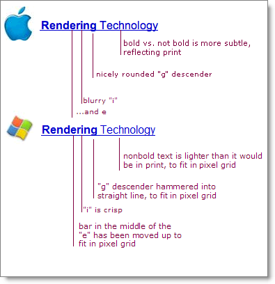
Text translation from top to bottom:
• Mac
- The difference between bold and non-greasy text is less than the corresponding print
- A beautifully curled tail of the letter “g”
- Blurred “i”
-… and “e”
• Windows
- non-greasy text is lighter than print to fit in a grid of pixels
- tail “g” is aligned to fit in the pixel grid
- “i” clear
- the jumper to “e” is moved higher to fit in the pixel grid
The differences are due to Apple’s legacy in desktop printing and graphic design. The nice thing about Apple’s algorithm is that you create a text page for printing, and on the screen you have an option very close to the final product. This is especially useful if it matters to you how dark the block of text looks. Microsoft's mechanism for “corraling” fonts into pixels means that they really don’t mind using thinner lines to avoid blurry edges, even when it makes a whole paragraph lighter than it looks when printed.
The advantage of the Microsoft method is that it works better for screen reading. Microsoft pragmatically decided that the design of the style is not so untouchable, and that clear text on the screen that is easy to read is more important than the idea of the font designer about how light or dark a whole block of text should be felt. Microsoft did develop screen fonts, such as Georgia and Verdana, taking into account the boundaries of pixels. They are very beautiful on the screen, but not impressive when printed.
Traditionally, Apple chooses a stylish way, putting art above practicality, because Steve Jobs has a taste, and Microsoft chooses a convenient way, measured in a pragmatic way, which has a single gram of style. It can be said differently, if Apple were Target, then Microsoft would be Wal-Mart. (Approx. Ln. - Target and Wal-Mart - supermarket chains in the US. Target is beautiful, stylish stores, while Wal-Mart is a mass market, inexpensive goods, and the appropriate design of stores.)
Now as for the question of preferences
Apple users prefer the Apple method, while Windows users prefer the method developed by Microsoft. This is not an ordinary fanatic at all; it reflects the fact that when you ask people to choose a style or design that they like, if they are not prepared, they usually choose the one that looks most familiar. In matters of taste, when you do a survey of preferences, you may find that most people do not know what to choose, and therefore choose what seems most familiar. This applies to anything from cutlery (people choose a drawing that looks like a drawing from cutlery they had in their childhood) to fonts and graphic design: if people are not trained to know what to look for, they will choose what they familiar.
That's why Apple engineers probably think that they are doing a huge service to the Windows community, using their “excellent” font rendering technology to pagans, and this explains why Windows users will most likely think that font rendering in Safari is blurred and weird, and they don’t know why it is, but they just don't like it. They rather think ... "Oppa ... It is different. I do not like when different. Why don't I like these fonts? Yeah, when I look closer, they look blurry. That's why."
Translation: alexmak.net .
PS
Sorry, maybe you saw this topic that I posted, but I still did not fully understand the principle of the habra engine. :(
Original
')
Algortm
Apple and Microsoft have always had differences over how to display fonts on a computer screen. Today, both companies use “sub-pixel” rendering to achieve clearer-looking fonts on traditionally low resolution screens. Where they differ is in philosophy.
Apple believes that the purpose of the algorithm is to keep the design of the font as much as possible, even at the cost of a slight blur.
Microsoft believes that the shape of each letter should be within the boundaries set by the pixels to prevent blurring and improve readability, even at the expense of incomplete alignment.
Now, when Safari for Windows came out, which had to work hard to use Apple’s text-rendering algorithms in Windows, you can compare the differences between the philosophy of companies on your monitor and you’ll understand what I mean. I think you will notice the difference. Apple's fonts are actually a bit blurry, with blurred edges, but with a small font size there are noticeably more variations between different font families, because drawing them closer to how the font would look printed in high resolution.
(Attention: To see the illustration correctly, you need an LCD monitor with the order of the pixels R, G, B, like mine. Otherwise, everything will look different and wrong for you.)
Text translation from top to bottom:
• Mac
- The difference between bold and non-greasy text is less than the corresponding print
- A beautifully curled tail of the letter “g”
- Blurred “i”
-… and “e”
• Windows
- non-greasy text is lighter than print to fit in a grid of pixels
- tail “g” is aligned to fit in the pixel grid
- “i” clear
- the jumper to “e” is moved higher to fit in the pixel grid
The differences are due to Apple’s legacy in desktop printing and graphic design. The nice thing about Apple’s algorithm is that you create a text page for printing, and on the screen you have an option very close to the final product. This is especially useful if it matters to you how dark the block of text looks. Microsoft's mechanism for “corraling” fonts into pixels means that they really don’t mind using thinner lines to avoid blurry edges, even when it makes a whole paragraph lighter than it looks when printed.
The advantage of the Microsoft method is that it works better for screen reading. Microsoft pragmatically decided that the design of the style is not so untouchable, and that clear text on the screen that is easy to read is more important than the idea of the font designer about how light or dark a whole block of text should be felt. Microsoft did develop screen fonts, such as Georgia and Verdana, taking into account the boundaries of pixels. They are very beautiful on the screen, but not impressive when printed.
Traditionally, Apple chooses a stylish way, putting art above practicality, because Steve Jobs has a taste, and Microsoft chooses a convenient way, measured in a pragmatic way, which has a single gram of style. It can be said differently, if Apple were Target, then Microsoft would be Wal-Mart. (Approx. Ln. - Target and Wal-Mart - supermarket chains in the US. Target is beautiful, stylish stores, while Wal-Mart is a mass market, inexpensive goods, and the appropriate design of stores.)
Now as for the question of preferences
Apple users prefer the Apple method, while Windows users prefer the method developed by Microsoft. This is not an ordinary fanatic at all; it reflects the fact that when you ask people to choose a style or design that they like, if they are not prepared, they usually choose the one that looks most familiar. In matters of taste, when you do a survey of preferences, you may find that most people do not know what to choose, and therefore choose what seems most familiar. This applies to anything from cutlery (people choose a drawing that looks like a drawing from cutlery they had in their childhood) to fonts and graphic design: if people are not trained to know what to look for, they will choose what they familiar.
That's why Apple engineers probably think that they are doing a huge service to the Windows community, using their “excellent” font rendering technology to pagans, and this explains why Windows users will most likely think that font rendering in Safari is blurred and weird, and they don’t know why it is, but they just don't like it. They rather think ... "Oppa ... It is different. I do not like when different. Why don't I like these fonts? Yeah, when I look closer, they look blurry. That's why."
Translation: alexmak.net .
PS
Sorry, maybe you saw this topic that I posted, but I still did not fully understand the principle of the habra engine. :(
Source: https://habr.com/ru/post/18291/
All Articles