Search on Drupal 7 using Apache Solr Part 5 - widgets for facet filters

In the last article I talked about using facets. We delve a little into this topic and find out what are the widgets for facet filters. And of course, learn to make your own widget. If you have not read the previous article, then I strongly recommend that you read it in order to better understand the material.
- Search on Drupal 7 with Apache Solr Part 1 - Basic Setup
- Search on Drupal 7 using Apache Solr Part 2 - learn how to customize the index
- Search on Drupal 7 using Apache Solr Part 3 - learn to add your own fields and options to the index
- Search on Drupal 7 using Apache Solr Part 4 - faceted filters
- Search on Drupal 7 using Apache Solr Part 5 - widgets for facet filters
- Search on Drupal 7 using Apache Solr Part 6 - configure apache solr + tomcat
- Search on Drupal 7 using Apache Solr Part 7 - full-text search in Russian
Ready Widgets
First I want to mention ready-made widgets. By default, the module facetapi already has two widgets - links and checkboxes. In addition to these widgets, there are several. You can find out about them on the facetapi module page in the “Contributed Widgets” section.
I will not talk about each of them, because the best way is to install the module and see for yourself :)
Own widget
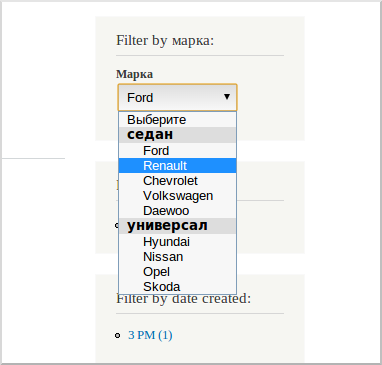
There can always be a situation when you need your own widget. Let's analyze in detail what is needed for this. We will make a “selectbox” type widget but with item division into groups. I decided to add this widget to the car brand selection field. It will look like this:
')
The first thing to do is declare a facetapi_widgets hook:
/** * Implements hook_facetapi_widgets(). */ function test_search_facetapi_widgets() { return array( 'facetapi_selectbox_group' => array( 'handler' => array( 'label' => 'Selectbox with groups of items', 'class' => 'FacetapiWidgetSelectboxGroup', 'query types' => array('term'), ), ), ); } and indicate our widget in it. Then create a class for the widget. Inherited from one of the standard widget classes. I used the FacetapiWidgetCheckboxLinks class. I will not give all the class code here and I will limit myself to just one function. The full code of the module with the widget is available for download at the end of the article.
/** * Redefine buildListItems(). */ function buildListItems($build) { // Builds rows. $items = array(); $facet_active_item = reset($this->facet->getAdapter()->getActiveItems($this->facet->getFacet())); // Respect current selection. if ($facet_active_item) { $items['active_value'] = $facet_active_item['value']; } $i = 0; // Default value $items['values'] = array(''); foreach ($build as $item) { if ($i < 5) { $items['values'][''][$item['#markup']] = $item['#markup']; } else { $items['values'][''][$item['#markup']] = $item['#markup']; } $i++; } return $items; } This function builds an array of values that facetapi returns to us. For example, I have broken the items in order. The first 5 will fall in the number of sedans, the rest in the number of generalists.
In order to activate a new widget, go to the index settings, then in the facets tab, select the desired field and select the new widget in its settings.
Briefly about the other two functions of the class. The init function is used to connect the js file that will handle the onChange event on our selectbox. The execute function is used to build and render html.
Such a widget implementation is not an example of implementation; moreover, such a widget is not even universal and will work only on one field. But I didn’t want to clutter it with unnecessary code to give it versatility. After all, our goal was to understand how to make your widget, and not to write a new module :)
The source code of the module with the widget, you can download below. If you have already configured the environment as in the previous article , then this module will immediately work for you. You just need to turn it on and select a new widget in the field settings.
Module source code
Source: https://habr.com/ru/post/182820/
All Articles