Overview of the mobile application Pronto for the Android platform
Dear friends, we are starting a series of publications on mobile apps for Android, aimed at improving the quality and dissemination of practical recommendations for improving the design, architecture and ergonomics of the interface. Reviews prepared in collaboration with UsabilityLab . The first review of the series can be found below.
The Pronto application is designed to order delivery of pizza and other Italian dishes from the Pronto restaurant chain. Currently, the application works only in Moscow and cities of the Moscow region.
')
According to Google Play reviews, users are not very satisfied with the application. For example, user Yury Balikhin writes:
The main problem of the Pronto application is that it is impossible to place an order with its help. At least, the experts who conducted the assessment did not succeed. And the point here is not that the navigation and the logic of the application work are not entirely user-friendly, and not even in technical flaws. Just when you try to send the generated order from the basket, the message “Error sending order” appears without explaining what the error is and without instructions for eliminating it. But first things first.
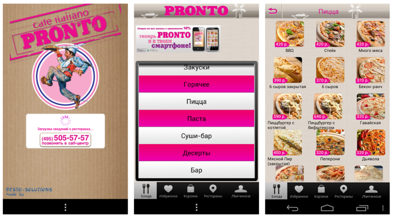
When you start the application, the user sees a nicely designed splash-screen with the words "Downloading information about restaurants." After 10, 20, 30 seconds nothing changes on the screen - the same inscription and infinitely rotating loading indicator are visible. After some time, there are doubts about the performance of the application.

Some users who left reviews on Google Play could not wait for the download to finish. For example, an application user writes:
When you restart the application, the problem persists.
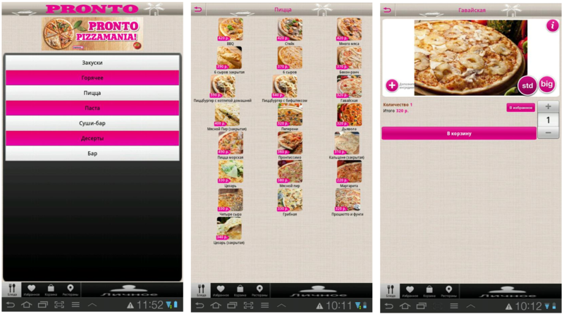
The first screen that the user sees after the application finally opens is the menu screen with the items “Pizza”, “Sushi Bar”, “Hot”, etc. The menu is designed in the form of a spinning drum, which contradicts one of the design principles for Android: "When creating a user interface, do not imitate the styles of other platforms." However, this problem is not very critical, since it does not make it difficult to work with the application.
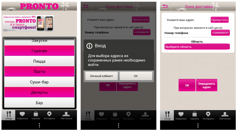
Another really significant problem can frighten off users: navigating through the menu is almost impossible without authorization. When you try to go to any menu item, a window appears with an offer of authorization, while the user is forcibly transferred to the screen with the address entry form. To leave it, you must click on the button "Skip", located in the upper right corner of the screen. Because of the unusual location (usually the “Skip” button is located at the bottom of the screen), it is difficult to find, so the user feels driven into a dead end. After clicking on the "Skip" button, the user enters the desired section of the menu, but when you try to go to any other section (for example, from "Pizza" to "Hot"), the story repeats.
This intrusive authorization requirement may not please those users who installed the application, just to familiarize themselves with the pizzeria assortment and decide whether to order something there.
The address entered once is not saved, so when you restart the application, the user will have to either enter the address again or enter the personal account (via the “Personal” section) if it is registered there.
From the menu, the user enters the screen with a list of dishes. For each dish there is a small photo and name, the price is indicated. Icons are located three in a row. Because of this organization of information on the screen, as well as due to the lack of alphabetic or any other sorting, it is very difficult to find the right dish, even if its name is known. If the user does not know the name, but simply wants to choose something for himself, then by the small photo on the icon and by name he will not be able to understand what this dish is (for example, what is included in the Proshiutto and fungi pizza?).
In any case, to make an order, you must go to the next screen, where there is a large photo of the dish, the "order" button and the price. The price is written in very small print and has a much lower visual priority than the element for selecting the number of dishes. This does not correspond to the user's logic: price is more important than quantity. By the way, the input element for the number of copies of the product does not correspond to the style guide for the Android platform.
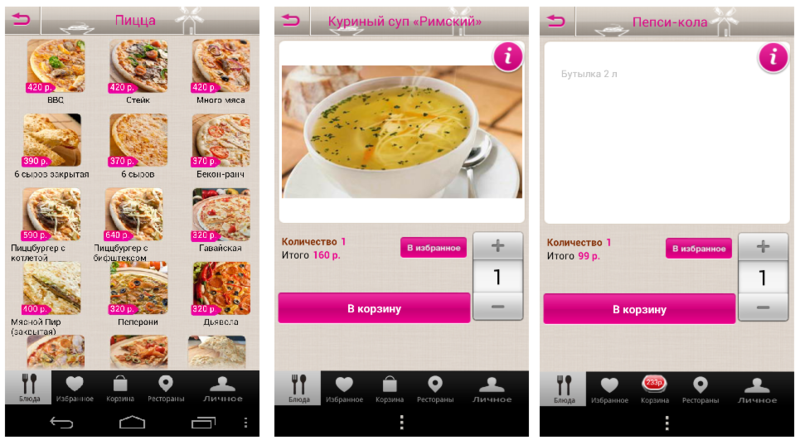
There is no description of the dish on the screen - in order to see it, the user will have to take one more step and press the “i” button on the photo. On the screen that opens, you can see a brief description written in low-contrast light gray font on a white background. Thus, to make a choice of several dishes, the user will be forced to do a lot of unnecessary actions: select a dish, go to the screen with his photo, go to the screen with its description, go back to the list of dishes, and repeat all over again. Even if you do not take into account the problems described above with the requirement of mandatory authorization, such a long chain of steps can cause considerable irritation to the user.
Finally, the user gets to the basket. In the basket, you can change the number of selected items and proceed to checkout. The only problem on this screen, not very significant, is that it is impossible to go from the basket to the description of the product. This can cause inconvenience to users who are accustomed to using the cart as a comparison tool. Before placing the order, they re-view the parameters of the selected dishes and choose one of a number of the same type. In this application, they will not have this opportunity.
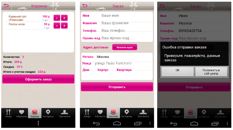
By clicking on the "Send" button, the user will see a form for entering the name and address. The form is made quite carelessly: signatures to the lines crawl on the separators and are not aligned to the left. In addition, the principle of data entry here does not correspond to the style guide for the Android platform.
Well, in the end, the user is faced with what we said at the beginning - it is impossible to send an order, because after entering all the data and clicking on the “Send” button, the application displays a window with an error message.
The application has a very useful feature. The user can view where the restaurant is located, in one of two ways: in the list of restaurants and on the map of the city. However, the transition to the map is carried out only after viewing the selected restaurant, you can not see all the restaurants on the map. Such a solution may be inconvenient for users. You can, for example, imagine a situation where a user is going for a walk to a specific area of the city and plans where to eat there - then it will be more convenient for him to see the location of all the restaurants on the map, rather than use the list.
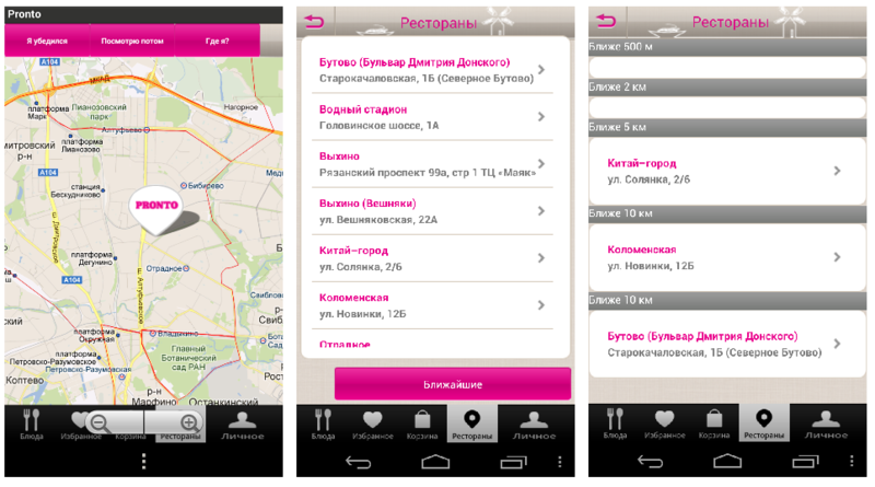
On the map of the city, the selected restaurant is marked with a large “Pronto” label, so it’s impossible not to notice. There are three buttons above the map: “Where am I?”, “I made sure” and “I will look later.” The purpose of the last two buttons is completely unobvious. When you click on them, the application displays an error message and stops working correctly: text and image disappears from all screens.
Taking care of the convenience of the user, the developers have added a function to view the restaurants closest to it - to do this, in the list of restaurants, click the “Nearest” button. But in the implementation of this function there are also a number of problems: first, the list is loaded for a long time. Secondly, when there are no restaurants near the user, empty lines appear in the list, which does not look very nice. In addition, this list display does not match the style guide for the Android platform.
The application for the tablet is a version of the application for a smartphone that is greatly stretched on the big screen. Because of this, all the errors in the design become even more noticeable and produce a rather unpleasant impression. This is the lack of alignment, the crawling of labels on the separators between the lines; The pictures at the top of the screen and the “personal” button in the bottom menu are very stretched. If there is little information on the screen, then a lot of unstructured empty space remains in its lower part, which also does not look very good. Landscape orientation is not supported.
In fact, the application has some good ideas.
However, at the moment these good ideas are lost against the background of various problems of the application.
Due to numerous technical problems, errors in the design and not always convenient implementation of the functionality, the application gives the impression of "raw" and not fully thought out. However, most of the problems described here can be solved in the next update. It is enough to remove the intrusive authorization requirement and eliminate technical problems, especially with the inability to place an order in order to satisfy most users. And if you improve the design of the application and bring it into compliance with the requirements of the style guide for the Android platform, it will not be worse, and perhaps even better than some competing applications.
Developers Relations Team, Google Russia
About the application
The Pronto application is designed to order delivery of pizza and other Italian dishes from the Pronto restaurant chain. Currently, the application works only in Moscow and cities of the Moscow region.
')
According to Google Play reviews, users are not very satisfied with the application. For example, user Yury Balikhin writes:
“They would check it before launching the application in the market. When you really want to eat, it is very difficult to remain calm, trying to overcome the program. ”The average rating of the application is 1.6 out of 5. Today we will try to figure out what exactly the users did not like and whether it is possible to somehow improve the situation.
Briefly about the main thing
The main problem of the Pronto application is that it is impossible to place an order with its help. At least, the experts who conducted the assessment did not succeed. And the point here is not that the navigation and the logic of the application work are not entirely user-friendly, and not even in technical flaws. Just when you try to send the generated order from the basket, the message “Error sending order” appears without explaining what the error is and without instructions for eliminating it. But first things first.
Information for developers
Problem | Criticality | Recommendation |
| Unable to order |  | If the message is caused by a technical fault, eliminate the fault. Otherwise, modify the message so that the user can understand exactly what the error is and could eliminate it. |
Application launch
When you start the application, the user sees a nicely designed splash-screen with the words "Downloading information about restaurants." After 10, 20, 30 seconds nothing changes on the screen - the same inscription and infinitely rotating loading indicator are visible. After some time, there are doubts about the performance of the application.
Some users who left reviews on Google Play could not wait for the download to finish. For example, an application user writes:
"I did not wait for the menu to load."User rating is 1 out of 5.
When you restart the application, the problem persists.
Information for developers
Problem | Criticality | Recommendation |
| Starting the application takes too much time. The download indicator does not give an idea of how long it remains to wait for the download to finish. | | Speed up the download of restaurant data. If possible, store data about restaurants in the local storage. Replace the existing display method on the Progress Bar. Above the Progress Bar, display information about the loaded data and the percentage of the operation completed. |
Menu screen
The first screen that the user sees after the application finally opens is the menu screen with the items “Pizza”, “Sushi Bar”, “Hot”, etc. The menu is designed in the form of a spinning drum, which contradicts one of the design principles for Android: "When creating a user interface, do not imitate the styles of other platforms." However, this problem is not very critical, since it does not make it difficult to work with the application.
Another really significant problem can frighten off users: navigating through the menu is almost impossible without authorization. When you try to go to any menu item, a window appears with an offer of authorization, while the user is forcibly transferred to the screen with the address entry form. To leave it, you must click on the button "Skip", located in the upper right corner of the screen. Because of the unusual location (usually the “Skip” button is located at the bottom of the screen), it is difficult to find, so the user feels driven into a dead end. After clicking on the "Skip" button, the user enters the desired section of the menu, but when you try to go to any other section (for example, from "Pizza" to "Hot"), the story repeats.
This intrusive authorization requirement may not please those users who installed the application, just to familiarize themselves with the pizzeria assortment and decide whether to order something there.
The address entered once is not saved, so when you restart the application, the user will have to either enter the address again or enter the personal account (via the “Personal” section) if it is registered there.
Information for developers
Problem | Criticality | Recommendation |
| Navigating the menu for unauthorized users is virtually impossible due to the constant forced translations on the screen with the form for entering the address. | | Ask the user to enter the address only during the ordering process, or when he entered the registration section himself. At the first invitation to authorization to give the opportunity to refuse repeat invitations. |
| The application does not remember the address entered by the user - the next time you start the address, you must enter it again. |  | Save user input even after the application is closed (addresses, logins, passwords, the contents of the basket, etc.). |
| The menu design does not match Android patterns. |  | Bring the display of the list of menu categories in accordance with the style guide for the Android platform. |
Choice of dishes
From the menu, the user enters the screen with a list of dishes. For each dish there is a small photo and name, the price is indicated. Icons are located three in a row. Because of this organization of information on the screen, as well as due to the lack of alphabetic or any other sorting, it is very difficult to find the right dish, even if its name is known. If the user does not know the name, but simply wants to choose something for himself, then by the small photo on the icon and by name he will not be able to understand what this dish is (for example, what is included in the Proshiutto and fungi pizza?).
In any case, to make an order, you must go to the next screen, where there is a large photo of the dish, the "order" button and the price. The price is written in very small print and has a much lower visual priority than the element for selecting the number of dishes. This does not correspond to the user's logic: price is more important than quantity. By the way, the input element for the number of copies of the product does not correspond to the style guide for the Android platform.
There is no description of the dish on the screen - in order to see it, the user will have to take one more step and press the “i” button on the photo. On the screen that opens, you can see a brief description written in low-contrast light gray font on a white background. Thus, to make a choice of several dishes, the user will be forced to do a lot of unnecessary actions: select a dish, go to the screen with his photo, go to the screen with its description, go back to the list of dishes, and repeat all over again. Even if you do not take into account the problems described above with the requirement of mandatory authorization, such a long chain of steps can cause considerable irritation to the user.
Information for developers
Problem | Criticality | Recommendation |
| On the screen with the list of dishes there are no descriptions, price and ability to order, without going to the next screen. | | Change the screen with a list of dishes. Arrange photos of dishes in a column, next to each photo to write the price, a brief description. Add the ability to put the dish in the basket without going to the screen with his large photo. |
| On the screen of a particular dish there is no description of it - it is hidden behind the “i” button, which users may not notice. The description of a particular dish is made with a low-contrast gray font on a white background, which makes it difficult to read. | | Display all product information on a single product screen. |
| The price of a particular dish is written in small print and is not very noticeable to users. | | Make the price display visually more noticeable compared to the other parameters of the ordered goods. |
| The input element for the number of copies of the product does not match the style guide for the Android platform. | | Bring the display of the choice of the number of copies of the goods in accordance with the style guide for the Android platform. |
Basket
Finally, the user gets to the basket. In the basket, you can change the number of selected items and proceed to checkout. The only problem on this screen, not very significant, is that it is impossible to go from the basket to the description of the product. This can cause inconvenience to users who are accustomed to using the cart as a comparison tool. Before placing the order, they re-view the parameters of the selected dishes and choose one of a number of the same type. In this application, they will not have this opportunity.
By clicking on the "Send" button, the user will see a form for entering the name and address. The form is made quite carelessly: signatures to the lines crawl on the separators and are not aligned to the left. In addition, the principle of data entry here does not correspond to the style guide for the Android platform.
Well, in the end, the user is faced with what we said at the beginning - it is impossible to send an order, because after entering all the data and clicking on the “Send” button, the application displays a window with an error message.
Information for developers
Problem | Criticality | Recommendation |
| Unable to order | | If the message is caused by a technical fault, eliminate the fault. Otherwise, modify the message so that the user can understand exactly what the error is and could eliminate it. Bring the display of the dialog box with an error in accordance with the style guide for the Android platform. |
| From the basket can not go to the description of a particular dish. | | Add the ability to go from the basket to the detailed description of pending goods. |
| Signatures to the lines crawl into dividers and are not aligned to the left. | | Correct the errors in the design of the lists. |
| The data entry fields do not correspond to the style guide for the Android platform. | | Bring the design of the data entry fields in accordance with the style guide. |
Screen "Restaurants"
The application has a very useful feature. The user can view where the restaurant is located, in one of two ways: in the list of restaurants and on the map of the city. However, the transition to the map is carried out only after viewing the selected restaurant, you can not see all the restaurants on the map. Such a solution may be inconvenient for users. You can, for example, imagine a situation where a user is going for a walk to a specific area of the city and plans where to eat there - then it will be more convenient for him to see the location of all the restaurants on the map, rather than use the list.
On the map of the city, the selected restaurant is marked with a large “Pronto” label, so it’s impossible not to notice. There are three buttons above the map: “Where am I?”, “I made sure” and “I will look later.” The purpose of the last two buttons is completely unobvious. When you click on them, the application displays an error message and stops working correctly: text and image disappears from all screens.
Taking care of the convenience of the user, the developers have added a function to view the restaurants closest to it - to do this, in the list of restaurants, click the “Nearest” button. But in the implementation of this function there are also a number of problems: first, the list is loaded for a long time. Secondly, when there are no restaurants near the user, empty lines appear in the list, which does not look very nice. In addition, this list display does not match the style guide for the Android platform.
Information for developers
Problem | Criticality | Recommendation |
| Unable to see the location of all the restaurants on the map. | | Make it possible to view and select restaurants on the map. |
| The purpose of the buttons "I was convinced" and "I will look later" is unknown. Clicking on them leads to incorrect operation of the application. | | Make sure that the actions behind these buttons are required and rename the buttons according to their value to the user. Troubleshoot technical issues. |
| Displaying a list of restaurants does not match the style guide for the Android platform. | | Bring the list display in accordance with the style guide for the Android platform. |
Work on tablet devices
The application for the tablet is a version of the application for a smartphone that is greatly stretched on the big screen. Because of this, all the errors in the design become even more noticeable and produce a rather unpleasant impression. This is the lack of alignment, the crawling of labels on the separators between the lines; The pictures at the top of the screen and the “personal” button in the bottom menu are very stretched. If there is little information on the screen, then a lot of unstructured empty space remains in its lower part, which also does not look very good. Landscape orientation is not supported.
Little about good
In fact, the application has some good ideas.
- Dishes can be added to the "Favorites", which often order the same. True, in order to get this opportunity, you must first go through the registration process, indicating your name, phone, email and password in the "Personal" section. In addition, there is a big technical problem with this section: if an authorized user tries to go there, then the application issues an error message and stops working correctly.
- At the stage of entering personal data, if the user is too lazy to specify the address, the application can try to determine the address for it using geolocation services - not very accurate, but the existence of the possibility itself is quite pleasant.
- The user has the opportunity to view a list of restaurants and even find the one closest to him.
- You can find out about restaurant promotions - just click on the banner at the top of the screen.
However, at the moment these good ideas are lost against the background of various problems of the application.
Information for developers
Problem | Criticality | Recommendation |
| If an authorized user tries to go to the Favorites section, the application terminates. | | Fix technical issues with the Favorites section. |
Summarize
Due to numerous technical problems, errors in the design and not always convenient implementation of the functionality, the application gives the impression of "raw" and not fully thought out. However, most of the problems described here can be solved in the next update. It is enough to remove the intrusive authorization requirement and eliminate technical problems, especially with the inability to place an order in order to satisfy most users. And if you improve the design of the application and bring it into compliance with the requirements of the style guide for the Android platform, it will not be worse, and perhaps even better than some competing applications.
Resume for developers: what to do first
Recommendation | Criticality |
| Eliminate technical problems with sending an order from the basket. | |
| Speed up the download of restaurant data. If possible, store data about restaurants in the local storage. | |
| Replace the existing load indication on the Progress Bar. Above the Progress Bar, display information about the loaded data and the percentage of the operation completed. | |
| Eliminate intrusive authorization requirements. At the first invitation to authorization to give the user the opportunity to opt out of repeated invitations. Offer authorization during the checkout process, or when the user entered the registration section on his own. | |
| Save user input even after the application is closed (addresses, logins, passwords, basket contents, etc.) | |
| Change the screen with a list of dishes. Arrange photos of dishes in a column, next to each photo to write the price, a brief description. Add the ability to put the dish in the basket without going to the screen with his large photo. | |
| Display all product information on a single product screen. | |
| Make the price display visually more noticeable compared to the other parameters of the ordered goods. | |
| Add the ability to go from the basket to the detailed description of pending goods. | |
| Solve technical problems with the "Favorites" section. | |
| Make it possible to view and select restaurants on the map. | |
| Make sure that the actions behind the buttons “I made sure” and “I will look later” (on the map) are in demand and rename the buttons according to their value to the user. Solve technical problems that occur after clicking on these buttons. | |
| Correct the errors in the design: the lack of alignment on the screen section of the menu, crawling line captions on the dividers (basket), empty lists (list of restaurants), etc. | |
| Show the display of the menu, lists, authorization forms, elements for selecting the number of copies of the goods, etc. in accordance with the style guide for the Android platform: developer.android.com/design/building-blocks/lists.html developer.android.com/design/building-blocks/dialogs.html developer.android.com/design/building-blocks/text-fields.html etc. | |
Source: https://habr.com/ru/post/182444/
All Articles