Review of the Railway Tickets mobile app for the Android platform
We continue to sort applications from Google Play . We present to your attention the second review of a series of practical recommendations for improving the design, architecture and ergonomics of the interface of applications for Android. Reviews prepared in collaboration with UsabilityLab .
The Railway Tickets application is so far the first application on Google Play, with which you can buy train tickets. Through the application, you can find a ticket, pay it with a bank card and immediately go through the electronic registration.
')
Turning to reviews on Google Play, we see that users are not very happy with this application. Here is a review by Yuriy Turchin:
Next, we will talk about the key problems of the application and give recommendations on how to eliminate them.
One of the main problems of the application, repulsive users, is not even an inconvenient interface, but a commission for buying tickets, which sometimes amounts to about 20% of the cost of the ticket itself. User Serg Q writes:
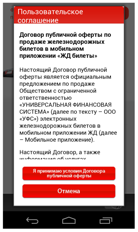
When you first start the application, the user sees a pop-up window with a user agreement, in order to start working with the application, he needs to read and accept the terms of the offer (although we all know that users are usually not inclined to read such long texts). The pop-up window does not have a scroll indicator, which, firstly, does not allow to assess how long the text is contained in the window, and secondly, it does not correspond to the style guide for the Android platform.
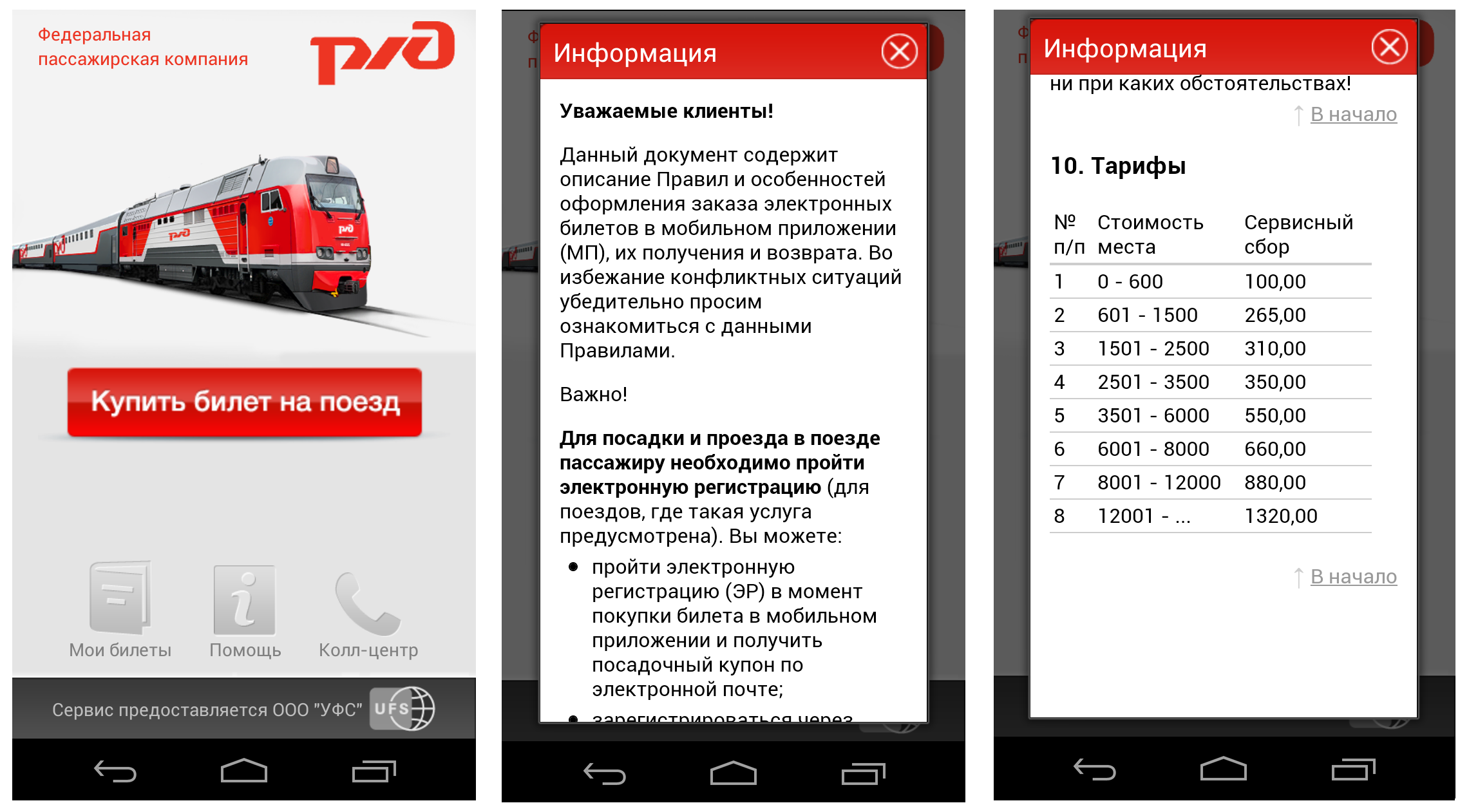
After the user has accepted the terms of the offer, he is taken to the main screen of the application, which contains a large bright button “Buy a train ticket” and the sections “My tickets”, “Help”, and “Call center”. The "My Tickets" section contains a list of tickets purchased through the application, and clicking on the "Call Center" button opens the phone with the already dialed call center number. Interaction with these sections does not cause problems for users. If the user decides to learn more about the capabilities of the application and goes to the "Help" section, then he will be confronted with a very long text containing the complete rules for making tickets through the mobile application. The text is written in an official language and is rather difficult to perceive, the pop-up window again does not have a scroll indicator, and the most important, from the point of view of users, information about tariffs is at the very end of the document.
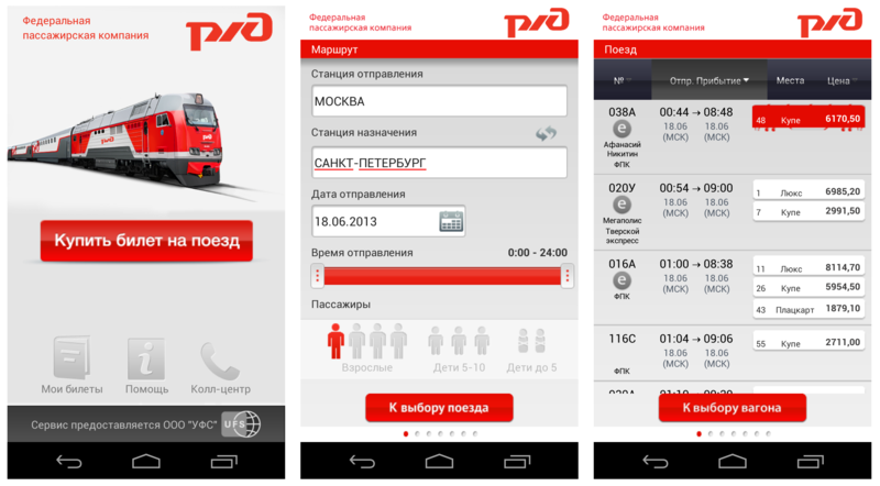
Step 1. Clicking on the button "Buy a train ticket", the user enters the "Route" screen. At this step, he needs to specify the parameters of his trip - from where and where he goes, the date and time of departure, the number of passengers. On the screen, the default route is "Moscow - St. Petersburg". If the user wants to change it, then when you enter the first letters of the station name, a list of prompts appears, which sometimes inaccurately opens on the screen, crawling over the upper boundary of the application and closing the input window.
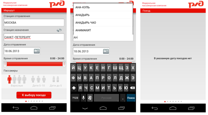
Unfortunately, in the application you can buy tickets only for trains of direct communication. When trying to set a route with transfers, the application either gives a technical error, or the message “There are no trains on the specified date”. Such feedback is not informative for the user, because does not allow to understand the reason for failure - the user thinks that by specifying a different date or time of departure, he will be able to find a ticket.
Step 2. After the user has specified all the parameters of the trip, he goes to the “Train” screen. It displays all the found train options, including the train number, departure and arrival times, the price of tickets and the number of empty seats. You can sort the selected trains by train number, departure time and price. But sorting by price works only within one train, which is inconvenient for the user, since he has to carefully look through the entire train list to find a suitable ticket.
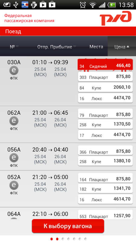
In addition, several other interface errors can be seen on this screen. First, the step indicator in the lower bar does not change. Secondly, when looking at this screen, the user feels that the entire list of trains is presented, but this is not so. One of the indicators of the continuation of the page, except for the side scroll bar, are images, text and any content that goes beyond the border of the screen and prompts the user to continue the page. And on this screen we see that the information break goes clearly along the lower border of the text block, and it seems that the list ends there.
Step 3. After the user has selected the appropriate train and car type, he will be taken to the page with the car number selection. The inconvenience is that along with the choice of the car, the user expects to simultaneously select and place. However, when you click on the image of the car, the application takes the user to the next screen. This, firstly, does not meet the user's expectations, and, secondly, contradicts the Android sign pattern - flipping should occur with a gesture of sliding, and not just touching the screen. Such inconsistency of navigation knocks down the user and interferes with his work with the application. In addition, there are other problems with navigation in the application - a swipe gesture that scrolls through screens, works differently on different screens - somewhere they can be flipped through from the middle of the screen, and somewhere only in the lower corners of the screen.

Also on this screen, the user sees an inscription in large print with the amount of the order, but important information about the amount of the service fee for buying a ticket through the application is indicated in small gray font, and is invisible to the user. Full information about tariffs can be obtained only by clicking on this area with a gray font. This action is absolutely not obvious to the user. When you click on the legend over the image of the car, a pop-up window appears with the decoding, which begins to tremble. Read the information on it is impossible.
Step 4. Finally, the user goes to the "Places" screen, where he can select the desired place in the train car. However, everything is not so simple. Unlike the Russian Railways site, where the user can immediately choose the right place on the scheme, here the user is prompted to do it in three steps - specify a range of locations, specify the type of location (“in one compartment” or “not important” if the user buys only one ticket and location tier. The location range is set using the pick-up. You cannot manually enter values, and the user has to make about 50 clicks to select places next to each other, if he purchases two tickets, or wants a place in a certain part of the car. Even if the user chose a compartment car or a suite, the range will remain unchanged from 1 to 56, although it is known that the number of seats in the luxury and coupe cars is much less.
Step 5 . We proceed to specifying passenger data. The screen contains fields for entering the details, and the fields for entering the series and the document number do not contain any prompts or fill patterns. This is inconvenient, because This data can be entered in several different ways (with a space, without a space), and if the user enters the data incorrectly, he will have to spend too much time correcting it.
Step 6. After entering all the passenger data and the electronic check-in, the user goes to the "Payment method" window. In the application, you can pay for tickets in only one way - by credit card. Information on this is in the Help section on the main screen. The problem is that not all users will carefully review this section, because it contains a large number of complexly worded text, which discourages users from reading it. This can lead to an unpleasant situation when a person who does not have a bank card has gone through all the purchase steps and at the end found that there are no other payment methods.
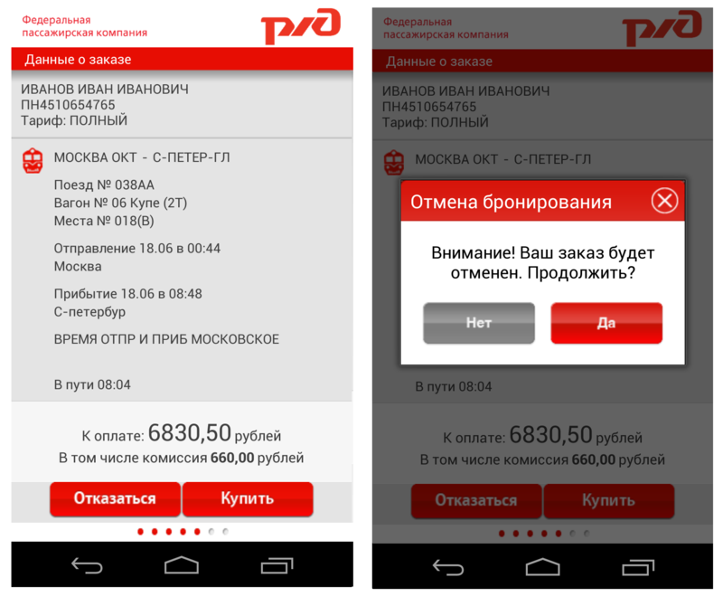
Step 7. On the “Order Details” screen, the user must once again carefully check all the details of the trip and proceed to payment. If he notices an error, then one cannot go back a step and correct it - in this case, the system will offer to cancel the reservation, and the purchase procedure will have to be repeated. Considering that when working with the touch keyboard, users make more mistakes and typos than when working with the desktop, we can assume that this behavior of the application will give users certain inconveniences.
The application is not adapted for tablet devices, and is a version for smartphones stretched on a large screen. This does not interfere with the user task, but it does not make a very pleasant impression. By the way, both versions - for smartphone and tablet, do not support landscape orientation. Error notifications appear at the bottom of the screen and are invisible to users, because The entire work area of the application is concentrated in the upper half of the screen.

The very idea of the application seems very correct. A smartphone or tablet - these are the things that are always at our fingertips and access to them is easier than to desktops and laptops. Accordingly, the ability to buy tickets directly through the application, without going to the site - this is what should make life easier for the client, especially if he often has to travel by train. The advantages of the application also include a bright nice interface.
The application, not without problems, but still copes with the implementation of the main user task - buying a ticket. However, users are more deterred not by the inconvenience of working with the application, but by the policy of its creators. Most users recognize that this application is necessary, but the cost of the service is not adequate. User Gregory Bezhentsev writes:
Developers Relations Team, Google Russia
About the application
The Railway Tickets application is so far the first application on Google Play, with which you can buy train tickets. Through the application, you can find a ticket, pay it with a bank card and immediately go through the electronic registration.
')
Turning to reviews on Google Play, we see that users are not very happy with this application. Here is a review by Yuriy Turchin:
The average grade for this application is 2.4 out of 5.“It doesn’t work properly and there are still such high margins for the application. Called service charges - exactions for the raw product. "
Next, we will talk about the key problems of the application and give recommendations on how to eliminate them.
Briefly about the main thing
One of the main problems of the application, repulsive users, is not even an inconvenient interface, but a commission for buying tickets, which sometimes amounts to about 20% of the cost of the ticket itself. User Serg Q writes:
The fact that users are so outraged by high commissions is not surprising. At the moment, there is a widespread sales practice - users are encouraged to access websites and mobile applications in order to reduce the burden on offline offices and get rid of queues. For example, the official site of the Russian Railways offers discounts and bonuses for buying tickets online. In the case of this application, the situation is reversed - because of the high commission, the whole point of buying a ticket through the application is lost, it is easier for the user to buy a ticket at the station, or to access the site from a mobile phone, despite the fact that it is less convenient. But we will pass to interface problems.“I was waiting for the application, due to the fact that I often ride the train. Ticket price 950r., Commission 350r. ?? What is this anyway? What kind of country we have this ?? Rzhd can not afford a free application? ".
Application launch
When you first start the application, the user sees a pop-up window with a user agreement, in order to start working with the application, he needs to read and accept the terms of the offer (although we all know that users are usually not inclined to read such long texts). The pop-up window does not have a scroll indicator, which, firstly, does not allow to assess how long the text is contained in the window, and secondly, it does not correspond to the style guide for the Android platform.
Information for developers
Problem | Criticality | Recommendation |
| No scrolling on popup window with user agreement. |  | Add a scroll in accordance with the Android style guide. |
Main screen
After the user has accepted the terms of the offer, he is taken to the main screen of the application, which contains a large bright button “Buy a train ticket” and the sections “My tickets”, “Help”, and “Call center”. The "My Tickets" section contains a list of tickets purchased through the application, and clicking on the "Call Center" button opens the phone with the already dialed call center number. Interaction with these sections does not cause problems for users. If the user decides to learn more about the capabilities of the application and goes to the "Help" section, then he will be confronted with a very long text containing the complete rules for making tickets through the mobile application. The text is written in an official language and is rather difficult to perceive, the pop-up window again does not have a scroll indicator, and the most important, from the point of view of users, information about tariffs is at the very end of the document.
Information for developers
Problem | Criticality | Recommendation |
| The text with instructions for buying tickets through the application is difficult to formulate and difficult to understand. | | Formulate the rules for using the service in a language understandable to the user. |
| No scrolling on the pop-up window with information about the rules for buying tickets through the application. | | Add a scroll in accordance with the Android style guide. |
Ticket purchase
Step 1. Clicking on the button "Buy a train ticket", the user enters the "Route" screen. At this step, he needs to specify the parameters of his trip - from where and where he goes, the date and time of departure, the number of passengers. On the screen, the default route is "Moscow - St. Petersburg". If the user wants to change it, then when you enter the first letters of the station name, a list of prompts appears, which sometimes inaccurately opens on the screen, crawling over the upper boundary of the application and closing the input window.
Unfortunately, in the application you can buy tickets only for trains of direct communication. When trying to set a route with transfers, the application either gives a technical error, or the message “There are no trains on the specified date”. Such feedback is not informative for the user, because does not allow to understand the reason for failure - the user thinks that by specifying a different date or time of departure, he will be able to find a ticket.
Information for developers
Problem | Criticality | Recommendation |
| The message about the absence of search results does not contain information about the reasons for this result and suggestions for changing the search criteria. | | This message should contain information about why it is impossible to find trains on the selected route, and also contain proposals for changing it to another (with transfers) if there are no trains for direct communication. |
| The drop-down list of tips inaccurately opens on the screen, closing the keyboard. |  | Correct the design of the drop-down list. The rules for creating drop-down lists are contained in the Android guidelines . |
Step 2. After the user has specified all the parameters of the trip, he goes to the “Train” screen. It displays all the found train options, including the train number, departure and arrival times, the price of tickets and the number of empty seats. You can sort the selected trains by train number, departure time and price. But sorting by price works only within one train, which is inconvenient for the user, since he has to carefully look through the entire train list to find a suitable ticket.
In addition, several other interface errors can be seen on this screen. First, the step indicator in the lower bar does not change. Secondly, when looking at this screen, the user feels that the entire list of trains is presented, but this is not so. One of the indicators of the continuation of the page, except for the side scroll bar, are images, text and any content that goes beyond the border of the screen and prompts the user to continue the page. And on this screen we see that the information break goes clearly along the lower border of the text block, and it seems that the list ends there.
Information for developers
Problem | Criticality | Recommendation |
| Sorting by price occurs within a single train and does not allow the user to immediately find a ticket in the desired price range. Instead, he has to look through the entire list of trains. | | Change the principle of sorting by price. Sorting by ticket price should not be made within a single train, but for all found trains. |
| The list of found trains is presented on the screen in such a way that it does not give the user an idea of the continuation of this list outside the screen. | | To change the view of the train list visually, so that the information is broken in the middle of a line or graphic element. |
| The bottom panel (bar) with the indicator of the passage of the steps to buy a ticket does not work. | | Correct the work of the bottom panel with the step indicator - when moving to the next step, the position of the point should change, or the number of filled points should correspond to the number of steps passed. |
Step 3. After the user has selected the appropriate train and car type, he will be taken to the page with the car number selection. The inconvenience is that along with the choice of the car, the user expects to simultaneously select and place. However, when you click on the image of the car, the application takes the user to the next screen. This, firstly, does not meet the user's expectations, and, secondly, contradicts the Android sign pattern - flipping should occur with a gesture of sliding, and not just touching the screen. Such inconsistency of navigation knocks down the user and interferes with his work with the application. In addition, there are other problems with navigation in the application - a swipe gesture that scrolls through screens, works differently on different screens - somewhere they can be flipped through from the middle of the screen, and somewhere only in the lower corners of the screen.
Also on this screen, the user sees an inscription in large print with the amount of the order, but important information about the amount of the service fee for buying a ticket through the application is indicated in small gray font, and is invisible to the user. Full information about tariffs can be obtained only by clicking on this area with a gray font. This action is absolutely not obvious to the user. When you click on the legend over the image of the car, a pop-up window appears with the decoding, which begins to tremble. Read the information on it is impossible.
Information for developers
Problem | Criticality | Recommendation |
| Not highlighted important information about the commission for the purchase of tickets. | | Visually highlight information about the commission, indicate it under the main price of the order in large and bright font. |
| The inconsistency of navigation. The transition to the next screen takes place by touch, and not through the swipe gesture familiar to Android users. Flipping works the same way not on all screens. | | Align navigation with Android guidelines . |
| Technical problems when viewing information about the car - a pop-up window begins to tremble. | | Eliminate this error. |
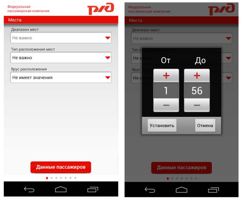
Step 4. Finally, the user goes to the "Places" screen, where he can select the desired place in the train car. However, everything is not so simple. Unlike the Russian Railways site, where the user can immediately choose the right place on the scheme, here the user is prompted to do it in three steps - specify a range of locations, specify the type of location (“in one compartment” or “not important” if the user buys only one ticket and location tier. The location range is set using the pick-up. You cannot manually enter values, and the user has to make about 50 clicks to select places next to each other, if he purchases two tickets, or wants a place in a certain part of the car. Even if the user chose a compartment car or a suite, the range will remain unchanged from 1 to 56, although it is known that the number of seats in the luxury and coupe cars is much less.
Information for developers
Problem | Criticality | Recommendation |
| The user is not able to select a specific place in the car. | | Implement the choice of seats using the car layout where the user can immediately select the desired location, or specify a range of seats within one compartment / compartment in the reserved seat. |
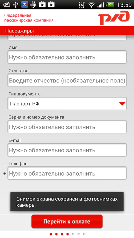
Step 5 . We proceed to specifying passenger data. The screen contains fields for entering the details, and the fields for entering the series and the document number do not contain any prompts or fill patterns. This is inconvenient, because This data can be entered in several different ways (with a space, without a space), and if the user enters the data incorrectly, he will have to spend too much time correcting it.
Information for developers
Problem | Criticality | Recommendation |
| There are no prompts or examples of filling in the “Series and document number” field. | | Add examples or tips with samples to fill this field. |
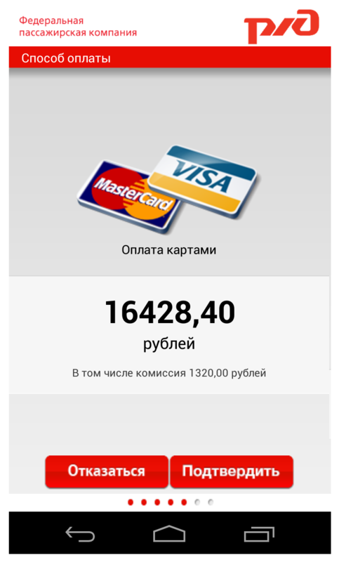
Step 6. After entering all the passenger data and the electronic check-in, the user goes to the "Payment method" window. In the application, you can pay for tickets in only one way - by credit card. Information on this is in the Help section on the main screen. The problem is that not all users will carefully review this section, because it contains a large number of complexly worded text, which discourages users from reading it. This can lead to an unpleasant situation when a person who does not have a bank card has gone through all the purchase steps and at the end found that there are no other payment methods.
Information for developers
Problem | Criticality | Recommendation |
| Important information for users about possible payment methods is in the “Help” section, which contains a lot of text and does not make the user want to read it carefully. | | Duplicate information about payment methods immediately before the start of the ticket purchase. |
Step 7. On the “Order Details” screen, the user must once again carefully check all the details of the trip and proceed to payment. If he notices an error, then one cannot go back a step and correct it - in this case, the system will offer to cancel the reservation, and the purchase procedure will have to be repeated. Considering that when working with the touch keyboard, users make more mistakes and typos than when working with the desktop, we can assume that this behavior of the application will give users certain inconveniences.
Information for developers
Problem | Criticality | Recommendation |
| From the screen for checking order data, it is impossible to go back and correct details if an error was made. | | Implement the ability to go back from this screen. |
Work on tablet devices
The application is not adapted for tablet devices, and is a version for smartphones stretched on a large screen. This does not interfere with the user task, but it does not make a very pleasant impression. By the way, both versions - for smartphone and tablet, do not support landscape orientation. Error notifications appear at the bottom of the screen and are invisible to users, because The entire work area of the application is concentrated in the upper half of the screen.
Little about good
The very idea of the application seems very correct. A smartphone or tablet - these are the things that are always at our fingertips and access to them is easier than to desktops and laptops. Accordingly, the ability to buy tickets directly through the application, without going to the site - this is what should make life easier for the client, especially if he often has to travel by train. The advantages of the application also include a bright nice interface.
Total
The application, not without problems, but still copes with the implementation of the main user task - buying a ticket. However, users are more deterred not by the inconvenience of working with the application, but by the policy of its creators. Most users recognize that this application is necessary, but the cost of the service is not adequate. User Gregory Bezhentsev writes:
“Too a large percentage of the commission, especially if you buy for travel, if it were 1-3% set, and for good you can take it from the Russian Railways. It’s not so difficult to access the Russian Railways website from a smartphone and buy without commissions. ”
Resume for developers: what to do first
Recommendation | Criticality |
| Refine error messages when searching for trains. The message should contain information about why it is impossible to find trains on the selected route, and also contain proposals for changing this route to the route with transfers. | |
| Change the principle of sorting by price. Sorting by ticket price should not be made within a single train, but for all found trains. | |
| Implement the choice of seats using the car layout where the user can immediately select the desired location, or specify a range of seats within one compartment / compartment in the reserved seat. | |
| Arrange navigation by application. Swiping screens should occur on the same gesture in accordance with Android guidelines. | |
| Implement the ability to go back from the order data verification screen. | |
| The popup window with the user agreement must be provided with a scroll indicator in accordance with the style guide for Android . | |
| Correct the design of the drop-down list of tips with stations. The rules for creating drop-down lists are contained in the Android guidelines . | |
| On the screen with the search result of trains, you need to change the visual representation of the list of found trains, so that at the bottom of the screen a break in information goes in the middle of a line or graphic element, prompting the user to continue the list. | |
| Correct the work of the bottom panel with the step indicator - when moving to the next step, the position of the point should change, or the number of filled points should correspond to the number of steps passed. | |
| Solve a technical problem when viewing information about the car on the pop-up window (the pop-up window starts to tremble). | |
| Add examples or hints with samples of the field “Series and document number” on the screen for entering passenger data. | |
| Information about payment methods must be duplicated immediately before the start of the ticket purchase. | |
Source: https://habr.com/ru/post/182400/
All Articles