Interactive SVG cartogram with d3.js
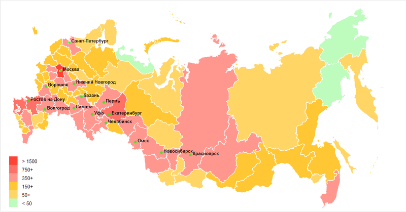
Greetings to you, graceful! Today I will tell you how to make an interactive SVG cartogram using d3js.org , about the capabilities of this JavaScript library in general, and also have to figure out a little how and where it is better to store geo-information for the web. In the final we get the following:
You can start this exciting journey under the cut.
In principle, this section can be skipped, if not interesting, a link to the desired file at the very end of the section. Who cares, understand further. What is a map, in fact, is information about the geometry of a certain object with reference to coordinates. In GIS systems, shapefiles are usually used for this purpose. We will draw a map of Russia, most likely the search will lead you to the same place as me, namely on the GIS-Lab . I chose the Albers-Siberia projection. Download First of all, we need to transform our shapefile according to the WGS 84 standard (it’s the same EPSG: 4326). To do this, you need to create a projection file, for example,
Then, using GDAL , or rather one of its OGR libraries, we will perform the conversion. I downloaded Quantum GIS for these needs, which already contains everything you need and even more. After installation, you will have several shortcuts, look for
Thus, we got the shapefile we need, although as needed, it doesn’t suit us at all on the web, so now we will generate a GeoJSON file based on our data. Then from GeoJSON we will generate TopoJSON , which is needed for our cartogram. Such are the cases, but do not worry, GeoJSON is useful, maybe it will be useful. So, we go back to the console and write about the following:
We get our GeoJSON file, open it and see a surprise from GIS-Lab.
Now let's move on to generating TopoJSON, this will allow us to reduce the file size. In general, TopoJSON is GeoJSON’s optimization in topology, it removes redundant information, for example, it removes duplication of common borders from neighboring regions. But we can reduce the file size even more by simplifying the geometry. So let's get started! Run the Node.js command line (it is needed for the implementation of TopoJSON ) and write the following:
Here, the
')
Map will draw at all, or how? Now we have everything we need to draw a map using d3.js. Copy the following template and proceed:
First, let's set the size of our SVG map.
Let's set the domain of colors for the cartogram, the domain for the legend and the legend legend.
Add an element and a tooltip class to the document.
Add SVG with attributes that define the size.
Let's set the projection parameters (remember / look at Albers_Siberia.prj from the beginning of the article):
We read the data.
Start drawing. Create objects for couples
Drawing and coloring cartograms.
We process events: we change the brightness of the region (for highlighting) and output the region name and the exact numerical value in the tooltip.
Now I would like to learn how to add something to this very map, I decided to add the million cities of Russia, for this we actually need the city itself and its coordinates (latitude and longitude in decimal degrees), unfortunately to find a geocoder like this gpsvisualizer.com/ geocoder , so that he understands Russian, I could not (can anyone know?), but I did not want to go into the Yandex.Maps API, especially as the list is small. It would be nice if they themselves did such a koldunchik, but oh well, I was distracted. As a result, received a list of the following form:
Well, actually, add them in a group:
Here I would like to add that instead of points you can add, for example, a pie / donut chart, thereby increasing the information load on our cartogram. In general, the possibilities are mass, everything is limited by your tasks, imagination and expediency from the point of view of UI / UX .
Well, at the end we will add the legend of our cartogram:
That's basically all, I tried to show the main points on a simple example, I hope that I succeeded. The code is of course not perfect (nothing is perfect), but the goal, I repeat, was to make it understandable, and not super universal / effective. Sources can be found on GitHub , and you can touch the result through the service bl.ocks.org . Yes, we did not consider CSS here, but everything is trivial there.
Well, we created a simple cartogram, without the possibility of approaching, complex animation and other bells and whistles, but if you want to add them here, it will not be difficult. In general, this library has the broadest possibilities for visualizing everything and everything: graphs, charts, cartograms, trees, graphs, charts, heatmaps ... Such a DataViz harvester, everything you need can be found through the site d3js.org . Mike Bostock is actively developing the project, almost every day it lays out new examples (one minus, almost all without comments), on stackoverflow there are also a lot of things and respond there promptly, including Mike himself. So go ahead, IMHO this library, which is essentially the main visualization tool behind the hill, is unfairly deprived of attention in us. Well and I, if it will be interesting to a habrosobosomstve, I will periodically sort interesting examples. Actually everything, comments, questions and suggestions are welcome.
PS I almost forgot the most important thing, be careful on the roads, especially if you are not from Chukotka, we have enough freaks and plenty of video from the recorders is a confirmation! In general, it is sad, almost 28 thousand deaths per year, the horror is simple (data was taken from the traffic police site).
You can start this exciting journey under the cut.
Cartographic affairs.
In principle, this section can be skipped, if not interesting, a link to the desired file at the very end of the section. Who cares, understand further. What is a map, in fact, is information about the geometry of a certain object with reference to coordinates. In GIS systems, shapefiles are usually used for this purpose. We will draw a map of Russia, most likely the search will lead you to the same place as me, namely on the GIS-Lab . I chose the Albers-Siberia projection. Download First of all, we need to transform our shapefile according to the WGS 84 standard (it’s the same EPSG: 4326). To do this, you need to create a projection file, for example,
Albers_Siberia.prj with the following contents : +proj=aea +lat_1=52 +lat_2=64 +lat_0=0 +lon_0=105 +x_0=18500000 +y_0=0 +ellps=krass +units=m +towgs84=28,-130,-95,0,0,0,0 +no_defs Then, using GDAL , or rather one of its OGR libraries, we will perform the conversion. I downloaded Quantum GIS for these needs, which already contains everything you need and even more. After installation, you will have several shortcuts, look for
OSGeo4W among them, click on it, go to the directory with our files and enter the following command: ogr2ogr -f 'ESRI Shapefile' -s_srs Albers_Siberia.prj -t_srs EPSG:4326 input-fixed.shp input.shp Thus, we got the shapefile we need, although as needed, it doesn’t suit us at all on the web, so now we will generate a GeoJSON file based on our data. Then from GeoJSON we will generate TopoJSON , which is needed for our cartogram. Such are the cases, but do not worry, GeoJSON is useful, maybe it will be useful. So, we go back to the console and write about the following:
ogr2ogr -f GeoJSON output.json input.shp We get our GeoJSON file, open it and see a surprise from GIS-Lab.
Encryption from GIS-Lab
Generally speaking, this feature is present in the shapefile initially, but I noticed this “pleasant” surprise only at this stage. The feature is that all the names of the regions are encrypted from the enemies of the Motherland and are displayed by kryakozyabrami. But our man knows where to look for the encryption book . But it was not there. Not one Cyrillic encoding came up (there were meaningful names on DOS-866, but some letters were displayed in different squares), then I became thoughtful and went to search for truth on the Internet, maybe I was looking bad, but on the GIS-Lab forums, and in other places there was nothing at all about the krakozyabr on this map at all (and the map from 2010, as I understand it), I was completely desperate, opened again the EditPad (there, I think, most of the encodings are presented, and indeed it is very convenient to work with text and regulars) and began to sort through all the encodings in a row, and, lo and behold, when you Ore MIK encoding: (!?) Bulgarian got almost what I wanted, namely the names of regions. True, all the letters in the names were separated by the DOS symbol ├, well, a simple regulars solved this problem rather quickly. Although why a problem, this is a cipher, and we have passed the test of friend or foe =). By the way, this file has one more feature, which the truth immediately mentions on the GIS-Lab, namely: there are no borders of the Chechen and Ingush republics on the map due to the lack of data from the Rosreestr (well, they don’t want to go there on a business trip, and everyone is here). Well, yes, in principle, not scary (although to whom of course), but the unpleasant sediment remained.
Now let's move on to generating TopoJSON, this will allow us to reduce the file size. In general, TopoJSON is GeoJSON’s optimization in topology, it removes redundant information, for example, it removes duplication of common borders from neighboring regions. But we can reduce the file size even more by simplifying the geometry. So let's get started! Run the Node.js command line (it is needed for the implementation of TopoJSON ) and write the following:
topojson -o output_topo.json -p -s 1e-7 -- name=input_geo.json Here, the
-p parameter is responsible for the preservation of the feature properties , and -s 1e-7 for simplifying the geometry, 1e-7 is the threshold in steradians, the smaller, the more accurate the geometry: 1e-3 is Switzerland relative to the world map, and 1e-9 football field. For what it may be necessary - if you want to make it possible to zoom on your map. The separator -- just a separator (your KO) of the output and input files, and the russia prefix specifies the name of the object, if you do not specify it, then the name of the input file will be used as a name, which is not always convenient (can be cumbersome). In the resulting file, I replaced the names of the regions with codes in accordance with ISO 3166-2: RU . Everything. The file can be taken on GitHub .')
We draw the cartogram
Map will draw at all, or how? Now we have everything we need to draw a map using d3.js. Copy the following template and proceed:
<!DOCTYPE html> <html lang="en"> <head> <meta charset="utf-8"> <title>Accidents on the Road - Choropleth</title> <script type="text/javascript" src="http://d3js.org/d3.v3.min.js"></script> <script type="text/javascript" src="http://d3js.org/queue.v1.min.js"></script> <script type="text/javascript" src="http://d3js.org/topojson.v0.min.js"></script> <!-- <script type="text/javascript" src="http://d3js.org/topojson.v1.min.js"></script> --> </head> <style> your awesome CSS </style> <body> <h1>Cool Header</h1> <script type="text/javascript"> Your awesome d3.js code </script> </body> </html> First, let's set the size of our SVG map.
var width = 960, height = 500; Let's set the domain of colors for the cartogram, the domain for the legend and the legend legend.
var color_domain = [50, 150, 350, 750, 1500] var ext_color_domain = [0, 50, 150, 350, 750, 1500] var legend_labels = ["< 50", "50+", "150+", "350+", "750+", "> 1500"] var color = d3.scale.threshold() .domain(color_domain) .range(["#adfcad", "#ffcb40", "#ffba00", "#ff7d73", "#ff4e40", "#ff1300"]); Add an element and a tooltip class to the document.
var div = d3.select("body").append("div") .attr("class", "tooltip") .style("opacity", 0); Add SVG with attributes that define the size.
var svg = d3.select("body").append("svg") .attr("width", width) .attr("height", height); Let's set the projection parameters (remember / look at Albers_Siberia.prj from the beginning of the article):
var projection = d3.geo.albers() .rotate([-105, 0]) .center([-10, 65]) .parallels([52, 64]) .scale(700) .translate([width / 2, height / 2]); var path = d3.geo.path().projection(projection); We read the data.
queue() .defer(d3.json, "/d/5685937/russia_1e-7sr.json") .defer(d3.csv, "Accidents.csv") .await(ready); Start drawing. Create objects for couples
: - and : . function ready(error, map, data) { var rateById = {}; var nameById = {}; data.forEach(function(d) { rateById[d.RegionCode] = +d.Deaths; nameById[d.RegionCode] = d.RegionName; }); Drawing and coloring cartograms.
svg.append("g") .attr("class", "region") .selectAll("path") .data(topojson.object(map, map.objects.russia).geometries) //.data(topojson.feature(map, map.objects.russia).features) <-- in case topojson.v1.js .enter().append("path") .attr("d", path) .style("fill", function(d) { return color(rateById[d.properties.region]); }) .style("opacity", 0.8) We process events: we change the brightness of the region (for highlighting) and output the region name and the exact numerical value in the tooltip.
.on("mouseover", function(d) { d3.select(this).transition().duration(300).style("opacity", 1); div.transition().duration(300) .style("opacity", 1) div.text(nameById[d.properties.region] + " : " + rateById[d.properties.region]) .style("left", (d3.event.pageX) + "px") .style("top", (d3.event.pageY -30) + "px"); }) .on("mouseout", function() { d3.select(this) .transition().duration(300) .style("opacity", 0.8); div.transition().duration(300) .style("opacity", 0); }) Now I would like to learn how to add something to this very map, I decided to add the million cities of Russia, for this we actually need the city itself and its coordinates (latitude and longitude in decimal degrees), unfortunately to find a geocoder like this gpsvisualizer.com/ geocoder , so that he understands Russian, I could not (can anyone know?), but I did not want to go into the Yandex.Maps API, especially as the list is small. It would be nice if they themselves did such a koldunchik, but oh well, I was distracted. As a result, received a list of the following form:
City lat lon 55.7522200 37.6155600 - 59.8944400 30.2641700 Well, actually, add them in a group:
- . d3.tsv("cities.tsv", function(error, data) { var city = svg.selectAll("g.city") .data(data) .enter() .append("g") .attr("class", "city") .attr("transform", function(d) { return "translate(" + projection([d.lon, d.lat]) + ")"; }); city.append("circle") .attr("r", 3) .style("fill", "lime") .style("opacity", 0.75); city.append("text") .attr("x", 5) .text(function(d) { return d.City; }); }); }; Here I would like to add that instead of points you can add, for example, a pie / donut chart, thereby increasing the information load on our cartogram. In general, the possibilities are mass, everything is limited by your tasks, imagination and expediency from the point of view of UI / UX .
Well, at the end we will add the legend of our cartogram:
var legend = svg.selectAll("g.legend") .data(ext_color_domain) .enter().append("g") .attr("class", "legend"); var ls_w = 20, ls_h = 20; legend.append("rect") .attr("x", 20) .attr("y", function(d, i){ return height - (i*ls_h) - 2*ls_h;}) .attr("width", ls_w) .attr("height", ls_h) .style("fill", function(d, i) { return color(d); }) .style("opacity", 0.8); legend.append("text") .attr("x", 50) .attr("y", function(d, i){ return height - (i*ls_h) - ls_h - 4;}) .text(function(d, i){ return legend_labels[i]; }); That's basically all, I tried to show the main points on a simple example, I hope that I succeeded. The code is of course not perfect (nothing is perfect), but the goal, I repeat, was to make it understandable, and not super universal / effective. Sources can be found on GitHub , and you can touch the result through the service bl.ocks.org . Yes, we did not consider CSS here, but everything is trivial there.
Results What's next?
Well, we created a simple cartogram, without the possibility of approaching, complex animation and other bells and whistles, but if you want to add them here, it will not be difficult. In general, this library has the broadest possibilities for visualizing everything and everything: graphs, charts, cartograms, trees, graphs, charts, heatmaps ... Such a DataViz harvester, everything you need can be found through the site d3js.org . Mike Bostock is actively developing the project, almost every day it lays out new examples (one minus, almost all without comments), on stackoverflow there are also a lot of things and respond there promptly, including Mike himself. So go ahead, IMHO this library, which is essentially the main visualization tool behind the hill, is unfairly deprived of attention in us. Well and I, if it will be interesting to a habrosobosomstve, I will periodically sort interesting examples. Actually everything, comments, questions and suggestions are welcome.
PS I almost forgot the most important thing, be careful on the roads, especially if you are not from Chukotka, we have enough freaks and plenty of video from the recorders is a confirmation! In general, it is sad, almost 28 thousand deaths per year, the horror is simple (data was taken from the traffic police site).
Source: https://habr.com/ru/post/181766/
All Articles