About hatred of fish ... and love of meaningful text. Part 1
We continue to publish transcripts of speeches from our December Design Camp . Today on the next article Alexey Kulakov from JetStyle . A video version of the speech is available on techdays.ru , the presentation can be downloaded there.
As before, this is an author article and does not reflect the position of Microsoft.
The article was written based on the report for designers (mostly).
')
I have objects of hate in our design process. I want to share them with you, perhaps this will change something.
I hope, to explain that the design is not “beautiful pictures” no one needs anymore. We all understand that we are actually engaged in building effective communication with visual means.
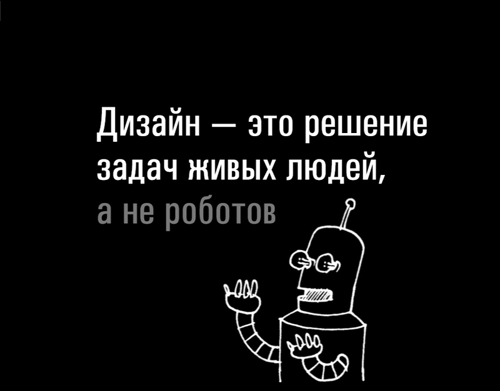
Everything that will be discussed, comes from the fact that we (the designers) solve the problems of living people, that the designers themselves are living people. Conscious, endowed with will, responsibility, performing a specific function. This function is to share content using the screen. Actually, this is called the interface =)
The interface is a “shell” that allows you to interact with some content. The shell consists of navigation, buttons, molds, different beauty, etc. And there is something that “lies” in this interface, what the user extracts from the interaction with him — the content. The interface is needed to transfer it. Even when it’s not about “content sites”, but about tools, the user extracts something from the interface, and that it must be very well understood.
Most often, this content is text, because people are verbal beings: we think with the help of words, communicate with the help of words. Now (speaking at Design Camp) I have to say the words. If I try to show pictures in silence, communication will be more difficult. If I try to draw all kinds of wireframes in the air and don’t say anything, you won’t understand me at all.
But even when it’s a picture or a video, or a way to do something, the content is quite specific, and people think about it with words.
Now attention, the question is: if the interface is created for the sake of getting content, where does the phenomenon of fish come from in the design process?
The same thing that we use as a dummy content, while it is not yet? That disgusting rotten trash that masks the lack of content? The fish appears because designers are descended from graphic artists, and not from anyone else. If designers as directors had directors, I think that you and I would have been much more fortunate, and communication with users would have been much more meaningful. And so we get indescribable beauty and often quite a little sense.
Where does fish come from?
There are several reasons where the fish is taken. Here are the most common:
1. Time trouble
Quite often we do not have content in the interface, simply because there is no time to create it. Deadlines are pressing, you need to do something quickly. I think everyone faced this.
2. Laziness
Let's be honest, who was too lazy to think about the content? There are such? I am a designer, I am 37 years old, and I did it.
3. Irresponsibility
In the way the process is built, we often think that the designer is not responsible for the text. Some other people are always responsible for the text, and the designer is responsible for the beauty and convenience, but not the text. And that is why the designer is not responsible for the text.
If we have time one night, if we don’t really want to, if we are lazy, then we can put anything into the interface, right?
4. Misunderstanding
And most importantly, we often just do not understand the user and what he is. We do not know whose problem we are deciding, where it hurts, what he loves, what makes his eyes shine, and what makes him sleep from boredom.
3 harmful myths
In addition to these reasons, there are 3 harmful myths. We live with them.
Myth one: "The text for the interface provides the customer."
As it usually happens. We have something like this in design, and we know that someday ... If this is, for example, a site, then after us, the makers will impose it, then the programmers will come and program. Then, someday, finally, the content manager will find time on the part of the client or on the part of our internal customer, he will come there, pour something into the interface. We will look at it, our eyes will flow out. So everything usually happens, right?
The text in the interface should appear from the very beginning! The person who has to take care that the text (or any other content) appears in the interface is called a designer. If he does not care about the text, it means he is not responsible for the content. And if he is not responsible for the content of the interface, then what does he design then?
Myth two: “If the text was not delivered to us ready outside, a copywriter should write it.”
The designer does not have to be literate? He is not obliged to be able to write good texts? Does he need to have good Russian? Above all, it doesn't have to be exciting, right? He can write anything, because then specially trained people will come, who will write something good instead of him in the right places of the text.
Copywriters, journalists and managers are wonderful people. Surely many of them write text better than designers. For what the text is about, what it is, where its place in the interface is, whether it helps the user, the designer answers!
Lorem ipsum
This is what you need to burn. Fortunately, when I teach designers now, designers come across from time to time who don’t know what it is. This is heavenly happiness! (For those who do not know, lorem ipsum is such a special piece of text that I don’t remember who thought up to take as default text when you just need to fill in a piece of text in the interface. Instead of taking and typing, you need to take phrase and pour it there).
If the designer uses lorem ipsum, then nothing sensible will come out of it.
But this note was hanging in our kitchen in the office, and the designer wrote it (probably):

I think that no copywriter would have better conveyed the thought. I think this is a great text:
- it is clear who is the addressee;
- clear message;
- short text;
- there are even no mistakes, neither spelling nor punctuation;
- language is alive.
Normal, lively human text. Why don't designers write this in interfaces?
I don’t understand how a design can be made if we don’t deal with the content of this design. Attention! I am not talking here only about the text of the navigation, not only about the text of the tutorial, not only about the text help. I am talking, first of all, about the text of the content.
Why do I use the word "content" and not "content"? Because “content” is what our communication contains, and “context” is a much colder word, detached, indierent.
We are engaged in the organization of interaction, so? So, when we make an interface, interface instances should contain examples of this communication. Therefore, the designer must be responsible for the content.
What happens when the designer is not responsible for the text?
First, the designer goes into the bowels of hallucinations.
It is very easy to get off the ground when you put in the interface as text on horrible. And instead of a picture draw oblique crosses.
If you look like conferences - for example, conferences of startups, interface designers, any product ideology - we will hear that half of the reports and conversations mean that the person who is engaged in product design (in the broad sense, design, I mean, not only graphic , not only usability by design, but, in principle, inventing the logic of communications, the meaning of the service), firmly stood with his feet on the ground, understood what kind of pain he heals, whose she, etc. So much talk about it, because from the ground it is very easy to come off and leave dotochenie on the layout, fichah, start sanding medyashku, make beautiful icons and find yourself in the stream, and then to discover how our broken crystal dream of reality, it is very simple.
Secondly, if we made an interface with fish instead of text and envelopes instead of pictures, then it cannot be tested !
Let's conduct a mental experiment and make sure that a prototype without content cannot be tested. Suppose we are making a mailer interface.
I specifically say that we make the interface of a tool. It is immediately clear that if we make the interface of the site that sells phones, then it generally cannot be tested without reliable content, because if there is not the phone model that a person is looking for and an adequate price, then we simply will not see natural behavior.
But if we make mail, we also will not be able to test it until we have some alpha and beta containing real correspondence. If we have only a graphical interface with fish poured into it, everything will be sad. There will be no life history, because we will not show the user any reliable example of interaction. Moreover, we will not show it to ourselves. We simply will not know what should be contained there.
We will make abstract interface examples around abstract text examples. We will not understand what value our interface carries. Why do I put so much stress on it? Because the text for us is a way to understand what we are investing in each specific screen . When we write text, we can build with ourselves a dialogue on the topic of what value in the interface with users we talk about using our graphical means. And if there is no text in the interface, if there is no content or it is conditional, then we will not be able to organize any dialogue either with ourselves or with the user.
What happens if the designer writes the text, not the fish?
Of course, new problems! Because nothing is cured by itself.
You probably watched (I watched it for myself, and for all the designers I had to articulate) that when the designer said: “Write a reliable text,” he begins to get the texts about the same as they say in the tax inspection. Long complex sentences (like I have in this article), in which there are many neologisms and no emotions. The designer speaks like a living person, and writes like an official because he is clamped down.
Why the designer does not write, for example, like this:

A special case is when a designer, when he is asked to write a text, begins to write a particularly creative fish . The fashion for creative fish lived in our office for a while. It ended with the fact that a particularly creative fish was designed by a designer, then a designer, and then programmed by a programmer. And then, before we sent the result to the client, no one removed it. And it was written there ... What exactly I can not say, because it is obscene. And you know, it was very difficult for us to explain to the client why we did this. This incident happened 8 years ago, and after that we introduced a firm rule - not to make krativnoy fish.
But even without this risk, creative fish is not what is required of the text in the interface. The text of the content, as well as everything else in the interface, should help the user.
The third problem is the random place of text in the interface . If the text is conditional, it is very easy, instead of creating a complete system, to fall into the sin of grinding a fragment. And from the fragments, then nothing will come together. When we do not think about how one text lies next to another, absurdities arise. Such as this, for example:

Why it happens? I have already spoken about this: because we came not just from a monkey. We (designers) are descended from a monkey artist, and not from a monkey psychologist, or a monkey writer, or a monkey director.
We are not thinking about the story. We think about "how it looks." Those. we can talk a lot about the importance of user experience, about goals and scenarios, but the internal designer still appreciates the pictures more! Therefore, we are engaged in design, and in order to have something to make out, we set aside for the content a “content place” . And we think about the content as a decorated block. Instead of thinking that the user will extract from this piece of the interface.
Several things are pushing us towards this position. First, the business process pushes us towards this. There is such a delicate moment. On the one hand, the entire industry for 20 years already says the following: “No, the designer and designer are different words.” Banalism. Everyone knows that these are different words. The decorator is the one who makes the beautiful, and the designer is the one who solves the user's tasks. But the details of our business process are still built in such a way that the designer is the one who is creating the graphical shell. He is not engaged in the core of communications. He is not a story expressed in the text, comes up with. He puts it in the shell.
If the designer has long been taught usability, then he knows that before he draws the interface, he will have to understand what the user’s task is. He will divide the entire audience into groups, then select a person from it, understand the context of the person, formulate the person’s purpose from the context. Then he distills the script from this goal. And after that draws a shell in which there will be no content.
Where does such a gap of logic come from? Why is the story not expressed in the text?
After all, what further had to be done? After that, it would be necessary to take and write a story, what exactly the user will read in the interface, and put something specific in the interface. That is, to find copies of pictures that would inspire the user; write texts for him that would solve his problems. But instead we start drawing envelopes.
Why else? We have such an industry standard animation prototype, called Axura. I personally do not love her, although all usabilityists love her. I do not want to say that this is a bad program, but it imposes such logic. It is very easy to make neat prototypes that do not contain content.
I'm talking specifically about prototypes. It is clear that the prototypes have different stages. There is, for example, such a stage when we simply draw on the board to discuss something. We do not want to test it yet. But as soon as we started to make a prototype, the purpose of which is testing, the first thing to do is to write the words. Even when we make some tools, for example, for drawing, where there will be no words at the end. We have to understand for ourselves about each screen, about what content it transmits to the user.
Here is an example.

This is not a screen, but, in general, a good example. This is a wooden cannon. It was used, in my opinion, in the war of the North and the South. She was put on the fort, so it seemed that there was a gun. But she did not know how to shoot, because she was made of derava. Just worked as a message for a specific audience: “Do not approach our fortress. We have guns. ” The man who designed this gun, he clearly understood the content. There is no envelope here which suggests that there is something here that will frighten the enemy. Here is a very specific thing.
When I talk about content and text, I don’t necessarily say that each interface ultimately contains exactly the letters that say: “This button is very important. Click it to get the most important content of something. ”

Each interface should focus on a specific living person and convey to it an explicit message. It is clear that it would be good for this button to say without words: “Anxiety, anxiety! The wolf blew away. So that she herself was so entered into the interface by graphic means that the user understood what was going on here.
It is important that at the very beginning of the design phase, we must begin with an understanding of what a particular user should understand in a particular scenario when he interacts with any element of the interface. If we succeed in getting rid of the text at the next stages of interface development and preserve understanding of the content, this is excellent. After all, design is the better, the more sparing means it creates communication. We all know that our brain is so arranged that the more information we read from fewer signs, the more aesthetic pleasure we experience.
To be continued…
Source: https://habr.com/ru/post/180829/
All Articles