Handbook of front-end developer: types of horizontal navigation panels
Preface: working as a layout designer, your humble servant noticed that there are several types of menus; at the same time for the layout of each of them should use their own techniques.
Details - under the cut.
This article is aimed more at beginning make-up designers, but, maybe, experienced professionals will also find something new in it or refer to it as a reference book.
The topic is structured as follows: first, the task is set - the type of the required navigation block is described, then the techniques are considered that allow creating just such navigation.
It is understood that the writing of styles is carried out under the semantically correct menu structure, which looks like this:
When doing layout for a doctype other than html5, we omit the nav element or replace it with the corresponding div.
')
Well, let's start! ..
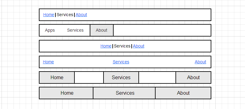
Menu items located on the right / left side
This section describes the navigation blocks in which the elements are located on the right / left side. For the layout of such blocks, depending on the situation, you can use several methods:
- display: inline;
- float: left / right;
- display: inline-block.
Display: inline
When we apply
This method is advisable to use in the layout menu of a simple type, in which the elements are presented in the form of separate words, not having paddings and are separated only by spaces between them:

Living example

How is done
The li elements in CSS need to set the display: inline property. By the way, this will also remove unnecessary markers in most menus of this type, since they are in additional blocks that are contained in items with display: list-item, while inline's are missing.
At ul, set the text-align property to right or left, respectively.
Notes
- When using this option, it is worth remembering that vertical margins are not taken into account for inline elements, but horizontal margins work;
- If you need pixel perfect layout, there is a possibility of a problem: in different browsers the width of the space between the elements is different. To solve the problem, the distance between the elements is set by margins, and spaces are removed ;
- If the underlining in the links of the menu items is made the lower border, in modern browsers you can get a nice animated on: hover menu ( JSFiddle ).
Float: left / right
When we apply
When you need to make a menu with items that have padding and / or fixed height / width:

Living example

How is done
Set float: left or float: right to li elements. If you need to remove markers, you need to add display: block or list-style: none.
Notes
- It is necessary to “clear” ul, by giving it a class .clearfix or by placing at its end an element with clear: both, otherwise ul the height will be zero; You can read about other ways to “clean” floats here ;
- An example of an interesting menu, built-up float'ami: html5guy .
Display: inline-block
When we apply
The tasks are the same as for layout with float. And yes, when solving such a problem, the inline-block fell in an unequal battle. First, the cross-browser compatibility of such a solution is lower than that of the float, and second, between inline-blocks, as well as between inline-elements, there are gaps, often unnecessary. These problems are solvable, but why create them?
How is done
Set display: inline-block elements li. Well, for IE7 (if you support it) we write * display: inline; * zoom: 1.
Symmetrical with respect to left and right sides of the navigation
In this section, the navigation blocks are located symmetrically. There are several types of such menus; each of them has its own type of layout:
- menu items are centered;
- menu items are evenly distributed across the width, there is a gap between the elements;
- menu items are evenly distributed across the entire width, elements fill the entire width of ul.
Menu items are centered
When we apply
The menu is located in the center:


Living example

How is done
Depending on the type of menu items, set display: inline or display: inline-block (if padding is provided for menu items and width and / or height are set) to li elements. Parent (ul) set text-align: center.
Notes
Let me repeat myself: sometimes there is a need to remove spaces between inline and inline block elements; several ways to solve this problem can be found here .
Menu items are evenly distributed across the width, there is a gap between the elements
When we apply
Menu items are evenly distributed across the width, there are gaps between the individual items:


Living example

How is done
Depending on the type of menu items, set the display: inline or display: inline-block elements li. Parent (ul) set text-align: justify. But immediately justify does not work - you need to fill the first line (if it is not clear why this is so - we start the Word and try to stretch a few words to the full width with justify). Therefore, at the end of the ul element we add an additional element with display: inline-block and width: 100%, or, better, a pseudo-element :: after with the same characteristics.
Notes
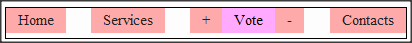
Remember, in the previous menu types, we removed spaces between elements with the display property set to inline and inline-block? So, in this case, it is absolutely impossible to do so - the browser needs gaps between menu items. By the way, if you remove the spaces between some elements, you can group the buttons ( JSFiddle ):
Menu items are evenly distributed across the width, elements fill the entire width of ul.
When we apply
There are no gaps between menu items; any number of menu items occupies the entire width:


How is done
In solving this problem, there is a temptation to impose a menu of tables; but we're not going to break the semantics of the document, right? Therefore, use display: table-cell for li and display: table for ul; then we set the width for ul
If you need support for older browsers, use a script polyfill that replaces such blocks with tables for IE6 and IE7 or arrange fallback in other ways.
Notes
When making a menu in this way, you need to remember that you cannot place elements with position: absolute relative to the table-cell.
Why?
The fact is that in the w3c specification, the position: relative action on the table-cell is not defined , so each browser can have its own characteristics.
Look at this example in different browsers (we are especially closely watching the behavior of Mozilla Firefox!).
To solve this problem, you need to place a div in the cell, relative to which positioning to be performed.
Look at this example in different browsers (we are especially closely watching the behavior of Mozilla Firefox!).
To solve this problem, you need to place a div in the cell, relative to which positioning to be performed.
Total
The article lists the main types of menus and features of their layout. I hope this material is useful to you, thank you for your attention.
Source: https://habr.com/ru/post/180473/
All Articles