Real Estate Search Engine Interface
I think many of you, dear habrachitchiteley, at least once had to decide the issue of renting or buying a home. Then, probably, you went to Google, typed something like “renting an apartment <city>”, after which you started to load such “wonderful” interfaces in numerous tabs:
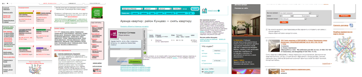
I will not talk about the problems of these interfaces. In any case, I believe that the millions of people who every day are trying to find housing for themselves are definitely worthy of the best.
In this article I will tell you how to quickly and cheaply create a prototype of quite a decent site for real estate search. Fans to read about usability please under the cat.
')
It is necessary to develop a prototype of the site for easy search of real estate objects that want to buy, sell, rent or rent. The interface should be universal from the point of view of user experience, i.e., ideally, everything, young and old, should immediately use it without any problems.
The interface will be used by people with very different levels of computer literacy and with different habits. But when we take a pencil in our hands, knowing about it will be useless in itself, because we will not have a picture of our target user in our head.
To solve this problem, you need to form a collective image of all these people and their experiences of use. For this you need to show a little imagination. I was lucky, one kind person gave me access to Yandex.Metrica of a similar site with good traffic, so besides fantasy I also had some statistics.
We take the tool for creating mental maps and invent our character. Some facts may be entirely fictional, but they must be, most likely, the most likely:

If you try especially without thinking about running your eyes on this map, then an abstract image of this Masha will form in your head. Immediately I recall such “Masha” from real life, and everything becomes clear: what is on her mind, how does she own a computer, what does she think of such real estate sites, and so on. All this is quite enough to design not just an interface, but an interface for people like Masha. To enhance your own impression of this image, you can add an expressive photo card:
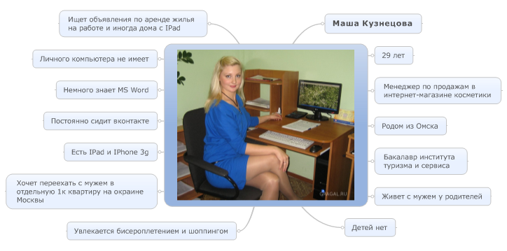
I must say, I am not a supporter of long and detailed portraits of users, except if we are not talking about any highly specialized automation system. Practice has shown that the simpler and shorter the portrait, the more often the designer will use it during the creation of the prototype, and the portrait is created for this purpose.
A pencil is the surest way to get a prototype of the interface at a level that is sufficient for coordinating conceptual moments with the customer in just a few hours, so I really like a pencil. And he saves a lot of man-days and nerves, and is also an excellent excuse to divert tired eyes from the monitor. The main thing during the creation of a paper prototype is not to overdo it with detail: in each such prototype there is a certain boundary point, starting from which all subsequent refinements are performed faster in an interactive analog on a computer than on paper.
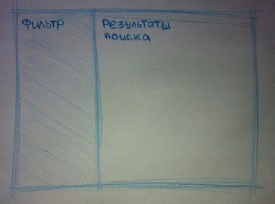
Let's return to our interface. First you need to decide on the main blocks and their location on the page. Our Masha has a small HD monitor at work, the iPad at home. Both screens are rectangular. She could also have some kind of netbook, which is also rectangular, but with a small resolution. Actually, draw a rectangle:

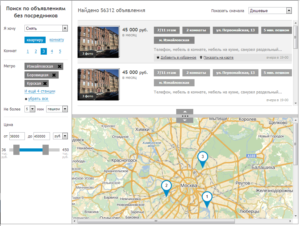
If Masha wants to search for real estate objects, then she will need at least a list of these objects. Understandably, there are not 10 of them there, and it is also worth adding a block with filters from this list. On Masha’s monitors, the horizontal areas are particularly valuable in terms of the use of the space of the rectangle, so we will occupy the filter with a vertical bar. Immediately, problems with returning to the filter are solved after a long scrolling of the list of objects: the filter will always always be on the side, in the same place.
Masha does not get out of Vkontakte, so she is accustomed to choose something on the left, and to absorb the content on the right. Anyway, the traditional area for vertical navigation is the left page bar. Therefore, we will place our filters for a start on the left, and if we realize that it is better on the right, we place it on the right (after all, this is a paper prototype, everything is possible here):
For Masha important distance from the subway, parks and major roads. The quickest way to show all this is to indicate the address of the object as a point on the map. There will be several objects in our issue, so we’ll make a common map for these objects:

It seems as long as Masha is happy with everything, so let's get to the details. As I said, it is important not to get involved in them, but some key elements are still worth showing.
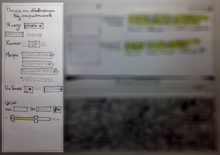
Let's start with the filter. In general, real estate objects have a lot of parameters, but conditionally they can be divided into two groups: necessary and not necessary for the majority. Parameters from the second group can be hidden in some kind of pop-up or drop-down element, so we will not think about them for now. From the first group we have the type of ad (rent, sale, etc.), the type of property, distance from the metro and the price.
The filter block should show only actual interface elements. For example, if the object type is “room”, then the choice of the number of rooms in the apartment should be hidden. Our Masha is typing slowly (according to legend, because of long nails) and prefers to use only a mouse. Therefore, Masha should be able to set all the search parameters without using the keyboard. We get this block with filters (I washed the rest of the prototype so as not to be distracted by it):
Go to the list of objects. Let's think about why Masha of two approximately the same in terms of parameters of objects can choose one? Apparently, because the photograph of this selected object is closer to that image of an ideal apartment that hovers in Masha's head. Since the parameters from the object to the object usually do not change much in the list, first of all it is necessary to slip the look of the photograph (of course, the best), and only then the price and everything else. Everything else is advisable to submit as systematically as possible and in the case, so as not to waste valuable man-seconds to recognize the parameters of each ad. I decided to design a set of standard object parameters in the form of tags.
Above the list we place the number of ads found and the sorting type. Ads will be loaded from the server in batches when scrolling. When hovering over an ad, the add to favorites buttons and object highlights on the map will appear. Here's what happened:

It remains to add the card itself and the main interface is ready:

A bit ugly, but quickly and cheaply. But you can discuss the interface and, if necessary, just as quickly and cheaply redo everything. Now leave the pencil and proceed to the creation of an interactive prototype.
To create an interactive prototype, you can open a notepad and write a ton of html-code. However, I prefer to spend time on more interesting activities, so I use special software for dynamic prototyping, namely, the good old Axure.
To begin with, let's transfer to the interactive prototype what is already drawn on paper. Everything is simple, there is nothing special to explain, this is a matter of technology:
We lack only two interfaces: the choice of metro stations and the page of the advertisement itself. Let's start with the subway.
Our Masha is looking for an apartment in the east of the blue line outside the ring line. And she looks at the ads in the company, because her husband works there. Let her choose all this in a couple of clicks:
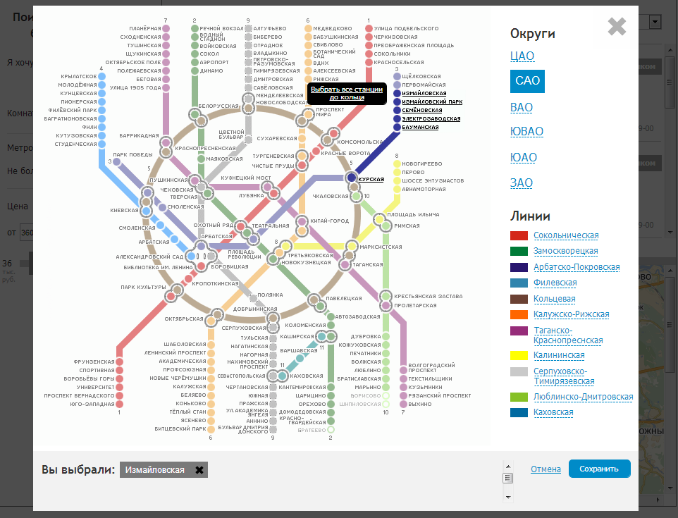
Metro stations selected. It remains only to come up with an ad page. In fact, renting and, moreover, buying a home is an important milestone in Masha's life, so she is concerned about a lot of nuances: is there a freight elevator to transport her favorite closet, how far is the kindergarten she will take the child to? houses special parking with places for residents, because Masha does not like to park spontaneously. We divide this chaos of information about the object into three parts: information about the apartment, the house and the area. We will place all this consistently on one page with the ability to quickly move between sections. To do this, we fix the navigation bar on top so that it does not fall into the scroll area:

That's all. You can click on the live prototype here .
By simple manipulations with a pencil and mouse, we got a prototype interface in which our Masha (and therefore the overwhelming part of the target audience) could conveniently and comfortably sit out the best days of their lives in search of suitable housing. The result of the introduction of such an interface can only be positive: loyal customers, increased conversion and traffic for a real estate agency; comfort and time saved on trying to understand the interface - for customers.
Finally, let me do a bit of PR.
Information system is not the last in your business, and you have already realized that usability in the face of tough competition is “must have”? Then welcome to the site of our usability bureau . We will help if not by deed, then by good advice - for sure.
Did you find anything new in this article? Are you sure you could do better? Then we wait for your outstanding portfolio with prototypes at hr@uxman.ru . Perhaps there are a couple of interesting tasks for you.
Thank you for your attention and waiting for your comments!
I will not talk about the problems of these interfaces. In any case, I believe that the millions of people who every day are trying to find housing for themselves are definitely worthy of the best.
In this article I will tell you how to quickly and cheaply create a prototype of quite a decent site for real estate search. Fans to read about usability please under the cat.
')
Formulation of the problem
It is necessary to develop a prototype of the site for easy search of real estate objects that want to buy, sell, rent or rent. The interface should be universal from the point of view of user experience, i.e., ideally, everything, young and old, should immediately use it without any problems.
Before you pick up a pencil
The interface will be used by people with very different levels of computer literacy and with different habits. But when we take a pencil in our hands, knowing about it will be useless in itself, because we will not have a picture of our target user in our head.
To solve this problem, you need to form a collective image of all these people and their experiences of use. For this you need to show a little imagination. I was lucky, one kind person gave me access to Yandex.Metrica of a similar site with good traffic, so besides fantasy I also had some statistics.
We take the tool for creating mental maps and invent our character. Some facts may be entirely fictional, but they must be, most likely, the most likely:
If you try especially without thinking about running your eyes on this map, then an abstract image of this Masha will form in your head. Immediately I recall such “Masha” from real life, and everything becomes clear: what is on her mind, how does she own a computer, what does she think of such real estate sites, and so on. All this is quite enough to design not just an interface, but an interface for people like Masha. To enhance your own impression of this image, you can add an expressive photo card:
I must say, I am not a supporter of long and detailed portraits of users, except if we are not talking about any highly specialized automation system. Practice has shown that the simpler and shorter the portrait, the more often the designer will use it during the creation of the prototype, and the portrait is created for this purpose.
Now is the time to take a pencil.
A pencil is the surest way to get a prototype of the interface at a level that is sufficient for coordinating conceptual moments with the customer in just a few hours, so I really like a pencil. And he saves a lot of man-days and nerves, and is also an excellent excuse to divert tired eyes from the monitor. The main thing during the creation of a paper prototype is not to overdo it with detail: in each such prototype there is a certain boundary point, starting from which all subsequent refinements are performed faster in an interactive analog on a computer than on paper.
Let's return to our interface. First you need to decide on the main blocks and their location on the page. Our Masha has a small HD monitor at work, the iPad at home. Both screens are rectangular. She could also have some kind of netbook, which is also rectangular, but with a small resolution. Actually, draw a rectangle:
If Masha wants to search for real estate objects, then she will need at least a list of these objects. Understandably, there are not 10 of them there, and it is also worth adding a block with filters from this list. On Masha’s monitors, the horizontal areas are particularly valuable in terms of the use of the space of the rectangle, so we will occupy the filter with a vertical bar. Immediately, problems with returning to the filter are solved after a long scrolling of the list of objects: the filter will always always be on the side, in the same place.
Masha does not get out of Vkontakte, so she is accustomed to choose something on the left, and to absorb the content on the right. Anyway, the traditional area for vertical navigation is the left page bar. Therefore, we will place our filters for a start on the left, and if we realize that it is better on the right, we place it on the right (after all, this is a paper prototype, everything is possible here):
For Masha important distance from the subway, parks and major roads. The quickest way to show all this is to indicate the address of the object as a point on the map. There will be several objects in our issue, so we’ll make a common map for these objects:
It seems as long as Masha is happy with everything, so let's get to the details. As I said, it is important not to get involved in them, but some key elements are still worth showing.
Let's start with the filter. In general, real estate objects have a lot of parameters, but conditionally they can be divided into two groups: necessary and not necessary for the majority. Parameters from the second group can be hidden in some kind of pop-up or drop-down element, so we will not think about them for now. From the first group we have the type of ad (rent, sale, etc.), the type of property, distance from the metro and the price.
The filter block should show only actual interface elements. For example, if the object type is “room”, then the choice of the number of rooms in the apartment should be hidden. Our Masha is typing slowly (according to legend, because of long nails) and prefers to use only a mouse. Therefore, Masha should be able to set all the search parameters without using the keyboard. We get this block with filters (I washed the rest of the prototype so as not to be distracted by it):
Go to the list of objects. Let's think about why Masha of two approximately the same in terms of parameters of objects can choose one? Apparently, because the photograph of this selected object is closer to that image of an ideal apartment that hovers in Masha's head. Since the parameters from the object to the object usually do not change much in the list, first of all it is necessary to slip the look of the photograph (of course, the best), and only then the price and everything else. Everything else is advisable to submit as systematically as possible and in the case, so as not to waste valuable man-seconds to recognize the parameters of each ad. I decided to design a set of standard object parameters in the form of tags.
Above the list we place the number of ads found and the sorting type. Ads will be loaded from the server in batches when scrolling. When hovering over an ad, the add to favorites buttons and object highlights on the map will appear. Here's what happened:
It remains to add the card itself and the main interface is ready:
A bit ugly, but quickly and cheaply. But you can discuss the interface and, if necessary, just as quickly and cheaply redo everything. Now leave the pencil and proceed to the creation of an interactive prototype.
Interactive Prototype
To create an interactive prototype, you can open a notepad and write a ton of html-code. However, I prefer to spend time on more interesting activities, so I use special software for dynamic prototyping, namely, the good old Axure.
To begin with, let's transfer to the interactive prototype what is already drawn on paper. Everything is simple, there is nothing special to explain, this is a matter of technology:
We lack only two interfaces: the choice of metro stations and the page of the advertisement itself. Let's start with the subway.
Our Masha is looking for an apartment in the east of the blue line outside the ring line. And she looks at the ads in the company, because her husband works there. Let her choose all this in a couple of clicks:
Metro stations selected. It remains only to come up with an ad page. In fact, renting and, moreover, buying a home is an important milestone in Masha's life, so she is concerned about a lot of nuances: is there a freight elevator to transport her favorite closet, how far is the kindergarten she will take the child to? houses special parking with places for residents, because Masha does not like to park spontaneously. We divide this chaos of information about the object into three parts: information about the apartment, the house and the area. We will place all this consistently on one page with the ability to quickly move between sections. To do this, we fix the navigation bar on top so that it does not fall into the scroll area:
That's all. You can click on the live prototype here .
Conclusion
By simple manipulations with a pencil and mouse, we got a prototype interface in which our Masha (and therefore the overwhelming part of the target audience) could conveniently and comfortably sit out the best days of their lives in search of suitable housing. The result of the introduction of such an interface can only be positive: loyal customers, increased conversion and traffic for a real estate agency; comfort and time saved on trying to understand the interface - for customers.
Finally, let me do a bit of PR.
Information system is not the last in your business, and you have already realized that usability in the face of tough competition is “must have”? Then welcome to the site of our usability bureau . We will help if not by deed, then by good advice - for sure.
Did you find anything new in this article? Are you sure you could do better? Then we wait for your outstanding portfolio with prototypes at hr@uxman.ru . Perhaps there are a couple of interesting tasks for you.
Thank you for your attention and waiting for your comments!
Source: https://habr.com/ru/post/180077/
All Articles