Basics of professional layout of emails

It's no secret that email marketing is just beginning to gain momentum all over the world. And for Russia, it is also a completely young niche in the market. And professional layout of emails is one of the components of success. Professional layout means not only a visually beautiful and reliable layout, but also how the card usability looks from a marketing point of view, how the graphics are optimized along with the typography for spam filters and much more. The layout of e-mails is quite an extensive topic, in one article it does not fit, therefore, in this post I will try to describe only the basic elements and techniques that have been reliably proven over the years of practice and work in the top most used email clients in the world: iPhone 4S / 5; Outlook 07/10/13; iPad; Apple Mail; Android 2.3 / 4.0; Yahoo; Gmail If we consider only the Russian market, then it is impossible not to mention Mail.ru and Yandex . Mail .
What you need to know at the beginning?
Just want to highlight a few of the main and important points:
- In our arsenal there is a very curtailed set of css-properties that are supported by all mailers. At the same time, you need to register styles inline, and in the head only make vendor properties and those blocks of ads that do not bear the load on the basic styling of the letter. Well, to use link in head is extremely undesirable.
- Do not use background-image in basic visual design elements and do not place important textual information in images. In general, you should always consider the option that the letter will be viewed by the recipient without a single image.
')
Frame
Perhaps everyone who has ever installed a letter for the newsletter knows that it is better to build a framework using tables. In fact, a simple block div model is currently supported in all of the above mailers, with the exception of MS Outlook since the 2007 version. This is due to the fact that the latest versions of Outlook use Microsoft Word as the engine, which, in turn, does not know much about block css properties. I do not recommend to ignore this email client during layout, so use table as a foundation. Yes, and having achieved a good result for Outlook, you can be sure that in most mailers, the letter will look good too, but rather better.
As an example, consider the most important elements of the following non-complex template:
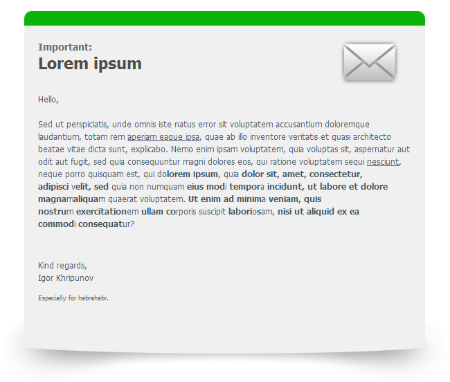
The markup here can be represented as follows:
<table width="100%" cellspacing="0" cellpadding="0" border="0"> <tr> <td align="center"> <table width="600" cellpadding="0" cellspacing="0" border="0" style="border-collapse: collapse;"> <!--header line statrs--> <tr> <td><img ... /></td> <td><img ... /></td> <td><img ... /></td> </tr> <!--header line end--> <!--content statrs--> <tr> <td colspan="3" align="center"> <table width="540" cellpadding="0" cellspacing="0" border="0" style="border: solid 1px #000; border-collapse: collapse;"> <tr> <td>content</td> </tr> </table> </td> </tr> <!--content end--> </table> <!--footer img starts--> <table width="660" cellpadding="0" cellspacing="0" border="0" style="border-collapse: collapse;"> <tr> <td><img ... /></td> </tr> </table> <!--footer img end--> </td> </tr> </table> What is important here?
- Always “reset” the tables to be sure of the value you specified in the width :
<table width="600" cellpadding="0" cellspacing="0" border="0" style="border-collapse: collapse;"> - The alignment of elements is performed in one of the ways:
<td align="center"> style="text-align: center;" <center></center> - Do not leave intermediate cells empty and do not fill in with the nbsp symbol if you want to preserve the visual integrity of the template during the Forward letter. It is better to fill them with a transparent .gif image (see example below).
If you want to make a vertical distance between tables or table rows, do not use margin and padding . I recommend making spacers in this design:
<tr> <td height="10"> <div style="margin: 0; padding: 0; line-height: 0;"> <img src="...indent.gif" border="0" width="1" height="1" style="display: block;" alt="" /> </div> </td> </tr> where height varies by the height of a table cell. Transparent .gif is used as a cell fill. Its real size should not be 1x1px, it is better to make it slightly larger (for example, 20x20px) and compress using the weight or height attributes. Thus, you will get rid of the visual defect when viewing a letter without loaded images and protect yourself from getting the letter in the junk box. Do not forget about the attributes of the cellpadding and cellspacing tables. They work fine everywhere, but it’s not always possible to do without them.
Text decoration
Here things are more or less well. Almost all CSS properties from specification 2.1 are supported.
- Initially, for the layout of letters, a recommendation was made to wrap all the text in a string element span or font and set the font style in them. Currently this can be neglected. You can describe properties for text in any HTML element inside the body tag, but preferably only inline.
- To set the font size, it is better to use absolute units of measurement ( px or pt ), because we do not always have access to the styling of the base font. This will guarantee the same font-size for all email clients. WebKit-based devices use text scaling by default. To disable this behavior, there is a vendor property -webkit-text-size-adjust . I advise you to simply move the following selector to head :
div, p, span, strong, b, em, i, a, li, td { -webkit-text-size-adjust: none; } - In order to cross-mine a link , the following construction is necessary:
<a href="#" target="_blank" style="color: #267f00 !important; text-decoration: underline;"><span style="color: #267f00;">link</span></a>
Re-wrapping the link in the span and setting the color is needed for Outlook, because he does not understand the priority of ! important , and without it, Yandex. Mail will repaint your link red at the hover event.
The target = "_ blank" attribute is needed only if your letter has a link to the web version of the letter so that the links in this version open in new tabs. And so, all mail clients do it independently. - If you want line-height to work everywhere, set it only for block elements ( td, div, p, li ).
Images
If there is only one image in one cell and you want no extra space around it, then take the habit of writing display: block for it (for example, this flaw already exists in Gmail for more than one year).
In Outlook 2013 there is also a drawback for images whose height is less than 20px, they have 8px of space on top, which can significantly affect the appearance of the layout, if this is not foreseen. This is solved by setting the line-height property for the parent block, the value of which is less than or equal to the height of the image. It can be specified for both the td cell and the item to be wrapped:
<div style="margin: 0; padding: 0; line-height: 15px;"> <img src="..." border="0" width="600" height="15" style="display: block;" alt="" /> </div> Corner rounding in letters
border-radius currently supports most of the most popular email clients, but not MS Outlook 07/10/13, whose share of usage is ~ 18%. About how to make rounded corners in letters, you can give any example of the implementation of the layout. I will show you the version I used in the above layout:
<tr> <td align="left" valign="top" style="background-color: #0BB40B;"> <img src="round_l.png" /></td> <td style="background-color: #0BB40B;"> <img ... /></td> <td align="right" valign="top" style="background-color: #0BB40B;"> <img src="round_r.png" /></td> </tr> As images for rounding, I used two images with transparency, which I placed in the side cells.

This method is good because later, if you decide to change the background color, you only need to change the background-color value. The disadvantage is that the background color of the parent block must match the color specified in the image (in my case it is white).
What you need to know at the end?
Here I would like to write a little about how to reduce the likelihood of your letters falling into the spam box. Spam filters are now very much and each works on different algorithms. Making a letter that is ideal for all filters at the same time is almost impossible, there will always be a percentage of spam, but how high it depends largely on you. Of course, all spam filters pay great attention to the content of the text in the subject line and the body of the letter, but the HTML check is also not the last criterion.
The most reliable way is to convince the recipient to add your email address from which the mailings are being sent to his address book. But you will never know whether the recipient did it or not, so follow the simplest tips when creating emails:
- The ratio of images and text in letters should be 30/70%
- Do not select text in too bright colors (# ff0000, # 4CFF00, etc.). The fact that setting the font color close to the background is not worth mentioning is a hackneyed and not working for a long time trick.
- Too much uppercase text (including text-transform: uppercase; ) or repeating multiple exclamation points in a row also increases the likelihood of being spammed.
- Do not write a lot of text in large font. The recommended font-size is no more than 12pt = 16px and not less than 7pt = 11px
- And of course, valid HTML / CSS has not been canceled yet.
In the end I want to reiterate that a good layout of emails gives you a significant advantage in your marketing. Create neat and attractive cards. Thanks for attention!
Source: https://habr.com/ru/post/180013/
All Articles