Big changes on Yandex - “Islands” platform: interactive answers in search results
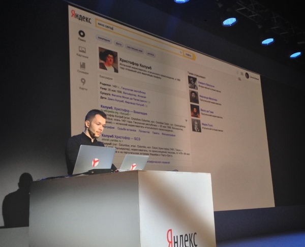
Today at YaC / m, we announced that Yandex is planning a radical update on the type of search results. Firstly, they change ideologically: now the user will not only find answers to his requests, but will be able to solve his tasks directly on the page with the issue. And secondly, the search results will be updated visually - the design will become part of our new approach to search.
The text below was written by Danila Kovchiy, one of the authors of the Ostrov platform, which will be discussed further. He is on stage right now and cannot post it himself. Further the narration will go on his behalf.
')
I am Danila Kovchy, I’m listed as a designer in Yandex, and now I’ll act as an intermediary between you and the latest events in the company.
Yandex is changing. Its main product is also changing - search. Here I will talk mainly about him, what, how and why we had to redo it, what were the reasons and a little bit about the consequences.
Search changes are divided into two areas:
- block issue;
- context-sensitive interface.
Yandex search all the time tries to grasp the immense in the desire to respond to each and every request. The requirements of people to search engine answers are constantly growing - the algorithms are becoming more and more complicated, the answers to the search results swell, incorporating prices, ratings, photos, working hours, addresses and telephones. The coverage of issuing extended answers is growing steadily, and according to some requests, almost all of our diversity can fall out on a person: yandex.ru/yandsearch?text=tamon
One way or another, Yandex has got its way - to offer solutions to problems. We were the first to begin to dilute a uniform list of references to documents with special answers that allow us to finish what we started without leaving the issue: listen to the song, choose a movie at the box office, and clarify when the hot water is turned off at home. Such answers we call sorcerers. Here are some examples:
http://yandex.ru/yandsearch?text= love a thunderstorm in early May
http://yandex.ru/yandsearch?text=james blake retrograde
http://yandex.ru/yandsearch?text=red
http://yandex.ru/yandsearch?text=2+3
Koldunshchiki are very popular, and for many services are the main entry points. If earlier Yandex found only documents in which the requested phrase is found, now, if I ask [how to get Tver 23], this does not mean at all that I need a website where this phrase occurs most often; I thereby inform the system of my desire to find out the route and look at the map. And the witches in such situations still come to
help:

At a certain point, we realized that it was time to restore order to the issue: it became too heterogeneous in structure, and we continue to try to fit all the diversity on a flat list. So there were groups of homogeneous answers - tie-ins. We still answer the list, but homogeneous answers are collected in groups and are marked by some common trailing feature. For example, inset fresh results.

Or the Twitter box:
![Insert Twitter on demand [segalovich]](https://habrastorage.org/getpro/habr/post_images/d47/faa/d47/d47faad47776697e3053fbe58e1597f6.png)
But, as practice has shown, the sidebars in the form in which they were conceived do not work: not all people understand where the beginning and where the end is, and that this is generally a separate type of answers. There have been attempts to separate the sidebar lines:
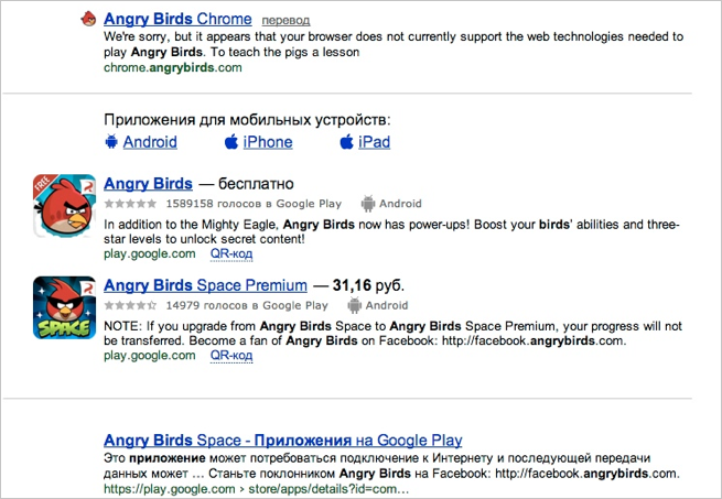
This did not correct the situation either: the distributed extradition did not bring additional clarity to the people.
In the meantime, on the approach there was a grouping of answers from one site, the connections of subordination between answers were outlined. More and more forms were squeezed into the search: it became possible to make a route, book a hotel, or buy a plane ticket. But the list presentation of answers to the issue remained a brake on the development of the system.
It became obvious to us that the search interface requires a complete rethinking, if we want to live and grow further.
Earlier, it was already noted that the list is excellent for uniformly issuing answers with a header-site-summary scheme. But many of Yandex’s answers go far beyond the framework of this scheme; therefore, as an alternative, we have given each answer its own block. The blocks do not have to have much in common with their neighbors, they are clearly separated from each other, they have the right to heterogeneity within themselves - just what we need. Since a block can be called anything, including an area with invisible borders, our block got its own name - the island .

The decision suggested itself and treated many birth injuries, so we immediately began to try on the islands to all types of answers, starting with the poorest and ending with the most swollen options and forms of booking tables in restaurants.
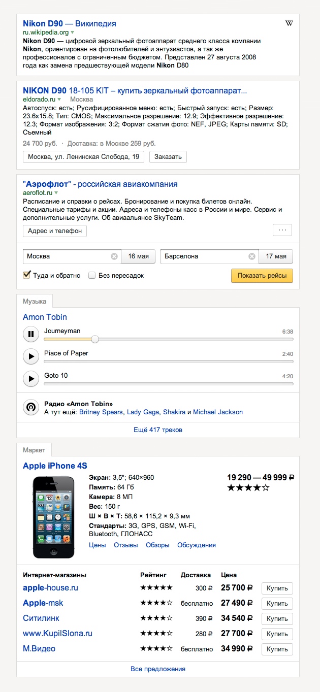
As you can see, all the blocks are quite different, but each of them is assembled in such a way as to best work out its function. And with all the heterogeneity of the islands, their proximity does not lead to chaos.
When we more or less dealt with single answers, we started thinking about tie-ins. Since we were already limited by nothing, we could have isolated their appearance from everything else. The thought was the core of the reasoning: if it is a group of answers of one type, then by its appearance it should be obvious what kind. In other words, it’s not enough to look at the group, you need to immediately understand why these answers are brought together. So we gave the sidebar a tabular structure to put in a separate column the general signs that the grouping worked according to.
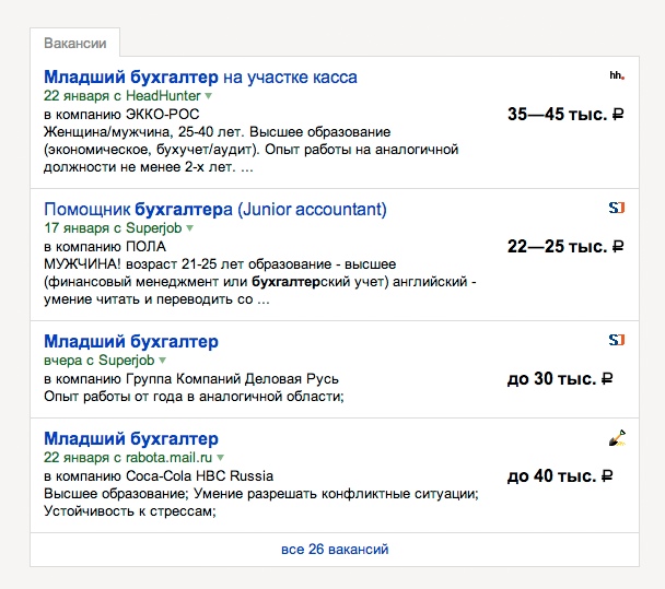
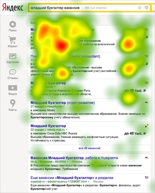
But this step - to place on the classical issue the most important thing on the right - caused a lot of controversy within the company, because the heat maps describing the field of view of people looked like this:

All sorts of experiments also confirmed that the right edge of the output is a blind zone.
But research on living prototypes showed what we expected to see: people do not look in the upper left corner of the screen, but where they show something:
The last problem with the block structure remained - it looks redundant on a poor issue, when Yandex has nothing to offer except a list of links. For example, the answer on request [TV program] in the new Yandex loses to the old one.
It was:

It became:

Upon reflection, we came to the following: the original issue - this is one island. Warlockers and tie-ins are separated from the common island, forming their own islands. Now the poor issue looked like this:

In general, the average response of the new Yandex now looks like this:

Yandex search consists of so-called verticals - areas with more or less homogeneous answers. The main vertical is web search. In addition, there is a vertical image, video, products, blogs, etc. For example, there is a Yandex.Market service, and when we search for something in it, we get to the search vertical of the market. Theoretically, during the search, you can switch between verticals with the help of the links above the arrow.

But, as the instruments show, few people use this opportunity. Therefore, we call the upper part of the cap a blind zone - a bright arrow takes all the attention to itself. On the other verticals, people mostly get either through the witches, or moving to the desired service even before the request for links from the main page.
By the way, as a homework, I propose to speculate on the principle on which the links above the search arrow are ordered.
There was no desire to make the line of links more noticeable in the search — this way or another, the path to a dead end: there are no fewer verticals for Yandex, so for each request you would have to offer the same fixed infinitely swelling list with the “More” button .
Loyal guys should be aware that last year Yandex released a search application for the iPad.
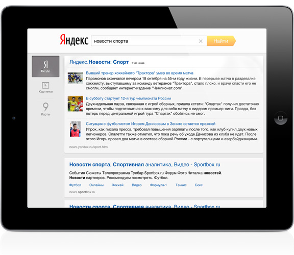
By the way, blocks are already appearing here, but in a simplified form. But another thing is interesting here - the way to switch verticals. Everybody liked this interface solution very much: it was at the same time noticeable, visual and did not distract from the main thing, the one on the right. If the search application is looking only for three or four verticals, it can afford to have such a sweeping list. In general, the search for verticals is much more, however, far each of them meets the current request. Therefore, we decided to develop this idea in an obvious way: the left column should contain only those verticals that correspond to the given context. And the context is set by user request.
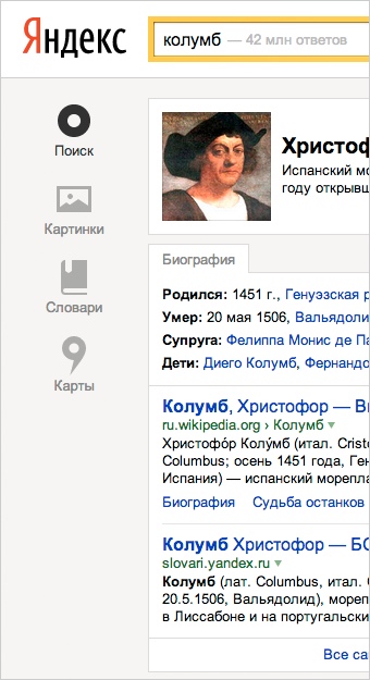
Now everything logically adds up: there is a header with a search arrow - this is the input area, and all that is lower is the output area. And the output area is completely subject to the request, no matter what answers we place in it. A list of verticals is also a kind of answer. In addition, it also serves as a table of contents for the main issue.
Previously, Yandex tried in every way to hint that it has a lot of services, and each of them has its own purpose. So, for example, color coding of arrows for different verticals was invented.
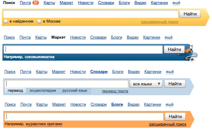
But people, finding a vacuum cleaner on the market, quite calmly continued to look for [classmates.ru] there. And, admittedly, they had every right to do that: Yandex was written, a familiar search arrow was next to it, and the “Search” button. So at this stage of our development, we realized that no one wants and should not explore the entire infrastructure of Yandex, what is better to look for and where to go there. Now Yandex has only one arrow, and you can ask her anything, anywhere.

And then we will try to keep you informed of changes in other services. I already capture the spirit when I imagine that all this will begin to work. And in the search, I didn’t have much time to tell about everything: contextual clues, ways of ranking and grouping answers, actions on answers, the right part of the output, and many more things are waiting for changes.
There is also a beautiful promo site , there you can watch videos and pictures, as well as find out all the details about when it will affect you personally, and how to make it happen as soon as possible.
kovchiy , lead designer
The text below was written by Danila Kovchiy, one of the authors of the Ostrov platform, which will be discussed further. He is on stage right now and cannot post it himself. Further the narration will go on his behalf.

')
I am Danila Kovchy, I’m listed as a designer in Yandex, and now I’ll act as an intermediary between you and the latest events in the company.
To business
Yandex is changing. Its main product is also changing - search. Here I will talk mainly about him, what, how and why we had to redo it, what were the reasons and a little bit about the consequences.
Search changes are divided into two areas:
- block issue;
- context-sensitive interface.
Prerequisites
Yandex search all the time tries to grasp the immense in the desire to respond to each and every request. The requirements of people to search engine answers are constantly growing - the algorithms are becoming more and more complicated, the answers to the search results swell, incorporating prices, ratings, photos, working hours, addresses and telephones. The coverage of issuing extended answers is growing steadily, and according to some requests, almost all of our diversity can fall out on a person: yandex.ru/yandsearch?text=tamon
One way or another, Yandex has got its way - to offer solutions to problems. We were the first to begin to dilute a uniform list of references to documents with special answers that allow us to finish what we started without leaving the issue: listen to the song, choose a movie at the box office, and clarify when the hot water is turned off at home. Such answers we call sorcerers. Here are some examples:
http://yandex.ru/yandsearch?text= love a thunderstorm in early May
http://yandex.ru/yandsearch?text=james blake retrograde
http://yandex.ru/yandsearch?text=red
http://yandex.ru/yandsearch?text=2+3
Koldunshchiki are very popular, and for many services are the main entry points. If earlier Yandex found only documents in which the requested phrase is found, now, if I ask [how to get Tver 23], this does not mean at all that I need a website where this phrase occurs most often; I thereby inform the system of my desire to find out the route and look at the map. And the witches in such situations still come to
help:

At a certain point, we realized that it was time to restore order to the issue: it became too heterogeneous in structure, and we continue to try to fit all the diversity on a flat list. So there were groups of homogeneous answers - tie-ins. We still answer the list, but homogeneous answers are collected in groups and are marked by some common trailing feature. For example, inset fresh results.

Or the Twitter box:
![Insert Twitter on demand [segalovich]](https://habrastorage.org/getpro/habr/post_images/d47/faa/d47/d47faad47776697e3053fbe58e1597f6.png)
But, as practice has shown, the sidebars in the form in which they were conceived do not work: not all people understand where the beginning and where the end is, and that this is generally a separate type of answers. There have been attempts to separate the sidebar lines:

This did not correct the situation either: the distributed extradition did not bring additional clarity to the people.
In the meantime, on the approach there was a grouping of answers from one site, the connections of subordination between answers were outlined. More and more forms were squeezed into the search: it became possible to make a route, book a hotel, or buy a plane ticket. But the list presentation of answers to the issue remained a brake on the development of the system.
It became obvious to us that the search interface requires a complete rethinking, if we want to live and grow further.
Isle
Earlier, it was already noted that the list is excellent for uniformly issuing answers with a header-site-summary scheme. But many of Yandex’s answers go far beyond the framework of this scheme; therefore, as an alternative, we have given each answer its own block. The blocks do not have to have much in common with their neighbors, they are clearly separated from each other, they have the right to heterogeneity within themselves - just what we need. Since a block can be called anything, including an area with invisible borders, our block got its own name - the island .

The decision suggested itself and treated many birth injuries, so we immediately began to try on the islands to all types of answers, starting with the poorest and ending with the most swollen options and forms of booking tables in restaurants.

As you can see, all the blocks are quite different, but each of them is assembled in such a way as to best work out its function. And with all the heterogeneity of the islands, their proximity does not lead to chaos.
When we more or less dealt with single answers, we started thinking about tie-ins. Since we were already limited by nothing, we could have isolated their appearance from everything else. The thought was the core of the reasoning: if it is a group of answers of one type, then by its appearance it should be obvious what kind. In other words, it’s not enough to look at the group, you need to immediately understand why these answers are brought together. So we gave the sidebar a tabular structure to put in a separate column the general signs that the grouping worked according to.

But this step - to place on the classical issue the most important thing on the right - caused a lot of controversy within the company, because the heat maps describing the field of view of people looked like this:

All sorts of experiments also confirmed that the right edge of the output is a blind zone.
But research on living prototypes showed what we expected to see: people do not look in the upper left corner of the screen, but where they show something:

The last problem with the block structure remained - it looks redundant on a poor issue, when Yandex has nothing to offer except a list of links. For example, the answer on request [TV program] in the new Yandex loses to the old one.
It was:

It became:

Upon reflection, we came to the following: the original issue - this is one island. Warlockers and tie-ins are separated from the common island, forming their own islands. Now the poor issue looked like this:

In general, the average response of the new Yandex now looks like this:

Relevant Interface
Yandex search consists of so-called verticals - areas with more or less homogeneous answers. The main vertical is web search. In addition, there is a vertical image, video, products, blogs, etc. For example, there is a Yandex.Market service, and when we search for something in it, we get to the search vertical of the market. Theoretically, during the search, you can switch between verticals with the help of the links above the arrow.

But, as the instruments show, few people use this opportunity. Therefore, we call the upper part of the cap a blind zone - a bright arrow takes all the attention to itself. On the other verticals, people mostly get either through the witches, or moving to the desired service even before the request for links from the main page.
By the way, as a homework, I propose to speculate on the principle on which the links above the search arrow are ordered.
There was no desire to make the line of links more noticeable in the search — this way or another, the path to a dead end: there are no fewer verticals for Yandex, so for each request you would have to offer the same fixed infinitely swelling list with the “More” button .
Loyal guys should be aware that last year Yandex released a search application for the iPad.

By the way, blocks are already appearing here, but in a simplified form. But another thing is interesting here - the way to switch verticals. Everybody liked this interface solution very much: it was at the same time noticeable, visual and did not distract from the main thing, the one on the right. If the search application is looking only for three or four verticals, it can afford to have such a sweeping list. In general, the search for verticals is much more, however, far each of them meets the current request. Therefore, we decided to develop this idea in an obvious way: the left column should contain only those verticals that correspond to the given context. And the context is set by user request.

Now everything logically adds up: there is a header with a search arrow - this is the input area, and all that is lower is the output area. And the output area is completely subject to the request, no matter what answers we place in it. A list of verticals is also a kind of answer. In addition, it also serves as a table of contents for the main issue.
Single search
Previously, Yandex tried in every way to hint that it has a lot of services, and each of them has its own purpose. So, for example, color coding of arrows for different verticals was invented.

But people, finding a vacuum cleaner on the market, quite calmly continued to look for [classmates.ru] there. And, admittedly, they had every right to do that: Yandex was written, a familiar search arrow was next to it, and the “Search” button. So at this stage of our development, we realized that no one wants and should not explore the entire infrastructure of Yandex, what is better to look for and where to go there. Now Yandex has only one arrow, and you can ask her anything, anywhere.

What's next
And then we will try to keep you informed of changes in other services. I already capture the spirit when I imagine that all this will begin to work. And in the search, I didn’t have much time to tell about everything: contextual clues, ways of ranking and grouping answers, actions on answers, the right part of the output, and many more things are waiting for changes.
There is also a beautiful promo site , there you can watch videos and pictures, as well as find out all the details about when it will affect you personally, and how to make it happen as soon as possible.
kovchiy , lead designer
Source: https://habr.com/ru/post/179777/
All Articles