Google and Time have launched a service that shows how the planet has changed in 30 years.
Thanks to the new Google project and Time magazine, it became possible to see how the surface of the Earth has changed over the past 30 years. In collaboration with the US Geological Survey (USGS) and NASA, they gathered together images of the planet taken from space for more than a quarter of a century and made an interactive frame-by-map map of them.
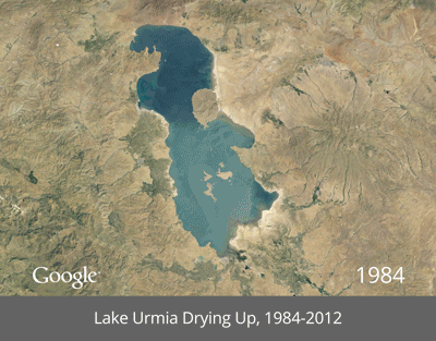
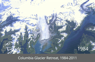
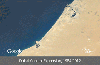
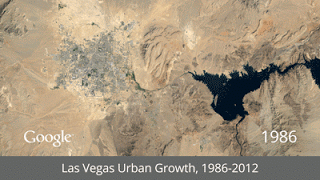
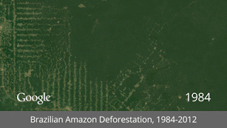
This map, which, as they say in the Google blog, consists of millions of satellite images and trillions of pixels, can be viewed on the website Timelapse . In addition to the history of the expansion of his native city, you can see how the artificial Palm Islands in Dubai were built, how the Columbia Glacier in Alaska retreats, how Amazon forests were cut down, and how Las Vegas grew from 1984 to 2012.
')
These images were collected as part of an ongoing joint project by the US Geological Survey and NASA, known as Landsat. Their satellites have been taking photographs of Earth from space since the 1970s. All captured images are sent to Earth and archived in USGS tape drives, which look like this:

In 2009, Google began working with the USGS to digitize this image archive. Using the Google Earth Engine technology, they went through 2,068,467 images — a total of 909 terabytes of data — to select the highest quality (for example, no clouds) for each year since 1984 and for every place on Earth. They then assembled them into huge planetary images, 1.78 therapy-cells each, one for each year.
At the final stage, Google, along with the Carnegie Mellon University CREATE Lab, the recipient of the Google Focused Research Award, transformed these annual images of the Earth into a single, viewable HTML5 animation, which is also available on Google .
Source: https://habr.com/ru/post/179183/
All Articles