User research. The secret of focus. Part 2: Research, as a design tool.
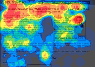
The figure on the right shows an example of the so-called “heatmap”, obtained as a result of recording the movement of the user's eyes. Those points on the screen that the user watched for a longer time are highlighted in red.
In my opinion, the so-called "empirical" user interface testing has limited utility. The amount of information you can get is finite. Sooner or later you will reach the moment when the information will have to start interpreting. It is during the process of interpretation that the risk of making a mistake is greatest. At this point, you may not notice the influence of some important factor or even come to false conclusions, especially if you do not have sufficient experience and skills in design.
Eyetracking (eyetracking), which in one article was rashly called the “future of web design,” is a remarkable example of a “design tool” that has recently attracted considerable attention. Jared Spoole believes that this technique may not deserve such attention , and I fully agree with him. My first objection is that the eye movement detection system can only tell you what people are looking at at the moment, but not what they see there. Secondly, the results obtained during the registration of eye movements are rarely unexpected for a good designer. Finally, the same results can be interpreted differently, as happens with every attempt to analyze a subjective experience.
I am not claiming that recording eye movements has no practical use. For example, here is a great example of how the registration of eye movement was successfully used to obtain useful information about the perception of users of a particular web site, as well as of all web sites in general. What I like about this article is that its author sees the results of eye movement registration not as an exhaustive scientific measurement of the effectiveness of his website, but as another source of information that he uses to plan the redesign of his website.
The key point here is that the author is an experienced marketing strategist with a good sense of design. In such hands, these data will most likely be used exactly as they should.
')
Evidence of the obvious
 On the remarkable blog of Eyetools , one of the leading companies in the field of eye movement registration, there are dozens of illustrative examples of the real application of this technology, supplemented by heatmap images, their short analysis, interpretation and specific tips for improving the design. In almost every case, Eyetools tries to create the impression that without the use of eye movement registration, we (or site owners) are not able to have a clear idea of whether a particular design works and how it works.
What is striking in their examples: a) in most cases they come to good conclusions (except for a couple of examples where the conclusions are inflated from obviously insufficient data ) b) these good conclusions are very similar to those that a good interface designer would come to or any person with a sufficient understanding of the specifics of design) guided solely by their design instincts, without using any additional methods.
On the example to the right , there is a page with an initially clearly weak design. Then it slightly, but quite noticeably, corrects the graphic design (improves the color gamut, typography, corrects the page structure). This leads to a significant improvement in test results with the registration of eye movement. So what's surprising here?
Impact of the interpretation of research on design
In the case of the registration of eye movements, there is a risk of drawing false conclusions that may lead to erroneous decisions in the design. The harm from these erroneous decisions may outweigh the benefits of using the method, especially if the organization does not have a good designer for an appropriate assessment of the results.If, for example, the results of eye movement registration indicate that visitors do not look at your company's logo, should this be interpreted as something that you need a new logo, or as something that your logo is simply familiar to visitors? If the results of the study show that someone spends too much time looking at the diagram of your processes, does this mean that the diagram is very interesting or, on the contrary, very boring?
If these data do not fall into good hands, they can easily be misinterpreted. In this case, the lack of design knowledge is dangerous.
The difference between design and content
 In one of the discussions, Jared Spoole responded to Todd Warfel’s skeptical observation of eye movement:
Todd: At the client is now engaged in the redesign of your site. So, they can not determine why their mechanism for registering customers does not work.On the right is another example from the Eyetools blog. The analysis notes that readers of the site run through the headings, but completely ignore the main text. A possible explanation for this is the inability of the writer to draw the attention of readers.
Jared: Or maybe just no one wants to use their services? If this is indeed the case, then no matter how you register eye movements, you will not be able to help.
I'm already tired of finding fault with Eyetools, but really, is it so necessary for us to register eye movement to come to the conclusion that people usually run through the headings, skipping the main text? Maybe we for this will be enough just common sense?
Anyway, won't it hurt?
It is possible that the registration of eye movement is also harmless to the design process, like chicken broth for the patient. Although, as I said, there is a risk of misinterpretation of the results. It will be hard to believe that recommendations from such a study will have any significant impact on the design process if your graphic designers have at least some talent (I confess that most web sites suffer precisely from the lack of design talent). It is even more improbable to believe that the results of the registration of eye movements can be the very basis for redesign. I would advise you, instead of conducting such a study, to hire another good designer. You will have to hire a good designer anyway, because only a good designer is able to correctly interpret the research results.And what if you hired an amazing designer with an excellent track record, but your management doesn’t trust his advice? Even if your ingenious designer is easily able to distinguish by eye what will work and what does not, most people do not possess such abilities. Some may simply not have a designer sense, and for some this sense may be wrong. And often such people are in top management positions.
So what should the designer or the head of the design department do in order to prove to the boss, deprived of design instincts, that good design really is good design? What if the only way to make a website redesign is to convince management that the old design is just awful?
Hmm, maybe in this case, just register eye movement ...
Source: https://habr.com/ru/post/17916/
All Articles