Charts in the accounting. Half a century before Excel
Today's retro review is devoted to graphs, generally a clear presentation of data in the accounting department.
Do you know what accountants used for half a century before Excel?
They used the same graphs with what, only they were drawn by hand.
However, charts were rarely used in accounting, one might say, they were not used at all until the twentieth century.
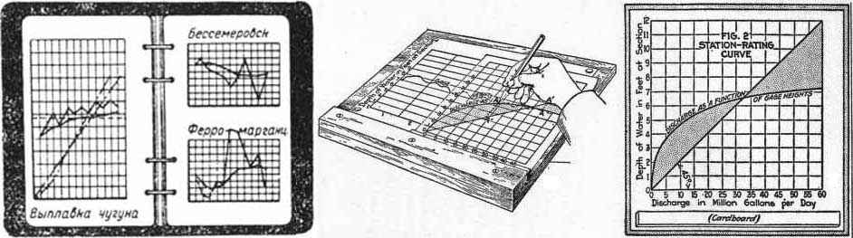
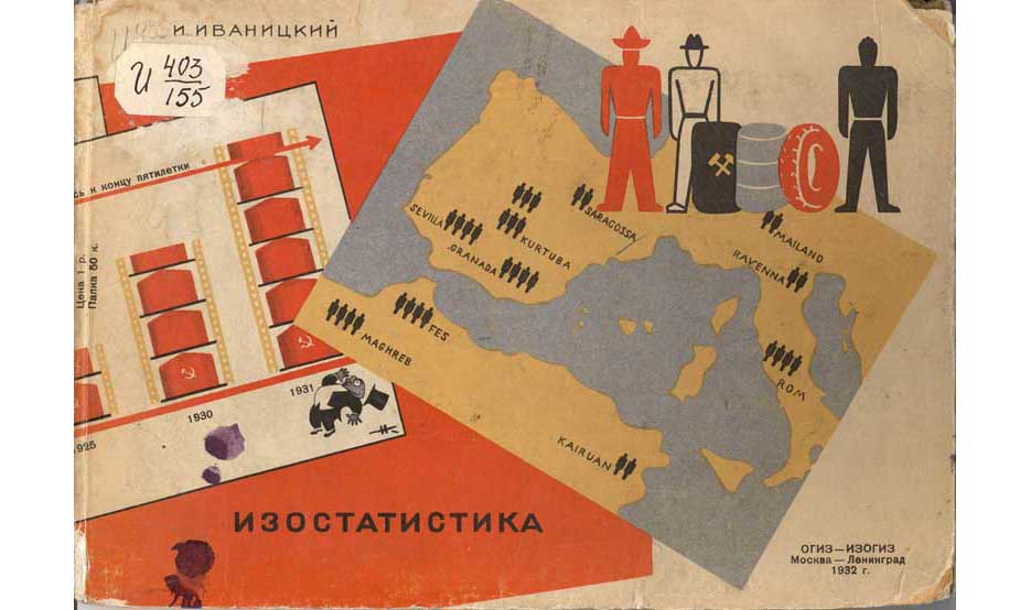
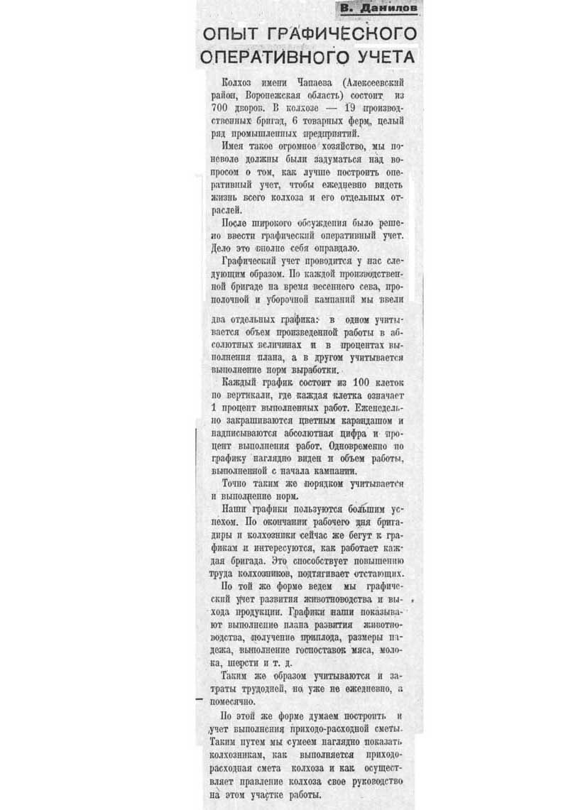
In the twentieth century, use was also limited. Already in Soviet times, there was a clear agitation, such as:
')
Sometimes diagrams came across, but also, of necessity, not from a good life:

Agree, such information is much more convenient to present not in numbers, but in the form of a diagram.
In these years, to which the presented illustrations refer, in the late 1920s - early 1930s, there was another problem in the accounting department.
The named period is my favorite, the period of accounting loose spells, connected with the coming of a generation of Soviet people to science. These Soviet scientists, often from the plow, were not wise by the bourgeois formation, but no less ardently and sincerely than their pre-revolutionary predecessors, were eager for discoveries and inventions. I have already reported on some inventions, in particular, on copy boards and filing cabinets. Against this background, the fascination with the graphical representation of the data looked innocent and almost imperceptible fun, but it existed and was widely advertised. Special literature came out:

What did these books and many others offer?
First of all, they advertised graphic methods. It's so great, just a season beep - to perceive the data in a graphical form. The main thing is to be intelligible: you look at the chart and you can immediately see whether it is creeping up or down.
From this point of view, it is important that the graph is clear. That is, certain types of graphs - and their inventors, needless to say - competed for greater visibility. Here, out of competition was the American G.L. Gant with graphs of his name. I do not presume to judge how they differed from others (maybe Gant was the first to come up with a plan to reflect the schedules?), But the fact remains.
Here's how — no wonder, from my point of view — the Gant graphs looked like:
As always in such situations, a mass of people willing to develop and improve immediately stood out from the public.
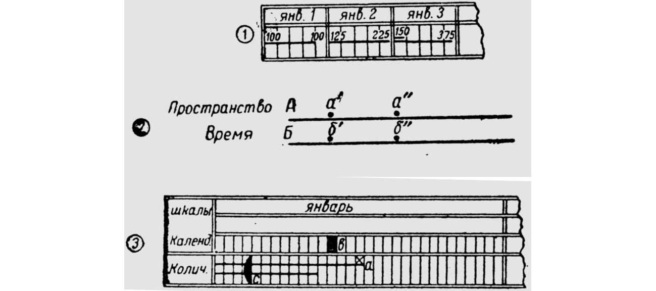
This, judging by the original source, is an introduction to the Gantt charts of the coordinates of time and space according to the Vanzetti method. Do you understand anything?
But a special shield for the Gantt graphics: did you need to hang Gant graphics somewhere, really?

But of course, there were other inventors of graphics, foreign and domestic.
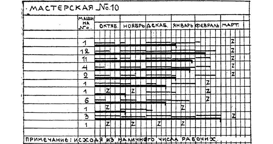
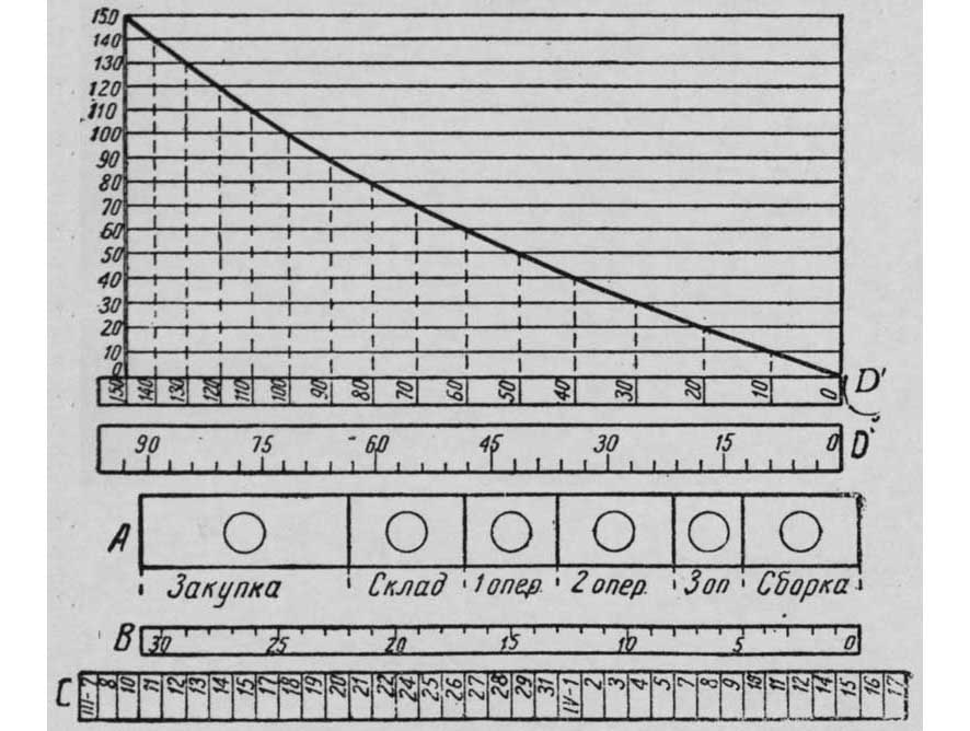
Graph GD Babcock. According to the original source, consisted of four bands (tapes): tape operations, tape working days, tape calendar days, tape release.
And this is a skew graph of our compatriot DD. Boginsky, used in the metal industry.
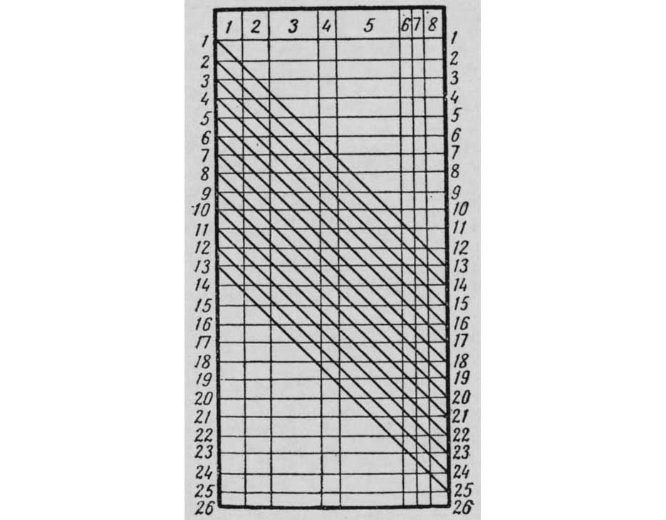
Again, I will not undertake to assess what his innovation is, let the experts understand.
People have not changed since the 1930s (so much time has not passed to change), and the same accounting requirements. Modern practitioners taldychat with the same perseverance: let it be clear, let it be clear. The charts with their crawling up and down lines on this side can be very useful: they are understandable or create the appearance of understanding, it does not matter. It is important that computer programs allow you to get a variety of graphics without any visible effort.
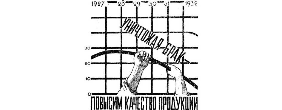
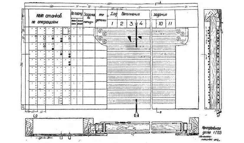
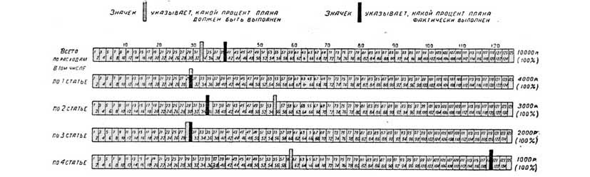
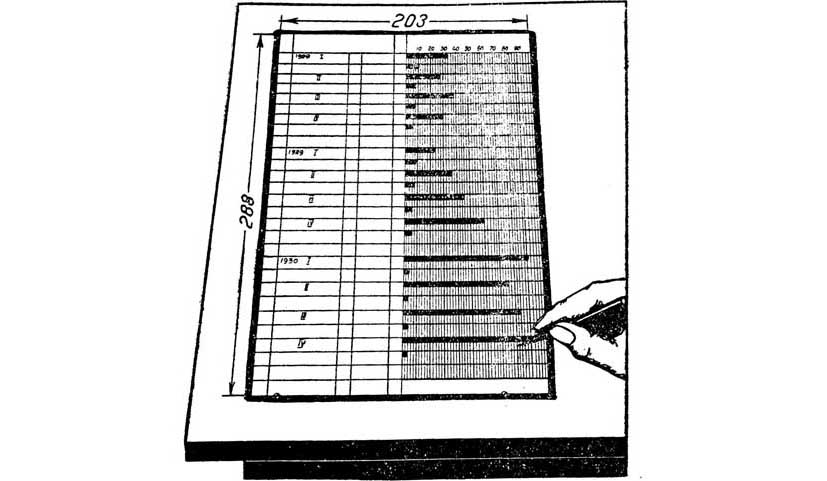
However, fifty or more years ago, there was a lot of effort with computers; in order to generate graphs, you had to use a different technique - the so-called control boards. Such a board was hung somewhere in the corridor of the institution, and the passing employees could see in a graphic form which unit as far as the plan was fulfilled. And available, and, again, a public event.
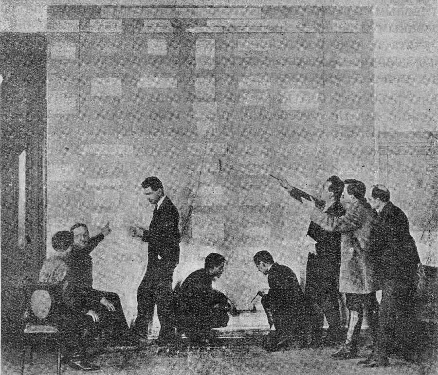
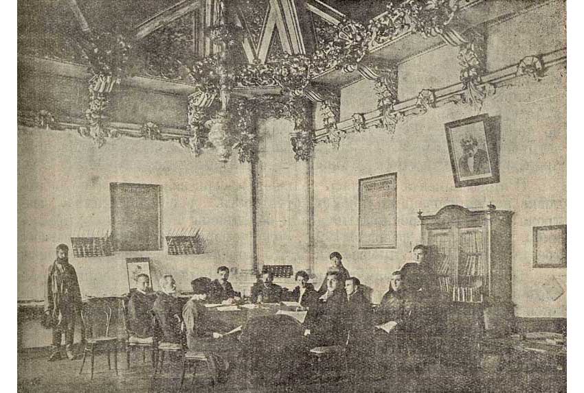
Employees of the Institute of Scientific Production Organization, the city of Taganrog, at the control board. Managerial work in full swing.
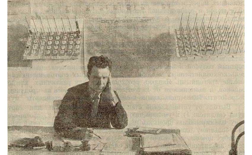
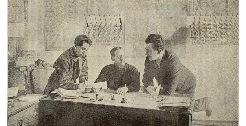
Here are samples of this technique that I found:
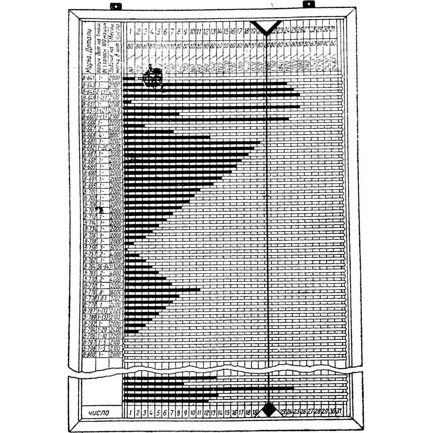
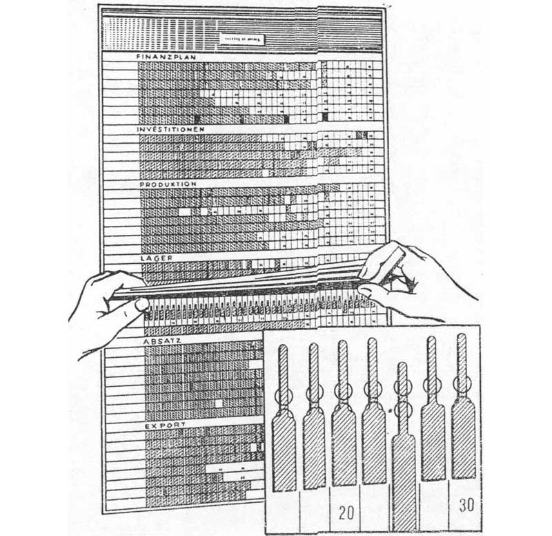
The last picture shows the control board of an accountant (very good, by the way) B.. Wolkenstein.
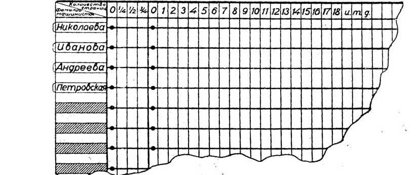
But, apparently, a desktop fixture is a Pole K. Adametsky's diagrammer.
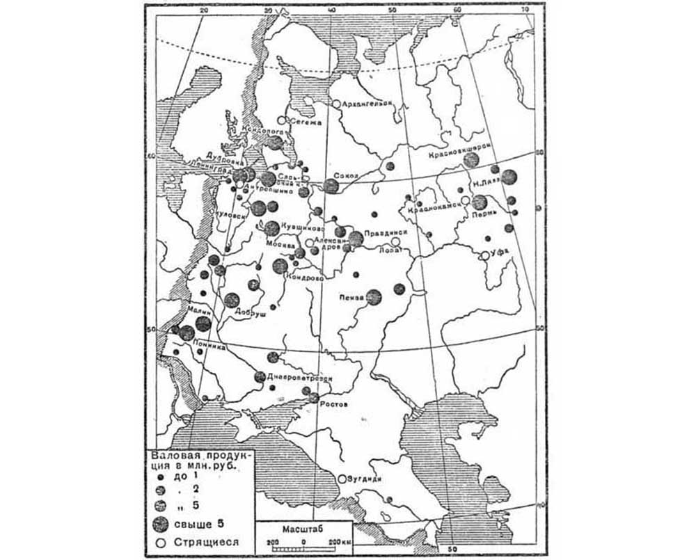
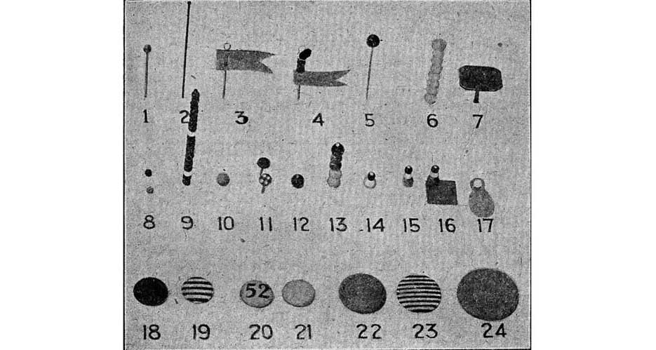
From the ways of visual presentation of data, I can also mention - let not charts, but cartograms. It is also a very visual device, especially for enterprises with an extensive branch network. To such cartograms even special pins were produced.
Finally, the cherished - my favorite. He himself dug up in the old book, scanned, mentioned in the writings. On Habré has not yet boasted, I hasten to correct the mistake.
Reporting device "System of streams", the invention of the engineer Pavel Matveyevich Yesmansky and the whole team of the above-mentioned Institute of Scientific Organization of Production (INOP).

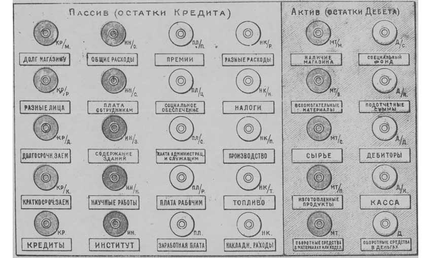
I explain: there is a balance in front of you (although with asset and liability reversed in place, it is not clear why). The number of dies threaded into the pins indicate the amount. That is, there is an ordinary balance sheet, but three-dimensional, which is why it is extremely visual.
You can ask the question, why did a rope pass through the pins? I believed in simplicity: in order to move dies along a string. Then they explained to me that I was an idiot, because the rope passes through the pin through, you can't move the plate on the string. I scratched my head and had to agree.
To find out what the string was for, I had to stamp the library again.
What do you think, why rope? I'll tell you later, but for now look at the historical evidence of how effectively the reporting system “System of streams” was used in practice.
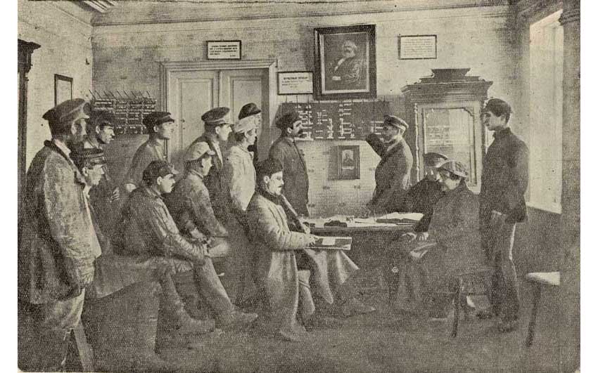
In the office of the chairperson of the Institute of industrial education:
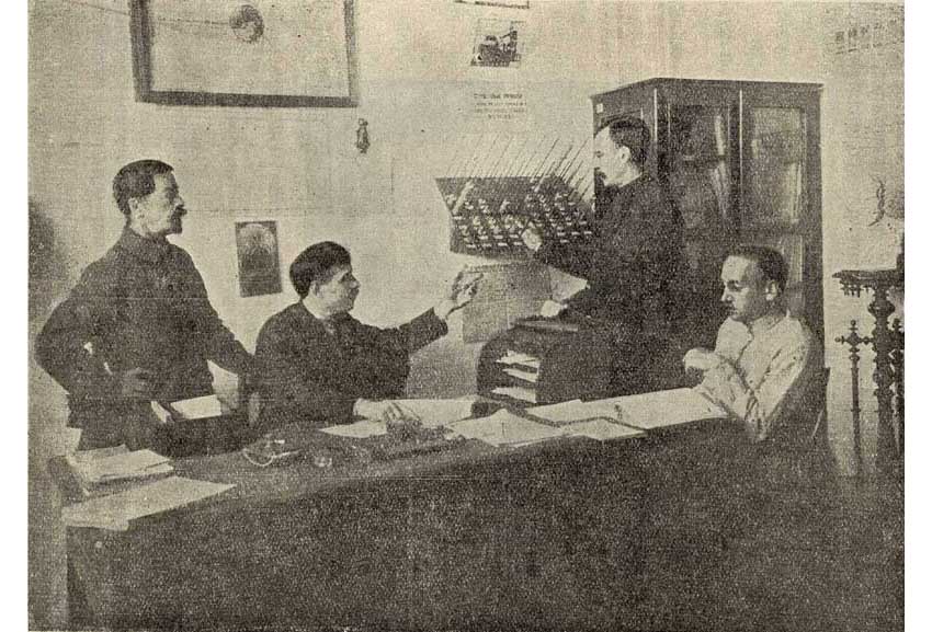
An emergency meeting of the members of the Council
Cabinet authorized by INOP in Rostov-on-Don:
Board meeting of an experienced INOP trust:
Mill Accountant INOP uses a visual agitation:
It was.
By the way, instead of control boards and pins with dies, projectors of various designs were used to achieve clarity. This projector was called a reflectoscope:

Of course, projectors were used to demonstrate not only graphs, but also other images - as they are now expressed, for presentations.
Since the late 1930s. the fascination with charts, as it happened with all accounting quirks, went into decline. Although in periodicals from time to time there were still published notes like this, from the journal “Accounting and Finance in Collective Farms” for 1937:
Strangely enough, the graphics suddenly came into vogue in the postwar years, although very briefly, in just two or three years, thanks to the efforts of one Saratov professor, A.I. Lozinsky.
Here is a photo from his post-war graphics tutorial:

Since the late 1940s. The use of charts in accounting, let's say, has returned to normal.
Yes, I almost forgot. I promised to open your eyes to the use of the string in the reporting instrument “The System of Streams” of the Taganrog Institute of Scientific Organization of Production.
It's simple: the string was used to seal the device (in the upper right corner you can see the seal, if you look closely). A pest will sneak into the mill director’s office to distort the reported data, and the device is sealed. Imagine what a bummer for vile vrazhin.
So, with the help of vigilance and working ingenuity, Soviet inventors disrupted the enemy’s ingenious plans.
Source: https://habr.com/ru/post/178751/
All Articles