RE: How to deal with low-quality Android applications
 In response to: habrahabr.ru/post/178673
I spent a year on Windows Phone and got rid of this phone as soon as possible. Now I have a Nexus 4.
Windows Phone is functionally awful. And the style of Metro is not that close to me.
But for the first two weeks I was really in a kind of cultural shock. I had a clean guglofon, without any third-party shells, firmware and applications. Only pure google reference.
')
And, you know what? I do not understand how such a company, with such resources and such experience in interface design, has enough conscience to take money for it.
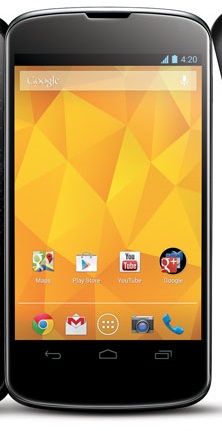
Pay attention to the screen on the left. This is the LG Nexus 4 start screen. A little exercise:
1) find two icons in the same style
2) find an icon that looks good on a bright orange background
3) try to read the text
4) find two icons aligned on the bottom border.
Seriously. In my opinion, it’s not the developers who turned the Android platform into a bunch of bright stuff without any hint of interface commonality. This is all done by Google itself.
Under the black hole icon hides a set of other pre-installed Google applications:

Suddenly, two similar icons! g + and chat are made for each other!
Did Google really not have enough designers to make the icons of their services recognizable-google? Or at least fit them in the same form?
We have here: icons on a square substrate, rectangular, without substrate; with right angles, slightly rounded, strongly rounded; in the presence of three different fonts (not counting the font signatures) and a complete set of artistic styles from realism to minimalism.
Go through the standard applications.
Here is a list of contacts:
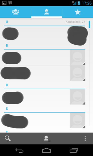
Top switch on the blue substrate, the list itself is on white, the photos on the right, below are three buttons - search, new contact, menu.
Now look at the list of SMS:
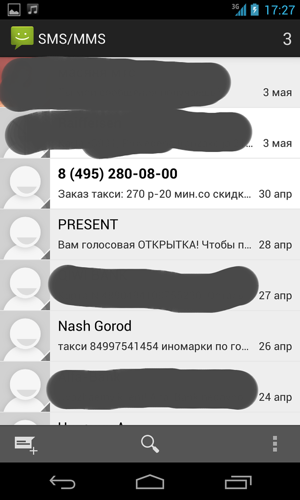
Now we have a black plate on top with the name of the application, a photo on the left, and in the bottom menu the order of the icons has changed - now we have a new SMS more important than a search.
Look further, the list of books, for example:

Now, suddenly, the search has moved to the top (now white) die, and the bottom panel has disappeared completely.
And here is the local image gallery:

Now we have a black die, a black background and some sort of metro tiles. Search in the same pictures, in the opinion of Google, is not necessary at all. Tea is not SMS.
Four applications - four interfaces. Four different dies. Three different places for the search button. And this is the largest search company in the world ?!
Or, check the head. Clock:
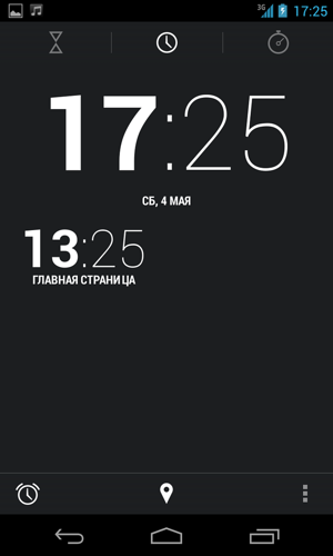
Exercise for telepaths: without looking at the instructions, guess what is behind the button with the enema. Oh, by the way, for some reason the enema was stylized for a common black and white interface, but for some reason the hand did not rise in the map icon.
Or, beautiful. Quick Settings Panel:
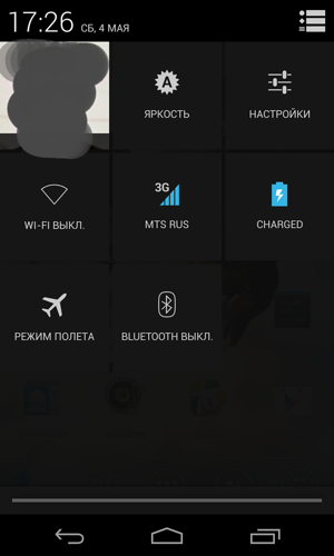
What do you think will happen when you click the Wi-Fi icon? Do not guess, the Wi-Fi settings menu will open.
Now, if you do not enter the quick settings, but the usual ones, then there will be a Wi-Fi toggle switch:

And so on and so forth. But this is, for a moment, the 17 major version of the operating system!
Frankly, I just do not understand how in such conditions we can expect from the developers of the sane interface if the system applications do not have this interface. How to organize lists correctly - on a white background, on gray, on black, in tiles? Pictures on the right or left to put? Search button where? What color top plate do?
Despite all the advantages of the Android operating system, the sophistication of its interfaces can be briefly assessed with the word “squalor.”
Source: https://habr.com/ru/post/178713/
All Articles