Customization of scrollbars in the browser: a compromise between html, css, js technologies and usability
Greetings to all!
The article is dedicated to solving the problem of customization of browser scrollbars for the sake of translating ambitious ideas of the designer into life. The article is designed for those who are freely oriented in the technologies of html, css, js, because The proposed solution is based on their compromise use.
')
The article will describe and solve the following tasks and goals:
- minimum JavaScript calculations when scrolling and resizing an element
- cross browser and mobile browsers
- ease of use, customization and implementation
- taking into account the behavior of elements when scrolling using content selection
- update scrollbar parameters when updating, changing or reloading content
- bypassing the standard behavior of browser content when changing the width of its window
Intro. Features system scrolling.
In order to make a start from what, I will give a simple example ( see the work ):
<div style="border: 3px solid #f08080; height: 300px; overflow: auto; width: 300px;"> <div style="background-color: #90ee90; border: 10px solid #4169e1; min-height: 600px; min-width: 600px;"> content... </div> </div> A browser for navigating content in this area provides the following features (I advise you to try all of them):
- mouse wheel (some mice except for vertical scrolling allow horizontal scrolling)
- arrow keys when focusing on an element (up, down, right, left)
- touchpad (special convenience and pleasure from content manipulation can be felt on the touchpad at Macintosh computers)
- touchscreen tablets and phones, as well as computers
- You can also scroll the content, highlighting it (this feature is provided to highlight, for example, large texts, some of which are out of sight)
- and, directly, the elements of scrollbars: sliders and buttons
As you can see, the set of features is very large and it is very well implemented, thought out, convenient and familiar to the end user ...
Is it worth it all or part of this implement means js, to change the appearance of scrollbars?
Yes : because there are new ideas for navigating through content, craving for experiments with js, etc.
No : the browser already does all this and you need to find a way to use it. Here I will tell about it below .
So.
The solution has the following structure in html:
<div class="scrollar"> <div class="scrollar-viewport"> <div class="scrollar-systemscrolls"> <div class="scrollar-contentwrap"> <div class="scrollar-content"></div> </div> </div> </div> <div class="scrollar-scroll scrollar-vscroll"> <div class="scrollar-btn scrollar-btnup"></div> <div class="scrollar-btn scrollar-btndown"></div> <div class="scrollar-track scrollar-vtrack"> <div class="scrollar-thumb scrollar-vthumb"></div> </div> </div> <div class="scrollar-scroll scrollar-hscroll"> <div class="scrollar-btn scrollar-btnleft"></div> <div class="scrollar-btn scrollar-btnright"></div> <div class="scrollar-track scrollar-htrack"> <div class="scrollar-thumb scrollar-hthumb"></div> </div> </div> <div class="scrollar-corner"></div> </div> Scrollar is both the name of the solution and the namespace to exclude the intersection of styles on the landing page where the solution can be used.
To make it clearer - I will explain the structure:
- the root block is a wrapper for the whole structure and determines the area and dimensions of the whole structure as a whole;
- viewport - this block is limited to the content viewing area;
- systemscrolls - this block is responsible for scrolling content;
- Contentwrap is a correction block (about its meaning and possibilities below);
- content - the content itself;
- vtrack and htrack - vertical and horizontal scrollbars. With their contents and so everything is clear.
And now you can begin to consider the key points ...
Main severity: Scroll and Resize operations
In my opinion, these are the most “difficult” and inconvenient operations in javascript implementation. Why? In order to programmatically implement Resize and the preservation of proportions, it is necessary to mainly handle the window.onresize event, and when this event occurs, adjust the sizes and proportions of several elements (most often so ...). The disadvantage of resizing in this way is the non-smooth (with small inconsistent, visible to the eye, steps) resizing element, who tried to debug like this - will understand me. This greatly "strains" the eyes when you put your soul into the development and try to bring the work of the entire interface to idel.
Thus, in order to maintain maximum smoothness when changing the size of elements, it is worth using one of the options for rubber layout of block elements with absolute positioning relative to each other and changing the size of elements due to binding to specific coordinates:
.scrollar, .scrollar-viewport, .scrollar-systemscrolls, .scrollar-contentwrap, .scrollar-content { bottom: 0px; height: auto; left: 0px; position: absolute; right: 0px; top: 0px; width: auto; } /* */ .scrollar { overflow: visible; position: relative; } /* */ .scrollar-contentwrap, .scrollar-content { bottom: auto; right: auto; } after the declaration of such styles, the browser will itself resize both the scroll pane and the internal elements. Below the article, the styles of some elements will be supplemented and adjusted to achieve the desired and better result.
About Scroll . To implement scroll on desktop browsers, you need to handle the mouse wheel event and analyze the values from this event (also remember that some mice allow you to scroll content horizontally, and not just vertical), and for mobile browsers you need to handle touch events . Those. for a cross-platform solution, you need to program these two implementations. But it’s better to scroll the content on the browser itself. It is enough to define the style for the systemscrolls element:
.scrollar-systemscrolls { overflow: scroll; } Hiding system scrollbars and 22px
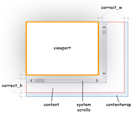
Solving the problem of scrolling content, I used the overflow: scroll property, which forces the browser to display scrollbars always and thus provides the user with all the convenience of system scrolling. But now you need to hide these scrollbars. This is where the viewport will help - this block will hide everything that goes beyond it. This can be done in two ways:
.scrollar-viewport { overflow: scroll; } .scrollar-viewport { clip: rect(0, auto, auto, 0); clip: rect(0 100% 100% 0); } The first option with overflow is easy to understand, but when the user wants to select content and starts dragging the cursor in the right direction, he is likely to see system scrollbars, since with such an action, they will come out from under the hidden area. The version with clip does not suffer like this, but in this case I had to use a small hack to support ie7. But that's not all ... The systemscrolls block has the same dimensions as the viewport block, i.e. system scrollbars are still visible. Here the key moment is used: “22px” - this is the value by which the systemscrolls unit will be adjusted. The fact is that the scrollbars thickness in popular browsers is less than 21px. The correction itself looks like this:
.scrollar-systemscrolls { bottom: -22px; right: -22px; } After that, the scrollbars will be hidden and will be outside the boundaries of the area that is clipped with the clip.
And what is the result? The browser itself changes and monitors the size of the entire element, the content scrolls easily and smoothly in all the ways described above, and the system scrollbars are hidden. But if it is left in this form, then the part of the content on the right and bottom will not be displayed ...
Contentwrap block
The main and main purpose of the contentwrap block is to make it so that in the viewport block you can see the content block completely: from one edge to another with different scrolling methods.
Up to this point, javascript was not required, but now it is useful in order to adjust the size of the contentwrap block.
… var viewport = $(".scrollar-viewport", scrollar); var systemscrolls = $(".scrollar-systemscrolls", scrollar); var correct_h = systemscrolls[0].clientHeight - viewport.height(); // var correct_w = systemscrolls[0].clientWidth - viewport.width(); // … thus, the dimensions of the contentwrap element will be obtained from the addition of these values with the dimensions of the content block, and this will need to be done each time the size of the content block changes. There are exceptions, but they will be discussed below.
Adjusting the contentwrap block with js allows you to ignore the type and version of the browser and the thickness of the scrollbars it uses.
Vscroll and hscroll blocks
vscroll and hscroll - scrollbars. At the moment, the main task is to “glue” them to the edges and force them to change their size and location of their child elements at the expense of the browser:
.scrollar-scroll, .scrollar-track, .scrollar-btn, .scrollar-thumb, .scrollar-corner { position: absolute; } .scrollar-hscroll { bottom: 0px; height: 0px; left: 0px; right: 0px; } .scrollar-vscroll { bottom: 0px; right: 0px; top: 0px; width: 0px; } .scrollar-btnup { left: 0px; top: 0px; } .scrollar-btndown { bottom: 0px; left: 0px; } .scrollar-btnleft { left: 0px; top: 0px; } .scrollar-btnright { right: 0px; top: 0px; } .scrollar-vthumb { max-height: 100%; height: 30px; left: 0px; right: 0px; } .scrollar-hthumb { max-width: 100%; width: 30px; bottom: 0px; top: 0px; } There is nothing complicated in this listing and I will move on to the more interesting part: the sliders.
Runners
For the successful implementation of the runner functionality, you need to consider the following tasks:
- change the position of the slider when scrolling content in the ways indicated above
- dragging the mouse with the mouse pointer and the content response to these actions
- resizing and maintaining the position of the slider when the content is resized relative to the size of the component or when the size of the component changes (this problem is solved when the parameters of the entire component are updated and the solution is described below)
Changing the position of the slider when scrolling content
This is extremely easy to do. Due to the established overflow: scroll property of the systemscrolls block, you can catch the scroll on this block, and already when this event occurs, move the slider depending on the position (scrollLeft and scrollTop properties) of the content relative to the left upper point of the systemscrolls block, taking into account the proportionality coefficient, which is calculated in function update component parameters (see below).
Dragging the Runners
The slider must respond to the behavior of the mouse pointer as well as in the system. This is not very difficult to do. The algorithm is as follows:
- catch the mousedown event on the slider itself
- connect the mousemove and mouseup events to the document element
- handle the document.mousemove event, thereby changing the position of the slider and scrolling through the content
- catching the document.mouseup event - disable mousemove and mouseup events on the document element
As you can see, the algorithm is very simple, but there is one nuance: changing the position of the sliders, or rather the algorithm for changing this position. You can change the position of the sliders in two ways:
- scroll event from the systemscrolls element. It arises as follows: to scroll through content using js, you need to change the scrollLeft and scrollTop properties of the systemscrolls block, and changing these properties will trigger the scroll event of this blog. Thus, the algorithm for changing the position of the slider when scrolling content, which is described above, will work.
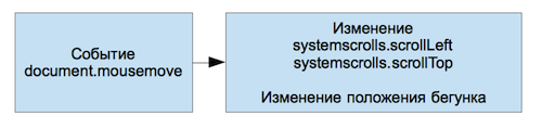
- after the mousedown event on the slider is caught, you need to disable the scroll event on the systemscrolls element, and the slider elements move on the mousemove event on the document element while simultaneously scrolling through the content by changing the scrollLeft and scrollTop properties on the systemscrolls block.
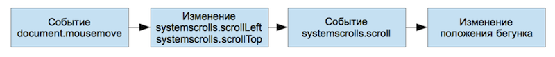
At first glance, the first method seems better, because requires less effort to implement. But the disadvantage of this method is the presence of feedback through the systemscrolls.scroll event (see figure), due to which the slider begins to noticeably lag behind the mouse pointer as the latter moves quickly. At the same time, the systemscrolls.scroll event occurs every time when the scrollLeft and scrollTop properties of the systemscrolls block change, causing the function of moving the sliders.
With the second method you can get a much better result. Additional operations for detaching and attaching the systemscrolls.scroll event occur only twice: on the mousemove and mouseup events (respectively) of the document element. Thus, the processing of the document.mousemove event is faster and more optimal (see figure).
Update component settings
That time has come to a very important function - updating the parameters of the component. For this function, you must ensure the speed of execution, because it can be called when resizing and changing content very often, so most of it is written in pure js. Below is a piece of code to update the parameters horizontally:
// if (options.hscroll) { scroll = env.hscroll; var ss_cw = ss.clientWidth; // contentwrap cw.style.width = (ct.offsetWidth + env.correct_w) + "px"; while (Math.abs(cw.scrollWidth - ct.offsetWidth) <= 1) { cw.style.width = (ct.offsetWidth + 1000) + "px"; cw.style.width = (ct.offsetWidth + env.correct_w) + "px"; } var ss_sw = ss.scrollWidth; // var htrack_w = scroll.track.width(); var hthumb_w = htrack_w * ss_cw / ss_sw; if (hthumb_w > htrack_w) { hthumb_w = htrack_w; } else if (hthumb_w < 30) { hthumb_w = 30; } scroll.thumb.outerWidth(hthumb_w); // x = htrack_w - hthumb_w; scroll.ratio = (ss_sw - ss_cw) / (x < 1 ? 1 : x); if (scroll.ratio < 1) scroll.ratio = 1; // scroll.min_pos = 0; scroll.max_pos = htrack_w - hthumb_w; // scroll.thumb.css("left", ss.scrollLeft / scroll.ratio); } From this listing, I want to pay attention to a piece of the code “Adjusting the width of the contentwrap” code, the rest is clear and without explanation. The meaning of this piece is as follows:
- in the browser, more content than vertical takes precedence over the horizontal, which means that if you change the width of the browser window (and the content does not have any hard width restrictions), the content height will increase without any restrictions, and the width will decrease. In fact, everything is logical and user-friendly, because the presence of a horizontal scroll window at the same time as a vertical window — these are certain inconveniences; it is better to pull the content vertically. But when it comes to the scroll pane of an interface element, I would like the horizontal scroll pane to increase automatically when needed. And this code of 5 lines solves this problem: determines when the browser can build elements horizontally and then expands the content to the desired size.
When do I need to update component parameters?
- initialization
- resize browser window
- change of contact
If the first two cases are very transparent, then the last one is fraught with pitfalls. The content may change not only during the removal or addition of any elements, but also upon the completion of loading any images, if their sizes are not specified in advance, etc. You can catch all variants of onload events, but this is not worth it. The most optimal solution - setInterval (update, 300) - the update function will run every 300 ms, the browser load is almost none and everything is very reliable.
Customization
Customization - this is what all this was started for. The goal was: to minimize the efforts of the coder and save time. After several experiments with the structure of the elements in the scrollbar, the structure below is more flexible:
<div class="scrollar-scroll scrollar-vscroll"> <div class="scrollar-btn scrollar-btnup"></div> <div class="scrollar-btn scrollar-btndown"></div> <div class="scrollar-track scrollar-vtrack"> <div class="scrollar-thumb scrollar-vthumb"></div> </div> </div> This layout of vertical scrollbar (for horizontal everything is alike). The advantage of this structure is the following:
- generalizing classes scrollar-scroll, scrollar-btn, scrollar-track and scrollar-thumb allow you to set common styles for both vertical and horizontal scrollbars (for example, by setting scrollar-btn {display: none;} you can hide buttons);
- scrollar-btn and scrollar-track are fixed relative to the parent element scrollar-scroll, which allows you to change their position and their size, as well as the size of the scrollar-scroll, at the expense of the browser;
- the scrollar-track element does not require styling, since it is intended to define the scrollar-thumb slider's motion area, but if you wish, you can apply styles to this element;
- elements are positioned absolutely (position: absolute) relative to the scrollar-scroll, which allows them to be placed relative to each other very easily;
In fact, all customization comes down to writing styles. At the end of the article there will be links to examples of customization, as well as links to style files for these examples.
And if horizontal or vertical scroll is not needed?
It's simple: when you initialize a component, you need to specify which scroll is not needed (by default, both are displayed). Visibility control and scrolling is done by adding or removing classes. Also, the addition of these classes affects the size of the content (for example, when hscroll: false, the width of the content will change automatically due to the native browser functionality)
How to change content?
There is a content function (“action”, content), where action is a jQuery content management function (text, html, append, prepend ...). Also, this function can be called without parameters, then it will return the jQuery object and you can work with it, in this case, the component parameters will be updated every 300 ms. Examples:
- content ("html", "Abcd") - replaces the content in the scroll area with a paragraph with text, and the component parameters will be updated instantly, immediately upon completion of the function;
- content (). html ("Abcd") - the effect will be the same as in the previous example, but the content will be updated due to setInterval, as a last resort, you can force the update () function
Links to the article:
Customization - on this page you can see several options for customization, as well as you can try out the scroll element's reaction to the resizing of the browser window.
GitHub is a repository where you can find everything that was described in the article.
Default style - an example of arbitrary styling.
Safari style - styling scrollbars in the style of Mac OS 10.8
Conclusion
Should I invent something new? Of course! Every new idea has a chance to influence the future (in a particular case - the future of usability)
Source: https://habr.com/ru/post/178299/
All Articles