Serious design serious sites. Part 2. Visualization
7. Map of the mind.
Having a huge number of ideas, we can begin to visualize them and build logical relationships. At this step, the task of the designer is to bring everything into a single system and discard the unnecessary.
To create a mind map (it is often called the English term “Mind map”), we can use special software, I recommend Xmind.
First you need to take a few of our documents with the ideas that we made at the previous stages, we will systematize them. All ideas need to be divided into global blocks (sections). For example, imagine that we are designing a real estate portal, the global blocks of which can be: real estate catalog; community; news articles; knowledge base, etc. All the ideas we need to distribute these global blocks. Mutually exclusive ideas combine or choose one of them. According to the principles of brainstorming, we discard unhelpful ideas, or rather leave it until better times. The total number of blocks should correspond to future sections of the site, each section may have subsections. Ideally, the number of sections should not exceed 7-8 for a large portal, if we design, for example, the media, there may be many sections, which in fact differ only in the content theme, but have the same purpose, such options are also acceptable, but they need to be very careful, it is important that the user is not confused.
')
In each block we form logical chains of ideas. We are sure to show interdependent ideas, for example, a user’s rating can be associated with activity, in particular, with writing articles, so we have to take an arrow from the articles to the rating in order not to forget that one affects the other.
For convenience, you can come up with your own type of marks for different functional groups, for example, if the designer is not sure whether there will be any function in the site, you can put a question mark. So it will be easier to navigate, the cards are very large.
In the mind map, we can select a beta version, but it is desirable to design the entire project at once, so that we can think about extensibility.
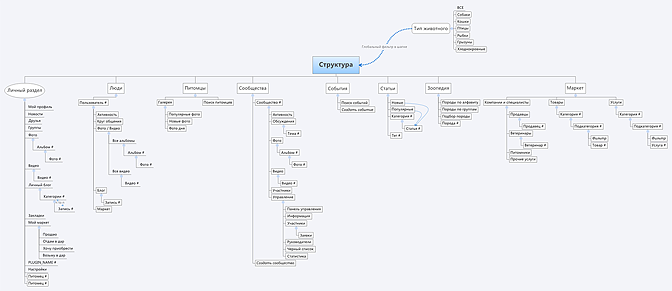
At the output we get a mind map with all the ideas of the project, a kind of map of the future project. It is, of course, very important to approve with the customer.
Example:
Project: social network of pet owners.
Fig. 3. Mind Map

8. Site structure.
Having a mind map on which the main sections and subsections are visible, we can make up the structure of the site, according to which we will prototype in the next step. The structure can be made in the mind map or Visio.
It is very important to show all the main sections on the main page, in addition to group all the subsections, it is obvious that the user on the main page understands exactly where it is and has the opportunity to get into any important part of the site without much effort. Often the site can have two levels of navigation: the main and auxiliary. This will be especially useful for online stores where there is a menu-catalog (the main one) and separately there is a menu with information about the store (auxiliary). The same is true for portals with social functions: a separate thematic menu and a separate social one.
At the exit, we have a complete site structure with all sections and subsections. This is our skeleton, around which we will build up prototypes in the next stage. The structure must be approved with the customer.
Example:
Project: social network of pet owners.
Fig. 4. Site structure
9. Prototyping.
One of the key stages is the creation of interface prototypes. For this, you can use special software, I recommend Axure, although it is not the only program for creating interface prototypes, there are many others.
The most difficult thing is to design the first layout. It is there that the common framework will be designed: a hat, a main menu, a cellar, etc. It is not always necessary to design from the main page, the store usually starts from the product page, and social networks from the user profile.
The designer must take the structure and the map of the mind, for it will be the first layout of the site. It is important to think about what the user may need on this page, and lay all the necessary blocks and links. We can depict the most important functions in the form of blocks with detailed information in the content part, where we put what almost everything will use and constantly. We can place less important functions in the menu, which can have several levels, or make links to the content part.
Before we start designing, we need to remember who is the core of our target center. and get used to their role. This will allow to design from the point of view of our Central Asia.
To begin, we must design the menu, this is the most important. We need to understand whether we will have one or several menus, whether there will be nesting there and how they will be presented. After you need to design a header, it contains important navigation elements: the menu itself, the search, you can place phones for shops, a logo on the left, often there are links to the user's personal account and other personal sections. The hat is the most valuable space, so it is used to accommodate the most important elements.
After the cap, we design the content part, it will change in each of the layouts. Blocks we have all the necessary functionality and content, some blocks may be unchanged for all pages, as well as the header. The right part of the page is traditionally considered to be a “blind zone”: users are used to the fact that this part of the site is dedicated to advertising and pay little attention to it, hence it is not recommended to place important interface elements there.
At the bottom of the page we design the so-called "basement", which will be the same for the entire site. Usually in the basement duplicate menu, recently fashionable to make large basements, where there is a complete site structure, copyright information, links to social. networks and links to contact information for contacting site owners.
Do not forget to take into account the modular grid layout. So visually the page will be much easier to perceive. In addition, you need to remember that the user is looking from left to right and from top to bottom, this means that all important information should be located to the left and above.
We also remember about branding, the logo should be noticeable and attract the attention of new visitors. It should be placed in the upper left corner, so subconsciously it will be remembered by users.
After we have designed the first page, it's time to open our competitors and see how this section is implemented in them, this may give rise to certain thoughts.
The first page should be presented to the customer, tell why it was done this way and not otherwise. After the customer, most likely, he wants to make corrections, it is the visual part of the design that causes the customers a great desire to make their edits. Many ideas can be very useful, but their other part is very likely to be complete nonsense, so the designer should be able to competently justify his thoughts and guide him on the correct version, the volume that will work. Do not forget that it is the designer who is responsible for the final result.
After the approval of the first page, you can proceed to the rest. All the ideas that are displayed in the mind map, as a result, should be presented in the designed prototypes. It is important to design all the functionality laid down, every little thing, otherwise in the future the under-projected parts will turn into hell for the developer.
We can test prototypes using our scripts to check the logic once again, already in the interfaces.
Work on time is very voluminous, it takes more than all the other stages of design combined. In large sites, there can be more than 100 unique interface prototypes.
The output should be a lot of interface prototypes, each of which should ideally be discussed with the customer and approved.
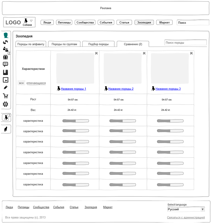
Example:
Project: social network of pet owners.
Fig. 5. User Profile:
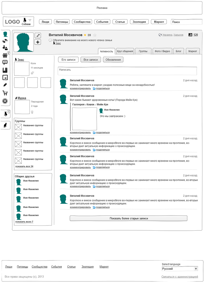
Fig. 6. Group:
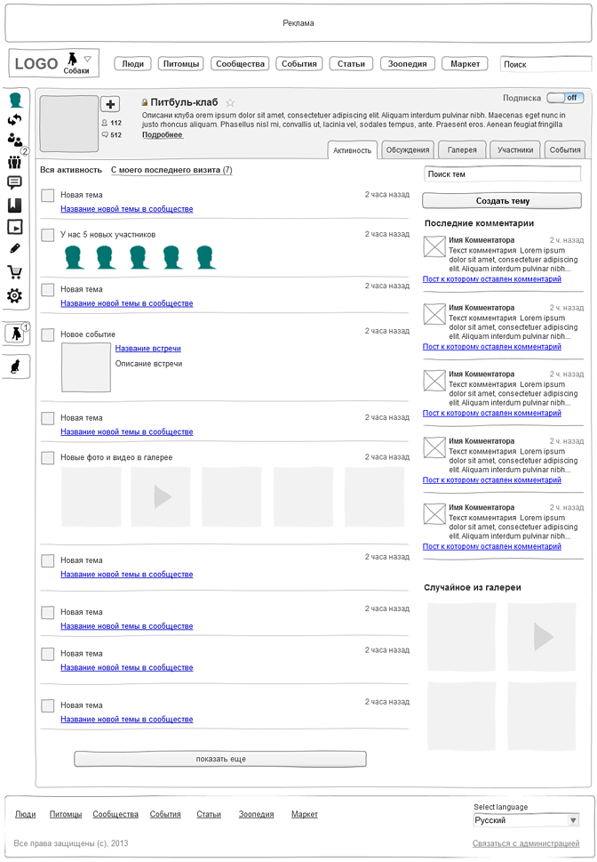
Fig. 7. Zoopedia. Animal comparison:
There are about 90 such prototypes of the interface in this project.
For comparison, you can see the prototypes of other projects developed by us:
Social network on photography FOTO.ua: prototype and design based on these prototypes.
Automobile social network Mazda Russia: prototype .
Building materials sales portal StroyPrice: prototype and design based on these prototypes.
Service for the realization of Dreamany's dreams: prototype and design based on these prototypes.
Lego online store: prototype and design- based prototypes.
As you can see, all the layouts are always worked out to the smallest detail, so that at the design, layout and programming stage there are no questions. This saves the development team and the customer from so many problems and, above all, from the risk of falling into the "infinite development" when, due to the ambiguity of the design task, constant alterations and improvements begin.
10. Usability Testing.
This is an optional step, but it can also help improve quality. Axure allows you to generate html from prototypes, which allows you to make them interactive and, accordingly, conduct full usability testing.
Testing will help us identify errors in logic, it is possible that places that are not clearly designed are emerging and need to be redone. In addition, testing can show important elements that are not visible, for example, an important button, which in the prototype has a small size, these places can be identified in the design.
For testing, we collect a group of users from among the target audience, set tasks for them to do something with the help of the site and watch their actions. This allows you to see the flaws of the interface. Separately, you can conduct a survey with the same experimental users and find out their opinion in general about the site. After testing, we are finalizing our prototypes.
At the exit, we get improved prototypes and see the preliminary reaction of users to the future site.
11. Technical assignment.
The final stage, at which it is necessary to make a description of all the layouts, to prescribe non-obvious work algorithms, to think over the business logic of the system for programmers.
The description should be unambiguous and complete, but without fanaticism, describe the obvious things: that the link is a link, of course, is not worth it. The description should contain all the formulas and calculations that will be used in the work, especially for rating calculations, which in large sites can be with very complex formulas and interrelations.
The description is done in a regular Word file, interface layouts are inserted there. Layouts do not have to be inserted entirely if we describe, for example, a menu, but it is advisable to cut the menu from a large layout and insert a specific part.
Requirements for hardware and software, requirements for technologies that are appropriate for specific tasks, design requirements (sometimes called an artistic task), planned loads, etc. In fact, this document should not cause questions to the project team, which, after the designer, will implement the site.
At the exit we get a very voluminous document that accurately describes the future system. This document has already laid interesting "chips" for Central Asia, there are requirements for design and technology, there is a complete description of any function on the site. The document is approved by the customer and until the end of development, it no longer changes, only after approval, you can begin the production phase of the site. If this is a commercial development to order, the TZ must necessarily be an annex to the contract, and it will be on it that the work will be accepted and accepted.
Example:
Project: social network of pet owners.
File TZ: TZ-slj.doc
TK cropped, for informational purposes only.
Instead of conclusion
Designing is a whole science, not very simple and with a bunch of features. Any serious project will not do without design, it is really extremely important. Even a first-class idea can be ruined by poor design.
The design technology described above is used in our company, we are constantly improving and improving it. Naturally, besides the technology itself, we still have internal quality standards that allow us to create really interesting things, but this is another voluminous topic for another article.
Well, as a bonus, I want to show how all the beauty looks already in color (design outline):

PS Under the social network of pet owners, which I showed in the example, we are looking for an investor or buyer. Contact any contacts on the site.
PPS To receive our new articles before others or simply not to miss new publications - subscribe to us on Facebook , VK , Twitter
PPPS Very soon the course starts in our business school Digitov: Designing serious sites . Subscribe to the course now and you can buy it at a discount.
Original article here: http://seclgroup.ru/article-serjoznoe-proektirovanie-serjoznix-saitov.html (there you can also see the Mind map and other pictures in high resolution)
Author:
Nikita Semenov ( Facebook , VK , LinkedIn )
CEO
SECL GROUP / Internet Sales Technologies
Source: https://habr.com/ru/post/178049/
All Articles