Prism Developer Guide - Part 8, Navigation
Table of contents
During user interaction, the application UI can undergo significant changes, depending on what actions the user must perform and what data he is working with. The process when an application coordinates user interface changes is often called “navigation”.
Often, “navigation” means that some controls are removed, while others are added to the user interface. In other cases, this means updating the appearance of existing controls. For example, some controls may be hidden, or collapse, while others, on the contrary, appear or unfold. Similarly, “navigation” can mean that the data shown in some controls can be updated to display the current state of the application. For example, with the " master-detail " script, the data displayed in the detail view is updated depending on which item is selected in the master view. All of these scenarios can be regarded as “navigation”, since the user interface is updated to display the internal state of the application and what task the user is currently performing.
Navigation in the UI can be a consequence of user interaction, and a reaction to changes in the internal state of the application. In some cases, navigation may generate very small UI updates that do not require any complex logic. In other cases, complex business rules may be involved. For example, an application may not allow a user to exit a form without making sure that the entered data is correct.
')
The implementation of navigation in WPF and Silverlight can often be quite straightforward, since both of these platforms provide built-in navigation support. However, the implementation of navigation can become quite complex when using the MVVM pattern, or in composite applications that use several loosely coupled modules. Prism provides guidance on how to implement navigation in such cases.
Prism Navigation
The term “navigation” is defined as a process in which an application coordinates UI changes in response to user gestures, or changes in the internal state of an application.
Updates in the UI can be made either by deleting or adding controls to the visual tree, or by changing the state of elements already in it. Due to the flexibility of WPF and Silverlight, both of these approaches can be applied. But what approach will be more appropriate for your case may be influenced by a large number of factors.
Prism makes the distinction between the two types of navigation described above. Navigation based on changing the state of already existing controls is called state-based navigation . Navigation based on the addition or removal of controls from the visual tree is called " view-based navigation ". Prism provides guidance on the implementation of these types of navigation, focusing on applications using the MVVM pattern.
State-Based Navigation
With state-based navigation, the view is updated both when the state of the view model changes, and when the user interacts with the view itself. At the same time, instead of replacing the view with another view, its state simply changes. Depending on how the presentation state changes, this can be perceived by the user as navigation.
This navigation style works well in the following cases:
- The view needs to display the same data or functionality, but in a different form or format.
- A view must change its markup, or style, in response to a change in the state of the view model.
- A view must produce modal, or modeless user interaction, without changing the view context.
This style is not suitable in cases where the UI must provide the user with data of a different type, or when the user must switch to another task. In such cases, it is best to create separate views (and view models) to present the relevant data and tasks, and then navigate to them based on the views, which will be described later in this chapter. Similarly, such navigation is not appropriate in cases where a large number of changes in the state of the user interface are required, since the resulting views will be too complex and confusing. In this case, it will be more correct to implement navigation on the basis of views, between several views.
The following sections describe typical situations in which state-based navigation can be used. Each section refers to State-Based Navigation QuickStart , which is an instant messaging application that allows users to chat and manage their contacts.
Displaying data in various styles and formats
Often, your application may need to display the same information, but in different formats or styles. In this case, you can use state-based navigation to switch between different presentation styles, possibly using transition animation. For example, State-Based Navigation QuickStart allows the user to select a visual representation of his contacts — in plain text, or in the form of avatars. He can select the type of view by clicking the List , or Avatars buttons. The view makes an animated transition between the two views, as shown in the illustration below.

Since the view operates on the same data, but with different display styles, the view model does not need to perform any actions while switching between these styles. This approach provides greater flexibility to the user interface designer, since it does not need to work with the application code.
The behaviors of Microsoft Expression Blend make it easy to implement this type of navigation in a view. The State-Based Navigation QuickStart application uses Expression Blend's
DataStateBehavior to switch between the visual states defined in the visual state manager using radio buttons. One button includes a list of views of the contacts, the other - in the form of avatars. <DataStateBehavior Binding="{Binding IsChecked, ElementName= ShowAsListButton}" TrueState="ShowAsList" FalseState="ShowAsIcons"/> When the user clicks the Contacts or Avatar radio button, the visual state switches between the
ShowAsList and the ShowAsIcons state. The flip transition animation is also defined in the visual state manager.Another example of using this navigation style is presented in State-Based Navigation QuickStart , when the user switches to a view with additional information about the selected contact, as shown in the following illustration.
This is also easily implemented using Expression Blend's
DataStateBehavior , but in this case the behavior is tied to the ShowDetails property of the ShowDetails model, which switches between the visual states of ShowDetails and ShowContacts using flip transition animation.Display of application status
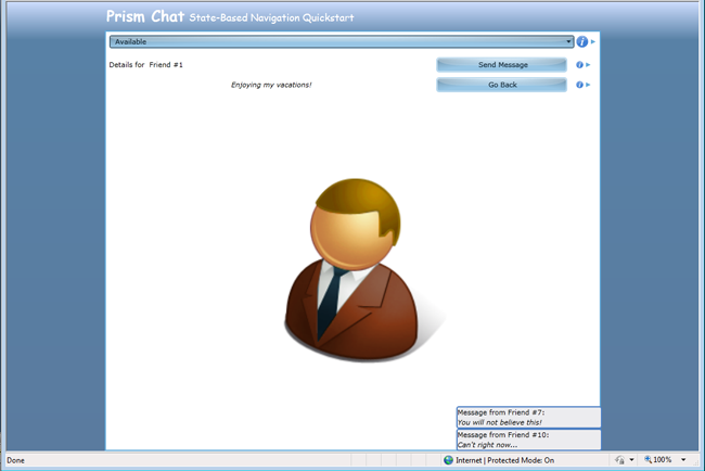
Similarly, the presentation in the application can sometimes change its markup, or style, depending on the change in the internal state of the application, which, in turn, can be represented through the properties of the presentation model. An example of such a scenario is given in State-Based Navigation QuickStart , where client connection status is provided via the
ConnectionStatus property in the Chat view model. When the connection status changes, the view is updated (by a property change event), as shown in the illustration below.
To implement such a state switch, the view declared the behavior of a
DataStateBehavior with the ConnectionStatus property of the view model. <DataStateBehavior Binding="{Binding ConnectionStatus}" TrueState="Available" FalseState="Unavailable"/> Note that the connection status can be changed either by the user through the visual interface or by the application, depending on the internal logic, or the occurrence of an event. For example, an application can switch to the “unavailable” state if the user does not interact with the presentation for a certain time, or if the user’s calendar reports that he is in a meeting. State-Based Navigation QuickStart simulates this behavior by randomly switching the state on a timer. When the state changes, the view model property is updated, after which the view is notified of this through a property change event. The user interface is updated to show the change in connection status.
All previous examples included the declaration of visual states in the view, and switching between them as a result of user interaction with the view, or by changing the value of the properties declared in the view model. This approach allows UI designers to implement visual behavior in the style of navigation without the need to change the presentation, or change any source code of the application. This approach is applicable when the view needs to display the same data in different styles, or with different markup. It is not suitable in situations where you need to display data of different types, or other application functionality, as well as when you need to navigate to other parts of the application.
User interaction
Quite often, an application needs to perform user interaction in a limited form. In such situations, it is easier to use state-based navigation in the current context, rather than switching to a new view. For example, in State-Based Navigation QuickStart, a user can send a message to a contact by clicking on the Send Message button. After that, the view displays a pop-up message that allows the user to enter the desired message, as shown below. Since user interaction is limited and logically related to the context of the parent view, it is much easier to implement it using state-based navigation.
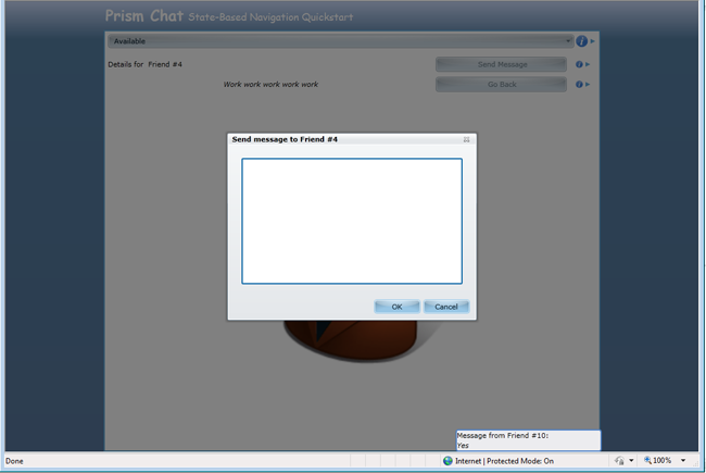
To achieve this behavior, State-Based Navigation QuickStart implements the
SendMessage command, which is tied to the Send Message button. When this command is called, the view model interacts with the view to display a popup window. This is achieved using the Interaction Request pattern described in Chapter 5, “ Implementing the MVVM Pattern ”.The following code shows how the view in State-Based Navigation QuickStart uses the
SendMessageRequest interaction request object provided by the view model. When an interaction request event occurs, the SendMessageChildWindow view is displayed in a popup window. <prism:InteractionRequestTrigger SourceObject="{Binding SendMessageRequest}"> <prism:PopupChildWindowAction> <prism:PopupChildWindowAction.ChildWindow> <vs:SendMessageChildWindow /> </prism:PopupChildWindowAction.ChildWindow> </prism:PopupChildWindowAction> </prism:InteractionRequestTrigger> To be continued.
Source: https://habr.com/ru/post/178009/
All Articles