Prism Developer Guide - Part 7.1, UI Design Guidelines
Table of contents
UI design guidelines
The purpose of this section is to provide a shallow guide for XAML designers and programmers building applications using WPF, Silverlight, or Windows RT and the Prism library. This section describes the user interface layout, visual presentation, data binding, resources, and data mapping model. After reading this section, you will get a cursory understanding of how to create a user interface using the Prism library, as well as how to use techniques that can help you create a supported UI in a modular application.
UI development
The markup of composite applications created using the Prism library is built on the standard principles of WPF and Silverlight - the markup uses the concept of panels containing related elements. However, in composite applications, the content of the panels is dynamic and not known until the moment the application is launched. This forces designers and developers to create such a markup structure that can display dynamic content, and then develop each of the elements of this content separately. For you, this means that you will have to learn the two main concepts of the Prism library: container composition and regions.
Container Composition
Container composition is merely an extension of the content model provided by WFP and Silverlight by default. The term “container” can refer to any element, such as a window, page, user control, panel, special control, control pattern, or dynamic content. The fixed content will be the general structure of the user interface element, and the dynamic content will be what is placed inside the regions.
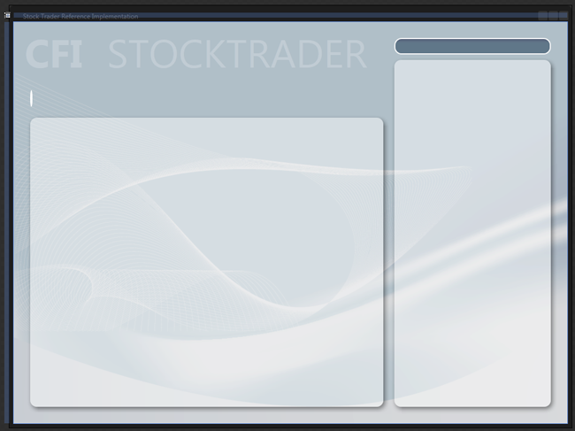
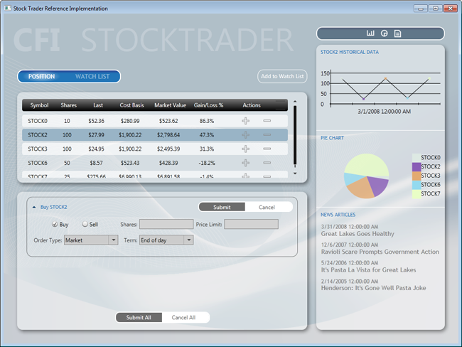
Support for design time from tools, for composite applications, is somewhat limited, but the fact that you know what content will be placed in different regions at runtime is crucial for development. For example, compare the view of the window at design time to the illustration below, and the view after starting the application, in the following illustration. At the time of design, the page is mostly blank. Compare with the view after the launch, when you see a lot of controls that perform the basic functions of the application. Based on this, you can imagine the complexity of the task facing developers and designers of composite applications.
')
Elements cannot be seen during design, therefore, determining what size they should be, and how they will fit the overall appearance of the application, presents certain difficulties. Consider the following points when composing your containers:
- Are there any restrictions on the maximum size of the content? If there are, consider using containers that support scrolling.
- Consider using a combination of
ExpanderandScrollViewerfor situations where a large amount of dynamic content should be placed in a limited space. - Pay close attention to how the content will resize when the application window is resized, to be sure that your application will look attractive at any window size.
Stock Trader RI main window in Expression Blend.
Stock Trader RI main window after launch.
Type of composite application at design time
The previous two illustrations show one of the problems in developing composite applications. Each user interface element in a composite application must be developed separately. This makes it difficult to visualize how the application will look after launch. In order to present what the application will look like in the assembled state, you can create a test project with a page or window containing all the user interface elements for the presentation you want to test.
- Additionally, consider using sample design-time data provided by Expression Blend and Visual Studio 2010-2012 for populating UI elements. This feature can be very useful when working with data templates, lists, graphs, or charts. For more information, see Guidelines for Design-Time Sample Data .
Markup
Consider the following points when designing the layout of a composite application:
- The shell specifies the basic layout of the application. Each layout region is a region, and must be an empty container. Do not place content inside regions at design time; it will be loaded into them at startup.
- The shell should contain a background and headers. Think of it as a master page in ASP.NET.
- Controls that serve as containers for a region are separated from the view they contain. Therefore, you will need to be able to resize the view, without modifying the controls, and resize the controls without modifying the view. You should consider the following points when setting the presentation size:
- If the view will be used in several regions, or you are not sure where it will be used, design it with dynamic height and width.
- If views have fixed sizes, the regions in the shell must have dynamic sizes.
- If the regions in the shell have fixed sizes, then the views should have dynamic sizes.
- Views may require a fixed height and dynamic width. As an example of this approach, Stock Trader RI has a
PositionPieChartview located in the sidebar. - The remaining views may have dynamic height and width. For example, the
NewsReaderon the sidebar in Stock Trader RI . Its height depends on the length of its title, and the width must always correspond to the size of the region. The same rules apply to PositionSummaryView, where the width of the table must adapt to the size of the screen, and the height to the number of rows in the table.
- Views should generally have a transparent background, allowing the shell to provide its background.
- Always use named resources to assign colors, brushes, and fonts, rather than assign them directly to element properties. This will greatly simplify application support. Also, it may allow the display of dynamic changes in resource dictionaries at run time.
Animations
Consider the following points if you are using animations in the shell, or in views:
- You can animate the shell layout, but you will need to animate its contents and views separately.
- Design and animate each presentation separately.
- Use soft and unobtrusive animation to indicate that a visual element has been added to, or removed from, a view. This will add gloss to your application.
Expression Blend provides a rich set of behaviors, fading functions, as well as tremendous possibilities for creating and editing animations and transitions based on states and events. For more information, see the "VisualStateManager Class" article in MSDN.
Runtime optimization
Consider the following points to optimize performance:
- Place any shared resources in the
App.xamlfile, or in aApp.xamldictionary to prevent duplicate styles. - In Silverlight, avoid using non-system fonts for text styles that are different from the rest of the application, for example, for headings. In this case, consider converting text into a path, or embedding a font in an application. The introduction of a font into an application can significantly affect its size, since some font files are relatively large. To reduce the size of the loaded .xap file, Expression Blend allows you to load only a subset of characters, and not the entire font.
For more information, see “Using Custom Fonts in Silverlight” .
Design time optimization
Further recommendations and solutions to some problems arising from the visual design of the application are given.
Big solutions with lots of XAML resources
In a large solution with a lot of XAML resources that are part of it, the load time of the visual editor can increase dramatically. This happens because the visual editor must load and parse all the embedded resources. One way to deal with this is to transfer all XAML resources into a separate project, compile this project, and then create a link to the resulting DLL from the original project. Since now all resources are in a binary assembly, the designer does not need to disassemble them independently, which has a positive effect on performance during design. While moving XAML resources to another project, you can consider using
ComponentResourceKeys for your resources. For more information, see “ComponentResourceKey Markup Extension” on MSDN.XAML resources
XAML is a powerful and expressive language for creating resources such as images, diagrams, drawings and 3D scenes. Some developers and designers prefer to create such resources instead of using graphic images. The first advantage of this approach is independence of screen resolution. The second is the ability to use only the Expression Suite, both for creating all the necessary resources and for the design of the application.
Visual editor and builds
The downside to using a separate assembly for resources is that the property editor in Expression Blend and Visual Studio 2010 does not display resources located in such assemblies. From this it follows that you will have to manually type the names of resources located in other assemblies.
Silverlight Design-Time App.xaml resources
Composite Silverlight applications can be structured to either reduce download time due to deferred loading of assemblies, or to reduce the initial .xap file. One strategy is to create the main Silverlight application, and then add assembly satellites to each module. When adding such an assembly, you can choose one of the templates, this is either a Silverlight project, or a Silverlight class library.
The choice for assembly satellites of the Silverlight project template provides an advantage when deploying: the assembly will be packaged in an
.xap file when compiled. However, a side effect is that the visual designer, if there are several Silverlight projects in one solution, uses resources only from the active project's App.xaml file.Expression Blend 4 provides a solution to this problem. When he identifies such a problem, he shows a dialogue where he suggests choosing the necessary library of resources to be used throughout the application. Visual Studio 2010 does not have this feature, respectively, assembly-satellites will not have the same support for visual editing, unless you put all the application-level resources in a separate assembly. If you chose this approach, then do not forget to remove these resources from the projects of satellite assemblies before deploying the application.
Guide to creating design-friendly views
The following points are characteristics of design-friendly views (also known as blendable , or tool-able ):
- They can be effectively edited using the designers in Visual Studio, or Expression Blend.
- You can use various tools, such as a binding expression builder.
- They provide sample data for display at design time.
- They allow code to run at design time without generating unhandled exceptions.
The following operations are performed multiple times during editing. User code that is not user-friendly for a designer can prevent them from being executed, thereby reducing the productivity of the designer or programmer.
- Design surface actions:
- Creating objects
- Loading objects
- Setting Property Values
- Event handling design surface
- Using a control as root
- Putting one control inside another
- Opening, closing and reloading a XAML file
- Recompile project
- Designer reload
- Anchor expression builder actions:
DataContextDetection- Listing available data sources
- Enumeration of data source type properties
- Selective design-time data actions:
- Using controls on the design surface to correctly display sample data
Creating code for execution at design time
For ease of use designer, Visual Studio and Expression Blend create objects and execute code during design. However, null reference exceptions caused by code that attempts to access objects before they are created can cause a large number of loading errors and unnecessary exceptions during design.
The following table lists the main issues affecting designer usability. By avoiding these problems and using techniques to eliminate them, you can significantly improve your productivity and satisfaction with the use of visual designers.
| Avoid this in your code. | Visual studio 2010 | Blend 4 |
Run multiple threads at design time. For example, creating and starting Timer in the constructor, or in the Loaded event. |  | |
| Use controls that could cause a stack to overflow during design, or that will recursively load themselves. | | |
| Generate null reference exceptions in a converter, or in a data template selector. | | |
Generate a null reference exception, or any other exception in the constructor. This may be caused by:
| | |
Generate a null reference exception, or any other exception within the control's Loaded event. This can happen when you make an assumption about the state of the control, which may be true at run time, but not run at design time. | | |
Attempts to access an Application , or Application.Current object at design time. | | |
Using StaticResource in WPF UserControls . |  | |
| Creating very large projects. | | |
Handling code problems during design
A number of defensive programming practices can eliminate almost all the items listed in the table above. However, before tackling problems in the code executed during design, we need to understand that the controls and application code are executed by the designer in isolation, inside an uninitialized application domain. Uninitialized, in this context, means that the loader or initialization code is not executed.
When your application starts running after startup, the code in
App.xaml.cs . If there is any code on which your application depends, then it will not be executed at design time. If you don’t expect unwanted exceptions. To eliminate this:- Never assume that an object will be created at design time. In code that can be executed at design time, always check for
nullbefore working with an object. - If your code works with an
Application, orApplication.Currentobject, check them before this fornull. - If the code in your constructor, or in the
Loadedevent, accesses a database or network service, consider the following options:- Before calling the code, check whether it is executed in the designer by calling the following method:
- WPF :
DesignerProperties.GetIsInDesignMode - Silverlight :
DesignerProperties.IsInDesignTool
- WPF :
- Instead of running the code directly in the constructor, or in the handler of the
Loadedevent, abstract it behind the method call through the interface, after which you can apply one of many techniques using different implementations at runtime, design, and tests.
- Before calling the code, check whether it is executed in the designer by calling the following method:
Determining that code is executed at design time.
Both Expression Blend and Visual Studio use the root object layout displayed in the designer panel. This is necessary to provide the designer with the necessary functions. Since the root object is fake, its constructor and the
Loaded event are not raised during design. However, the remaining controls on the stage are constructed normally, and their Loaded event is raised the same as at run time.In the following illustration, the constructor of the
Windows root element and its Loaded event are not raised, but the child element is called.
This concept is particularly important when creating composite applications that are dynamically constructed at run time.
Most of the views in the application are created independently. Because of this, they are usually the root objects in the designer, respectively, their designers and
Loaded events are never raised.However, if you place such a control on the design surface as a child element, previously isolated, it now begins to run during design. If you did not follow the design practices listed above, then this element can suddenly become a source of unpleasant mistakes and a reason for reducing the usability of the visual designer.
Design Time Properties
The built-in design-time properties with the prefix "
d: " provide an easy way to increase productivity during design.The problem we are trying to solve is to provide a designer with a binding expression of a type from which he can get information about his properties through reflection. You may also need to provide sample data that will be displayed at design time.
The following sections describe how to use the
d:DataContext and the d:DesignInstance markup d:DesignInstance ."
d: " in the previous paragraph is a pseudonym for the namespace in which the design-time tools are located. The following articles further disclose the " d: " properties and markup extensions:"
d: " markup properties and extensions cannot be created, or used in custom code, they can only be applied in XAML. They are also not compiled into your application, they are only used by tools in Visual Studio and Expression Blend.D: DataContext Property
d:DataContext sets the runtime data context for the control and its descendants. When specifying d:DataContext you must always provide data of the same type for the DataContext data context at run time.If both the
DataContext and a d:DataContext specified for the control, the design tools will select d:DataContext .Markup extension d: DesignInstance
If you do not know what markup extensions are, I advise you to read the article in MSDN "Markup Extensions and WPF XAML" .
d:DesignInstance creates and returns an object of the type you want to use as the data context during design. This type does not have to be with the ability to create an object. The following paragraphs explain the properties of the d:DesignInstance :| Markup Extension Property | Description |
|---|---|
Type | Type name Type is a constructor parameter. |
IsDesignTimeCreatable | Specifies whether an instance of this type will be created. If set to false , a pseudo-type will be created, not a real one. The default is false. |
CreateList | If true, then returns a generic list with elements of this type. The default is false . |
Typical usage scenarios for d: DataContext
The following code examples show a repeating pattern for associating views with view models.
PersonView has a dependency on
PersonViewModel resolved at runtime. Although the model presented in the example is intentionally simplified, in real-world applications it will have dependencies, usually injected into the constructor.When created
PersonView, its dependency PersonViewModelwill be created and resolved through the container.The note.
If the view model does not have any dependencies, it can be created entirely in XAML. In this installationDataContext, andd:DataContextis not required.
PersonViewModel.cs
[Export] public class PersonViewModel { public String FirstName { get; set; } public String LasName { get; set; } } PersonView.xaml.cs
[Export] public partial class PersonView : UserControl { public PersonView() { InitializeComponent(); } [Import] public PersonViewModel ViewModel { get { return this.DataContext as PersonViewModel; } set { this.DataContext = value; } } } This is a good template for linking a view and a view model. However, it leaves the view in the dark about what data context it should use during design.
In the following XAML, you can see the markup extension
d:DesignInstanceused on the element Gridthat returns the pseudo-instance PersonViewModelin which the property is set d:DataContext. As a result, the child elements Gridwill inherit the value d:DataContext, which allows the use of design tools to review properties and types in the context of the data, which greatly facilitates the work of the designer and programmer.PersonView.xaml
<UserControl xmlns:local="clr-namespace:WpfApplication1" x:Class="WpfApplication1.PersonView" xmlns="http://schemas.microsoft.com/winfx/2006/xaml/presentation" xmlns:x="http://schemas.microsoft.com/winfx/2006/xaml" xmlns:mc="http://schemas.openxmlformats.org/markup-compatibility/2006" xmlns:d="http://schemas.microsoft.com/expression/blend/2008" mc:Ignorable="d" d:DesignHeight="300" d:DesignWidth="300"> <Border BorderBrush="LightGray" BorderThickness="1" CornerRadius="10" Padding="10"> <Grid d:DataContext="{d:DesignInstance local:PersonViewModel}"> <Grid.RowDefinitions> <RowDefinition Height="Auto" /> <RowDefinition Height="Auto" /> </Grid.RowDefinitions> <Grid.ColumnDefinitions> <ColumnDefinition Width="100" /> <ColumnDefinition Width="Auto" /> </Grid.ColumnDefinitions> <Label Grid.Column="0" Grid.Row="0" Content="First Name" /> <Label Grid.Column="0" Grid.Row="1" Content="Las Name" /> <TextBox Grid.Column="1" Grid.Row="0" Width="150" MaxLength="50" HorizontalAlignment="Left" VerticalAlignment="Top" Text="{Binding Path=FirstName, Mode=TwoWay}" /> <TextBox Grid.Column="1" Grid.Row="1" Width="150" MaxLength="50" HorizontalAlignment="Left" VerticalAlignment="Top" Text="{Binding Path=LasName, Mode=TwoWay}" /> </Grid> </Border> </UserControl> : ViewModel Locator .
, . , , , .DataContext. , , .
,d:DataContext – d:DesignInstance, ,d:DesignInstance.
Regardless of what technique you use, it is necessary that it is used consistently throughout the application. Consistency simplifies application deployment and leads to successful interaction between the designer and the programmer.
Custom Design Time Creation Guide
The WPF and Silverlight design team has published an in-depth article that describes the use of sample data in WPF and Silverlight projects. This article is available on MSDN: "Sample Data in the WPF and Silverlight Designer . "
Using sample data ( Design-Time Sample Data )
Sample data becomes especially important when using visual design tools such as Expression Blend, or Visual Studio. Views can be filled with data and images, which greatly simplifies the work of the designer and makes it more productive.
Empty lists containing data templates will not be visible until you add data to them. Therefore, editing invisible data templates and running the application regularly to see how they will look, slows down the work and gets on your nerves to designers and programmers.
Sample Sources
You can get sample data from the following sources:
- Expression Blend XML sample data
- Expression Blend 4 and Visual Studio 2010 XAML sample data
- XAML resources
- Code
Obtaining data from these sources is discussed below.
Expression Blend XML Sample Data
Expression Blend allows you to quickly create an XML schema and populate the corresponding XML file with data. This is done without adding any extraneous projects to the solution.
The purpose of this type of sample data is that the designer can start working on the project, without waiting for the programmer to write the necessary classes.
Although most of the sample data is available in both Expression Blend and Visual Studio 2010 designer, sample XML data is a feature of Expression Blend and is not displayed in Visual Studio 2010 designer.
The note.
The sample XML data file is not compiled and added to the assembly. However, the XML schema is compiled into a final assembly.
Expression Blend 4 and Visual Studio 2010 XAML Sample Data
Starting with Expression Blend 4 and Visual Studio 2010, a markup extension has been added
d:DesignDatathat allows you to load sample data during design.A XAML file with sample data contains markup in which one or more instances of types are created, after which some data are assigned to their properties.
There
d:DesignDatais a property Sourcethat accepts a URI on a XAML file with sample data located in the project. The markup extension d:DesignDataloads this file, parses it and returns the object graph. It can be used by a property d:DataContext, property CollectionViewSource d:DesignSource, or property DomainDataSource d:DesignData.One of the problems solved by expansion
d:DesignData, is that it can create custom data for custom types that cannot be created. For example, in a WCF RIA application, service entity objects cannot be created in code. In addition to this, developers can have their own uncreated types, for which they still wanted to be selective data.You can change how
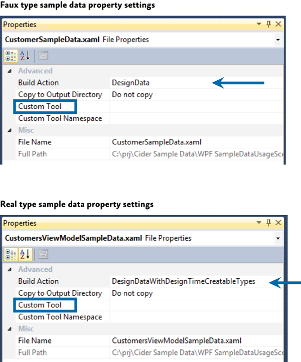
d:DesignDatayour sample data is processed by setting the Build Action property on the data file in Solution Explorer , as shown below:- Build Action = DesignData - pseudotypes will be created
- Build Action = DesignDataWithDesignTimeCreatableTypes - real types will be created
When using Expression Blend to create sample data, it creates a XAML file with a Build Action already installed in DesignData . If you need real types, open the solution in Visual Studio and change the Build Action for the data file to DesignDataWithDesignTimeCreatableTypes .
.
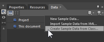
, Custom Tool . . , Expression Blend .
Visual Studio 2010, , . , Build Action Custom Tool .
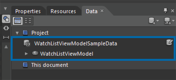
Expression Blend provides tools for quickly creating and linking custom XAML data. This data can also be used in the Visual Studio 2010 designer, as shown in the illustration below.
Setting the sample data in Expression Blend 4
After creating the sample data, they will appear in the data panel, as shown below.
Data panel.
After that, you can drag and drop them onto the root element of the view, such as
UserControl, which properly installs it d:DataContext . You can also drag a collection of sample data to ItemsControl, after which Blend will bind to this data.The note.
Selective XAML data is not compiled and is not included in the final assembly.
XAML resources
You can create a resource in XAML, where the desired type is created, and then bind it to
DataContext, or to the list.This technique can be used to quickly create one-time data that is used to edit a data template.
Code
If you prefer to create sample data in code, you can write a class that has properties and methods that return sample data. For example, you can write a class
Customersthat in the standard non-parametric constructor fills itself with instances of the class Customerfilled with the required data.One way to consume such data is to use the bundle
d:DataContext — d:DesignInstance, setting the property d:DesignInstance.IsDesignTimeCreatableto true, so that the code is executed during design. If this property is not set, a pseudo-type will be created, and only the type data will be available at design time.The following XAML demonstrates instantiating a class
Customersand setting it as d:DataContext. SubsidiariesGridcontrols can then use the sample data provided by the class Customers. <Grid d:DataContext="{d:DesignInstance local:Customers, IsDesignTimeCreatable=True}"> Key decisions when creating user interface markup
When creating a composite application project, you will need to make some decisions about user interface design that will be difficult to change in the future. As a rule, these are solutions of the whole application level, and their consistency will increase the productivity of developers and designers.
These solutions are as follows:
- Define the application flow and set the regions according to it.
- Determine what type of views will be loaded into each used region.
- Decide whether you will use Region Navigation APIs .
- , (MVVM, presentation model, ).
- .
Additional Information
For more information on expanding the Prism Library, see " Extending Prism ."
For more information on commands, see " Commands " in Part 5, " Implementing the MVVM Pattern ."
For more information about data binding, see " Data Binding " in Part 5, " Implementing the MVVM Pattern ."
For more information about navigating regions, see part 8, " Navigation ."
For more information on the guides discussed in this chapter, see:
- "Dependency Properties Overview" on MSDN:
- http://msdn.microsoft.com/en-us/library/ms752914.aspx .
- Data binding; see:
- «Data Binding Overview» on MSDN:
http://msdn.microsoft.com/en-us/library/ms742521.aspx . - «Data Binding in WPF» in MSDN Magazine :
http://msdn.microsoft.com/en-us/magazine/cc163299.aspx .
- «Data Binding Overview» on MSDN:
- «Data Templating Overview» on MSDN:
http://msdn.microsoft.com/en-us/library/ms742521.aspx . - «Resources Overview» on MSDN:
http://msdn.microsoft.com/en-us/library/ms750613.aspx . - «UserControl Class» on MSDN:
http://msdn.microsoft.com/en-us/library/system.windows.forms.usercontrol.aspx . - «VisualStateManager Class» on MSDN:
http://msdn.microsoft.com/en-us/library/cc626338(v=VS.95).aspx . - «Customizing Controls For Windows Presentation Foundation» in MSDN Magazine :
http://msdn.microsoft.com/en-us/magazine/cc163421.aspx . - «ComponentResourceKey Markup Extension» MSDN topic:
http://msdn.microsoft.com/en-us/library/ms753186.aspx . - «Design-Time Attributes in the WPF Designer» on MSDN:
http://msdn.microsoft.com/en-us/library/ee839627.aspx . - «Design-Time Attributes in the Silverlight Designer» on MSDN:
http://msdn.microsoft.com/en-us/library/ff602277(VS.95).aspx . - «Markup Extensions and WPF XAML» on MSDN:
http://msdn.microsoft.com/en-us/library/ms747254.aspx . - «Using Custom Fonts in Silverlight»:
http://silverlight.net/learn/learnvideo.aspx?video=69800 . - «Sample Data in the WPF and Silverlight Designer» on MSDN:
http://blogs.msdn.com/b/wpfsldesigner/archive/2010/06/30/sample-data-in-the-wpf-and-silverlight-designer.aspx . - Learning the Visual Studio WPF and Silverlight DesignerThis contains tutorials and articles on layout, resources, data binding, sample data, debugging data bindings, object data sources, and master-detail forms.
- http://blogs.msdn.com/b/wpfsldesigner/archive/2010/01/15/learn.aspx .
Source: https://habr.com/ru/post/177925/
All Articles