Prism Developer Guide - Part 7, creating a user interface
Table of contents
There are several paradigms for creating a user interface:
- All controls are contained in a single XAML file and are merged during form design.
- The form is divided into logical parts, usually user controls. The form is created at design time, referring to these parts.
- The form, as in the previous version, is divided into logical parts, but does not refer to them directly. Parts are added to the form at run time. Such applications are known as composite.
The interface of a composite application usually consists of disparate components, called views. Views are usually found in application modules, although this is not a requirement. If you break an application into modules, then you need a way to combine weakly related views into a user interface. However, this approach can be used even if the views are not in different modules.
')
To build a user interface, you need an architecture that allows you to create markup consisting of loosely coupled visual elements generated at runtime. In addition, this architecture should allow views to exchange messages with each other, while remaining loosely coupled.
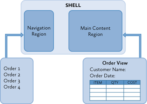
The Stock Trader Reference Implementation (Stock Trader RI) application performs user interface composition at runtime by loading views from various modules into regions declared in the shell (
Shell ), as shown in the illustration below.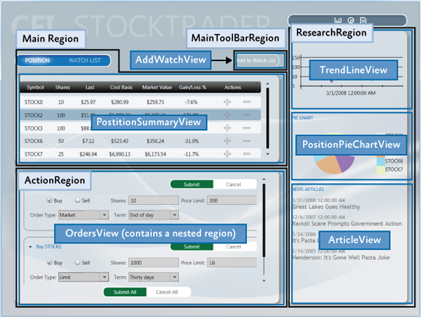
User Interface Layout Principles
The root element of a composite application is called a shell. The shell works as a master page for the application and consists of several regions (
Region ). Regions are placeholder elements into which content is loaded at run time. Regions can be associated with different UI elements, such as ContentControl , ItemsControl , TabControl , or a user control, and can manage their content. Regions can download content either automatically or on demand, depending on the requirements of the application.Usually, the content of the region is the presentation. It encapsulates part of the user interface of the application and keeps it separate from the rest of the application. A view can be either a user control or a data template.
Regions control the layout and display of views. Regions can be accessed by name. They also support the dynamic addition and removal of views. You can think of regions as containers that dynamically load views.
The following sections provide insights into high-level concepts for creating composite applications.
Shell
The shell is the root object of the application and contains the main parts of the user interface. In a WPF application, the
Windows object acts as a shell. In the Silverlight application - RootVisualUserControl .The shell plays the role of a master page, providing the basic interface markup structure. It contains one or more named regions in which modules can substitute the necessary representations. It may also contain certain high-level user interface components, such as the background, main menu, or toolbar.
The shell defines the overall look of the application. It can define styles and borders visible in the shell itself, as well as styles, patterns and themes that can be applied to the loaded views.
Typically, the shell is part of a primary WPF or Silverlight project. An assembly that contains a shell may refer to assemblies with loaded views, or it may not be referenced if assemblies are searched for and loaded at run time.
Views
Views are key elements in building the user interface of an application. You can use a user control, a page (
Page ), or a data template as a view. The view encapsulates those parts of the user interface that you want to keep away from the rest of the application. You can choose what will be contained in the view based on the separation of functionality, as well as on the basis of the reuse of parts of the interface within the application.Thanks to the content model used in WPF and Silverlight, nothing related to Prism, is required to create a view. The easiest way to create a view is to create a user control (
User Control ). To add a view to the UI, you only need a way to create this view and add it to the container. WPF and Silverlight provide mechanisms for doing this. Prism adds the ability to specify regions in which a view can be dynamically added at runtime.Composite views
A view, when adding some functionality to it, can become quite complex. In this case, you can split it into several child views and use the parent view to create and host child views. This can occur both statically, at design time, and dynamically, allowing modules to substitute views into regions at run time. If the representation is not fully defined in one class, then it can be referred to as a composite representation. In many cases, the parent view is responsible for both the creation of child views and the coordination of their interaction. You can design child views that are less connected with each other using Prism features such as event aggregator and command objects.
Views and Design Patterns
Although Prism does not insist on this, you should consider using some design patterns when creating views. Stock Trader RI and QuickStarts demonstrate the use of the MVVM pattern to divide the responsibility between the interface and logic.
The MVVM design pattern is recommended mostly due to the fact that it naturally combines with Microsoft XAML platforms such as WPF, Silverlight, Windows Phone, and Windows RT. The mechanism of dependent properties and rich data binding support enable the presentation model and presentation to interact in a loosely coupled manner.
Separating presentation logic from presentation itself is an important step that will facilitate testing and maintainability, as well as improve the process of interaction between designers and programmers.
If you create a view as a user control and place the logic in a separate code file, it will be difficult for you to test it, since for this you will need to create an instance of the view and test the logic through it. This presents some complexity for the reason that it will be necessary to create stubs for a huge amount of infrastructure. Accordingly, to remove infrastructure dependencies, it is necessary to separate the presentation logic from the presentation itself.
If you create a view as a data template. That code associated with this view is missing. For this reason, you must place the accompanying logic somewhere else. The same approach that ensured testability can now help with the deployment of a view.
The note.
Unit testing and automation testing UI are two completely different approaches to testing with completely different coverage. Best unit testing practices recommend that an object be tested in complete isolation. To achieve this, it is necessary to create fakes and stubs for all dependencies. After that, the unit test works with only one object. Automation UI tests run the application, then apply gestures to the UI and check the result. Tests of this type are necessary to verify the correctness of the connection of controls to the logic of the application.
The separation of logic from representation contributes to the division of responsibility. As a complement to increasing the ability to test, it allows the UI designer to work independently of the developer. For more information about the MVVM pattern, see part 5: Implementing the MVVM Pattern.
Commands ( Commands ), UI Triggers ( UI Triggers ), Actions ( Actions ) and Behaviors ( Behaviors )
If the presentation logic is located in a separate code, then event handlers are used to interact with the UI. However, when using MVVM, the view model cannot directly handle the events generated in the UI. To redirect events from a UI to a view model, you can use commands, UI triggers, actions, or behaviors.
Commands separate the semantics and the object on which this command is called from the logic of the command itself. Also, the command object makes it possible to determine whether this command can be executed at the moment. Commands in the UI are tied to the properties of the ICommand type of the view model. For more information, see the “Commands” section in Part 5.
UI triggers, actions, and behaviors are part of the
Microsoft.Expression.Interactivity namespace and come with Expression Blend. They are also part of the Expression SDK. These components provide an extensive API for intercepting UI events or commands and their subsequent routing in the ICommand object properties of the current data context. For more information about them, see the relevant sections in part 5.Data Binding
Data binding is the most important feature of XAML platforms. To successfully create applications that use XAML, you need to be well-versed in data binding.
Data binding uses a built-in change notification system provided by a system of dependent properties. When combined with the
INotifyPropertyChanged CLR interface, these notifications allow you to organize the interaction between the receiver and the data binding source, without using any additional code.Data binding allows you to connect sources and receiver that are incompatible by data type using value converters. It also provides several mechanisms for validating data.
Regions
Regions are available in Prism through the region manager, regions and region adapters. The following section describes how they work and interact.
Region Manager ( Region Managers )
The
RegionManager class RegionManager responsible for creating and deploying a collection of regions into controls. RegionManager uses adapters that are specific to each type of control to associate a new region with the corresponding control. The following illustration shows the relationship between a region, a control, and an adapter.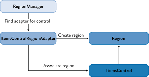
RegionManager can create regions in code, or in XAML. The RegionManager.RegionName attached property is used to create a region in XAML by applying it to a control that will act as a host for that region.
An application can contain one or more
RegionManager instances. It is possible to choose in which instance of the regional manager it is necessary to register the region. This can be useful if you want to move the control in the visual tree, but do not want the region to be cleared after clearing the attached property.RegionManager provides the RegionContext attached property, with which you can exchange data between regions.
Creating a region
A region is a class that implements the
IRegion interface. The term "region" refers to a container that can hold the dynamic contents of the user interface. Regions allow Prism to place dynamic content contained in modules in predefined placeholders in the user interface.Regions can hold any type of UI content. A module may contain UI content represented as user controls, data with associated data templates, specialized controls, or a combination of these. This allows you to specify the location of the areas in the UI, and then allow the modules to load the content into these areas.
A region may contain zero or more items. Depending on which control is used as a host for a given region, one or more elements may be visible. For example, ContentControl can only display a single object, whereas
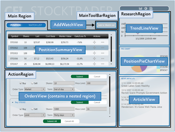
ItemsControl can display several items at once.In the following illustration, the Stock Trader RI shell consists of four regions:
MainRegion , MainToolbarRegion , ResearchRegion , and ActionRegion . These regions are filled with various modules of the application - the content can change at any time.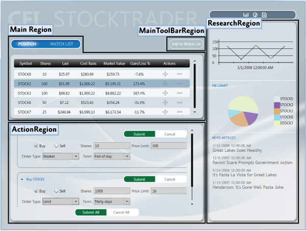
Displaying a user control from a module in a region
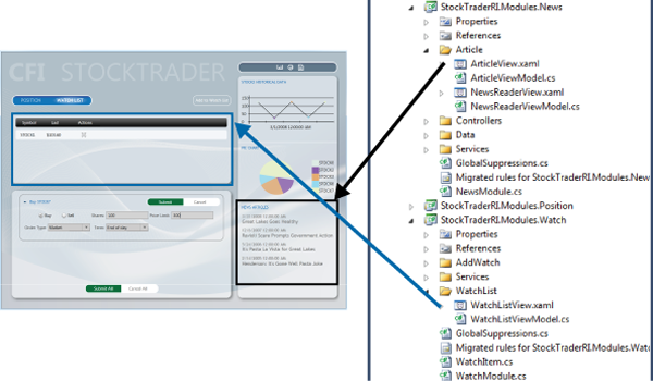
For a demonstration of how modules and content are linked to regions, see the following illustration. It shows the
WatchModule and NewsModule with the corresponding region in the shell.The
MainRegion region contains the WatchListView control, which is contained in the WatchModule module. The ResearchRegion region also contains the ArticleView user control, which is located in the NewsModule module.In an application created with Prism, displays like this will be a natural part of the development process, as the designer and developer use them to determine what content will be contained in a particular region. This allows the designer to determine what space is needed and what needs to be added so that the content can be seen in the space provided.
Standard region functionality
Although it is not necessary to know the details of their implementation to use the regions, it will be useful to understand how controls and regions are associated with each other. And also about their standard functionality: for example, how regions find and create views, how views can be notified when they become active, or how the life cycle of views can be associated with their activation.
The following sections describe region adapters and region behavior.
Region Adapters
To substitute a control into a region, it must have the necessary adapter. Region adapters are responsible for creating a region and associating it with a control element. This allows you to use the
IRegion interface to manage the content of the control in a consistent manner. Each region adapter adapts a particular type of control. Prism provides the following adapters:- ContentControlRegionAdapter . It adapts
System.Windows.Controls.ContentControland its successors. - SelectorRegionAdapter adapts
System.Windows.Controls.Primitives.Selectorand its descendants, such asSystem.Windows.Controls.TabControl. - ItemsControlRegionAdapter adapts
System.Windows.Controls.ItemsControland its heirs.
The note.
The Silverlight version of the Prism library contains another adapter namedTabControlRegionAdapter. This is because Silverlight'sTabControlis not a descendant of theSelectorclass and has a different behavior from WPF.
Region Behavior ( Region Behaviors )
Prism introduces the concept of regional behavior. These are plug-in components that are responsible for most of the functionality of the regions. Behaviors were introduced to support the discovery of views and the context of a region, as well as to create a uniform API for both WPF and Silverlight. Additionally, due to the behaviors, an effective way to expand the functionality of the regions appears.
Behavior is a class that is attached to a region and gives it additional functionality. The behavior joins the region and remains active throughout its existence. For example,
AutoPopulateRegionBehavior joining a region automatically creates and adds view types registered to a region with the given name. Throughout the life of the region, it continues to monitor RegionViewRegistry for new registrations. It is easy to add a new behavior, or replace the existing one, both for the entire application and for a particular region.The next few sections will talk about standard behaviors that are automatically added to regions. An exception is the behavior of
SelectorItemsSourceSyncBehavior , which is attached only to controls that are descendants of the Selector class.Registration Behavior
RegionManagerRegistrationBehavior responsible for ensuring that the region is registered with the correct regional manager. When a view or control is added to a visual tree, as a descendant of another control, or region, any region associated with the control must be registered in the RegionManager of the parent control. When you delete a control, the registration of the region should be removed.Auto-Population Behavior
Two classes are responsible for discovering views. One of them is
AutoPopulateRegionBehavior . When joining a region, it receives all types of views that are registered under the name of this region. After that, he creates instances of these views and adds them to the region. After creating a region, AutoPopulateRegionBehavior oversees the registration of new views in RegionViewRegistry for a given region name.If you need more control over the process of discovering views, you can create your own implementation of
IRegionViewRegistry and AutoPopulateRegionBehavior .Region Context Behaviors
The regional context functionality is enclosed in
SyncRegionContextWithHostBehaviorand BindRegionContextToDependencyObjectBehavior. These behaviors are responsible for observing changes in the context created for the region, and synchronizing this context with the corresponding dependency property attached to the view.Activation Behavior
RegionActiveAwareBehaviorresponsible for notifying whether it is active or not. To receive these notifications, the view must implement an interface IActiveAware. These notifications are unidirectional and are passed from behavior to presentation. A view cannot make itself active by affecting the corresponding property of the interface IActiveAware.Region lifetime behavior
RegionMemberLifetimeBehaviordetermines whether the item should be removed from the region when it is deactivated. RegionMemberLifetimeBehaviormonitors the ActiveViewsregion's collection to determine which items have been rendered inactive. The behavior checks whether the item has been deleted IRegionMemberLifetime, or RegionMemberLifetimeAttribute(in that order) to determine if it should be saved during deletion.If the item is
System.Windows.FrameworkElement, then it is DataContextalso checked for availability IRegionMemberLifetime, or RegionMemberLifetimeAttribute.Region elements are checked in the following order:
- Value
IRegionMemberLifetime.KeepAlive - Value
IRegionMemberLifetime.KeepAlive DataContext - Value
RegionMemberLifetimeAttribute.KeepAlive - Value
RegionMemberLifetimeAttribute.KeepAlive DataContext
Control Specific Behavior
SelectorItemsSourceSyncBehaviorused only if the control is inherited from Selector, for example, TabControlWPF. It is responsible for matching the selected elements in the selector with active views in the region.TabControlRegionSyncBehaviorsimilar SelectorItemsSourceSyncBehavior, and used instead in Silverlight.Expansion of regional functionality
Prism has extension points that allow you to extend or override the standard behavior of the provided APIs. For example, you can write your own regional adapter, regional behavior, change the way the Navigation API parses the URI, or extend the Navigation API to work with the Silverlight Frame Navigation . For more information, see the Extending Prism section .
View composition
The composition of views is how views are created. In composite applications, views from multiple modules must be displayed at runtime at a specific point in the user interface. To achieve this, you need to specify the regions in which the views will be located, and how the views will be created and displayed in these regions.
Views can be created and displayed both automatically, through the detection of views, and programmatically, through the introduction of views. These two techniques determine how views will be mapped to named regions in the application's user interface.
Detection representations ( View Discovery )
With this approach, it is necessary to create a relationship between the name of a region and the type of view in
RegionViewRegistry. When a region is created, it searches for everything ViewTypesassociated with that region and automatically creates and loads the appropriate views. Accordingly, in this approach, you have no direct control over how the representations corresponding to the given region are created and displayed.The introduction of representations ( View Take Injection )
In this case, your code gets a link to the region, and then programmatically adds the view to it. This is usually done at the time the module is loaded, or in response to a user action. Your code should request
RegionManagerfor the required region by its name, and then embed the view into it. So you have much more control over how views are created and substituted into regions. It is also possible to remove views from regions. However, you cannot add views to regions that have not yet been created.Navigation
Prism Library 4.0 contains the Navigation API . The Navigation API facilitates the process of introducing views through the ability to navigate by URI The Navigation API creates a view, adds it to the region, and activates it. Additionally, the Navigation API allows you to navigate to previously created views contained in a region. See Part 8 , Navigation, for more information .
When to use the detection of views, and when the introduction of views
The choice of region loading strategy depends on the requirements of the application and the function of the region.
View detection can be used in the following situations:
- Automatic loading of views is desired, or required.
- A single view instance is loaded into the region.
Introduction of the submission:
- The application uses the Navigation API .
- You need explicit control over how the view is created and displayed, or you must delete views from regions, for example, in response to a user action or as a result of navigation.
- You must display multiple instances of a single view in a region, linking each view to your data.
- You must control which instance of the region the view is added to. For example, you want to add a presentation with information about the buyer to the relevant information region. This approach requires the creation of a region with a limited scope, which will be shown later.
UI build scripts
In composite applications, views from multiple modules are displayed at runtime in certain places in the user interface. For this, you need to specify the regions where these views will be displayed, as well as how these views will be created and associated with these regions.
Separation of representations and places of their display in the interface allows the appearance and layout of the application to develop independently of the representations loaded into the regions.
The following sections describe the main scenarios that you will encounter when developing composite applications. If needed, examples from Stock Trader RI will demonstrate solutions for these scenarios.
Shell creation
The shell is the root object of the application, which contains the primary UI content. In a WPF application, the shell is an instance
Windows. In Silverlight - RootVisualUserControl.The shell can contain named regions in which modules can substitute the necessary representations. It can also set certain high-level UI elements, such as the main menu and toolbar. The shell defines the basic structure and presentation of the application, similar to ASP.NET master pages. It can set styles, borders that are visible in the shell itself, it can also set styles, patterns and themes applied to views loaded into the shell.
The shell is optional when creating applications using Prism. If you create a new composite application, creating a shell will give you a well-defined application root, as well as make initialization templates available to the main interface of the application. However, if you add Prism support to an existing application, you are not required to change its core architecture to add a shell. Instead, you can modify existing window or control definitions to add regions to display views.
You can have more than one shell in an application. If an application is designed in such a way that allows users to open more than one top-level window, each such window may behave like a shell for its content.
Stock Trader RI
WPF Stock Trader RI application as a shell has a main window. The following illustration highlights the shell and views. The shell is the main window that is created when the application starts and contains all views. It specifies the regions in which the modules substitute the necessary views, and several high-level user interface elements, such as the header and the Watch List banner.
The implementation of the Stock Trader RI shell is presented in the file
Shell.xaml, its separated code file Shell.xaml.cs, and also in the view model ShellViewModel.cs. Shell.xamlcontains markup and UI elements that are part of the shell, including definitions of regions to which modules add views.The following XAML shows the structure and main elements defined in the shell. The attached property
RegionNameis used to define regions, and the background image of the window is the background image of the shell.XAML Shell.xaml (WPF)
<Window x:Class="StockTraderRI.Shell"> <!—shell background --> <Window.Background> <ImageBrush ImageSource="Resources/background.png" Stretch="UniformToFill"/> </Window.Background> <Grid> <!-- --> <Canvas x:Name="Logo"> <TextBlock Text="CFI" ... /> <TextBlock Text="STOCKTRADER" .../> </Canvas> <!-- --> <ItemsControl x:Name="MainToolbar" cal:RegionManager.RegionName="{x:Static inf:RegionNames.MainToolBarRegion}"> </ItemsControl> <!-- --> <Grid> <Controls:AnimatedTabControl x:Name="PositionBuySellTab" cal:RegionManager.RegionName="{x:Static inf:RegionNames.MainRegion}"/> </Grid> <!-- --> <Grid> <ContentControl x:Name="ActionContent" cal:RegionManager.RegionName="{x:Static inf:RegionNames.ActionRegion}"> </ContentControl> </Grid> <!-- --> <Grid x:Name="SideGrid"> <Controls:ResearchControl cal:RegionManager.RegionName="{x:Static inf:RegionNames.ResearchRegion}"> </Controls:ResearchControl> </Grid> </Grid> </Window> The implementation is
Shell.xaml.csvery simple. Shellis exportable, which allows it to be created by the loader. Its dependencies are resolved by MEF. The shell has a single dependency on ShellViewModel, which is implemented during creation using MEF.C # Shell.xaml.cs
[Export] public partial class Shell : Window { public Shell() { InitializeComponent(); } [Import] ShellViewModel ViewModel { set { this.DataContext = value; } } } C # ShellViewModel.cs
[Export] public class ShellViewModel : NotificationObject { // . } By the amount of code in the code-behind file, you can appreciate the power and simplicity of the architecture of composite applications, and the weakness of the connection between the shell and views.
Task regions
Regions play the role of zones in which one or more views are displayed at run time. Modules can detect regions and load views into them without knowing how and where they are located. This allows you to change change regions without affecting the modules that provide content for them.
Regions can be specified by associating a region name with a control in XAML, or in code. Access to the region can be obtained by name. At run time, views are added to the regions and displayed according to the characteristics of the control associated with the region. For example, a region associated with
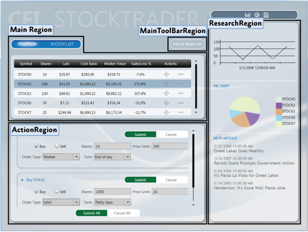
TabControl, will display tabs. Regions support adding and deleting views. Views can be created and displayed both programmatically and automatically. In Prism, this is achieved through the use of embedding views and detecting views. These two techniques determine how individual views will be mapped to named regions in the user interface.The application shell specifies the highest level markup. For example, specifying the location of the main content and navigation content, as shown in the illustration below. The markup inside these high-level views can be set similarly, allowing the user interface to be composed recursively.
Regions are sometimes used to specify the location of several logically related views. In this case, the region is usually ItemsControl or its successor, which displays views in accordance with its markup strategy, such as the arrangement of elements in the form of a stack, or tabs.
Regions may also be used for specifying the location of a single representation using, for example
ContenControl. In this case, the control associated with the region displays only one view at a time, even if several views have been added to this region.Regions in the shell Stock Trader RI
Stock Trader RI provides examples of approaches using both a single view and several views added to a region. You can see both approaches in the application shell. The following illustration shows the regions defined in the Stock Trader RI shell .
An approach using multiple representations can be seen in Stock Trader RI when buying, or selling stocks. The Buy / Sell area is a list-like region, which is shown
OrderCompositeViewas list items, as shown below.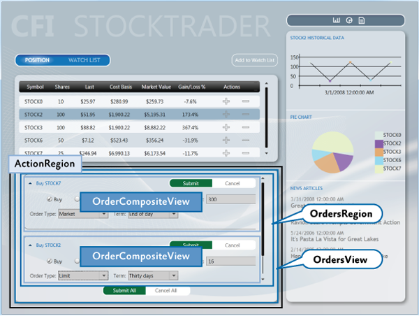
The shell region
ActionRegioncontains OrdersView. OrdersViewcontains the Submit All and Cancel All buttons , as well as the region OrdersRegion.OrdersRegionattached to a control ListBoxthat displays multiple views OrderCompositeViews.IRegion interface
The region is the class that implements the interface
IRegion. A region is a container containing content to display in a control. The following code shows what is contained in this interface. public interface IRegion : INavigateAsync, INotifyPropertyChanged { IViewsCollection Views { get; } IViewsCollection ActiveViews { get; } object Context { get; set; } string Name { get; set; } Comparison<object> SortComparison { get; set; } IRegionManager Add(object view); IRegionManager Add(object view, string viewName); IRegionManager Add(object view, string viewName, bool createRegionManagerScope); void Remove(object view); void Deactivate(object view); object GetView(string viewName); IRegionManager RegionManager { get; set; } IRegionBehaviorCollection Behaviors { get; } IRegionNavigationService NavigationService { get; set; } } Adding Regions to XAML
RegionManagerprovides an attached property that can be used to easily create a region in XAML. To use this approach, you must add the Prism namespace in the XAML and use the attached property RegionName. The following example shows how to associate a region with an item AnimatedTabControl.To get a string with the name of a region
MainRegion, the markup extension is used x:Static. This avoids the use of magic strings in XAML. <Controls:AnimatedTabControl x:Name="PositionBuySellTab" cal:RegionManager.RegionName="{x:Static inf:RegionNames.MainRegion}"/> Silverlight 4 does not allow to use
x:Static. Consequently, you will have to use string values to specify regions, or, if desired, define string resources available to the entire application that will contain these names. An attached property RegionName, using this approach, can be associated with such a resource to get the name of a region. <Controls:AnimatedTabControl Regions:RegionManager.RegionName="MainRegion" /> Adding regions in the code
Using
RegionManagerit is possible to register regions directly in the code, without using XAML. The following code example shows how to associate a region with a control in a file of separated code. To get started, you need to get a link to the regional manager. Then, using the static method RegionManager.SetRegionManagerand RegionManager.SetRegionName, the region is associated with the control ActionContent, after which its name is set in the “ActionRegion” . IRegionManager regionManager = ServiceLocator.Current.GetInstance<IRegionManager>(); RegionManager.SetRegionManager(this.ActionContent, regionManager); RegionManager.SetRegionName(this.ActionContent, "ActionRegion"); Display views in the region when it loads
When approaching the detection of views, modules can register views (view models, presenter models) in certain named regions. After the region is displayed at run time, any view that has been registered in the region will be created and displayed automatically.
Modules register views using a register. The parent representation may request from the register the representations that were registered in the region with the given name. After detection, the parent view places these views on the screen, adding them to the control associated with the region.
After the application is loaded, the composite view receives notifications that it needs to place in the user interface new views added to the register.
The following illustration shows the approach of finding views.

Prims provides a standard register class
RegionViewRegistrythat serves to register submissions in named regions.In order to display a view in a region, you need to register it with the manager of the regions. As shown in the example below. You can directly specify the type of the presentation, after which it will be resolved through the dependency injection container when loading the region.
this.regionManager.RegisterViewWithRegion("MainRegion", typeof(EmployeeView)); You can also provide a delegate that returns the required view, as shown below. The regional manager will display a view when creating a region.
this.regionManager.RegisterViewWithRegion("MainRegion", () => this.container.Resolve<EmployeeView>()); The Composition QuickStar UI has a step-by-step guide in a
EmployeeModule ModuleInit.csfile that demonstrates how to use the method RegisterViewWithRegion.Display representation in the region program
In the approach with the introduction of views, they are programmatically added, or removed from the regions, the modules responsible for them. To make this possible, the application supports the register of named regions declared in the user interface. A module can use this register in order to obtain a region from it, and programmatically introduce a representation into it. In order to make access to regions uniform throughout the application, each named region implements an interface
IRegion. The following illustration shows the implementation approach.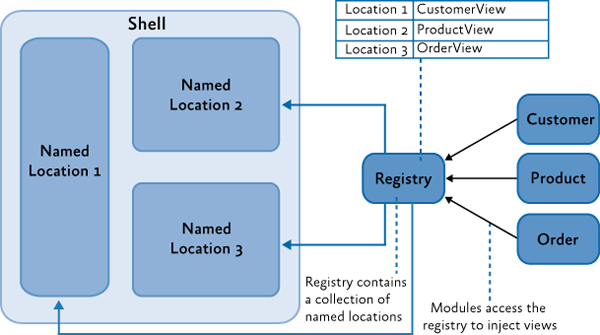
To introduce a view into a region, you need to get this region through the regional manager and call the method
Addas shown below. With this approach, the view becomes visible only after adding it to the region, which can happen after the module is loaded, or in response to a user action. IRegion region = regionManager.Regions["MainRegion"]; var ordersView = container.Resolve<OrdersView>(); region.Add(ordersView, "OrdersView"); region.Activate(ordersView); Stock Trader RI and UI Composition QuickStart provide step-by-step tutorials for applying this approach.
Navigation
Prism Library 4.0 includes the Navigation API , gives a rich and uniform approach to the implementation of navigation in WPF, or Silverlight applications.
Navigation regions is a case of introducing views. During the processing of a navigation request, an attempt is made to find a representation in the region that can fulfill the request. If it is impossible to find a suitable representation, the necessary representation is created through the DI container, after which it is embedded in the target region and activated.
The following code shows how to initiate a navigation query using the example of Stock Trader RI
ArticleViewModel . this.regionManager.RequestNavigate(RegionNames.SecondaryRegion, new Uri("/NewsReaderView", UriKind.Relative)); For more information, see part 8, section “Navigation”. View-Switching Navigation QuickStart and State-Based Navigation QuickStart are also examples of this approach.
Streamlining views in the region
Regardless of which approach is used, it is often necessary for an application to locate views in a region in a specific contract, in case the region is associated with a control that supports the display of several views. By default, views are located in the region in the order in which they were registered and added to the region.
When creating a composite application, views are often registered with different modules. Creating dependencies between modules can solve this problem, but this is not the best approach.
To control how views will be located in a region, Prism provides an attribute
ViewSortHint. It contains a string property.Hintwhich allows the submission to give a hint about how it wants to be located in the region.When displaying views, the class
Regionuses a standard sorting procedure, taking into account this hint, which is a simple, case-sensitive, sorting of rows. Views that have this attribute are sorted and placed in front of those that do not have it. Views without an attribute are arranged in the order in which they were added to the region.If you want to change the way that the views are sorted by region, the class
Regionhas a property SortComparisonthrough which you can specify your own delegate Comparison<object>. It is important to note that sorting the properties of a region ViewsandActiveViewsreflected on the UI due to the fact that adapters such as ItemsControlRegionAdapterbinding directly to these properties. A nonstandard adapter can implement its own sorting method, which will override the sorting of the views produced in the region.View Switching QuickStart demonstrates a simple numbering scheme for streamlining views in the navigation region. The following example
ViewSortHintapplies to each view responsible for navigation. [Export] [ViewSortHint("01")] public partial class EmailNavigationItemView { … } [Export] [ViewSortHint("02")] public partial class CalendarNavigationItemView { … } [Export] [ViewSortHint("03")] public partial class ContactsDetailNavigationItemView { … } [Export] [ViewSortHint("04")] public partial class ContactsAvatarNavigationItemView { … } Data exchange between multiple regions
Prims provides several approaches for interacting between views, depending on your scenario. The regional manager provides the property
RegionContextas one such approach.RegionContextuseful when you want the parent view and child views to share a common data context. RegionContextis an attached property. You set the required context through this property, and it becomes available to the child views added to the corresponding region. It can be both simple and complex object to which data can be bound. RegionContextIt can be used both in the detection and in the implementation of views.The note.
The propertyDataContextin Silverlight and in WPF is used to set the local data context for the view. This allows the view to use data binding to interact with the view model, local presenter, or model.RegionContextUsed to share context across multiple views and is not local to a single view. This provides a simple mechanism for sharing context across multiple views.
The following code shows how the attached property is
RegionContextused in XAML. <TabControl AutomationProperties.AutomationId="DetailsTabControl" cal:RegionManager.RegionName="{x:Static local:RegionNames.TabRegion}" cal:RegionManager.RegionContext="{Binding Path=SelectedEmployee.EmployeeId}" ... > You can also install
RegionContextin the code as shown below. RegionManager.Regions["Region1"].Context = employeeId; To get the context in the view, you can use a static method
RegionContext.GetObservableContext. It takes a view as a parameter, after which the context can be accessed through a property Value, as shown below. private void GetRegionContext() { this.Model.EmployeeId = (int)RegionContext.GetObservableContext(this).Value; } The value
RegionContextcan be changed by simply setting a new property value Value. Views can subscribe to notifications of context changes by using an event of an PropertyChangedobject of type ObservableObjectthat can be obtained by calling a method GetObservableContext. This allows multiple views to be synchronized when the context changes. The following example shows how to subscribe to context changes. ObservableObject<object> viewRegionContext = RegionContext.GetObservableContext(this); viewRegionContext.PropertyChanged += this.ViewRegionContext_OnPropertyChangedEvent; private void ViewRegionContext_OnPropertyChangedEvent(object sender, PropertyChangedEventArgs args) { if (args.PropertyName == "Value") { var context = (ObservableObject<object>) sender; int newValue = (int)context.Value; } } .RegionContext, , ,DependencyObject. , ,DependencyObject. , , , . ,RegionContext,DependencyObject.
Regions with a limited scope are only available when using the introduction of views. You may need them if you need a view with your own copy of the region. Views that define regions using the attached property automatically inherit the parent property
RegionManager. Usually, this is RegionManagercommon to the entire application, registered in the shell. If the application creates more than one view of this type, each of them will use the same one RegionManagerto register their regions. Since the regional manager only allows unique regional names, the second registration of the region in the view will throw an exception.To prevent this, you can use regions with limited scope. In this case, each submission will have its own regional manager, and its regions will be registered with the help of this particular manager, and not the parent one. This approach is shown in the illustration below.
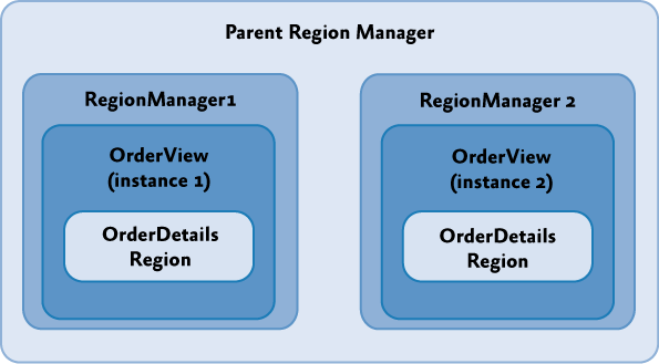
To create a local for the submission manager of regions, you must specify that a new one
RegionManagershould be created when adding a submission to a region, as shown below. IRegion detailsRegion = this.regionManager.Regions["DetailsRegion"]; View view = new View(); bool createRegionManagerScope = true; IRegionManager detailsRegionManager = detailsRegion.Add(view, null, createRegionManagerScope); The Add method returns a new manager of regions, which the view can save for later reference to regions from a local scope.
Creating views
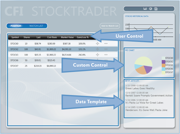
The appearance of your application can be created from a variety of elements, such as custom controls, special controls and data templates. In the case of Stock Trader RI , user controls are typically used to represent scattered areas in the main window, but this is not standard. In your application, you must take the approach that you are most familiar with and which is best suited for the designer. Regardless of the appearance of your application, you will most likely use a mixture of user controls, special controls and data templates. The following figure shows where the Stock Trader RI uses which approaches.. It will also be referenced by subsequent sections describing each of the approaches.
User Controls (User Controls)
Both Expression Blend and Visual Studio 2010-2012 provide rich support for creating these controls. User controls created using these tools are recommended for creating user interfaces when using Prism. As mentioned earlier, Stock Trader RI makes extensive use of them to create regional content. The WatchListView.xaml user control is a good example of how a small part of the user interface can be placed inside the WatchModule module. Such controls are very simple and straightforward to create and use.
Special Controls ( Custom Controls )
In some situations, user controls may be too limited. In these cases, special markup or extensibility may be more important than ease of creation. In such cases, special controls may be useful. In Stock Trader RI , a pie chart control is a good example of this. This type of control is more difficult to create than custom, and has more limited support for creating in Expression Blend and Visual Studio 2010-2012, compared to user controls.
Templates data ( Data Templates )
Data templates are an important part of most types of applications that operate on data. Using data patterns in list-based controls is especially common in Stock Trader RI . In many cases, using data templates, you can do without creating user controls at all. The region
ResearchRegionuses data templates to display articles, and, along with styles for Items, shows which element has been selected.Expression Blend has full support for visually creating data templates. Visual Studio 2010 provides data template editing only through XAML. In Visual Studio 2012, the visual editor is taken from Expression Blend, so almost similar support for data templates is provided, as in Expression Blend itself.
Resources ( the Resources )
Resources, such as styles, resource dictionaries and templates, can be scattered throughout the application. This is especially true for composite applications. When you think about where to put a resource, pay special attention to the dependencies between the UI elements and the resources they need. The Stock Trader RI project , shown in the figure below, contains tags that show where resources can live.
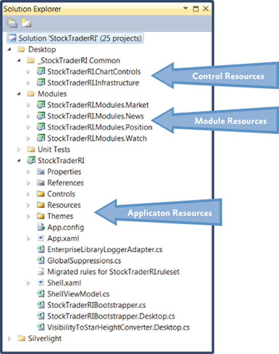
Application Tier Resources
Typically, application-level resources are used throughout the application. These resources are usually focused on the application root directory, but they can also provide default styles based on types for modules and controls. An example is the style for a text field, applicable to the type
TextBoxin the root of the application. This style will be applied to all text fields in the application, unless it is overridden in the module, or in the control itself.Module Level Resources
The role of module-level resources is similar to the application-level resources in that they apply to all elements in a module. The use of resources at this level can provide a consistent view of the individual module, as well as ensure the reuse of individual elements within the module. The use of module-level resources should be limited within this module. Creating dependencies between modules can lead to hard-to-find errors in the display of custom elements.
Control Level Resources
This type of resource is usually found in user element libraries, in which resources are used by all the elements contained in it. These resources usually have the smallest scope, due to the fact that libraries of user elements contain only certain elements and do not contain user controls. (In Prism applications, user controls are usually placed in the modules in which they are used.)
Source: https://habr.com/ru/post/176895/
All Articles