Business Usability
We are surrounded by many things, and these things are made for people to use. Homes, furniture, clothing, tools, appliances and communications - all this is created for people, taking into account their needs, physical and mental characteristics.
Programs and websites are also developed for people and take into account their interests and features. But very often the interests of the people for whom the product is made are taken into account, but of those who develop it or order it.
The author: Anna Galakhova
Published in "Marketing Management", December 2007, №12
In the world of things there is science ergonomics . Ergonomics studies the characteristics of a person and their influence on the design of objects that people will use. In the virtual world of interfaces for this there is usability .
Our customer supports a large web resource (social network). This example demonstrates the effect of changing the payment form on the site.
At the beginning of 2006, network sales dropped sharply, and this was due to various reasons, including technical ones — the hardware could not cope with the load. Attempts were made to rectify the situation with the help of technical support, advertising, and attracting new customers. However, attracting new customers caused a new load on the hardware, and the problem was not solved - sales did not rise even to the level of the beginning of the year.
Since there was nothing to lose, the company decided to change the payment form, i.e. increase its convenience. The payment form is one of the key elements of the site, so previously they were afraid to touch it, fearing a change for the worse.
The introduction of a new form was a good solution. Sales began to grow rapidly (see chart 1). By the end of 2006, the sales plan was fulfilled by 150%, despite pessimistic forecasts for the start of the year. At the same time, the number of customers remained the same, the costs of advertising and promotion even decreased.
Graph 1 illustrates the change in social network revenues for the first half of 2006:

')
Why the old form is not very successful:
Two steps on one screen. Billing information saved

Figure 4 (New payment form, two steps combined on one screen)
Why the new payment form has become better and more convenient:
Thus, the minimum steps to re-purchase:
TO change:
In this case, the client will buy only 2 credits (which is most often done).
AFTER the change:
Click the "Submit" button.
In this case, the client will buy 100 credits.
This example demonstrates how using convenient interfaces it was possible to achieve an increase in the efficiency of Call Center operators, to increase the number of calls serviced over a period of time, and, accordingly, the profitability of the center.
The call center in question deals with outgoing calls. Call Center has several features:
The main problem of the interface servicing this Call Center was that it did not automate the process of dialing to subscribers. This process took a lot of time from operators.
In this regard, it was decided to introduce an automatic dialing system and new interfaces for it. Below is a chart of Call Center profitability for 2006:
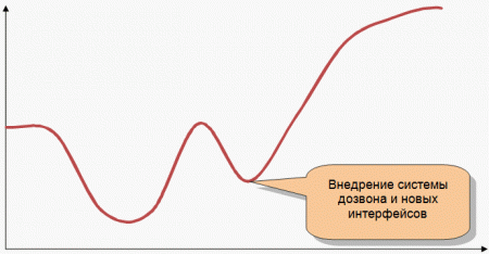
Figure 5 (Call Center Yield Graph, 2006)
The new system itself keeps track of applications and itself calls the subscriber. When the system dials, the operator receives a call. The operator picks up the phone, and at this moment a task window appears on the screen:
The system has programmed situations that may arise during a call.

Figure 6 (Task Window)
The task window immediately allows you to see who the system has phoned and view the call history. It simulates the process of conversation and programmed possible situations that may arise during a conversation. To select a situation, the operator simply needs to click on the link to see the corresponding scenario:
The operator only needs to pronounce the phrases that the system prompts.

Figure 7 (Task window offers ready-made conversation scripts)
The task window does not reboot when clicking on links (implementation by dynamically changing content in JavaScript), which allows not to lose too much time. The operator does not need to think what to say to the subscriber - the text has already been written, it just needs to be voiced.
This system allows you to minimize the burden on the operator, taking on all the automatic functions and making the work as convenient as possible. As a result of the introduction of new interfaces, the Call Center began to handle a larger volume of calls over the same period of time and receive more revenue.
This is the story of creating a successful dating site. Now the Internet is replete with many dating sites that are made on one template:

Figure 8

Figure 9
However, this solution is not the best. Mixing the interests of two different audiences in one interface leads to the creation of an interface that is inconvenient for both audiences.
It was decided to make two sites - one for men and one for women. The reason for this is that the motivation to meet and register on the dating site for men and women is different. For men, it is important to see a lot of photos of beautiful women, while it is important for women to imagine what their communication with a man will be.
Why every third visitor is registered on the site for women
Because the site is designed specifically for women, taking into account their motivation, their needs and behavioral features:
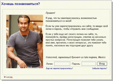
Figure 10 (every third visitor is registered on the website for women)
Attempting to create a unified website for men and women would never lead to such a success of a website that is intended only for women.
Thus, with the help of usability we managed to achieve:
A distinctive feature of the usability method is that almost everyone can consider himself to be an expert in this matter. In fact, a usability specialist is a subtle psychologist, analyst, technologist and businessman. Usability protects users, but it always keeps in mind the solvable business problems.
Until recently, usabilityists were trained only independently: they read books, articles, attended thematic seminars and conferences. There was no curriculum, and so far no university has graduated usability specialists. But now such specialists will become “bigger and better” - the first usability training center has recently opened in Moscow. All programs of this center are focused on usability-method. You can get acquainted with them on the official website of the training center www.edu.it-online.ru .
Programs and websites are also developed for people and take into account their interests and features. But very often the interests of the people for whom the product is made are taken into account, but of those who develop it or order it.
The author: Anna Galakhova
Published in "Marketing Management", December 2007, №12
In the world of things there is science ergonomics . Ergonomics studies the characteristics of a person and their influence on the design of objects that people will use. In the virtual world of interfaces for this there is usability .
What is usabilityUsability is the degree of efficiency, productivity and human satisfaction when working with the system. For a person to be successful, the system as a tool for solving problems must be:
Usability reflects the characteristics of human interaction with the computer interface, with the machine. When working with a computer, between the person and the task that he needs to perform, the interface comes up - the visible part of the system. To complete your task, you need to understand how it works. Inconvenient interface becomes an obstacle to achieving the goal. Usability helps people solve problems as efficiently as possible, making the tools for their implementation suitable for them and in the right situation. Usability and marketingWhen launching your product on the market, you need to know who your customers are, what their tasks are and how they solve them. And make the product exactly the way these people want to see it. In the field of Internet and software development, this approach is called the usability method, or user-oriented method. The principle of usability-method is not new, the concept itself and the area of its application are new. Methods focused on users (clients) have been successfully used in marketing for more than one year. Targeting your users is perhaps the only way to succeed. | When usability becomes the foundation of your business.
A few signs that you should think about usability
|
Examples Usability works!
Example 1. Increasing social network revenue
Our customer supports a large web resource (social network). This example demonstrates the effect of changing the payment form on the site.
At the beginning of 2006, network sales dropped sharply, and this was due to various reasons, including technical ones — the hardware could not cope with the load. Attempts were made to rectify the situation with the help of technical support, advertising, and attracting new customers. However, attracting new customers caused a new load on the hardware, and the problem was not solved - sales did not rise even to the level of the beginning of the year.
Since there was nothing to lose, the company decided to change the payment form, i.e. increase its convenience. The payment form is one of the key elements of the site, so previously they were afraid to touch it, fearing a change for the worse.
The introduction of a new form was a good solution. Sales began to grow rapidly (see chart 1). By the end of 2006, the sales plan was fulfilled by 150%, despite pessimistic forecasts for the start of the year. At the same time, the number of customers remained the same, the costs of advertising and promotion even decreased.
Graph 1 illustrates the change in social network revenues for the first half of 2006:
')
Payment form before change
| Step 1 | Step 2 |
 Figure 2 (Old Payment Form, Step 1) | 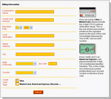 Figure 3 (Old payment form, step 2) |
Why the old form is not very successful:
- It is not clear why you need to buy loans.
- It seems that buying more than two credits at a time is unprofitable, since expensive.
- Every time you have to re-fill many fields.
- It is not clear how many steps there are in the form filling procedure.
- The design of the form is unsuccessful; a bright background is used for the fields, although usually the already highlighted fields are highlighted with a background, rather than empty fields.
Payment form after change
Two steps on one screen. Billing information saved
Figure 4 (New payment form, two steps combined on one screen)
Why the new payment form has become better and more convenient:
- Added an explanation of the appointment of loans. Now the client knows what he pays for translating letters, for checking, etc., and therefore knows that everything is done on the site, which means that the site is different from others and for the better.
- It became clear that it is most advantageous to immediately buy 100 credits, since in this case the price of one loan will be lower (the flags are turned upside down, the column “Per credit”, or “The price of 1 loan” is added).
- The form with the payment information is located on the same screen, and after the first filling in, all data is saved and it is not displayed. There is only a link "Change", which opens a form of payment information with the data entered into it.
- Added service of automatic purchase of credits (checkbox “Automatically process a purchase at this rate and amount whenever I need more credits”). This service is good because it allows the client not to be distracted by supporting actions like buying credits and doing only what he comes to the site to communicate with. As practice has shown, this service is really used, despite the fact that the client has a chance to lose control over their expenses.
- It was decided to abandon the bright, inappropriate design here.
Thus, the minimum steps to re-purchase:
TO change:
- Click the Next button.
- Fill 11 fields of payment information.
- Click the "Submit" button.
In this case, the client will buy only 2 credits (which is most often done).
AFTER the change:
Click the "Submit" button.
In this case, the client will buy 100 credits.
Example 2. Increasing Call Center Revenue
This example demonstrates how using convenient interfaces it was possible to achieve an increase in the efficiency of Call Center operators, to increase the number of calls serviced over a period of time, and, accordingly, the profitability of the center.
The call center in question deals with outgoing calls. Call Center has several features:
- a large number of operators, each of whom should be aware of previous conversations with the subscriber (in connection with which there is a need to have access to the call history);
- the need to quickly switch between routine tasks (dialing to the subscriber) and tasks requiring increased attention (conversation with the subscriber);
- the need to frequently repeat the same phrases;
- work in situations with a limited number of possible scenarios.
The main problem of the interface servicing this Call Center was that it did not automate the process of dialing to subscribers. This process took a lot of time from operators.
In this regard, it was decided to introduce an automatic dialing system and new interfaces for it. Below is a chart of Call Center profitability for 2006:
Figure 5 (Call Center Yield Graph, 2006)
Interfaces
The new system itself keeps track of applications and itself calls the subscriber. When the system dials, the operator receives a call. The operator picks up the phone, and at this moment a task window appears on the screen:
The system has programmed situations that may arise during a call.
Figure 6 (Task Window)
The task window immediately allows you to see who the system has phoned and view the call history. It simulates the process of conversation and programmed possible situations that may arise during a conversation. To select a situation, the operator simply needs to click on the link to see the corresponding scenario:
The operator only needs to pronounce the phrases that the system prompts.
Figure 7 (Task window offers ready-made conversation scripts)
The task window does not reboot when clicking on links (implementation by dynamically changing content in JavaScript), which allows not to lose too much time. The operator does not need to think what to say to the subscriber - the text has already been written, it just needs to be voiced.
This system allows you to minimize the burden on the operator, taking on all the automatic functions and making the work as convenient as possible. As a result of the introduction of new interfaces, the Call Center began to handle a larger volume of calls over the same period of time and receive more revenue.
Example 3. Improving the efficiency of a web resource by dividing the audience
This is the story of creating a successful dating site. Now the Internet is replete with many dating sites that are made on one template:
- one site for men and women:
Figure 8
- Advanced search in the parameters of the future partner:
Figure 9
However, this solution is not the best. Mixing the interests of two different audiences in one interface leads to the creation of an interface that is inconvenient for both audiences.
It was decided to make two sites - one for men and one for women. The reason for this is that the motivation to meet and register on the dating site for men and women is different. For men, it is important to see a lot of photos of beautiful women, while it is important for women to imagine what their communication with a man will be.
| Solution for men | Solution for women |
 |  |
Why every third visitor is registered on the site for women
Because the site is designed specifically for women, taking into account their motivation, their needs and behavioral features:
- The text on the site is written specifically for women: the woman is addressed to “you”, the imperative mood is often used in order not to put the girl before the choice of “to be or not to be”. Definitely - “to be”!
- The site uses the classification of men according to interests, and not according to height / weight / eye color and other parameters. It is important for a woman to imagine what she can have in common with a man, whether he corresponds to the idea of the ideal family that has developed with her.
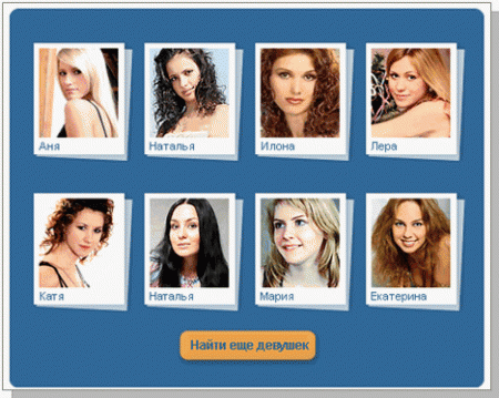
- At that moment, when the woman chose the man she liked, she was asked to register. The photograph of the man does not disappear anywhere, and the text that motivates the woman to register is compiled from the face of the man:
Figure 10 (every third visitor is registered on the website for women)
- The color scheme on the site is chosen specifically for women and creates a feeling of lightness, spring, youth, confidence (white, blue, yellowish).
Attempting to create a unified website for men and women would never lead to such a success of a website that is intended only for women.
Conclusion
Thus, with the help of usability we managed to achieve:
- increasing sales with a constant number of customers and advertising costs,
- increase the efficiency of operators and call center profitability,
- success of a new project (conversion rate 1/3).
Where to look for usabilityists?
A distinctive feature of the usability method is that almost everyone can consider himself to be an expert in this matter. In fact, a usability specialist is a subtle psychologist, analyst, technologist and businessman. Usability protects users, but it always keeps in mind the solvable business problems.
Until recently, usabilityists were trained only independently: they read books, articles, attended thematic seminars and conferences. There was no curriculum, and so far no university has graduated usability specialists. But now such specialists will become “bigger and better” - the first usability training center has recently opened in Moscow. All programs of this center are focused on usability-method. You can get acquainted with them on the official website of the training center www.edu.it-online.ru .
Source: https://habr.com/ru/post/17657/
All Articles