Content applications: on the way to the reader
Now more and more people are reading books, news and other content on mobile devices. The advantages of this are obvious: you do not need to physically store a large number of books and magazines, at any time you have access to a huge library. At the same time, many still prefer paper books and magazines. The reasons for this are different: someone loves the smell of printing ink, someone - the rustling of paper ... But in most cases, people prefer paper editions because applications for reading books and other content are simply not convenient.
With tablets and specialized devices (Nook, Kindle) everything is clear: in my opinion, they more or less cope with the task of conveniently displaying content. But with mobile applications (readers), not everything is so smooth. Having experience in developing mobile applications for reading various content, I want to talk about the main mistakes and features of mobile readers and content applications.
Many applications for reading books are close to reality - here you have the shelves with books, the covers of printed books, and the effect of real page turning (over which you once fought for a long time). It looks like this:
')
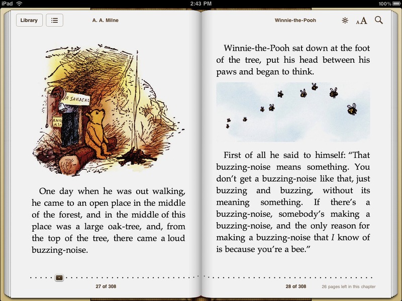
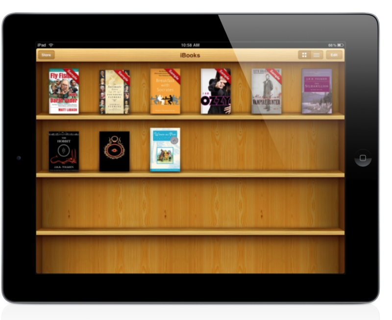
Book opened in iBooks app on iPad and Kiosk app
It would seem that in this bad? In fact, nothing but the fact that this method works well only on devices whose physical size is comparable to the physical size of books and magazines. Have you ever heard that on the same iPad and Kindle it is not convenient to read computer literature, which is mostly printed in PDF and A4 format? Here I am about this: if the physical form factor of the device and the content do not match, then there are difficulties in reading. One solution to this problem was the emergence of epub and mobi formats adapted for mobile devices, which partially solved the problem.

How did Microsoft cope with this problem? For Windows Phone and Windows 8, the Metro interface design language (now called Windows UI) was developed, one of the principles of which is: authentic digital, that is, initially focused on digital devices without analogy to the physical world.

Windows 8 Kindle app
I think it will be interesting for you to look at examples of authentic digital designs and concepts on Pinterest .
A good example is the Flipboard application, which, on the one hand, is a bit like a printed newspaper, on the other hand, it has all the elements of a digital edition:

Flipboard application
Many examples with demonstration of mobile platform capabilities are devoted to writing RSS readers. From the first days, a huge number of news customers and RSS-readers fill the app stores. It is believed that such an application can easily write a student in one evening.
The truth is that you can write something, only it will be absolutely impossible to use such a client. As well as half of the customers released for mobile devices.
Why? Because good readers have to take into account many nuances. For example, it is necessary that they:
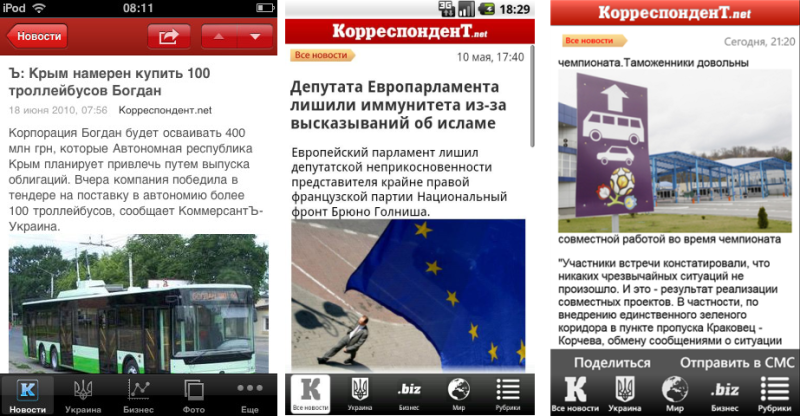
The main problem of readers and content applications is that the content is displayed in its original form (HTML), that is, using a web browser. In this case, the application is a regular wrapper over the browser, which, in my opinion, is not much different from using a regular web site (especially with a responsive design or version for mobile phones). In addition, the web browser does not use native fonts of mobile platforms, which is why the User Experience is suffering.

In the above example, I see several problems:
We solved this problem as follows: minimum space for branding, as well as a collapsed, but at any time accessible control panel (theoretically, you can make a headline in one line, which will add another 10% of usable space in the case of long headers):
From this we can conclude that the functionality and additional information should not interfere with the main task of the user - reading the content.
Navigation within content applications should be as simple as possible, and all additional functions (functions that are not related to reading the news, with rare exceptions, are optional) are hidden in the control panel or are called using additional actions.
This confirms the study , which states that one of the main problems of applications of this kind is a complex and non-intuitive navigation model.
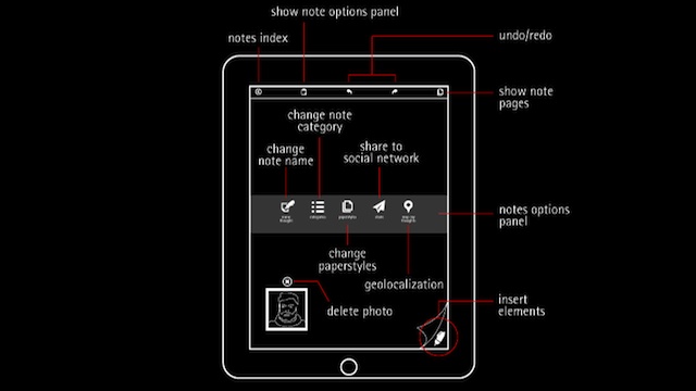
The authors of the applications solve this problem differently. For example, the Moleskine developers have illustrated the logic of user interaction with the application, since without additional explanations it is too complicated, which is why many people refuse this application in favor of more “easy” and “understandable”:
No scheme can not figure out
Users do not like this kind of scheme, because they do not want to feel "close" (who in our age is reading the instructions?).
Also it is impossible not to say about the importance of reverse action (to return to the search results, to the previous article, or to choose another section). The absence of the “Back” button or an intuitive way of returning can put the user in a dead end (apparently, because of this, the designers of Windows Phone made the “Back” button hardware and mandatory).
Another example is the Kinopoisk app for the iPad. Honestly, after a very convenient and thoughtful client for Windows Phone, I expected to see at least a convenient client for iPad (I got acquainted with the applications in that order).
The lower you go down the hierarchy of materials when working with this application, the more cluttered the screen becomes and the less clear is the logic of working with tabs.
It looks like this:
The application "Film Search"
The conclusion is the following: it is necessary to pay more attention to the model of user interaction, as well as to navigation within the application.
Here I would like to tell not so much about errors, but about different design approaches to displaying content. I can highlight several popular templates.
1. Pinterest-style:

In my opinion, one of the most unfortunate concepts, which has become widespread. Apparently, the creators are not too bothered to study the patterns of user behavior when reading. In this case, attention is scattered, not focusing on something specifically. But many people like it.
2. Unlike Pinterest-style, Windows-style assumes even squares lined up "along a ticker".

Extra padding and grouping of objects make it easy to navigate the application.
A: left and top spaces are the same throughout the application;
B: additional indents between groups of similar elements;
C: small distance between similar elements of the same group;
D: headers are aligned on a grid.
By the way, here is a guide that describes how to design a Windows 8 application based on an existing site.
Another feature of Windows 8 is that in the horizontal position the text is divided into columns and read from left to right, and in the vertical position from top to bottom, as we used to see the content on the site. Another example of adapting content to a specific form factor.
3. Facebook & Instagram style.
Such a design you rarely see in mobile applications, but this, perhaps, even for the better.

Many people forget about it and try to transfer the User Experience, which is familiar to web users, to mobile platforms. There are also situations when a mobile application, for example, for iOS, is trying to transfer one to one to a new platform - Android or Windows Phone.
This is fundamentally wrong, since you need to design for a specific platform, taking into account all its features.
Here is an example of the situation described:
Applications look almost identical for all platforms. Companies often explain this by recognizing and branding. However, practice shows that users rarely use two or three phones with different operating systems, so it’s necessary to work on recognizability not in a cross-platform manner. In addition, the authors violate the guidelines of at least two mobile platforms.
I hope that a small excursion into the world of content applications and designs was successful, and it became clearer to you why writing content applications is not as simple as it might seem at first glance.
What are your favorite content apps?
With tablets and specialized devices (Nook, Kindle) everything is clear: in my opinion, they more or less cope with the task of conveniently displaying content. But with mobile applications (readers), not everything is so smooth. Having experience in developing mobile applications for reading various content, I want to talk about the main mistakes and features of mobile readers and content applications.
Physical vs digital format
Many applications for reading books are close to reality - here you have the shelves with books, the covers of printed books, and the effect of real page turning (over which you once fought for a long time). It looks like this:
')
Book opened in iBooks app on iPad and Kiosk app
It would seem that in this bad? In fact, nothing but the fact that this method works well only on devices whose physical size is comparable to the physical size of books and magazines. Have you ever heard that on the same iPad and Kindle it is not convenient to read computer literature, which is mostly printed in PDF and A4 format? Here I am about this: if the physical form factor of the device and the content do not match, then there are difficulties in reading. One solution to this problem was the emergence of epub and mobi formats adapted for mobile devices, which partially solved the problem.
How did Microsoft cope with this problem? For Windows Phone and Windows 8, the Metro interface design language (now called Windows UI) was developed, one of the principles of which is: authentic digital, that is, initially focused on digital devices without analogy to the physical world.
Windows 8 Kindle app
I think it will be interesting for you to look at examples of authentic digital designs and concepts on Pinterest .
A good example is the Flipboard application, which, on the one hand, is a bit like a printed newspaper, on the other hand, it has all the elements of a digital edition:
Flipboard application
Is it easy to write an RSS reader?
Many examples with demonstration of mobile platform capabilities are devoted to writing RSS readers. From the first days, a huge number of news customers and RSS-readers fill the app stores. It is believed that such an application can easily write a student in one evening.
The truth is that you can write something, only it will be absolutely impossible to use such a client. As well as half of the customers released for mobile devices.
Why? Because good readers have to take into account many nuances. For example, it is necessary that they:
- support offline mode, while not taking up much space after several months of work;
- allowed to manage the font, background, subscriptions, as well as the frequency of their updates;
- were fast and consumed little traffic;
- provided an opportunity not only to consume content, but also to produce it, as well as share it;
- provided a convenient interface for content consumption and convenient gesture support for browsing and working with content - this is perhaps the most important thing.
The main problem of readers and content applications is that the content is displayed in its original form (HTML), that is, using a web browser. In this case, the application is a regular wrapper over the browser, which, in my opinion, is not much different from using a regular web site (especially with a responsive design or version for mobile phones). In addition, the web browser does not use native fonts of mobile platforms, which is why the User Experience is suffering.
In the above example, I see several problems:
- the text “Yesterday, 18:17” takes up too much space and does not contain a semantic load;
- the top branded panel + the bottom control panel + the text “Yesterday 18:17” occupies 25–30% of the working space that could be used for the text of the news.
We solved this problem as follows: minimum space for branding, as well as a collapsed, but at any time accessible control panel (theoretically, you can make a headline in one line, which will add another 10% of usable space in the case of long headers):
From this we can conclude that the functionality and additional information should not interfere with the main task of the user - reading the content.
Simple navigation
Navigation within content applications should be as simple as possible, and all additional functions (functions that are not related to reading the news, with rare exceptions, are optional) are hidden in the control panel or are called using additional actions.
This confirms the study , which states that one of the main problems of applications of this kind is a complex and non-intuitive navigation model.
The authors of the applications solve this problem differently. For example, the Moleskine developers have illustrated the logic of user interaction with the application, since without additional explanations it is too complicated, which is why many people refuse this application in favor of more “easy” and “understandable”:
No scheme can not figure out
Users do not like this kind of scheme, because they do not want to feel "close" (who in our age is reading the instructions?).
Also it is impossible not to say about the importance of reverse action (to return to the search results, to the previous article, or to choose another section). The absence of the “Back” button or an intuitive way of returning can put the user in a dead end (apparently, because of this, the designers of Windows Phone made the “Back” button hardware and mandatory).
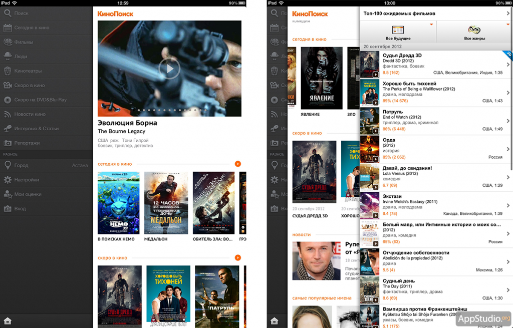
Another example is the Kinopoisk app for the iPad. Honestly, after a very convenient and thoughtful client for Windows Phone, I expected to see at least a convenient client for iPad (I got acquainted with the applications in that order).
The lower you go down the hierarchy of materials when working with this application, the more cluttered the screen becomes and the less clear is the logic of working with tabs.
It looks like this:
The application "Film Search"
The conclusion is the following: it is necessary to pay more attention to the model of user interaction, as well as to navigation within the application.
Content Display Templates
Here I would like to tell not so much about errors, but about different design approaches to displaying content. I can highlight several popular templates.
1. Pinterest-style:
In my opinion, one of the most unfortunate concepts, which has become widespread. Apparently, the creators are not too bothered to study the patterns of user behavior when reading. In this case, attention is scattered, not focusing on something specifically. But many people like it.
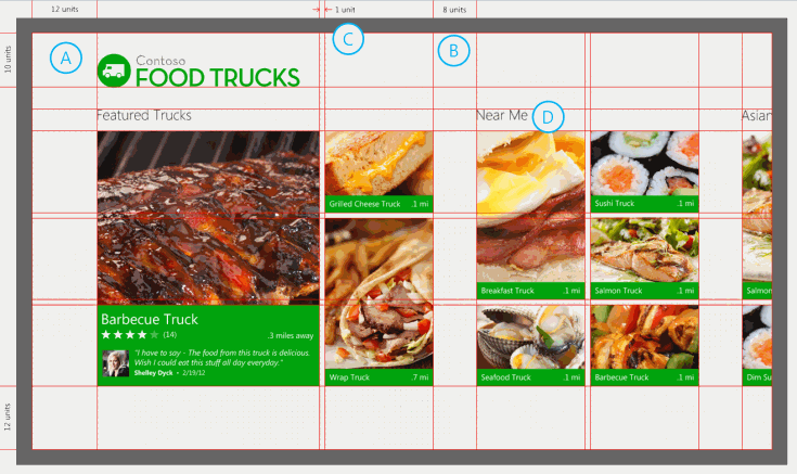
2. Unlike Pinterest-style, Windows-style assumes even squares lined up "along a ticker".
Extra padding and grouping of objects make it easy to navigate the application.
A: left and top spaces are the same throughout the application;
B: additional indents between groups of similar elements;
C: small distance between similar elements of the same group;
D: headers are aligned on a grid.
By the way, here is a guide that describes how to design a Windows 8 application based on an existing site.
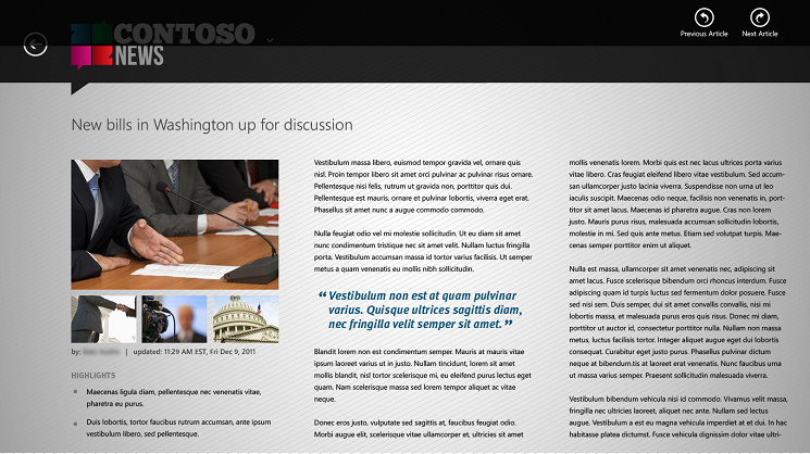
Another feature of Windows 8 is that in the horizontal position the text is divided into columns and read from left to right, and in the vertical position from top to bottom, as we used to see the content on the site. Another example of adapting content to a specific form factor.
3. Facebook & Instagram style.
Such a design you rarely see in mobile applications, but this, perhaps, even for the better.
Design for a specific platform
Many people forget about it and try to transfer the User Experience, which is familiar to web users, to mobile platforms. There are also situations when a mobile application, for example, for iOS, is trying to transfer one to one to a new platform - Android or Windows Phone.
This is fundamentally wrong, since you need to design for a specific platform, taking into account all its features.
Here is an example of the situation described:
Applications look almost identical for all platforms. Companies often explain this by recognizing and branding. However, practice shows that users rarely use two or three phones with different operating systems, so it’s necessary to work on recognizability not in a cross-platform manner. In addition, the authors violate the guidelines of at least two mobile platforms.
Instead of conclusions
I hope that a small excursion into the world of content applications and designs was successful, and it became clearer to you why writing content applications is not as simple as it might seem at first glance.
What are your favorite content apps?
Source: https://habr.com/ru/post/175869/
All Articles