Regular Expression Crossword: Online Version
Inspired by a recent post and commentary to it, I decided to make a similar interactive version.
There is keyboard navigation, highlighting of active strings, as well as indication of line matching with a regular expression. For convenience, the prompts of the selected cell are rotated horizontally.
The markup is pure HTML + CSS3.
Almost works in the latest versions of popular browsers. In IE9, navigation with the mouse is buggy, performance problems are observed in FF and Opera. And only Chrome - 100% OK.
I would be grateful for the optimization tips.
Link - here . Implementation details - under the cut.
To make this polygon with borders of several pixels, additional external containers with similar rotations and necessary borders were added to the content. The essence is shown in the picture. Here the red dotted lines denote external “invisible containers”, black - internal containers with borders.
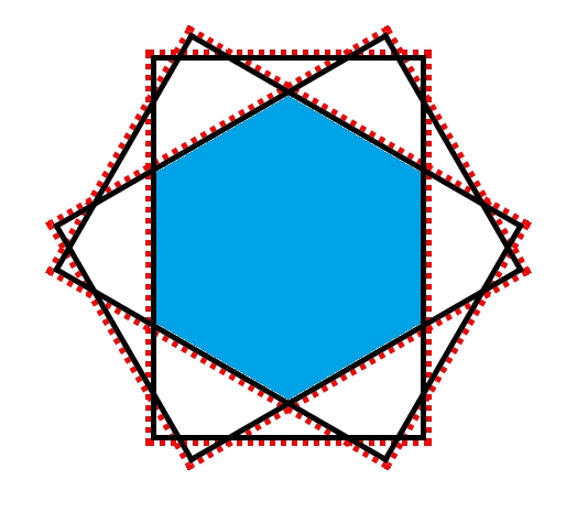
First, there are 3 nested elements with a red frame, inside them there are also nested visible containers with a black frame.
For placement of headers by means of CSS, they are added before the corresponding cell to the container with an absolute position and right-aligned. Thus, the binding to the size of the line disappears and it is sufficient to correctly position the container through the CSS
Everything else is not supernatural, so I will not describe it in a post. Those who wish can find everything in the source code.
UPD. It works fine in IE10, thanks to alexxxst .
Under the 9th there was a bug with the positioning of the headers (the horizontal slid to the left). As I understand it, this is some of its specificity. The first element in the line with
Also along with the twists, the text is crookedly rendered. In general, as experience has shown, graphics rendering together with transform leaves much to be desired.
UPD2. Sources
There is keyboard navigation, highlighting of active strings, as well as indication of line matching with a regular expression. For convenience, the prompts of the selected cell are rotated horizontally.
The markup is pure HTML + CSS3.
Almost works in the latest versions of popular browsers. In IE9, navigation with the mouse is buggy, performance problems are observed in FF and Opera. And only Chrome - 100% OK.
I would be grateful for the optimization tips.
Link - here . Implementation details - under the cut.
Implementation
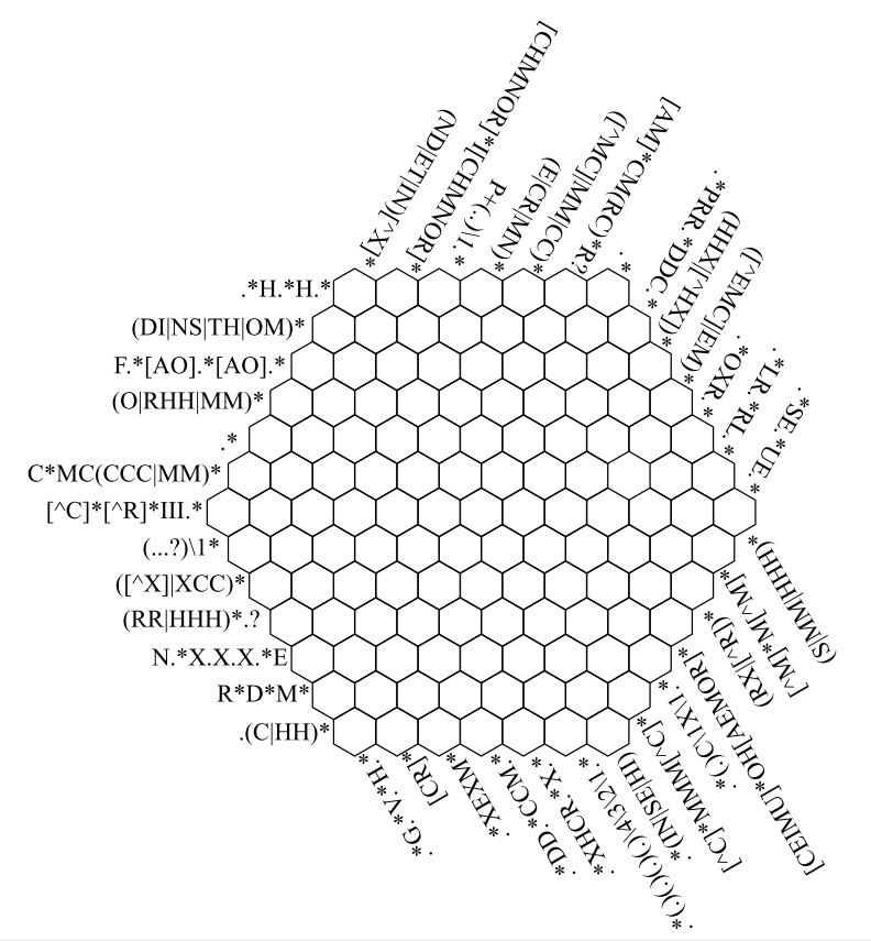
Perhaps the most interesting thing in the implementation is the crossword grid. Cell sverstana with the development of the idea of "honest polygons . " In short, multiple containers are created withvisibility:hidden and overflow:hidden , which provides for cutting off unnecessary content. Inside, content is created with visibility:visible . Using this in conjunction with the rotation of containers allows you to specify the shape of virtually any convex polygon to the final element.To make this polygon with borders of several pixels, additional external containers with similar rotations and necessary borders were added to the content. The essence is shown in the picture. Here the red dotted lines denote external “invisible containers”, black - internal containers with borders.
First, there are 3 nested elements with a red frame, inside them there are also nested visible containers with a black frame.
Code
To correctly merge cells into a grid, do the following:HTML
CSS
<span class="hexcell"> <span> <span> <span> <span> <span class="input"></span> </span> </span> </span> </span> </span> CSS
.hexcell { display: inline-block; vertical-align: middle; text-align: center; width: 50px; height: 70px; overflow:hidden; visibility:hidden; -webkit-transform: rotate(120deg); -moz-transform: rotate(120deg); -ms-transform: rotate(120deg); -o-transform: rotate(120deg); transform: rotate(120deg); } .hexcell span { position:relative; width:100%; height:100%; display:inline-block; overflow:hidden; visibility:hidden; vertical-align: middle; text-align: center; } .hexcell > span { -webkit-transform: rotate(-60deg); -moz-transform: rotate(-60deg); -ms-transform: rotate(-60deg); -o-transform: rotate(-60deg); transform: rotate(-60deg); } .hexcell > span > span { -webkit-transform: rotate(-60deg); -moz-transform: rotate(-60deg); -ms-transform: rotate(-60deg); -o-transform: rotate(-60deg); transform: rotate(-60deg); } .hexcell > span > span > span{ /* */ border: 1px solid #000000; height:68px; width:48px; visibility:visible; -webkit-transform: rotate(120deg); -moz-transform: rotate(120deg); -ms-transform: rotate(120deg); -o-transform: rotate(120deg); transform: rotate(120deg); } .hexcell > span > span > span > span{ /* */ border: 1px solid #000000; height:68px; width:48px; top:-1px; left:-1px; visibility:visible; -webkit-transform: rotate(-60deg); -moz-transform: rotate(-60deg); -ms-transform: rotate(-60deg); -o-transform: rotate(-60deg); transform: rotate(-60deg); } .hexcell > span > span > span > span > span.input{ /* */ border: 1px solid #000000; height:68px; width:48px; top:-1px; left:-1px; position:relative; visibility:visible; font-size:34px; -webkit-transform: rotate(-60deg); -moz-transform: rotate(-60deg); -ms-transform: rotate(-60deg); -o-transform: rotate(-60deg); transform: rotate(-60deg); } - the cells are wrapped in a container, the contents of which are centered
- pseudo-border-collapse is used: all cells except the last one are set to a smaller width and the last element (content container) removes the right border
- To align the lines, a negative
margin-topadded.
For placement of headers by means of CSS, they are added before the corresponding cell to the container with an absolute position and right-aligned. Thus, the binding to the size of the line disappears and it is sufficient to correctly position the container through the CSS
transform .Everything else is not supernatural, so I will not describe it in a post. Those who wish can find everything in the source code.
Performance
Separate questions causes functioning. Crossword is guaranteed to work only for Webkit (the development was conducted under the latest version of Chrome). In Firefox and Opera also works, but for some reason with noticeable brakes, especially in Opera. As the profiler showed in the same Opera, most of the time is spent on redrawing, even with the transitions disabled. Under IE10 not tested.UPD. It works fine in IE10, thanks to alexxxst .
Under the 9th there was a bug with the positioning of the headers (the horizontal slid to the left). As I understand it, this is some of its specificity. The first element in the line with
position:absolute moves to the left, despite the absence of an explicit position indication. Fixed through display:inline-block on container line.Also along with the twists, the text is crookedly rendered. In general, as experience has shown, graphics rendering together with transform leaves much to be desired.
UPD2. Sources
')
Source: https://habr.com/ru/post/175847/
All Articles