Facebook usability. Part 2: Facebook for people
In the first part of the article, I talked about some of the conceptual failures of Facebook in the area of usability. Now I armed myself with a pencil and paper and set myself the following task: if I were a Facebook designer and could do “all is well”, then where would I start?
So, let's begin. Let us have a couple of hours to figure out how to make Facebook more convenient. Of course, it will not be possible to redesign all the interfaces of this monster in such a short time, so first we will decide what improvements should be in priority. Based on the comments made in my previous article and your comments to it, I made a list of improvements that would not have required some huge costs and could have the most tangible positive effect:
Head over to facebook.com and highlight potential problem areas:

')
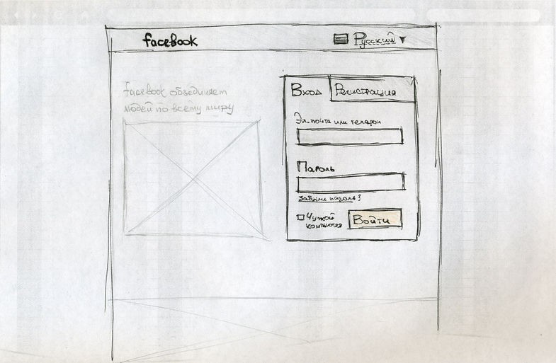
Regular users deserve the same large fields for logging into your account, which now only those who register. The “save / forget password” function should have a more “common” name, for example, “Alien Computer”. There is no need to repeat the email when registering: users often copy it, but you can add a password check (for example, as a “show password” function). It is necessary to provide the user with the ability to register by phone number. Birthday and gender can be filled after registration. The interface for changing the language is more expected in the upper right corner and is worth adding with the icons of the flags of the countries.
With all this in mind, at facebook.com, this page can be opened (do not be alarmed by curved lines and my terrible handwriting: in a fast paper prototype, this does not matter):
And if there is no account yet, click on the “Registration” tab:
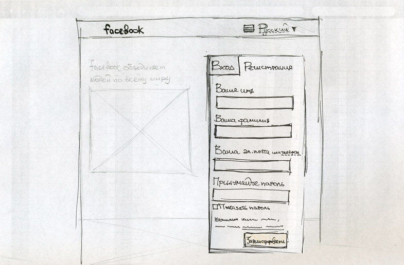
In addition to reducing the number of fields, users now have the opportunity to register by phone number. Such a function has already been implemented in Facebook, but the corresponding interface in the registration apparently just forgot to add.
After logging in to your account, the user must go to his profile page. I will not give here screenshots of current interfaces: what is wrong there, you can read in the previous article or look at it yourself .
Remove unnecessary buttons from the top panel; exclude distracting low-use side panels; fill the profile header with information that would help identify the user; Let us present the events of the chronicle in the form of a single column in order to read it more conveniently:
The top panel with the logo is fixed at the border of the browser window and remains there when scrolling the page:

One of the most critical problems of the current interface is the difficulty of accessing its own content (chronicle, photos, music, etc.). On the Vkontakte service, this problem is solved by a static panel on the left, which is accessible from all portal pages and with which you can always access your content in the same way:
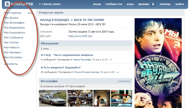
The disadvantages of this solution are the increased level of visual noise on the page (at least 10 menu items of two words each) and the likelihood of some users of the associations “My Photos”, “My friends”, etc. with the profile whose page is open to this moment.
The first problem can be solved, for example, by a drop-down list, and the second - by visually binding menu items to your profile. The logical solution is the area in the top panel with a small avatar and username, when hovering over which, a drop-down menu would appear with links to the user's content:

The drop-down menu next to sections displays the number of new events, and the total number of events is displayed on the button from which this drop-down list expands (the latter is not shown in the prototype).
In fact, in the presented paper prototype there are all the most basic interfaces from the point of view of the concept. Only content pages (photos, friends, etc.), a settings page and general information pages of the service remain, but their usability is a matter of technology. If the “pencil” sketches were made of good-quality graphic design and implemented, then at least I myself would become a regular user of Facebook.
I would be glad if in the comments you share your ideas, offer more interesting solutions and reasonably criticize my prototype. Thanks to everyone who read to this place.
Formulation of the problem
So, let's begin. Let us have a couple of hours to figure out how to make Facebook more convenient. Of course, it will not be possible to redesign all the interfaces of this monster in such a short time, so first we will decide what improvements should be in priority. Based on the comments made in my previous article and your comments to it, I made a list of improvements that would not have required some huge costs and could have the most tangible positive effect:
Login page
Head over to facebook.com and highlight potential problem areas:
')
Regular users deserve the same large fields for logging into your account, which now only those who register. The “save / forget password” function should have a more “common” name, for example, “Alien Computer”. There is no need to repeat the email when registering: users often copy it, but you can add a password check (for example, as a “show password” function). It is necessary to provide the user with the ability to register by phone number. Birthday and gender can be filled after registration. The interface for changing the language is more expected in the upper right corner and is worth adding with the icons of the flags of the countries.
With all this in mind, at facebook.com, this page can be opened (do not be alarmed by curved lines and my terrible handwriting: in a fast paper prototype, this does not matter):
And if there is no account yet, click on the “Registration” tab:
In addition to reducing the number of fields, users now have the opportunity to register by phone number. Such a function has already been implemented in Facebook, but the corresponding interface in the registration apparently just forgot to add.
Main page
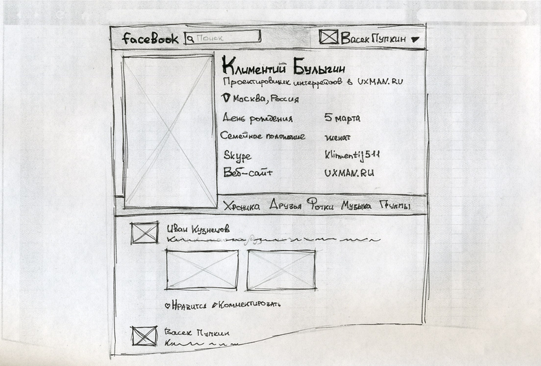
After logging in to your account, the user must go to his profile page. I will not give here screenshots of current interfaces: what is wrong there, you can read in the previous article or look at it yourself .
Remove unnecessary buttons from the top panel; exclude distracting low-use side panels; fill the profile header with information that would help identify the user; Let us present the events of the chronicle in the form of a single column in order to read it more conveniently:
The top panel with the logo is fixed at the border of the browser window and remains there when scrolling the page:
One of the most critical problems of the current interface is the difficulty of accessing its own content (chronicle, photos, music, etc.). On the Vkontakte service, this problem is solved by a static panel on the left, which is accessible from all portal pages and with which you can always access your content in the same way:
The disadvantages of this solution are the increased level of visual noise on the page (at least 10 menu items of two words each) and the likelihood of some users of the associations “My Photos”, “My friends”, etc. with the profile whose page is open to this moment.
The first problem can be solved, for example, by a drop-down list, and the second - by visually binding menu items to your profile. The logical solution is the area in the top panel with a small avatar and username, when hovering over which, a drop-down menu would appear with links to the user's content:
The drop-down menu next to sections displays the number of new events, and the total number of events is displayed on the button from which this drop-down list expands (the latter is not shown in the prototype).
Conclusion
In fact, in the presented paper prototype there are all the most basic interfaces from the point of view of the concept. Only content pages (photos, friends, etc.), a settings page and general information pages of the service remain, but their usability is a matter of technology. If the “pencil” sketches were made of good-quality graphic design and implemented, then at least I myself would become a regular user of Facebook.
I would be glad if in the comments you share your ideas, offer more interesting solutions and reasonably criticize my prototype. Thanks to everyone who read to this place.
Source: https://habr.com/ru/post/174909/
All Articles